Then you’ll likely end up with them. What I love about the scrown is its’ history. Used for casino and custom chips for decades, you can buy a set for yourself made with the same mold cups as some classic casino chips.I will get samples first and decide, I really, really liked the Scrown though!@Eriks
You are using an out of date browser. It may not display this or other websites correctly.
You should upgrade or use an alternative browser.
You should upgrade or use an alternative browser.
Need help with CPC custom Bellagio inspired chip design (1 Viewer)
- Thread starter ChipReeseG
- Start date
Same here. They’re easily the best looking chips with the coolest history. But imo there are other molds that win in the feel department (which is what wins long term). Subjective as hell of course. B-mold would obviously be a good fit theme wise in this instanceThen you’ll likely end up with them. What I love about the scrown is its’ history. Used for casino and custom chips for decades, you can buy a set for yourself made with the same mold cups as some classic casino chips.
ChipReeseG
High Hand
$5 - 400
$25 - 500
$100 - 200
$500 - 100
Decided to go with 1,200 chips. And skip the tourney set, maybe just order some Dunes China clay $1k's and $5k's, we never play tournaments anyway lol. Will update on designs tomorrow if I find the time.
$25 - 500
$100 - 200
$500 - 100
Decided to go with 1,200 chips. And skip the tourney set, maybe just order some Dunes China clay $1k's and $5k's, we never play tournaments anyway lol. Will update on designs tomorrow if I find the time.
What are the stakes? Generally in a cash game with 10 players, you only need 100-120 of your smallest denom as the small blind.$5 - 400
$25 - 500
$100 - 300
$500 - 100
Decided to go with 1,300 chips. And skip the tourney set, maybe just order some Dunes China clay $1k's and $5k's, we never play tournaments anyway lol. Will update on designs tomorrow if I find the time.
ChipReeseG
High Hand
We play $5/$5 (in reality in SEK it's $0.5/$0.5) with people buying in for anything between $2,000-$5,000 ($200-$500) so it can get pretty deep and we like big chips stacks with a lot of chips.
I understand, but that’s an expensive investment for chips that just going to look good in stacks but not be used.We play $5/$5 (in reality in SEK it's $0.5/$0.5) with people buying in for anything between $2,000-$5,000 ($200-$500) so it can get pretty deep and we like big chips stacks with a lot of chips.
$5 - 300
$25 - 300
$100 - 400
$500 - 150
$5000 - 50
This works for two tables and the $5000 gives you bank when people are buying in for 3000-5000$ often you need something bigger than $500
Playing in krónur myself I would take your time and think about the colours and how much you need
$25 - 300
$100 - 400
$500 - 150
$5000 - 50
This works for two tables and the $5000 gives you bank when people are buying in for 3000-5000$ often you need something bigger than $500
Playing in krónur myself I would take your time and think about the colours and how much you need
I play 2/5 or 5/5 mostly myself and I never have more than 3 racks of fives on the table for 8 players. I know your game plays very deep but unless you like to make bets two-fisted with fives, I would spend more on the higher denoms. The fives are just gonna sit in stacks. Maybe something like:
5 x 200-300
25 x 300-400
100 x 200-300
500 x 100+
Or perhaps skip the 500 and go straight for a 1k to store value. 100 of those would provide great bank.
5 x 200-300
25 x 300-400
100 x 200-300
500 x 100+
Or perhaps skip the 500 and go straight for a 1k to store value. 100 of those would provide great bank.
ChipReeseG
High Hand
$5 - 300
$25 - 400
$100 - 300
$500 - 100
$1k - 100
That's still 1,200 chips, but a little better lol.
Updated the design (a little bit);
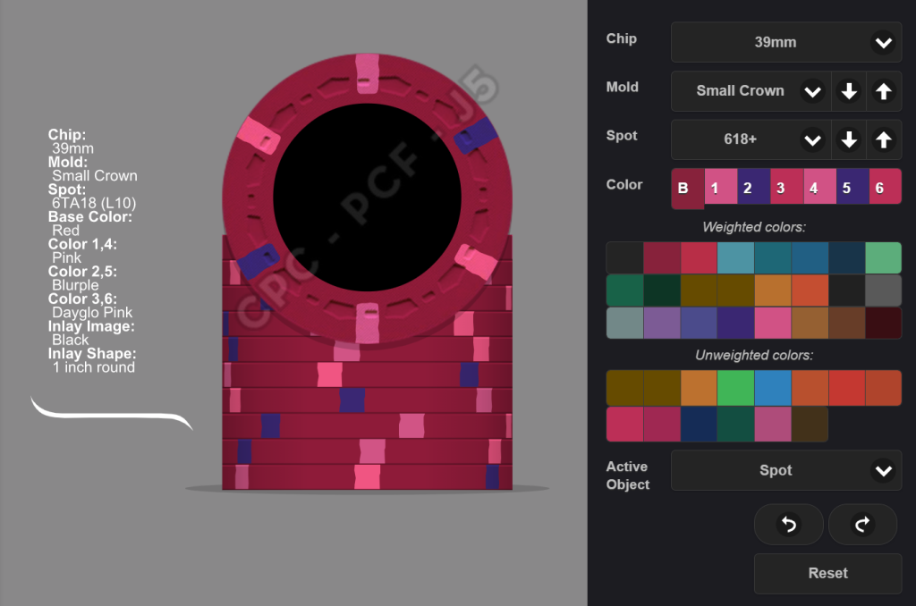
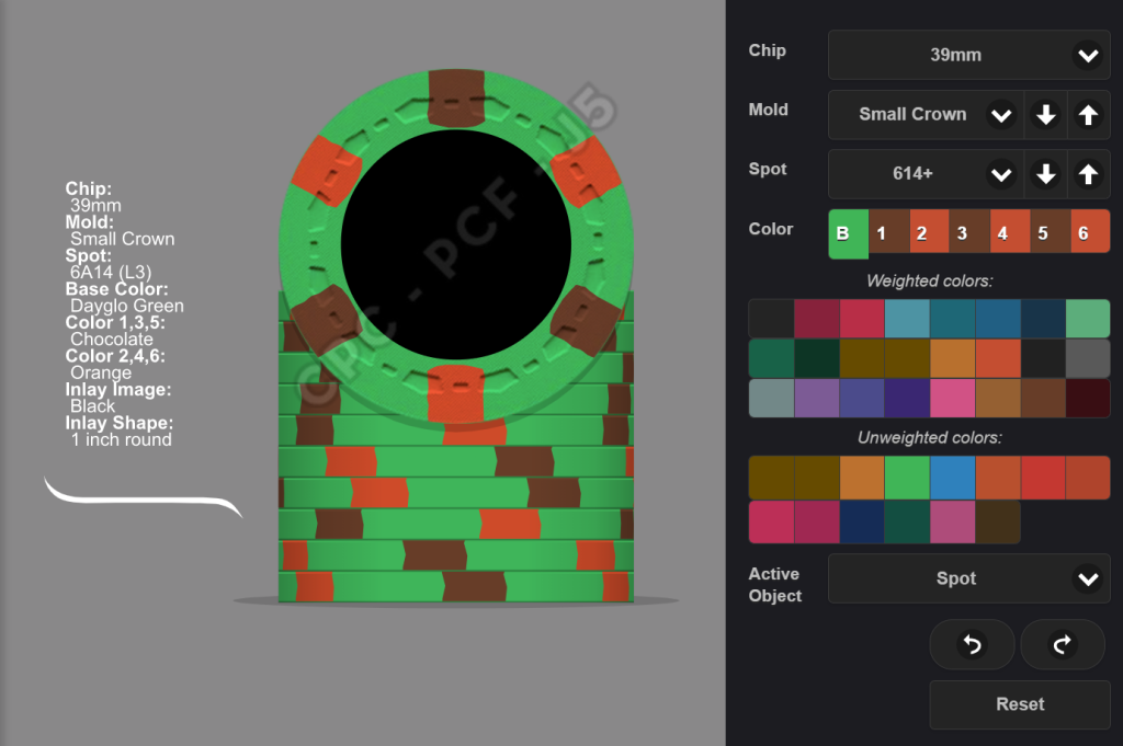
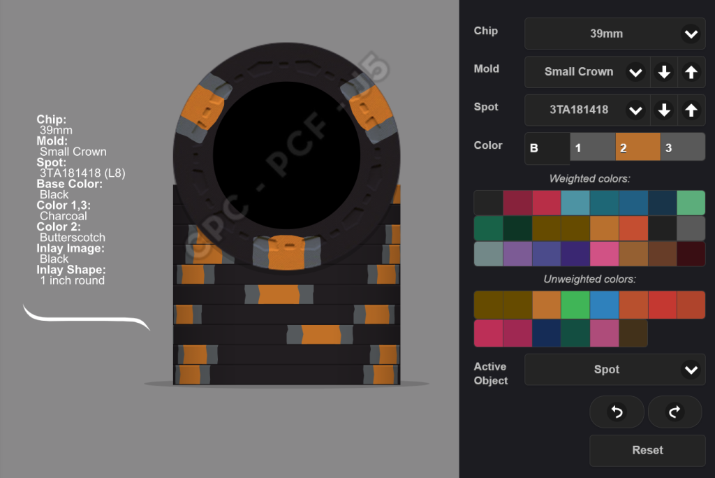
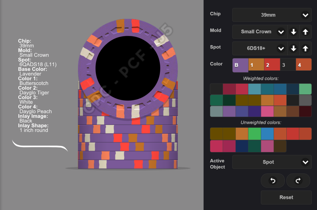
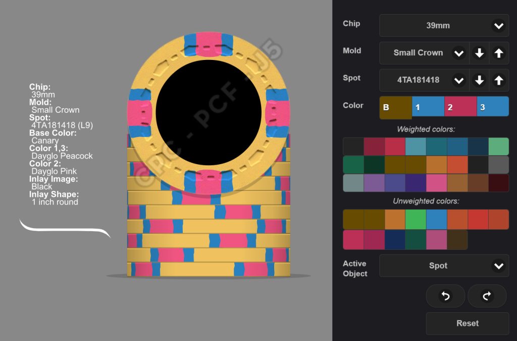
$25 - 400
$100 - 300
$500 - 100
$1k - 100
That's still 1,200 chips, but a little better lol.
Updated the design (a little bit);
links_slayer
4 of a Kind
need more contrast between the pink and dg pink spots in the most recent version of the $5 imo
ChipReeseG
High Hand
This feels better.
ChipReeseG
High Hand
Played around a little with https://www.brandcrowd.com/maker/lo...770?text=B.'s Hotel & Casino&isVariation=True
What is the NFJPT logo?
Not sure the print on the bottom is going to show, not sure the stuff up top will either.
How do you feel about a lone big centered B. with denom either in the middle of the B or under it? Old school meets new school. If you know you know cool, but not overly so.
Not sure the print on the bottom is going to show, not sure the stuff up top will either.
How do you feel about a lone big centered B. with denom either in the middle of the B or under it? Old school meets new school. If you know you know cool, but not overly so.
ChipReeseG
High Hand
NFJPT is Norrfjärden Poker Tour lol, just an inside joke/nickname for a home game tourney back in the days.
Ok so "NORRFJÄRDEN" and "ETT HUNDRA SVENSKA KRONOR" in a bigger font? Got it.
Hmm, not sure what you mean can you show me?
Ok so "NORRFJÄRDEN" and "ETT HUNDRA SVENSKA KRONOR" in a bigger font? Got it.
Hmm, not sure what you mean can you show me?
ChipReeseG
High Hand
This feels a lot better.
AlbinoDragon
Flush
The worry and suggestion here is that text will be too small to read wen printed on the chip. It looks fine on screen but when 1-inch across on the chip, when held at arms length that text will be too small to read.
Print your inlay design out at that size and see what it looks like "in reality" and not on your monitor. It's very easy to get buried in lots of tiny detail that will be unreadable or invisible on the finished chip.
Only related, the text in this newest version, the gray on black, is much too low contrast for printing. It's difficult to read on screen here and will be mostly invisible when printed.
ChipReeseG
High Hand
Allright, thank you for the input @AlbinoDragon I will try white on black then!
ChipReeseG
High Hand
This looks better I guess? @AlbinoDragon
Is these texts still too small?`I have no printer at home unfortunately.
AlbinoDragon
Flush
It doesn't necessarily have to be white, but that darker gray on a lack background will be very hard to see. You can try 80% white to get a "darker" effect yet still retain readability.Allright, thank you for the input @AlbinoDragon I will try white on black then!
In my last custom set I got too buried in what was some small text. After the third or fourth iteration, I realized I was going the wrong way only after I did my first test print. It's remarkable how much you can learn about a design after actually seeing it in your hand... even if it's just a paper printout of the design. Probably 50 or 60 test prints later did I finally find a design that worked and I was happy with.
Good luck and take your time. It'll take long enough to get custom CPCs made that it's worth the extra time to get everything just right.
AlbinoDragon
Flush
Definitely more readabale. The motto at the bottom doesn't have to be 100% readable all the time, but the darker color would have made it look like a smudge.View attachment 1117415
This looks better I guess? @AlbinoDragon
Is these texts still too small?`I have no printer at home unfortunately.
I don't have a printer at home either. Many thanks must be given to the nice printer at my office for all my test prints.
(I was responding before when you posted this.)
Yeah, they covered my concern above. The combination of the low contrast and small point size will make it really hard to read, especially if the inlay has texture to it (not sure if B mold does).
My other point is not overdoing the inlay. It’s a very small space, so I recommend you be deliberate and purposeful with what you add.
I also recommend looking at other inlays and reflecting on what you like and don’t like about them, to help inform your views.
An inlay, however, is art. Ultimately what looks good to you is what counts. I’m throwing out ideas to help test your views and make sure you’re loving the final design.
BottomPair7
Straight
I would make the denom almost the size of the logo and basically just skip having the logo big and center. Maybe try to incorporate it in the arc text instead.
As for base and spot colors, I like to go with way more contrast than what you have so far. Obv it comes down to personal taste but to me a black base with charcoal and butterscotch spots for instance, is way too dark.
Same with the five. Regular red is really dark and pairing it with maroon and blurple doesn’t work for me.
Naturally, you should go with what looks best to you, but those are my main concerns.
100 % take a LOT of time (like months), go back and forth and do NOT finalize anything until you have a color sample in hand. They’re shipped from the UK so no big wait or hassle. Or potentially you can find a used set from a EU member. Don’t buy one that’s too old though as they wouldn’t match the CPC colors you’d actually be getting for your set.
ChipReeseG
High Hand
Going with retro red 100% most certainly, just saw a pretty new picture of the regular red sample, very dark indeed.
Similar threads
- Replies
- 16
- Views
- 796
- Replies
- 28
- Views
- 975
