Weird stuff…

-
PCF is an eBay Partner. If you make a purchase through one of our links, we may earn a commission at no extra cost to you. Thank you for your support!
You are using an out of date browser. It may not display this or other websites correctly.
You should upgrade or use an alternative browser.
You should upgrade or use an alternative browser.
Minimalist Tina no mold design drafts (2 Viewers)
- Thread starter dylanthepiguy2
- Start date
OP
OP
dylanthepiguy2
Two Pair
have finally (mostly) finished tweaking the existing design!
finally moved from inkscape to illustrator to use cmyk mode
i'm pretty happy with it, but anyone got any feedback?

finally moved from inkscape to illustrator to use cmyk mode
i'm pretty happy with it, but anyone got any feedback?
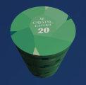
That might be low key one of the better Tina sets I've seen in recent memory. I wish more people would utilize the creative possibilities of the ceramic canvas vs. just trying to mimic clay chips/edge spots.hmm okay so i found this pic on tina's alibaba page (i think?).
HOLY FK THEY CAN DO GRADIENTS, WHAT :O :O :O
View attachment 1438197
https://szchenlin.en.alibaba.com/pr...html?spm=a2700.shop_index.74.2.440f2603pGrNou
maybe my designs are gonna be okay after all.
not sure if the gradients still look good between two highish saturated colours tho,
Microscopic
OP
OP
dylanthepiguy2
Two Pair
?Microscopic
FearlessFred
Two Pair
I think the .20 and 20 chips could be confusing without a currency symbol or another obvious way to tell them apart
- Joined
- Dec 29, 2017
- Messages
- 25,940
- Reaction score
- 35,090
- Rewards
- 0
- Location
- Burnaby (Greater Vancouver), BC
I would change from Orange to Yellow in order to increase contrast between Blue and Red.
Throw a c on the .20 and remove the .I think the .20 and 20 chips could be confusing without a currency symbol or another obvious way to tell them apart
Throw $ on the others.
Yes and no.....I would change from Orange to Yellow in order to increase contrast between Blue and Red.
I dont know what colors your casinos use but I'd think an orange 5 with that green 20 would feel quite natural but it makes yellow, red and brown less desirable on other chips.
Maybe frac and 1 are blue? black?
If the x is 100 sometimes maybe go darker red like the note and make the 5 a brighter orange.
Then purple could be frac.
===
Before I keep going. What are your casino standard colors? Are your players used to 1 standard??
SixSpeedFury
Full House
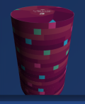
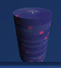
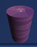
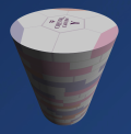
Gemstone PalaceJust coming back to working on these
i'm struggling on a name - anyone got any preferences here ?
icon might have to change depending on name
ive also gotta reduce the neon-ness of the purple as its outside cmyk, but anyways...
The Emerald Kingdom looks and sounds the best to me, but emeralds are green...
Hearts and Diamonds Casino could be another name but its quite long
View attachment 1462373
- Joined
- Dec 29, 2017
- Messages
- 25,940
- Reaction score
- 35,090
- Rewards
- 0
- Location
- Burnaby (Greater Vancouver), BC
Yes and no.....
View attachment 1517186
I dont know what colors your casinos use but I'd think an orange 5 with that green 20 would feel quite natural but it makes yellow, red and brown less desirable on other chips.
Maybe frac and 1 are blue? black?
If the x is 100 sometimes maybe go darker red like the note and make the 5 a brighter orange.
Then purple could be frac.
===
Before I keep going. What are your casino standard colors? Are your players used to 1 standard??
Keep Orange then, but add Yellow colour rather than darker Orange.
OP
OP
dylanthepiguy2
Two Pair
hmm good point, i thought i would be large enough, but maybe not for older people. ill try increase the size a little bit, although i cant make it too large without the proportions being thrown off.I like the spots, but they, and the print, both look really small to my eye. I’m more worried about the center print, though.
im personally choosing to keep the $/c off so i can play nano stakes if i want to. plus personally i think it looks cleaner without the extra symbolThrow a c on the .20 and remove the .
Throw $ on the others.
sadly chip culture here is terrible. its pretty normal to have 5 non-standard colour dice chips for a cash game because people have no idea what they're doing (dice chips are pretty much the only chips you can buy here in nz).Yes and no.....
View attachment 1517186
I dont know what colors your casinos use but I'd think an orange 5 with that green 20 would feel quite natural but it makes yellow, red and brown less desirable on other chips.
Maybe frac and 1 are blue? black?
If the x is 100 sometimes maybe go darker red like the note and make the 5 a brighter orange.
Then purple could be frac.
===
Before I keep going. What are your casino standard colors? Are your players used to 1 standard??
even our casinos use plastic garbage chips, and for some reason an orange 1 with red 5, green 25, black 100
id personally like to keep a more-or-less-standard colour scheme not that it matters to anyone except a few people here
i dont think a black gemstone would print well (plus i like rainbow vomit all over my chips lol)
i do think you guys are on to something re the contrast tho. there could be a little more contrast between the red and blue, but maybe even red/orange too
ill see what i can come up with
OP
OP
dylanthepiguy2
Two Pair
thanks for the feedback everyone, ive just made a slight lightening of the blues and although the contrast with red is not massive, i think it'll be sufficient
ive made the "label" 15% bigger. much more and it throws off the proportions. i think it's large enough for most people


onward!
ive made the "label" 15% bigger. much more and it throws off the proportions. i think it's large enough for most people
onward!
OP
OP
dylanthepiguy2
Two Pair
changed the denom font and thickened the thin edge spots
3d rendered using this https://www.pokerchipforum.com/threads/3d-poker-chip-renderer-tool.133181/
3d rendered using this https://www.pokerchipforum.com/threads/3d-poker-chip-renderer-tool.133181/
Attachments
Are you ever actually going to use the .20 at the same time with the 20?
because you can just drop it at one 20 and either A) save money/space on the number of chips or B) use the orange/green as a 100 denomination if you want to play a small Turney.
Any one with half a brain can deduce 20 = .20 1= is a dollar in a micro stakes game. People complaining that it will be confusing are pedantic.
This isn't a popular option but I'm am currently doing this my my set. 1s = .01, .1, 1, 5s = 0.05, .5, 50, 25s = 0.25, 2.50, 25
LOTS of flexibility playing micro stakes
Just an idea, your design looks cool
My thoughts are:Are you ever actually going to use the .20 at the same time with the 20?
because you can just drop it at one 20 and either A) save money/space on the number of chips or B) use the orange/green as a 100 denomination if you want to play a small Turney.
Any one with half a brain can deduce 20 = .20 1= is a dollar in a micro stakes game. People complaining that it will be confusing are pedantic.
This isn't a popular option but I'm am currently doing this my my set. 1s = .01, .1, 1, 5s = 0.05, .5, 50, 25s = 0.25, 2.50, 25
LOTS of flexibility playing micro stakes
Just an idea, your design looks cool
If you're building a casino used set or a custom CPC set and want to use it for Micro making such assignments is the way to go. Maybe you're in a pinch and your T25 based Tourney set is needed for second table at your family BBQ - sure run em with / 100. The usual workaround to add flexibility when overlabelling or building custom CPC is an X or AV chip. He already has one as $100 or $0.05 or $0.50.
We're in Tina town. For $60ish a rack for something that will likely last your lifetime I find it hard to not recommend getting any denom you expect to table with some frequency.
OP
OP
dylanthepiguy2
Two Pair
i’m definitely gonna use $.25 and the $20 chip at the same time. We have some very very splashy players on Friday. Between some guy and his son, he was down $1100 and a $.25 $.25 game!
Don’t worry Ive thiught a lot about how to use my chips in different gsmes! I intentionally didn’t put the dollar sign so could use them all as cents instead if I wanted to, and have the X chip (which I won’t use often to use as a $100 or 5c or bounty or whatever chip
Don’t worry Ive thiught a lot about how to use my chips in different gsmes! I intentionally didn’t put the dollar sign so could use them all as cents instead if I wanted to, and have the X chip (which I won’t use often to use as a $100 or 5c or bounty or whatever chip
Just make sure you triple check you design files! you put .20 instead of .25 on your pictures for the orange abovei’m definitely gonna use $.25 and the $20 chip at the same time. We have some very very splashy players on Friday. Between some guy and his son, he was down $1100 and a $.25 $.25 game!
Don’t worry Ive thiught a lot about how to use my chips in different gsmes! I intentionally didn’t put the dollar sign so could use them all as cents instead if I wanted to, and have the X chip (which I won’t use often to use as a $100 or 5c or bounty or whatever chip
OP
OP
dylanthepiguy2
Two Pair
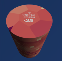
On the recent pics it’s .25
OP
OP
dylanthepiguy2
Two Pair
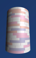
I decided to add a 43mm no mold white chip as a $500/nit button/whatever chip.
I came up with 2 designs.
Design 1:


Design 2:


I couldn't decide which one to go for, so I went with both!
Gonna get 50 of design 1 and 25 of design 2.
They actually look really cool mixed up in stacks with so much colour variety depending on the angle you look at, yet they are still clearly the white chip and not any other chip in the set. I'm super proud of this one (and I spent way too long on it lol)!


I came up with 2 designs.
Design 1:
Design 2:
I couldn't decide which one to go for, so I went with both!
Gonna get 50 of design 1 and 25 of design 2.
They actually look really cool mixed up in stacks with so much colour variety depending on the angle you look at, yet they are still clearly the white chip and not any other chip in the set. I'm super proud of this one (and I spent way too long on it lol)!
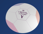
Why break away from the overall design? You can make white with shades of off whites for the crystal cuts. You can even add colors of the other chips to mimic the refraction on the edges. What's the 'Y' for ?
OP
OP
dylanthepiguy2
Two Pair
Because really light greys don’t print well, and I don’t like grey in general, so it was really hard to make the shades work effectively. Off whites though I haven’t played too much with, maybe I could try itWhy break away from the overall design? You can make white with shades of off whites for the crystal cuts. You can even add colors of the other chips to mimic the refraction on the edges. What's the 'Y' for ?
I think it’s also fine, cause this will be an extra big chip, and the only one, so it can break the pattern.
I have an X and a Y chip
maybe experiment with white as the main base, then adding off whites with a touch of the other colors. Kinda faking the reflection/ refraction of the other chips around it. You have a cool crystal design. These feel like another setBecause really light greys don’t print well, and I don’t like grey in general, so it was really hard to make the shades work effectively. Off whites though I haven’t played too much with, maybe I could try it
I have an X and a Y chip
OP
OP
dylanthepiguy2
Two Pair
i think you have a point about it feeling like another set. i was worried about this initially but kinda forgot about it. ill have a play around tonight with some offwhites or something. good thing i'm not in a rush!
OP
OP
dylanthepiguy2
Two Pair
ok i cant really find offwhite i like bearing in mind really light colours are hard to print. i also really want a white chip as it'll stand out from the others in the set. i think the compromise is something like this to create some segments (which i drew on with ms paint lol)
Attachments
ChipperAttitude
Pair
I’m open to ideas. It has been hard to make a name look great and sound great.
Thanks, I’ll try it around with number text and see what I get!
thanks! And nope
Gemstone / Crystal Inspired
- The Gilded Gem
- Emerald Mirage
- Obsidian Palace
- Topaz Tower
- The Diamond Hollow
- Ruby Royale
- Opal Spire
- Amethyst Isle
- The Sapphire Vault (variation on Sapphire Kingdom)
- Lapis Luxor
Fantasy Kingdom / Mythical
- The Crowned Jewel Casino
- Fortune’s Keep
- The Royal Facet
- House of Radiance
- Throne of Chance
- Mystic Denari
- Elysian Vault
- Palace of Luck & Lore
- The Velvet Chip
- Gem & Gamble
- High Stakes Hollow
- The Lucky Prism
- Crystal Bluff
- The Mirage Stack
- Shimmer House
- Hearts & Hematite
- Clubs & Crystals
- Diamonds & Dust
- Queens of Quartz
- The Royal Carat
I like your current line up and where the set is going!ok i cant really find offwhite i like bearing in mind really light colours are hard to print. i also really want a white chip as it'll stand out from the others in the set. i think the compromise is something like this to create some segments (which i drew on with ms paint lol)
IMO I wouldn't line out the segments (it reminds me more of a soccer ball than a diamond/gemstone)
Have you tried to incorporate a gradient for the segments in different directions to mimic the light refractions?
Here's a quick mockup i did with some iridiscient/holographic gradient for the facets.
Just my 2 cents to help you get more inspiration
P.S. sorry I butchered the logo, had to be quick & made it from scratch

OP
OP
dylanthepiguy2
Two Pair
Thanks, ChatGPT XD. I think I've seen all these ideas before, I've asked ChatGPT and other LLMs myself ha ha.Gemstone / Crystal Inspired
- The Gilded Gem
- Emerald Mirage
- Obsidian Palace
- Topaz Tower
- The Diamond Hollow
- Ruby Royale
- Opal Spire
- Amethyst Isle
- The Sapphire Vault (variation on Sapphire Kingdom)
- Lapis Luxor
Fantasy Kingdom / Mythical
Casino Flair with a Magical Twist
- The Crowned Jewel Casino
- Fortune’s Keep
- The Royal Facet
- House of Radiance
- Throne of Chance
- Mystic Denari
- Elysian Vault
- Palace of Luck & Lore
Casino Names Based on Suits + Jewels
- The Velvet Chip
- Gem & Gamble
- High Stakes Hollow
- The Lucky Prism
- Crystal Bluff
- The Mirage Stack
- Shimmer House
- Hearts & Hematite
- Clubs & Crystals
- Diamonds & Dust
- Queens of Quartz
- The Royal Carat
It looks really cool, thanks for mocking this up! I've been warned by one of Tina's associates that gradient often do not print well and since I've already paid for a sample for the main chips, I'd like to try avoid any risky things so I don't have to pay for another sample (unlessI am absolutely crazy in love with the design I guess). You might be able to do the holographic gradient design on a label (even then you'd be subject to colour accuracy issues), but I'm using no moulds.I like your current line up and where the set is going!
IMO I wouldn't line out the segments (it reminds me more of a soccer ball than a diamond/gemstone)
Have you tried to incorporate a gradient for the segments in different directions to mimic the light refractions?
Here's a quick mockup i did with some iridiscient/holographic gradient for the facets.
Just my 2 cents to help you get more inspiration
P.S. sorry I butchered the logo, had to be quick & made it from scratch
View attachment 1529177
Yeah, I'm not convinced by the lines as well, it seems to make the design a little unclean. Then again having no lines there makes it very plain on the face. I'll have to experiment a little more with this design, onto idea number 101 i guess haha (not kidding i do have 100+ image exports for this white chip lol)
I'd also thought about starting again from scratch for this chip and going for a similar design as the rest of chips, but the issue is it's quite hard to have a range of colours that:
* looks good
* visually stand out from the color other chips
* still has a recognisable colour even if 1/3 of the visible side is covered by a spot
* somehow can work with three contrasting colours in a delicate balance already
* can print well (so no gradient, or very light colour especially light grey and light yellow as Tina's associate tells me they can result in dots being printed instead of the desired colour)
All this leads to me back in a circle to my current design for the white chip without the extra lines on the face but somehow adding decoration, which is I guess what you're trying to do with the holographic gradient idea.
I'll try a few more ideas before I give up interest to keep what I've currently got. Maybe I can substitute a gradient for a dotted pattern myself to simulate the gradient (e.g. smatterings of micro diamond shapes or something.)
Similar threads
- Replies
- 30
- Views
- 2K
- Replies
- 57
- Views
- 4K
- Replies
- 7
- Views
- 838
- Replies
- 47
- Views
- 4K
- Replies
- 0
- Views
- 566