dylanthepiguy2
Two Pair
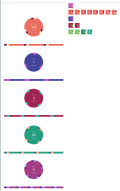
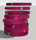
Started drafting up some gemstone and some plain chip ideas I had
I think I'll end up tweaking the gemstone colours, but what I'm stumped with what to do with the edge spots? Currently, there basically solid and I'm out of ideas. White sparkle marks or something?

What do people think of these plain ones? Too boring? Edge spots too pink?

I think I'll end up tweaking the gemstone colours, but what I'm stumped with what to do with the edge spots? Currently, there basically solid and I'm out of ideas. White sparkle marks or something?
What do people think of these plain ones? Too boring? Edge spots too pink?
Last edited: