Le Noir Frac design (8 Viewers)

Which is the better border?


  • Total voters
    3

ninjajim4

High Hand
Joined
Jan 14, 2024
Messages
89
Reaction score
159
Rewards
266
Location
Chicago
Bringing my insane OCD obsession over the minutia out into the open. If you've seen my other threads then you know I have recently gotten some Gear labels to overlabel my 10s. They look great, except I've belatedly realized that the font text is more of an ivory/cream than pure white as my labels are. For the minimal expense, I figure I'll just order new ones before I go about the onerous task of overlabeling everything.

But, since I now have the opportunity to mulligan this, I'm revisiting my original design decision.

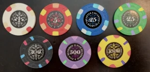
The word QUARTER is a weird outlier in terms of length/char count. As a result, it doesn't really fit cleanly into the existing border design convention of either repeating 2x or 4x. 4x is out of consideration altogether -- just way too cluttered. But @TheOffalo was amazing at both creatively thinking of solutions as well mocking up different versions to evaluate. He provided me artwork for a version where QUARTER repeats 3x as well as 2x.

Each of these versions breaks existing convention in some way. The 2x version matches font size of the largest font size of the originals (they're not all uniform, dependent on char count), but there's some decent amount of dead space between the text and the $ sign.

The 3x version look more inline with the set to my eye, but it's a structural anomaly/outlier in that the set strictly has 2x or 4x repeating borders. TheOffalo wisely pointed out however that the text length dictates the number of repetitions, so in some sense it's still in line with the spirit of the design.

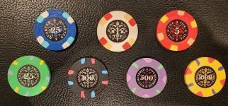
I'd opted initially to work within "the rules" and gone with 2x, as shown in the first pic. But feel like I could go either way with it.

Thoughts and opinions? Judgy comments about my excessive overly-analytical nittness will also be accepted as well :D
 

Attachments

  • 20260703_131849.webp
    20260703_131849.webp
    330.1 KB · Views: 46
  • 1750107984338.webp
    1750107984338.webp
    55.7 KB · Views: 46
Last edited:
I don't believe i've ever seen that before. It feels like it also violates the grammatical rules of the set
You could be the first 😉

And I think it still fits, both visually and verbally: twenty-five, five hundred, one thousand, one quarter 🤷🏻‍♂️

And like you said, you’ll have to break a rule some way somehow, so I think it would work well and look the most canon as well.

If Offalo would indulge, I’d at least have it created as a third option to view and consider

Hmmmm you are making me think a lot about it. You are right to point out that there is no perfect fit and some rule is going to have to get broken somewhere.

I like your idea but I ran this by AI to get a sense of why it felt a little off. Sharing here in the spirit of fun and friendly analysis, not to shoot the idea down.

From a strict rules-based perspective:

There is a semantic distinction that makes "ONE QUARTER" feel subtly wrong when you actually look at the values.

"HUNDRED" and "THOUSAND" are units of scale—they require a preceding number to tell you how many of that unit you have (One Hundred, Five Hundred).

But "QUARTER," "ONE," "FIVE," and "TEN" are all absolute, singular values on their own. Adding "ONE" to "QUARTER" is redundant in a way that doesn't apply to any other low denomination in your set. We don't say "ONE ONE," "ONE FIVE," or "ONE TEN."

If we look at your set's exact linguistic structure, the absolute values stand completely alone:

  • QUARTER (Value)
  • ONE (Value)
  • FIVE (Value)
  • TEN (Value)
  • TWENTY-FIVE (Value)
  • ONE HUNDRED (Multiplier + Unit)
  • FIVE HUNDRED (Multiplier + Unit)
  • ONE THOUSAND (Multiplier + Unit)
So "ONE QUARTER" absolutely breaks the naming convention for the absolute values. It treats a low-denom base value like a high-denom unit of scale, which introduces an inconsistency right at the bottom of the set.
EDIT:

Now that I think about it, each chip is referring to a unit, in this case "one". It starts with one, then five ones, 25 ones, 500 hundred ones etc. It's like a tourney value unit versus cash value which would denominate each as dollars, ie one-dollar, 500-dollars. So in this case, since 1 is the base unit being described, using "one quarter" would make sense for the .25 chip because it's describing a quarter of one.


The adding of the “one” is a way to make it match the set visually. It also kind of rolls off the tongue verbally and it isn’t wrong to describe it as “one quarter”.

Unless another option pops up, now you just have to decide what bothers you less, visuals or semantics. If you are choosing between these 3 options I would say the 3x quarter would rank the lowest for me, breaks the pattern visually and also a quarter is base 4, not 3, that disconnect would personally irk me a little too much 😅
 
Last edited:
If you look at the original lower denoms 1, 5, 10, they all have 4 repeating words for the denom. The upper denoms 25, 100, 500, 1000, 5000 all have 2 repeating words/phrases.

Personally, I would keep that convention for the lower denoms, including the QUARTER.

I mean, isn't it perfect to section a .25 quarter with fourths? And... doesn't it feel wrong to section a .25 quarter with 2 (halves) or 3 (thirds)? :unsure:

Lenoir_.25denom.webp
 
Last edited:
If you look at the original lower denoms 1, 5, 10, they all have 4 repeating words for the denom. The upper denoms 25, 100, 500, 1000, 5000 all have 2 repeating words/phrases.

Personally, I would keep that convention for the lower denoms, including the QUARTER.

I mean, isn't it perfect to section a .25 quarter with fourths? And... doesn't it feel wrong to section a .25 quarter with 2 (halves) or 3 (thirds)? :unsure:

View attachment 1698771
Wow this does look great. My question is how much smaller is this compared to the font size of the other denoms? When TheOffalo and I were looking at this we'd felt that it'd be noticeably smaller/too small?
 
Wow this does look great. My question is how much smaller is this compared to the font size of the other denoms? When TheOffalo and I were looking at this we'd felt that it'd be noticeably smaller/too small?
Print it out 39mm chip size and see.

1) I don't think it breaks convention, since other denom fonts are sized to fit.

2) Does it really matter that the font is too small? Do people really need to read every letter? :unsure:
 
I did a mock of the 4X originally. Here it is again, though I did enlarge the "QUARTER" text slightly more, reducing the space between the words and the "$".

1783205874956.webp


It is quite a bit smaller than all the other denom texts.
 
I did a mock of the 4X originally. Here it is again, though I did enlarge the "QUARTER" text slightly more, reducing the space between the words and the "$".

View attachment 1698814

It is quite a bit smaller than all the other denom texts.
Yes this is what I recall which is a shame. Even here it's noticabley smaller than the other fonts by a pretty large margin and then it's still pretty crowded, meaning it really ought to be smaller still.

Tbc, I don't think legibility is the concern as much as uniformity with the set as a whole
 
Yes this is what I recall which is a shame. Even here it's noticabley smaller than the other fonts by a pretty large margin and then it's still pretty crowded, meaning it really ought to be smaller still
1783206782034.webp


If you reduce the space in between each letter and increase spacing to the $ sign, there's less of a "crowded" feeling.

But yea, the small font is a tradeoff.

(I don't have the right fonts, it's just a quick AI thing for visualization.)
 
Last edited:

Create an account or login to comment

You must be a member in order to leave a comment

Create account

Create an account and join our community. It's easy!

Log in

Already have an account? Log in here.

Back
Top Bottom