
Group Buy: Point Defiance Dealer Buttons (1 Viewer)

Status
Not open for further replies.

12thMan

Full House
Joined
Nov 13, 2014
Messages
4,020
Reaction score
4,379
Rewards
0
Location
Westside is the Bestside
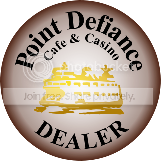
Thanks to @atomiktoaster , and some good input from board members, the art work below will be turned into a bevy of bad ass dealer buttons by @OldWestPokerSupplies on their 60mm buttons. If you are reading this post then you are probably already familiar with the high quality product OWPS puts out and this project should be no exception. The colors are striking, the quality will be top notch, oh, and what about that fauxy faux hot stamp in the middle?!?!? You know you need to get in on this!!!

PD%20button%2019_zpsvtkg3gut.png

PD%20edge%209_zpsm3lq8cnk.png


Cost per button is going to be $4 + shipping.

Shipping--up to two shipping in a bubble mailer in the US for $5. Three or more should go in a SFRB and will be $6.50 (International I have no idea, I will cross that bridge and check into it if it is necessary. sorry, I'm a newb.)(also, because I am a newb, any better ideas on shipping please let me know, I am doing my best estimation here with the help of other members)

After we see how many people are going to order and if any other text/color changes are agreed upon I will put an end date to orders and pm paypal information with a total at that time. Once money is collected it will go straight to OWPS to get these in production.

Reply in the thread with how many you want and we'll get this rolling.


(see bottom of post for more info on other designs)


Name/Amount:


12thMan--3 (at least)
David O--2 (at least)
catalyzeme--2
ovo--1


The design for this was made by atomiktoaster in this thread ------->>> http://www.pokerchipforum.com/threads/point-defiance-dealer-buttons.7030/

The minimum to be printed is only 5, so if you don't like the button above, or would prefer a different color, please post about it in the design thread and if a few other people like the idea it can be printed as well. Any subsequent design that creates enough interest to be ordered will be posted and kept track of in this thread as well.
 
Last edited:
I'm in for one, just help me out on the cost, is it 5 or 9 to 95065
 
Bubble mailers are about a $1 each, and need to be factored. SFRB provide the containers, thus are a decent value.

Should be noted that SFRB costs are $5.25 when you pay online, which is super easy (use PayPal). For a few $4 buttons, I personally don't need signature confirmation or extra insurance. I would advise you add a little to cover the costs of your printing the labels, and any other supplies. etc... Buttons ship nicely taped between two pieces of cardboard (spare FRBs work well, and are free).
 
Last edited:
Bubble mailers are about a $1 each, and need to be factored. SFRB provide the containers, thus are a decent value.

You can get 50 for $6 on Amazon. Much better deal than buying them individually. @12thMan has a link already.
 
Here's the digital proof from Sal for the first design:

100B382_PROOF.jpg
 
Put Jason and I down for 6 total buttons, 3 of each. Assuming that we'll have the yellow version done as well.

Also, this is the first design? It's supposed to be more brown, correct? It looks like a hybrid the orig design and the newer yellow one discussed. Not as much a fan of this, as it's not really brown, and it's not really yellow... And an orange button would have appeal, but this isn't quite orange either... However, it wouldn't stop me from ordering it...


Hmm...
 
This is supposed to be the chocolate brown, as I described it to Sal. The actual print is generally darker than the proof looks. Sal can do a free prototype to confirm that the color is right, if you want to take the time to do that.
 
Hate the proof. Hate it. Colors are wrong, gradient is wrong, it's just wrong. Did I mention that I hate it? Not interested in owning anything that even remotely looks like that. I hate it.

However, I'm in for two buttons (one brown, one yellow) -- provided they match the artwork provided by atomiktoaster. AT, do we need to get your files converted to .ai format to get the artwork correct? Or do we need to switch vendors?

In related news, I just received the 63mm 20th Century buttons from GOCC (paid on Wed 8-26, received on Wed 9-2). They are perfect, they are beautiful, and they match the submitted .ai files exactly. Highly recommended. No proofs, either (ugly or otherwise), or waiting on prototypes. They just printed and shipped, and fast. Did I mention perfect?

Btw, I hate that proof in post #9.
 
So yeah, I saw this post a little earlier and had some of the same questions myself. I was on my phone so I wanted to wait until I got home and looked at it on a bigger screen, and now that I see it again I have to say it is completely different than the original. What do you think atomik, it's a different final result than we were thinking, right? What's everybody's thoughts on what the next step is?

And if some one could please help me figure out if BG like this proof or not I would appreciate it, the guy sure beats around the bush. ;)
 
Hate the proof. Hate it. Colors are wrong, gradient is wrong, it's just wrong. Did I mention that I hate it? Not interested in owning anything that even remotely looks like that. I hate it.

However, I'm in for two buttons (one brown, one yellow) -- provided they match the artwork provided by atomiktoaster. AT, do we need to get your files converted to .ai format to get the artwork correct? Or do we need to switch vendors?

In related news, I just received the 63mm 20th Century buttons from GOCC (paid on Wed 8-26, received on Wed 9-2). They are perfect, they are beautiful, and they match the submitted .ai files exactly. Highly recommended. No proofs, either (ugly or otherwise), or waiting on prototypes. They just printed and shipped, and fast. Did I mention perfect?

Btw, I hate that proof in post #9.

If you want me to send the original artwork that was submitted to print without regard for what will happen I will do that. The only thing I can guarantee is that the color will not look like what you see on the screen.

I try and help my customers with their choices of artwork and color. If you don't want assistance or advice then I would recommend using another vendor.
 
As I've explained to Dan you can't trust the color on your computer screen to print how it will look on the screen.

"The problem is that you're thinking in terms of on-screen color. You can't trust on-screen color. You have to look at printed color and then use the codes given. The color will not look right on screen in fact it may look completely off. You have to trust the printed colors and the codes given. It's kind of like trying to choose a paint for your room based on a web page. You can't do it. You have to look at paint swatches and even after they have mixed your paint they have to wait for a sample of it to dry in order for you to be sure it's exactly what you want. It's almost the same process for print color.
It's really simple:
You should never choose a print color based on the what you see on the computer screen."​

There is a vast difference between color on a computer screen and print color.

I have explained this many times before and I try to explain it to each customer that I work with. Here's a link to the blog entry on our site regarding color choices.
http://www.oldwestpokersupplies.com/blog/cmyk-color-wheels-for-poker-chip-design


"Whenever we design or create anything on a computer screen we are are seeing colors generated by lights that are red green and blue on a black field. That is your monitor. A black field with lights. If you see white it's all three colors added together. This color mode is called RGB and it's used for monitors and televisions screens and all of our smartphones and tablets, etc.

rgb-additive-wiki.png


Now when we print something it is quite different. Have you ever printed something and said, "Well, that doesn't look right. That's not red. That's magenta." Maybe not in those words but you know what I mean. Well that's because your printers at home and especially most commercial printers use a CMYK color mode or palette for their printers. CMYK stands for Cyan (blues), Magenta (reds), Yellow(yellows) and blacK(blacks). If you view anything on paper you'll see a field of white with the inks printed for colors and then if you need white you leave it blank. And the brightness of that white paper or poker chip material is going dictate the brightness of your print job as well So you've got two really different ways that your eyes are going to view your design. On the computer it might look bright and vivid but when it goes to print it looks duller and it just doesn't pop like on your computer. With the use of light RGB has a very wide range of color possibilities whereas CMYK is limited to much fewer."

CMYK_color_wiki (1).png
SubtractiveColor_cmyk_wiki.png

Basically what you're seeing on you computer screen is not what you're going to get in print.

We offer free artwork assistance and free (unlimited) prototyping. I'm sorry that there is a wait. There is not a lot I can do about that. And if you don't want to wait for prototyping I always suggest purchasing our CMYK Color Wheels so that you can pick colors yourself. Follow the link for the blog entry above.

I will always attempt to assist you with your artwork and your color choices. If you don't want my assistance then like I said I would just use another vendor. I'm doing my best.
 
Now regarding this specific artwork. I used our color wheel to find a brown that I thought you guys were looking for. Unfortunately it doesn't look on the screen like how it will actually print. But the bigger issue is the gradient.

as I told Dan...

"The problem with dragging the brown (or as it ends up being beige) to the center is that browns are yellow and red based which is the same as the faux hot stamp color. So there will be much less contrast if you do that. It's hard to say how it will turn out. If you're doing a prototype I would suggest trying it but if you're not I would stay away from it."
Sometimes when you place two colors next to each other you don't get a good result. I'm afraid this might happen here. Putting the yellow faux hot stamp over the beige might cause the boat details to blend with the background. It's kind of like someone choosing to put a purple symbol on a royal blue background.

Like I said it might work or it might fall flat. Prototyping would answer the question.
 
Thanks for the input Sal. I don't know another vendor that gives as much effort towards art assistance as OWPS, which I always appreciate. If I was running the group buy here, I would go through the prototyping process (which I've done before with the Par-A-Dice buttons). The extra time is a small price to pay for me, but I'm not speaking for the GB members on this one.
 
So saw this earlier and wanted to see if anybody else jumped in and said anything but other than AT I'm hearing crickets.

My thoughts are this: I have always heard and am well aware that colors in "real life" are always going to be different than what you see on the screen, but I never realized that the color would differ from the original art work when being turned into a proof as well. That's just my ignorance, I thought OWPS would "input" the color AT used somehow into the printer, formatted in what ever code is needed, and then the final product might differ from that. If this is the way it needs to look on the screen to match the mock up when printed that's awesome, but my "what now?" question was asked in a "what do we need to change to get what we want?" type of way if the proof submitted was going to be close to the actual printed color. If the final product is a shade or two around the area of AT's design I am all for it (not speaking to the gradient issue), but if the actual printed color is a shade or two in the area of the proofs color then I am not a fan.

Also, to me, the gradient is different, and that might just be the way it appears on the screen or a result of printing limitations but it seems like it's a thicker gradient as opposed to AT's art that lightens up quicker. The "bubbles" of the P and D are darker in relation to what they would be on AT art is where it stands out the most to me.

Thanks for the input about the color choice with the gold hot stamp, that might be something to consider if you think it might not be the best choice of colors to go together. I guess that's where other peoples opinions and maybe prototypes, with AT help along the way, come in.

Speaking of prototypes, I for one would be fine waiting for a prototype if needed. Obviously the quicker the better because we all are greedy little chip whores and like shiny new things, but if people find it necessary to order prototypes my vote would be I'm fine with that. One of the things I've always heard from the beginning of getting into chips is "be patient', it's one of the golden rules of chips for everything from custom work to chip room sales to response/production times from vendors that we order from and contract with, I can't see why it should be any different for this project. I took BG's post as kind of tongue in cheek so I think he was just throwing in the line about it only taking 7 days (or whatever) and no prototypes as another "so there" type of thing, but if he was serious it would surprise me because he is one of the biggest proponents of "be patient" on the boards. For me personally, if over all speed from "idea" to "final product" were a line item on my list of wants for these buttons it would be near the bottom.
 
Last edited:
As previously stated, still in for one of each color if they look like the original artwork (and whatever it takes to get there). Zero, if they look like the proof.
 
I think the file type submitted has a huge impact. Not sure if this was discussed, but are we submitting the best file types?

Also not a fan of the abrupt gradient.
 
Sorry but I don't know how to explain it any more than I have. I'll try one more time.

!) The colors I chose are CMYK codes from swatches that match the original draft color. I held a colored chip up to the AT's draft from the original post on my computer monitor and matched those colors as best I could. When I found the right color I looked at the codes printed on that swatch and input the codes so that it would print as close as possible to AT's original draft. AT THAT POINT THE COLOR MAY NOT LOOK LIKE THE ORIGINAL DRAFT BUT IT WILL PRINT LIKE IT.

2) The Gradient colors that you guys want to combine with the yellow stamp are going to conflict. When I say conflict I mean that when you take a dark brown and you taper it as a gradient down it ends up being much more yellow than red. So the stamp will likely disappear and not show up well at all because it will basically be yellow on a field of yellowish brown. And this same problem is even more obvious if you use a yellow gradient with a yellow stamp. THE STAMP WILL NOT SHOW UP WELL.
Solution: a. Use colors that are not yellow based like blue, white, black, red and purple.
Solution: b. Avoid using the gradient - use a solid color or add a white label-like center around the stamp.
Solution: c. Change the color of the stamp.
Solution: d. Keep the colors the way they are but keep the gradient and the stamp from affecting each other.

I don't care what you guys end up doing. I am only doing what I am instructed to do after giving my advice on print color which I've learned from 15 years of designing and working with printers. If you want me to keep my nose out of it and just print the original draft as it is I'll do it. I'll be glad to.
 
  • Like
Reactions: ovo
Status
Not open for further replies.
Back
Top Bottom