"For The Biscuit" Custom Poker Chip Design (1 Viewer)

VoicelessMango

Sitting Out
Joined
Mar 27, 2023
Messages
26
Reaction score
77
Location
Charlottesville, VA, USA
Hey everyone, I've been having a lot of fun creating designs and getting samples printed as I think about what I want to do for a custom poker chip set. Here is a design I don't believe I have shared yet. These are "for the biscuit" ceramic poker chips. While Risk it for the Biscuit is a common enough phrase, Biscuit is also the name of my dog. In that way, the Biscuit Logo felt like a fun way to keep these personal. I'm considering a Bud Jones style edge spot system and making some light improvements to the biscuit vector drawing but pretty happy about where these are right now. I know that green 20's can be a little contentious around here but how do people feel about cash sets that don't have denominations?
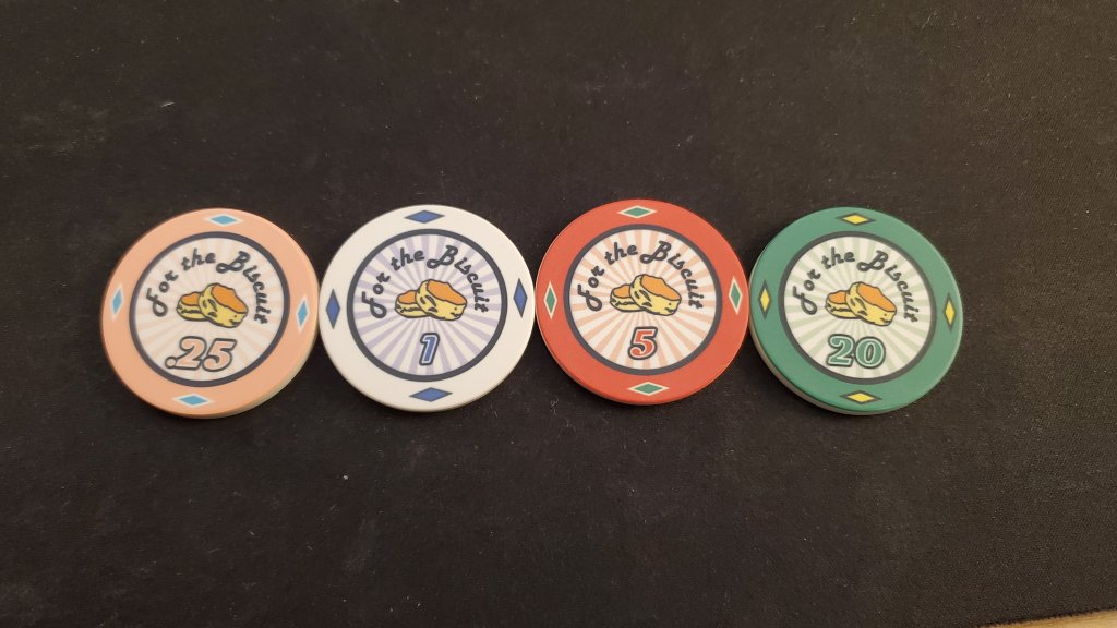
20231005_163302.jpg
 
Cool! I personally don't like the outlines or font of the denoms and the F is kind of spaced weird and the curly bottom throws me off. But color wise they're fun, glad they make you happy. Make sure the quarters and 5s are easy to discern in crappy lighting, some people play in places where they would be too similar.
 
I like the idea! The colored burst in the background is great too.
I was just about to comment on the kerning of the F and @NotRealNameNoSir beat me to it. I would tighten that up so it doesn’t read as “F or”. Maybe the B in Biscuit tighter a bit too.
Have you thought about dollar and cent signs? I’m never a fan of a decimal, but maybe that’s just me.
 
Cool! I personally don't like the outlines or font of the denoms and the F is kind of spaced weird and the curly bottom throws me off. But color wise they're fun, glad they make you happy. Make sure the quarters and 5s are easy to discern in crappy lighting, some people play in places where they would be too similar.
I like the idea! The colored burst in the background is great too.
I was just about to comment on the kerning of the F and @NotRealNameNoSir beat me to it. I would tighten that up so it doesn’t read as “F or”. Maybe the B in Biscuit tighter a bit too.
Have you thought about dollar and cent signs? I’m never a fan of a decimal, but maybe that’s just me.
Here is a mockup of the design changes you mentioned. I actually don't mind the swirly capital letters on the Harlow Solid Italic font, but I can see where you are coming from. I tend to lean on a few key fonts and was using Magneto and Harlow Solid Italic to try something different. Below are the Number with dollar and cent signs as well as adjusting the spacing of the F and the B. The Peach and red are quite different colors in different lighting and I plan to further differentiate them with distinct edge spots when I get to that point. Thank you both for the feedback though.
For the Biscuit Pokerpic1.jpg
 
I think it all looks much better.
The only thing I might change is making the dollar and cent signs not be any higher than the denomination itself.
Also the stroke around the denom should be on the outside of the letterform, not the inside. Most software has a tendency to do outlines on the inside, and it can ruin the type (you can see it in the "$")
Here's what I mean:
outline_stroke.jpeg


If you can set it to do the outline on the outside of the line, it looks better.

It's a nice set, you did a great job.
 
I think it all looks much better.
The only thing I might change is making the dollar and cent signs not be any higher than the denomination itself.
Also the stroke around the denom should be on the outside of the letterform, not the inside. Most software has a tendency to do outlines on the inside, and it can ruin the type (you can see it in the "$")
Here's what I mean:
View attachment 1205883

If you can set it to do the outline on the outside of the line, it looks better.

It's a nice set, you did a great job.
Amazing tip! thank you!
 
I think it all looks much better.
The only thing I might change is making the dollar and cent signs not be any higher than the denomination itself.
Also the stroke around the denom should be on the outside of the letterform, not the inside. Most software has a tendency to do outlines on the inside, and it can ruin the type (you can see it in the "$")
Here's what I mean:
View attachment 1205883

If you can set it to do the outline on the outside of the line, it looks better.

It's a nice set, you did a great job.
Definitely am saving this for future reference !
 
Nice edge dots and sunburst background!

For me, the black inlay ring is a bit bold compared to the other design elements. Have you tried a brown?

I would also consider capitalizing the T in "the".
 
Thought about the brown a little and liked the brown really only on the peach frac. Thought I'd take that feeling and try it out by making the border a darker version of the main color. Also played around a bit with the "For The Biscuit".
1696874335455.png

The capital "T" for Harlow Solid looks a lot like "J" so i might either go back to lower case or try out some different fonts.
 
Last edited:
Took some of the suggestions from above and made two more test sets through BrPro Poker (the two top sets). While the color matched inlay rings look good on a screen, I am not as sure they come across as well in real life, and everything just feels more muted. I also tried out a different font as well as no borders on the edge spots. What are people's thoughts?
1701446062562.png
 
I've been grinding away on something similar. I don't want to give it away but it rhymes with "suttered bausage" All kidding aside i thought this was a joke at first. Nope! Good luck with your biscuit chips!!
 

Attachments

  • 130BrngB8dgvks.gif
    130BrngB8dgvks.gif
    353.5 KB · Views: 26
Last edited:
“Let’s have a ball and a biscuit, sugar and take our sweet little time about it”- Jack white
 
Took some of the suggestions from above and made two more test sets through BrPro Poker (the two top sets). While the color matched inlay rings look good on a screen, I am not as sure they come across as well in real life, and everything just feels more muted. I also tried out a different font as well as no borders on the edge spots. What are people's thoughts?
View attachment 1233039
They're called scones! (rhymes with stones). Fun theme, leave it as biscuit for the lols.
Top row is right, though I like the bolder boundary of the bottom row.
 
They're called scones! (rhymes with stones). Fun theme, leave it as biscuit for the lols.
Top row is right, though I like the bolder boundary of the bottom row.
I realize getting into a conversation about differences in American vs British/Australian/Kiwi culture is about has fun as sticking your hand in a blender, but In America they are called biscuits. They originate from the American South as opposed to Scottish origin of the scone. American Biscuits are light, flaky, and often made with buttermilk to activate the leavening agent. Though I appreciate the similarity to the British empire's scone, they are different.
 
I realize getting into a conversation about differences in American vs British/Australian/Kiwi culture is about has fun as sticking your hand in a blender, but In America they are called biscuits. They originate from the American South as opposed to Scottish origin of the scone. American Biscuits are light, flaky, and often made with buttermilk to activate the leavening agent. Though I appreciate the similarity to the British empire's scone, they are different.
I'd eat them. The biscuits not the chips.
Just noticed the biscuits image may be slightly right of center, as if right side is closer to the font. Not sure though may be optical illusion. Or is bit of variance due to making a life-like mock. Thought I'd say, just in case.
Which of the three you preferring?
I think I am going to go back to the black border but haven't settled on anything else yet
1701618623678.png
 

Create an account or login to comment

You must be a member in order to leave a comment

Create account

Create an account and join our community. It's easy!

Log in

Already have an account? Log in here.

Back
Top Bottom