In the words of Team America 'FUCK YEAH!'Slept on it and considered a lot of the things that have been suggested and the ideas that I had that have been rattling around and I'm kind of liking where I have ended up....
View attachment 1169211
-
PCF is an Amazon Associate and an eBay Partner. If you make a purchase through one of our links, we may earn a commission at no extra cost to you. Thank you for your support!
You are using an out of date browser. It may not display this or other websites correctly.
You should upgrade or use an alternative browser.
You should upgrade or use an alternative browser.
Flamingo Lounge Cash Set Design (2 Viewers)
- Thread starter Salmonblaster
- Start date
Salmonblaster
Two Pair
Looking at it now, I think I need to make the 100 on the classy Flamingo side a little smaller....always tweaking...hahaIn the words of Team America 'FUCK YEAH!'
To give a little more room for the denom on the flamingo side, you can move the bird just a little bit to the right so that the top hat sits centered right under the 12 o'clock position.
mattross1313
Full House
mll_maid
Sitting Out
the pink 25 is fantastic with the big dots on the edges, like painted 
It looks like you’re making tons of great progress on this! If I may, I think you need to take a step back again look at the colors across the set at large. I think you have a similar blue problem to your initial white problem. They’re different variants but you have blue on the $1, $5 and $100 and the $1 and $25 base colors are variants on blue.
i think it’s important to try and find a similar theme and style to the colors selected and they should all feel like they could reasonably appear in the same set but that doesn’t mean leaning into a very narrow color pallet
Salmonblaster
Two Pair
Yeah, as I was fiddling with the 100 I noticed that the bird still had room to move to the right and not look totally off-center. Appreciate the feedback!To give a little more room for the denom on the flamingo side, you can move the bird just a little bit to the right so that the top hat sits centered right under the 12 o'clock position.
Salmonblaster
Two Pair
Thank you for the input! Going to see if I can take the 1 and the 5 in a different direction for the spots and see how I like it compared to the original and if it helps solve that problem a bit.It looks like you’re making tons of great progress on this! If I may, I think you need to take a step back again look at the colors across the set at large. I think you have a similar blue problem to your initial white problem. They’re different variants but you have blue on the $1, $5 and $100 and the $1 and $25 base colors are variants on blue.
BPTDirector
Full House
If I were doing ceramics at this time I think I’d wait for Justin’s new Greek Hybrid mold for these.
Salmonblaster
Two Pair
That idea felt like a game changer and I don't know why I had never considered it before it was suggested. It feels like an entirely different project but in the best way possible.For your inlay design, I really like the 2-sided version. That design evolved nicely and it makes the text and image bigger and better.
Agreed, I am chomping at the bit for those...hahaIf I were doing ceramics at this time I think I’d wait for Justin’s new Greek Hybrid mold for these.
Salmonblaster
Two Pair
Updated the 1 and the 5 to take away some of the blue from the set...
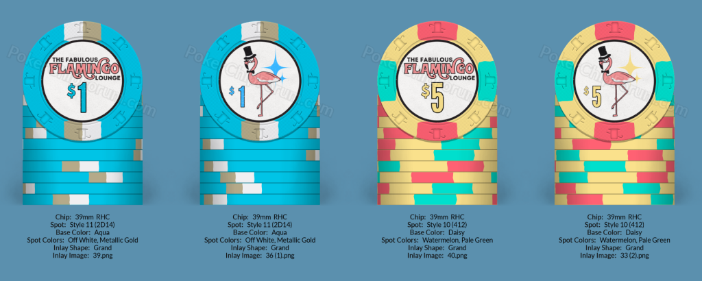
I think it looks better as a whole with the changes to the 1 and 5 as well, great insight on changing some things up a bit that you can't see until you take the wide view of it all.
I think it looks better as a whole with the changes to the 1 and 5 as well, great insight on changing some things up a bit that you can't see until you take the wide view of it all.
improviseallday
Flush
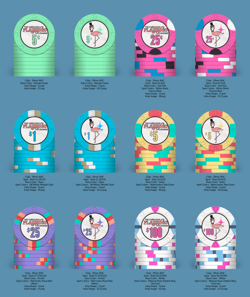
I like these! The color scheme feels very natural together.Updated the 1 and the 5 to take away some of the blue from the set...View attachment 1169550
I think it looks better as a whole with the changes to the 1 and 5 as well, great insight on changing some things up a bit that you can't see until you take the wide view of it all.
View attachment 1169551
The ring is very dark and draws attention. How about color matching the rings to your edge spots?
Salmonblaster
Two Pair
I like that idea quite a bit, going to mess around with it this weekend and see what happens. The question would be do I leave the nickel with the black ring or a lighter black color? Use the chip color and go with a green ring even though it might get lost? Add a spot to the chip?I like these! The color scheme feels very natural together.
The ring is very dark and draws attention. How about color matching the rings to your edge spots?
improviseallday
Flush
I like that idea quite a bit, going to mess around with it this weekend and see what happens. The question would be do I leave the nickel with the black ring or a lighter black color? Use the chip color and go with a green ring even though it might get lost? Add a spot to the chip?
If no spot, I'd go with dark green, similar to the 25 chip in the Matsui Horseshoe 43mm set.
But I like spots on every chip. Helps with counting stacks.
Salmonblaster
Two Pair
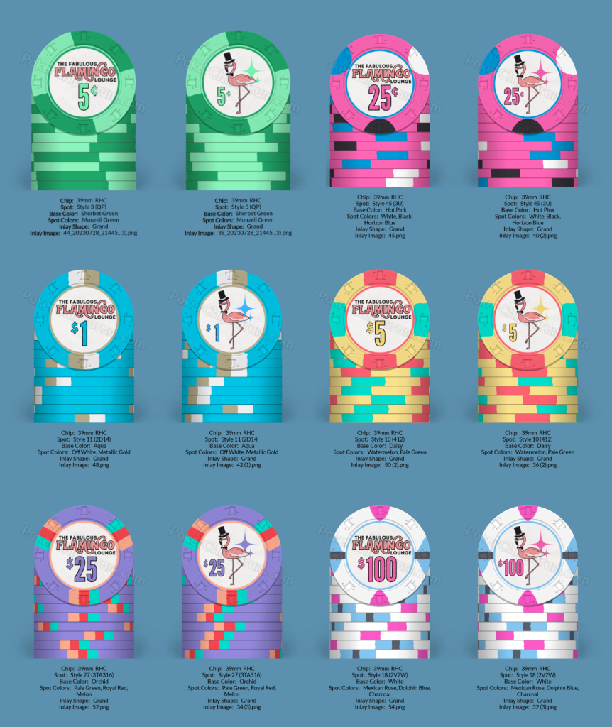
@improviseallday the idea of the spot color ring has set this off and I am loving it a LOT! I feel like I'm getting really close to my final design on these and it is super exciting. Darkened the font and starburst colors by one shade on the 5c and the $5 so that they are still matching but also pop a little more since they are both paler pastel colors than the rest of the set.
improviseallday
Flush
Love your quarter pie!
These look good to me, would love a sample set if you're ordering extras
These look good to me, would love a sample set if you're ordering extras
Salmonblaster
Two Pair
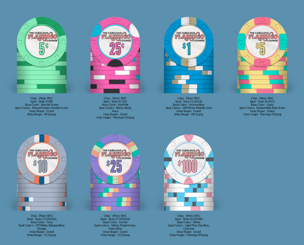
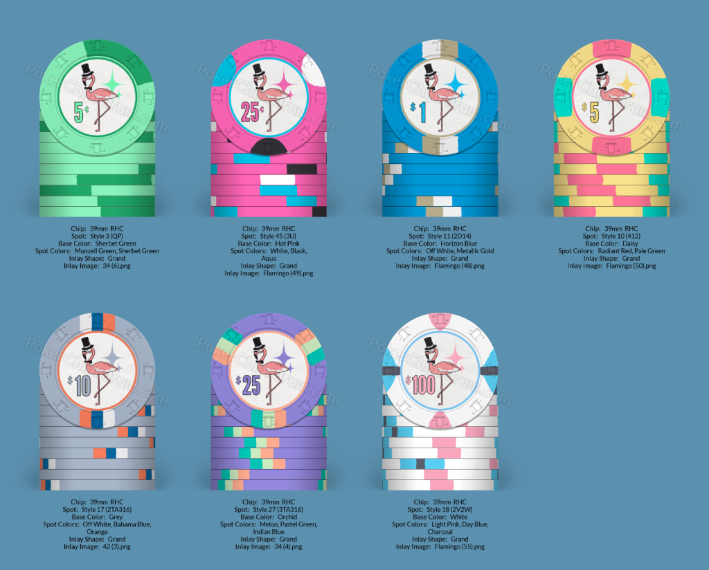
Made some minor tweaks over the holidays for a handful of reasons. Lightened the red spots on the 5 and the pink spots on the 100 and like how they fit the set a bit better now. Messed with the spots on the 25 because that one still doesn't feel like it has hit its final form yet. Darkened the chip color on the 1 to a Golden Nugget-ish blue that I am loving with the spot colors.
And now to the biggest change of all, adding a $10 chip to the set. Multiple players I spoke with about the set in and out of the family during the many holiday gatherings all wanted to have a $10 chip, but I was still hesitant about it. Over the holidays I got my immediate family hooked on the horse race game and they loved playing a dime a scratch (game went almost four hours on Christmas night and all seven of us had a blast). I figure the $10 can be my pseudo hundo for low stakes games and the dime for my horse race games. I may make it an NCV chip but we'll see how that goes.
As for the design, it's based on the '86 Mets road uniforms which I love (LFGM, although this year is looking pretty rough) and the color combo fits nicely with everything else to my eye.
Feeling like I am getting pretty darn close to the production phase of all of this and I'm excited!
As always, thoughts feedback etc. appreciated, thank you!
chipinla
Straight Flush
- Joined
- Apr 12, 2018
- Messages
- 8,799
- Reaction score
- 24,439
Take this for its worth but IMO you have way too much going on here. I think you need to consider how the chips look as a whole more rather than individually. Dirty stacks for days. Again, just my opinion but I would take a hard look at it.Made some minor tweaks over the holidays for a handful of reasons. Lightened the red spots on the 5 and the pink spots on the 100 and like how they fit the set a bit better now. Messed with the spots on the 25 because that one still doesn't feel like it has hit its final form yet. Darkened the chip color on the 1 to a Golden Nugget-ish blue that I am loving with the spot colors.
And now to the biggest change of all, adding a $10 chip to the set. Multiple players I spoke with about the set in and out of the family during the many holiday gatherings all wanted to have a $10 chip, but I was still hesitant about it. Over the holidays I got my immediate family hooked on the horse race game and they loved playing a dime a scratch (game went almost four hours on Christmas night and all seven of us had a blast). I figure the $10 can be my pseudo hundo for low stakes games and the dime for my horse race games. I may make it an NCV chip but we'll see how that goes.
As for the design, it's based on the '86 Mets road uniforms which I love (LFGM, although this year is looking pretty rough) and the color combo fits nicely with everything else to my eye.
Feeling like I am getting pretty darn close to the production phase of all of this and I'm excited!
As always, thoughts feedback etc. appreciated, thank you!
View attachment 1252447View attachment 1252446
Salmonblaster
Two Pair
chipinla
Straight Flush
- Joined
- Apr 12, 2018
- Messages
- 8,799
- Reaction score
- 24,439
I just take a screenshot of 5 chips then put them together in an app called Phonto. It’s a very basic photo app. I do that with every set I design to see how they look together.@chipinla What tool did you use to make the stack like that? Thank you for the thoughts on that as well.
Salmonblaster
Two Pair
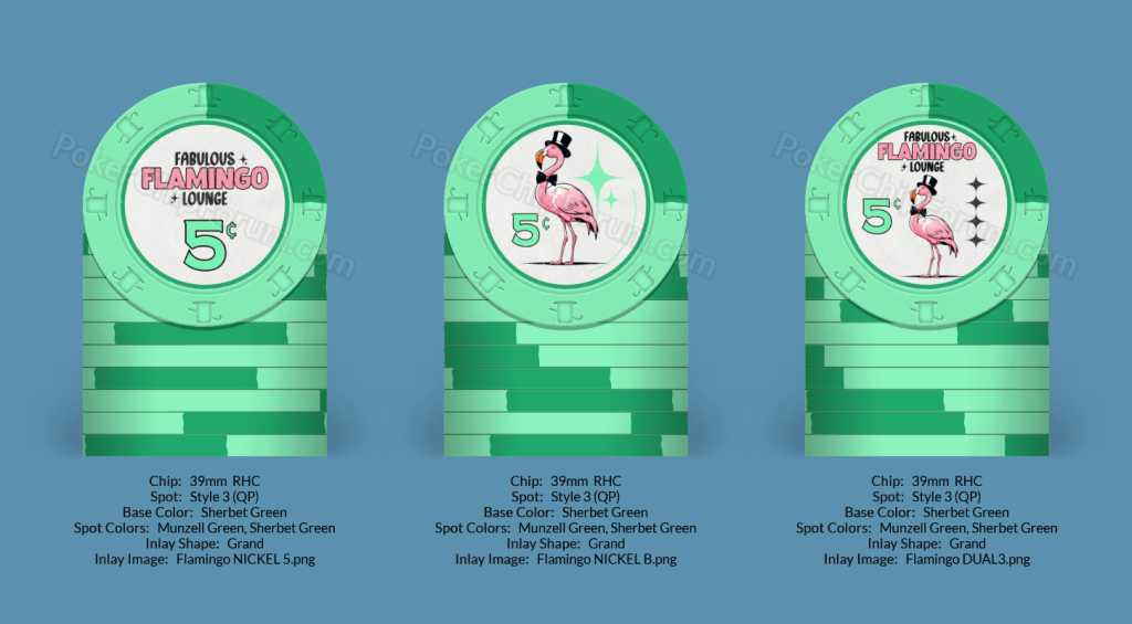
Played around a little with the logo and the flamingo itself, trying to get a bit closer to the 50's casino look I am trying to get towards. The first two cover if I were to continue with this design as a two-sided chip and the third is set up for the same inlay on both sides (those greek key hybrid labels are taunting me...haha). Not sure what I think of the lettering, especially the flamingo part of the logo text, but I quite like the new flamingo fella more than the original if I'm being honest. Also not sold on the diamonds on the right side of the third chip, just threw something in there to not have so much blank space... 
Last edited:
Salmonblaster
Two Pair
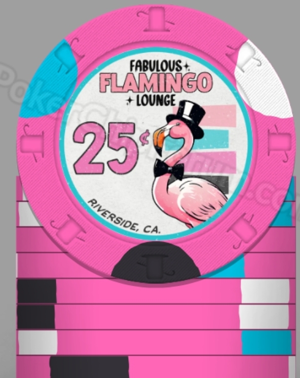
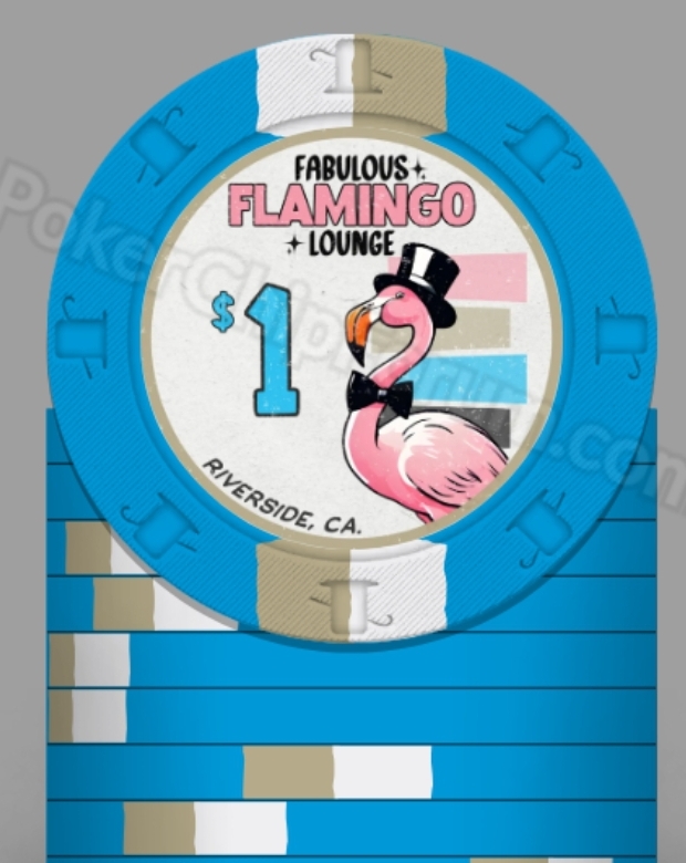
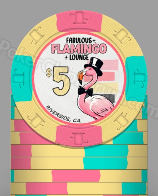
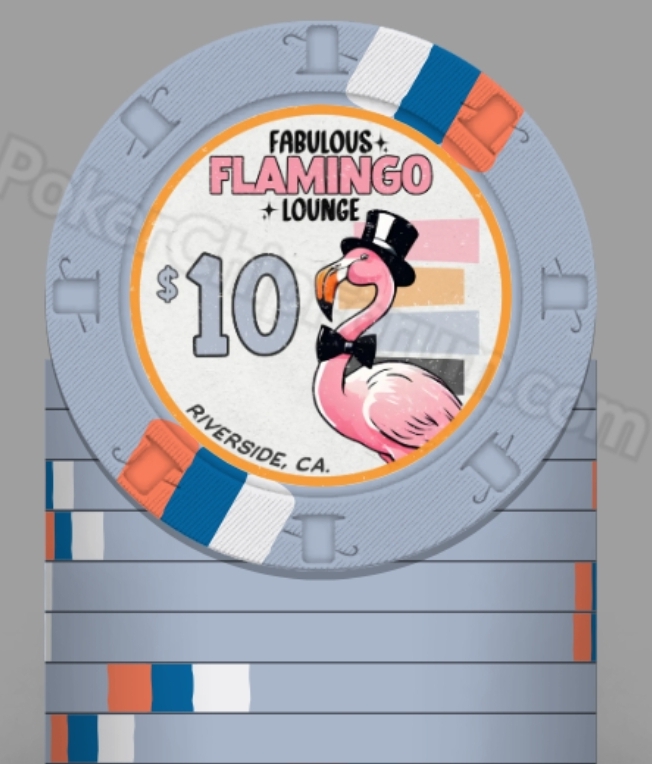
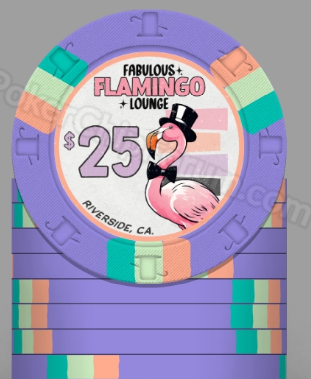
Did more tweaking and think I actually hit on my final version that I actually LOVE.
Did a ton of research into vintage font styles and things like that, while also tweaking my ideas a bit looking at casino chips from the 50's and 60's. I pulled in tight on my new famcy flamingo, added some elements of mid-century modern flair (still color matched the new elements to the chips/spots and the flamingo himself) and got to where I feel great about the finished product. I showed them to my wife and she was floored! There may be minor filter adjustments on the inlay art to come but for the first time I feel comfortable saying....I'm ready to give all of this over to someone to get the design set up for production in one of the next greek hybrid group buys!
Let me know what you guys think. I always appreciate any and all feedback I get from everyone, I feel like it's helped this project in leaps and bounds. Thank you all!
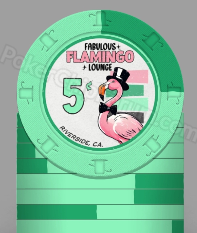
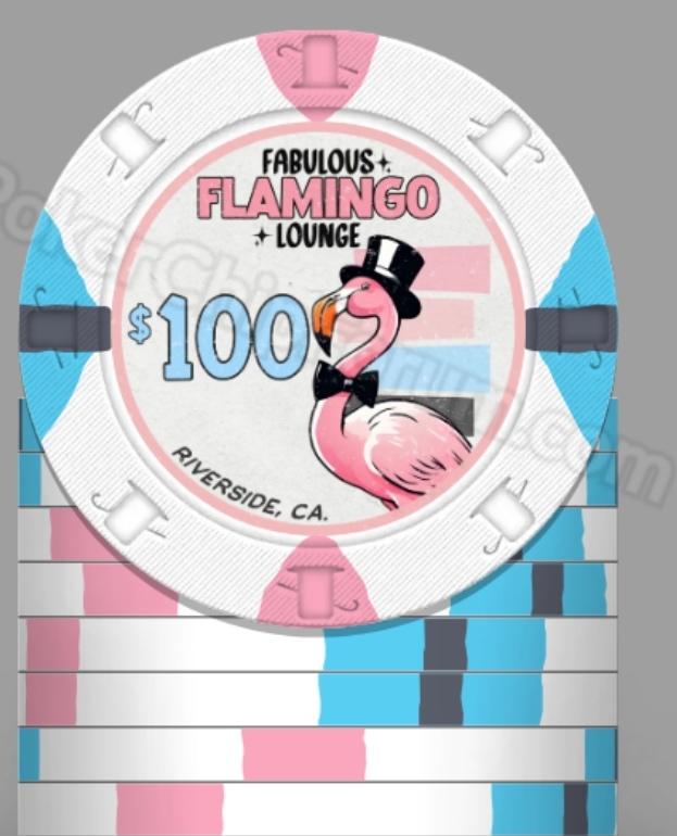
Really like this design with the flamingo very prominent! Like the offset stacks of colors behind too.
I'd like the "FLAMINGO" text to just have a little more "flare" than just in a blocky rectangular shape. The "Fabulous" and "Lounge" is a nice frame, and at first I thought maybe putting "FLAMINGO" on a curve, but I don't actually like that. Maybe alternating every other letter slightly up/down, like the color bars alternating slightly left and right?
I'd like the "FLAMINGO" text to just have a little more "flare" than just in a blocky rectangular shape. The "Fabulous" and "Lounge" is a nice frame, and at first I thought maybe putting "FLAMINGO" on a curve, but I don't actually like that. Maybe alternating every other letter slightly up/down, like the color bars alternating slightly left and right?
Salmonblaster
Two Pair
Something with a little bit more visual pizazz for the word Flamingo...maybe a bit closer to what you were thinking?Really like this design with the flamingo very prominent! Like the offset stacks of colors behind too.
I'd like the "FLAMINGO" text to just have a little more "flare" than just in a blocky rectangular shape. The "Fabulous" and "Lounge" is a nice frame, and at first I thought maybe putting "FLAMINGO" on a curve, but I don't actually like that. Maybe alternating every other letter slightly up/down, like the color bars alternating slightly left and right?
Yes even that spacing makes a difference! I forgot to expand on when I said "Fabulous" and "Lounge" framed the "Flamingo" I meant it both literally and figuratively. So the "Flamingo" itself needed to be more fabulous and lounge-y! ;-)
Salmonblaster
Two Pair
I quite fancy the new lounge-y version of it, thank you so much!Yes even that spacing makes a difference! I forgot to expand on when I said "Fabulous" and "Lounge" framed the "Flamingo" I meant it both literally and figuratively. So the "Flamingo" itself needed to be more fabulous and lounge-y! ;-)
CallingStation614
3 of a Kind
Very nice looking design. I am currently looking for inspiration for a Flamingo inspired chip for my first custom set, and stumbled upon this thread. Thrilled to see the chips in real life.
Salmonblaster
Two Pair
So I've made my final tweaks, this is the final form of the design and I feel great about it. Ditched the $10 in favor of a $500 to make this set one that can truly run the table from micro stakes all the way to high rolling games.
The other big change is that as a cash game set, I figured most people are going to buy or rebuy in counts of 100 or counts of 20 so the $25 is now a $20 chip. With that in mind here is the final product waiting for a finished chip design....
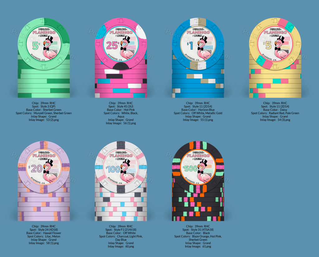
I love where I've ended up and I'm hoping to be in production soon. I will update once there is a finished product in hand to hit the tables! I sincerely appreciate everyone's input and ideas. It has all helped me immensely and I am grateful to you all!
The other big change is that as a cash game set, I figured most people are going to buy or rebuy in counts of 100 or counts of 20 so the $25 is now a $20 chip. With that in mind here is the final product waiting for a finished chip design....
I love where I've ended up and I'm hoping to be in production soon. I will update once there is a finished product in hand to hit the tables! I sincerely appreciate everyone's input and ideas. It has all helped me immensely and I am grateful to you all!
Similar threads
- Replies
- 24
- Views
- 959
- Replies
- 2
- Views
- 176
- Replies
- 6
- Views
- 276
- Replies
- 9
- Views
- 474
