bananasandblow
High Hand
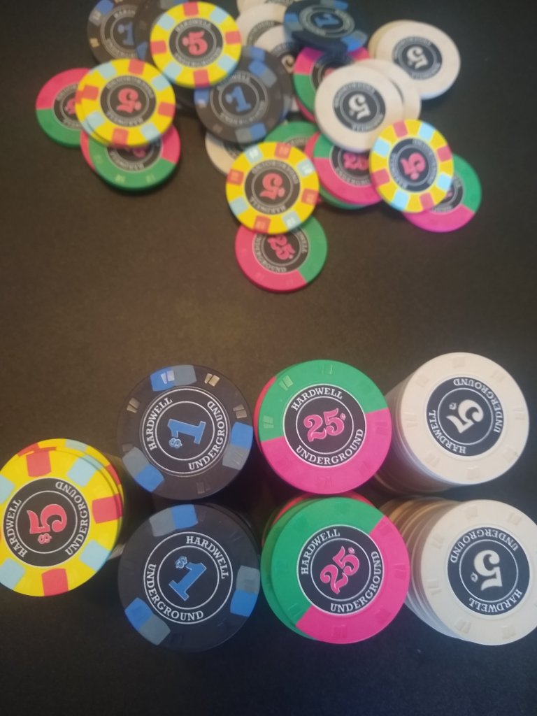
Hi all - long time chip lover, first time poster.
I'm looking for some quick feedback/impressions on my custom CPC set before I place an order.
Mostly concerned about the colors and edge spots. I'm personally not a fan of anything too flashy.

I'd also love to hear thoughts on the inlay, which I created myself without any design experience. I just want to ensure it would look alright on a real chip (and isn't hideous).
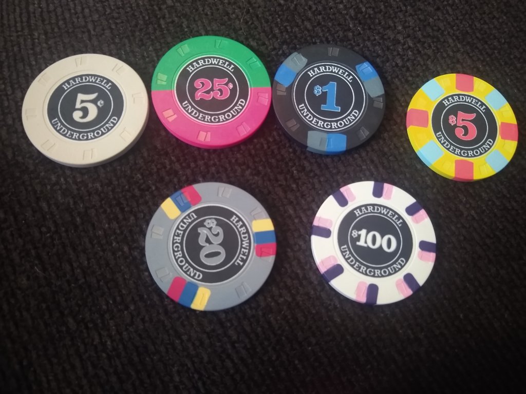
Here is a closeup:

I'm looking for some quick feedback/impressions on my custom CPC set before I place an order.
Mostly concerned about the colors and edge spots. I'm personally not a fan of anything too flashy.
I'd also love to hear thoughts on the inlay, which I created myself without any design experience. I just want to ensure it would look alright on a real chip (and isn't hideous).
Here is a closeup: