Faux house mold on Alibabas? (1 Viewer)

eightyWon

Straight
Joined
Jul 17, 2021
Messages
826
Reaction score
2,284
Location
Chicagoland
Wondering if anyone has tried a faux house mold on Alibaba chippies.

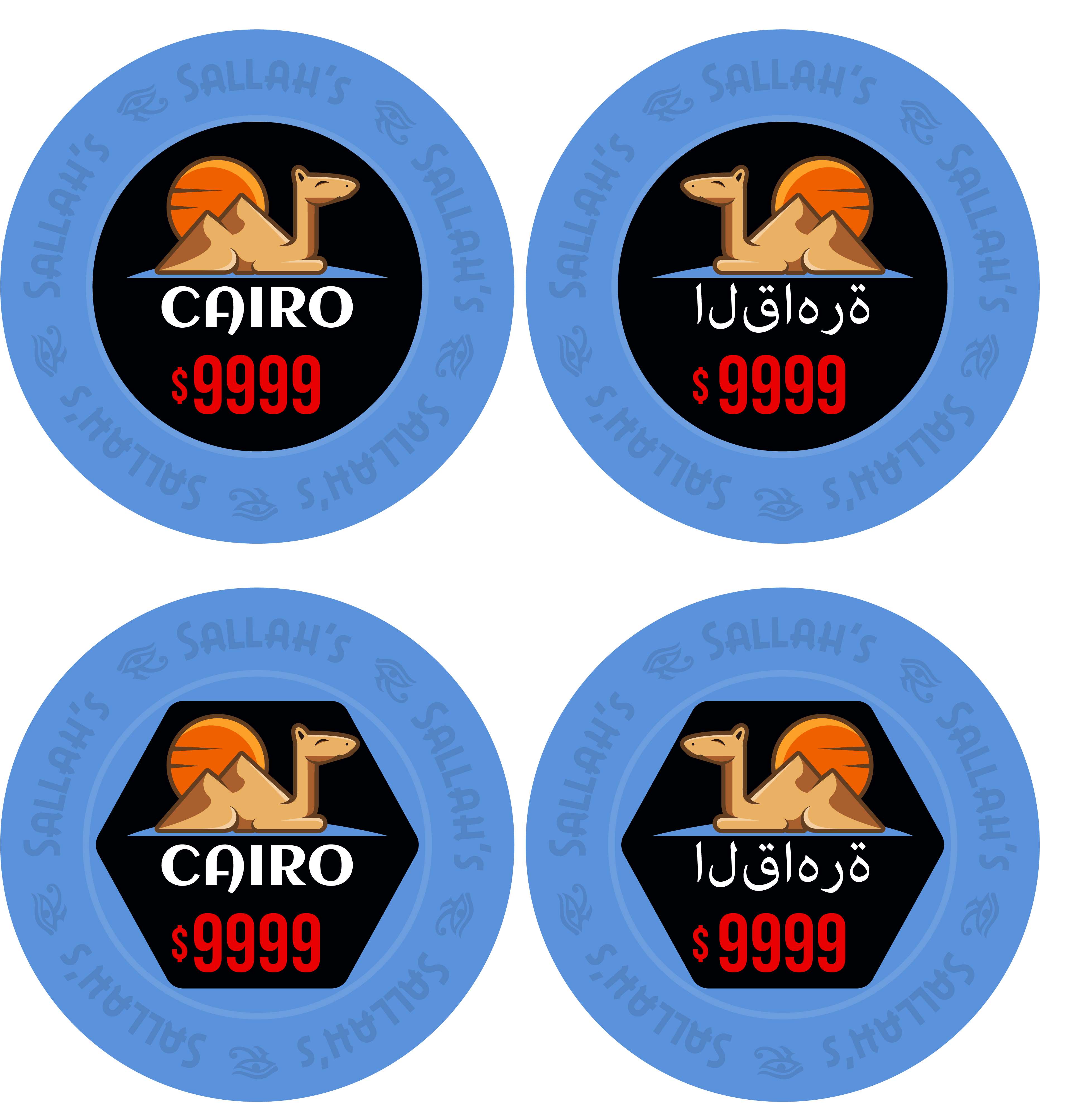
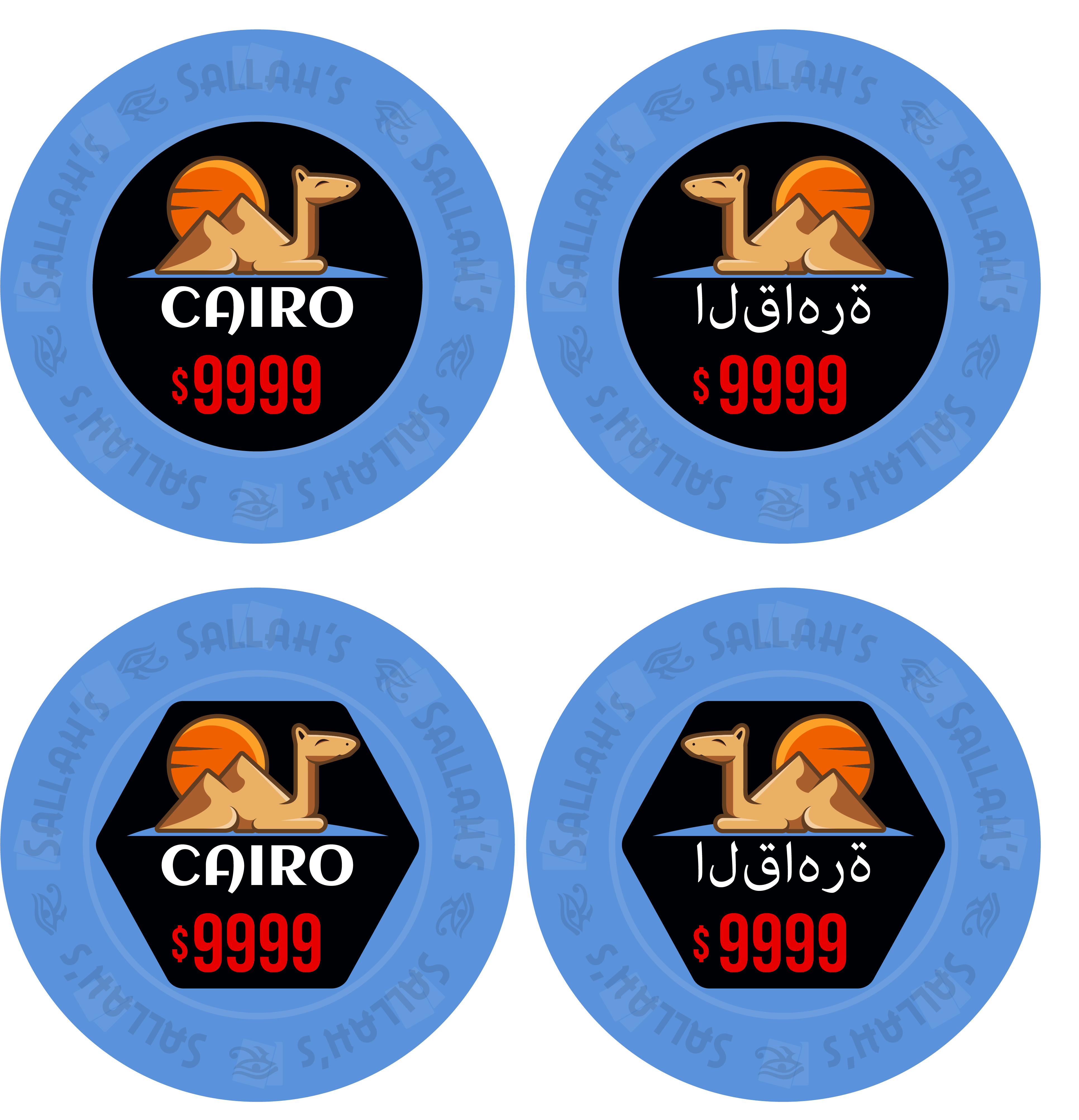
Messing around with something like this. Plan would be to mimic a house mold using transparency or the right color. Not even sure it would print right (will consult with a real designer)?

XUObQ1F.png


note: rough rough rough rough draft
 
  • Like
Reactions: DRG
If you’re ok with 39mm, it would look good on a hybrid chip, also. @Machine had these prototypes made with faux scrowns. Pretty well done IMO. Faux house mold is a great idea. Now you’ve got me thinking …

4878F4CB-2CCA-4398-843B-A17947E6977B.jpeg
 
Thanks for the tips @Himewad and @Kid_Eastwood. These examples are great and are helping lead me to more info. Found the Aria faux house molds too printed by Mandy (vendor new to me, researching).

Ignorant question here but want to confirm - from my research, hybrids are ceramics where chip is printed and inlay is a sticker/label, right?

Seems like from what I can find, faux mold chips have been either done by Sunfly or Mandy, both on hybrids. Doesn't seem to have been done yet on Tina hybrids (which are pretty new so that makes sense).
 
Just came across this thread looking for something else. Anyways I just did the web mold on ceramics from tina. Personally I think they came out fantastic View attachment 935410View attachment 935411View attachment 935412
These do look great, are these a hybrid or even the centres are printed on the ceramic chip?

If full ceramic what sort of detail can be achieved on ceramics as in line thickness like on your boat and black outline font?

Some I've seen look fuzzy but those look crisp.
 
Oh ok, I’ve never done ceramics like le this before, and thought I might br doing it wrong, lol.

For mine, I took the type and offset it twice, once for shadow and the other for the highlight. Then deleted the middle. I then used the “darken” and “lighten” transparency on them.
 
Oh ok, I’ve never done ceramics like le this before, and thought I might br doing it wrong, lol.

For mine, I took the type and offset it twice, once for shadow and the other for the highlight. Then deleted the middle. I then used the “darken” and “lighten” transparency on them.
Thanks for the explanation.
For the inner circle, you used a gradient on the outline of the circle ?
 
Thanks for the explanation.
For the inner circle, you used a gradient on the outline of the circle ?
I use Illustrator. I just took two circles and offset one slightly. I then used the Trim option in pathfinder to leave me with just a sliver of a crescent shape. That’s the shadow. Then made a copy and rotated it 180 degrees, and made that the highlight.
 
I use Illustrator. I just took two circles and offset one slightly. I then used the Trim option in pathfinder to leave me with just a sliver of a crescent shape. That’s the shadow. Then made a copy and rotated it 180 degrees, and made that the highlight.
Thx ! Good to know. I creates the shadow effect very well !
 
These do look great, are these a hybrid or even the centres are printed on the ceramic chip?

If full ceramic what sort of detail can be achieved on ceramics as in line thickness like on your boat and black outline font?

Some I've seen look fuzzy but those look crisp.

I'll second that, fantastic looking set @italstylz !
What made you go ceramic rather than clay (which as I understand Tina is most famous for)?

I think the $5 is the best chip of the lots.

Do you have any dirty issue as they are all quarter pie? $25, $100 & $500 look similar when mixed in a barrel stack
Thanks guys for all the complements . So they are full ceramics. You need to play with all of your settings to create the lines for your mold and inlay. I will not lie it was extremely time consuming. Each section of the mold is a different color in the quarter pie. Which makes it look more realistic.
As far as why not clay. Kid_Eastwood is right. Availability and the fact that that mold doesn't exist anymore. I mean cost also comes into account. You cannot compare the 2.
For dirty stacks the colors are far enough apart that I havent noticed any issues.
 

Create an account or login to comment

You must be a member in order to leave a comment

Create account

Create an account and join our community. It's easy!

Log in

Already have an account? Log in here.

Back
Top Bottom