Doge's Palace (3 Viewers)

gou1

Sitting Out
Joined
Feb 27, 2023
Messages
43
Reaction score
104
Rewards
0
Location
France
The Doge's Palace is a palace built in Venetian Gothic style, and one of the main landmarks of the city of Venice in northern Italy. The palace was the residence of the Doge of... oh wait, I'm just talking about the meme :wtf:

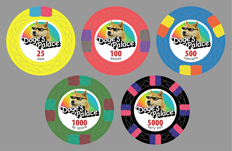
I am contemplating making a custom Tina Web Mold tournament set. I love the internet and I love this meme, and found the play on words funny.

I am colorblind so I like bright colors. I have been playing for 15 years with my dyed faux clays with bright non-standard colors, so I went with the same colors here. Not completely sold on spot colors yet.

Happy to hear your feedback!

doges-palace-mockup-pcf-v1.png
 
I love the concept. I agree that the subtext is amusing.

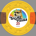
If you're colorblind, I would suggest varying the edgespots more, not just the colors. Something like this:
View attachment 1412683
Thank you very much for the suggestion, makes a lot of sense! I haven't really thought about using the chip design tool to tinker with the colors and spots, but that's obviously a good idea
Shouldn't the 'Doge' have a crown or something?
At first I wanted to have a different doge on each chip, but that did not really work, plus I find that thug life doge has a nice poker face. I like the crown idea though, maybe just for the 25k? I'll try some options with it
 
That would be perfect for the dealer button :D

Bounty Chip would be better I'd have thought?

(I'd prefer crypto never existed but) well played on the text :D
 
Last edited:
The Doge's Palace is a palace built in Venetian Gothic style, and one of the main landmarks of the city of Venice in northern Italy. The palace was the residence of the Doge of... oh wait, I'm just talking about the meme :wtf:

I am contemplating making a custom Tina Web Mold tournament set. I love the internet and I love this meme, and found the play on words funny.

I am colorblind so I like bright colors. I have been playing for 15 years with my dyed faux clays with bright non-standard colors, so I went with the same colors here. Not completely sold on spot colors yet.

Happy to hear your feedback!

View attachment 1412369
Looks amazing. Go for it!
 
I've swapped the black with a bronze one, to be more in line with the colorful theme.

paulson colors v4.png


Pretty happy with the results, I've started working on the production files.

I've also played around the idea of a bounty chip with a more complex print. I wonder if Tina can print fine details like this on the chips.

doges-palace-mockup-pcf-v2.jpg


For the colors, I took the color names from the Paulson Chip Tool and converted the values using https://www.pokerchipforum.com/thre...-colors-converted-to-cmyk-rgb-pantone.119694/

This is RGB colors for Web display and I also have the CMYK values for print (which look dull on screen). I will probably need to ajust the colors when I'm closer to production.

Next: edges and dealer button designs !
 
I'm working on the colors. I based my choices on the renders of the Paulson Chip Tool. Then I took the Paulson Colors Spreadsheet to have RGB values for screen display, and CMYK values for print. Something seems off as I pointed out in the thread above : the RGB values don't match with the Paulson Chip Tool (see most notably the Hot Pink 100). Also the CMYK values look weird (eg. contrast on the green 500), I guess that's to be expected, but I'm a little worried sending these values to Tina.

Doge's-Palace-Color-Comparison.jpg
 
I'm working on the colors. I based my choices on the renders of the Paulson Chip Tool. Then I took the Paulson Colors Spreadsheet to have RGB values for screen display, and CMYK values for print. Something seems off as I pointed out in the thread above : the RGB values don't match with the Paulson Chip Tool (see most notably the Hot Pink 100). Also the CMYK values look weird (eg. contrast on the green 500), I guess that's to be expected, but I'm a little worried sending these values to Tina.

View attachment 1420410
You have some tough colors! (e.g. Blues, greens).. but think you would be pretty happy with these values.. did my best to recommend values for Tina that would print closely to the paulson tool colors:

ChipBaseSpot 1Spot 2
Yellow4/3/99/00/80/36/00/72/98/0
Pink7/71/0/04/26/42/072/65/0/0
Blue63/5/1/039/1/1/00/0/0/0
Green77/1/99/076/3/48/066/4/100/0
Brown44/64/99/4623/18/19/07/0/88/0
 
You have some tough colors! (e.g. Blues, greens).. but think you would be pretty happy with these values.. did my best to recommend values for Tina that would print closely to the paulson tool colors:

ChipBaseSpot 1Spot 2
Yellow4/3/99/00/80/36/00/72/98/0
Pink7/71/0/04/26/42/072/65/0/0
Blue63/5/1/039/1/1/00/0/0/0
Green77/1/99/076/3/48/066/4/100/0
Brown44/64/99/4623/18/19/07/0/88/0

Thank you so much @Cratty for the suggestions you're the king :ah::ah: I'm going to give it a try and will report back.

Do you think I should also pay attention to the CMYK colors of the label, specifically the doge & rainbow backgrounds which are imported images?
 
Latest design: adjusted the rainbow, denom colors and subtexts a little bit, and also designed the edges. I'll make a separate post for the edge design workflow.

Doge's-Palace-Print.jpg
 
Thank you so much @Cratty for the suggestions you're the king :ah::ah: I'm going to give it a try and will report back.

Do you think I should also pay attention to the CMYK colors of the label, specifically the doge & rainbow backgrounds which are imported images?
I don't think you'll have any major issues with the labels, just the chip colors can be fairly significantly different in my experience.
 
The edge design workflow is based on an idea from @Cratty (detailed in his Cratty House Poker thread, thank you very much!) modified a little bit to use Photoshop's ruler.

I work in Photoshop in a CMYK 16bit document with 1333,826 pixels/inches. That way a 39mm chip is 2048*2048 pixels.

1. Import a template for drawing the spots, set it at 25% opacity, draw the spots free handed with the Brush tool with 50% smoothing:

1731695161795.png

1731695335800.png


2. Create colored spots with layer masks based on what has been drawn. Notice I drew the spots outside of the chip, and have a mask for the whole chip:
1731695374943.png


3. Add 2 guides to be able to snap to the chip center and top center:
1731695433992.png


4. Open Measurement Log Window, create a "Select Data Point" preset to only have Label & Angle ; this make it easier to read:
1731695514521.png


5. Bring up the Ruler tool. Place from top center to center, it snaps easily thanks to the guide. Press ALT to bring up angle measurement and loosely place at first spot:
1731695616487.png


6. Adjust placement at 5000% zoom:
1731695659113.png


7. Hit "Record Measurement" in the Measurement Log:
1731695688808.png


8. Move the ruler point from the top center to the 2nd spot location. Zoom. Adjust. Record Measurement. Alternate the ruler point you move for each spots, so that there's always a ruler point in common between two consecutive measurements.

9. Finish snapped at the top center, and measure that too. It will help detect errors. At the end, the Measurement Logs have all the unnecessary "Feature 1" & "Feature 2" entries.
1731695888266.png


9. Delete the unnecessary entries:
1731695940216.png


10. Select and export them to a text file:
1731695965167.png


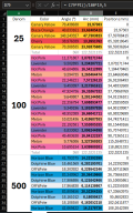
11. Import the values in Excell, add formulas to calculate the arc lengths and positions of each spots. I add colors to avoid errors. I also sum everything to make sure that all my angles add up to 360° and all the arcs add up to 122,5221135:
1731696081978-png.1421004


12. Create a PSD document with the same inches/pixels resolution, and draw all the boxes with the previous excel file:
1731696166224.png

12a. Note this is really to do with the Free Transform tool (set the origin in the top left corner, set the X position and With in millimeters):
1731696645040.png


13. Tweak the layer masks with the Brush Tool:
1731696191287.png

14. I will probably add a 1px or 2px blur to both the chip face and the edge, but haven't done that yet.

 

Attachments

  • 1731696081978.png
    1731696081978.png
    107.3 KB · Views: 280
  • 1731695136288.png
    1731695136288.png
    1.1 MB · Views: 84
Last edited:
The edge design workflow is based on an idea from @Cratty (detailed in his Cratty House Poker thread, thank you very much!) modified a little bit to use Photoshop's ruler.

I work in Photoshop in a CMYK 16bit document with 1333,826 pixels/inches. That way a 39mm chip is 2048*2048 pixels.

1. Import a template for drawing the spots, set it at 25% opacity, draw the spots free handed with the Brush tool with 50% smoothing:

View attachment 1420985
View attachment 1420990

2. Create colored spots with layer masks based on what has been drawn. Notice I drew the spots outside of the chip, and have a mask for the whole chip:
View attachment 1420991

3. Add 2 guides to be able to snap to the chip center and top center:
View attachment 1420992

4. Open Measurement Log Window, create a "Select Data Point" preset to only have Label & Angle ; this make it easier to read:
View attachment 1420995

5. Bring up the Ruler tool. Place from top center to center, it snaps easily thanks to the guide. Press ALT to bring up angle measurement and loosely place at first spot:
View attachment 1420997

6. Adjust placement at 5000% zoom:
View attachment 1420998

7. Hit "Record Measurement" in the Measurement Log:
View attachment 1420999

8. Move the ruler point from the top center to the 2nd spot location. Zoom. Adjust. Record Measurement. Alternate the ruler point you move for each spots, so that there's always a ruler point in common between two consecutive measurements.

9. Finish snapped at the top center, and measure that too. It will help detect errors. At the end, the Measurement Logs have all the unnecessary "Feature 1" & "Feature 2" entries.
View attachment 1421001

9. Delete the unnecessary entries:
View attachment 1421002

10. Select and export them to a text file:
View attachment 1421003

11. Import the values in Excell, add formulas to calculate the arc lengths and positions of each spots. I add colors to avoid errors. I also sum everything to make sure that all my angles add up to 360° and all the arcs add up to 122,5221135:
1731696081978-png.1421004


12. Create a PSD document with the same inches/pixels resolution, and draw all the boxes with the previous excel file:
View attachment 1421005
12a. Note this is really to do with the Free Transform tool (set the origin in the top left corner, set the X position and With in millimeters):
View attachment 1421011

13. Tweak the layer masks with the Brush Tool:
View attachment 1421006
14. I will probably add a 1px or 2px blur to both the chip face and the edge, but haven't done that yet.
Personally don't think you need blurs, just because there's a natural blur already created in printing with color-overruns (which if you ever print a really dark/light shade next to each other, e.g. black/white, it can be a recipe for a messy chip edge especially.

I will also note that no matter how hard I try to get edge spots to align perfectly, there's a good deal of variation with Tina and how they treat the art files/edge-spots. I've requested their "print-ready" templates to mitigate with no avail, ha. Couple things I've seen though..

1. General misalignment of edge-spots.. not the biggest deal in the world, and less frequent with some spot patterns than others (i.e. how hard would it be for them to see the edge spots.

2. When your file is converted for printing on their end, they will add some level of bleed-zone (and overlap area for the rolling edge). They aren't consistent though in terms of how they apply.. about 50% of the time when they convert your file for printing.. I've found that they just increase the image size.. problem is this can make the rolling edge get progressively less aligned than the first edge spot. This ends up not being the biggest deal in my opinion either, but you can see varying degrees of misalignment on the same chip. In other cases though, and especially with smaller edge-spots, I notice they take their time more and get them right.

In the end if you're looking for perfection, Tina aint it.. but there will be defects that only your eyes will likely ever see and may bug you if you expect it to be too good. One thing I will also say that has helped me... is to design edge spots to care-less about misalignment. E.g. a straight edge-spot will show imperfections the most, but rough or sloped inward edge-spots can still look "intended".
 
Personally don't think you need blurs, just because there's a natural blur already created in printing with color-overruns (which if you ever print a really dark/light shade next to each other, e.g. black/white, it can be a recipe for a messy chip edge especially.

I will also note that no matter how hard I try to get edge spots to align perfectly, there's a good deal of variation with Tina and how they treat the art files/edge-spots. I've requested their "print-ready" templates to mitigate with no avail, ha. Couple things I've seen though..

1. General misalignment of edge-spots.. not the biggest deal in the world, and less frequent with some spot patterns than others (i.e. how hard would it be for them to see the edge spots.

2. When your file is converted for printing on their end, they will add some level of bleed-zone (and overlap area for the rolling edge). They aren't consistent though in terms of how they apply.. about 50% of the time when they convert your file for printing.. I've found that they just increase the image size.. problem is this can make the rolling edge get progressively less aligned than the first edge spot. This ends up not being the biggest deal in my opinion either, but you can see varying degrees of misalignment on the same chip. In other cases though, and especially with smaller edge-spots, I notice they take their time more and get them right.

In the end if you're looking for perfection, Tina aint it.. but there will be defects that only your eyes will likely ever see and may bug you if you expect it to be too good. One thing I will also say that has helped me... is to design edge spots to care-less about misalignment. E.g. a straight edge-spot will show imperfections the most, but rough or sloped inward edge-spots can still look "intended".
Thanks for the precisions! Designing with bleed seems to be a standard in printing, I'm surprised to not see it mentioned that often around here. Maybe Tina can receive files with already a bleed zone ? I'm not I would trust them to not print it :ROFL: :ROFLMAO:

In the end I agree it's not perfect, and I'm not expecting that. It's a fun process to try and design accurate rough edges though :D
 

Create an account or login to comment

You must be a member in order to leave a comment

Create account

Create an account and join our community. It's easy!

Log in

Already have an account? Log in here.

Back
Top Bottom