Ok, here we go... After I realized that I NEED a new CPC set ..... yiiiiiieeeeks 

My first idea was based on a holliday experience in Canada = Lake O'Hara International Airport - but I got rid of it and went on....

So after playing around a bit, I thought I might be cool, to include something that reminds me of that beautiful city next to my hometown and the City where I work: Cologne/Germany. It's funny, because everytime I spoke with americans or canadians, everyone seemed to know Cologne.... : "yeah, of course, I've been there... it's that city with the big gothic cathedral!!!" ... yes, that is true... and so my thoughts become clearer and I wanted to include "the cathedral" (or "Dom" as we say in germany). And, well, because it also should have something in common with poker, I thought it would be a nice idea, to call this inlay "Rounders Cologne" And I have to say, I am quiet happy with this theme... not to forget: my wife is quiet happy about it as well ....
So, as a first time user, I made my first steps with Adobe Illustrator, loaded the CPC templates, and started the project. And after two days I have four differen versions of the inlay. Let's say it's some sort of evolving process and I included new ideas and get rid of some issues...
My first custom clay set had rather lighter colors and so I wanted to make it different this time. To get a more "elegant" feeling, I made it black with colors that matches the chip/edgespot colors.
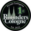
Version 1
My first attempt, I made the cathedral with a 2 dot outline, but after all, I ain't sure, if this will come out great. I Ihave my doubts that this will be good to see... as you can see, in the green one, I used a colored outline on the Rounders Cologne text. On the orange one, I used a black outline. On the Rounders text and on the chip value, I added a little iluminating effect - just a little bit, because I aint want it to be overloaded.


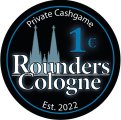
Version 2
Here I put the Dom to the left and made the Rounders Cologne as a curved text. Even that the cathedral looks a bit more fancy in Version 1, I do prefer the simple look of the silhouette in Version 2. But I am not a big fan of the Rounders Cologne as a curved text...


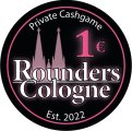
Version 3
Here I choose a gray-scaled cahtedral in the middle and in a bigger version, just to make it somewhat present in the background, but not too dominant. On the green inlay I made the grey a bit lighter and placed the Rounders Cologne text a bit lower just for the comparisson...


Version 4
Well, I think this is my most prefered version (not saying, that it was my last that I came up with...). For me it has the most classy look, even that the cathedral is not as visiable as in the three other versions. The illuminating effect is also included. I dont know if it would be better to make a thin (2pts.) white outline around the chip value.


Let me know, what you thinking about it. The chip colors are just for demonstration purpose and ain't final at all... I would love to know what you recommend as font size for the surrounding text (Est. 2022 / Private Cashgame) as I have such thin fonts on my first ASM set in it could have been better/thicker...
Even that I prefer version 4, I also love the idea of the grey-scaled cathedral as a background. As you see, the colored cathedrals looks a bit faded - I placed to layers together, one white and one in the color of the inlay and I made this top layer's opacity down to 40-50 or so... So even that I used the color chart that is posted at PCF, I aint sure if this fading color will match the final chip as good as I love to see...
choices choices choices...
Thank you in advance for sharing your thoughts...
Because I only could include 20 images in this post and due to the fact, that after I reached these 20 the website had some issues, I add the missing images in the next post...
My first idea was based on a holliday experience in Canada = Lake O'Hara International Airport - but I got rid of it and went on....
So after playing around a bit, I thought I might be cool, to include something that reminds me of that beautiful city next to my hometown and the City where I work: Cologne/Germany. It's funny, because everytime I spoke with americans or canadians, everyone seemed to know Cologne.... : "yeah, of course, I've been there... it's that city with the big gothic cathedral!!!" ... yes, that is true... and so my thoughts become clearer and I wanted to include "the cathedral" (or "Dom" as we say in germany). And, well, because it also should have something in common with poker, I thought it would be a nice idea, to call this inlay "Rounders Cologne"
And I have to say, I am quiet happy with this theme... not to forget: my wife is quiet happy about it as well ....So, as a first time user, I made my first steps with Adobe Illustrator, loaded the CPC templates, and started the project. And after two days I have four differen versions of the inlay. Let's say it's some sort of evolving process and I included new ideas and get rid of some issues...
My first custom clay set had rather lighter colors and so I wanted to make it different this time. To get a more "elegant" feeling, I made it black with colors that matches the chip/edgespot colors.
Version 1
My first attempt, I made the cathedral with a 2 dot outline, but after all, I ain't sure, if this will come out great. I Ihave my doubts that this will be good to see... as you can see, in the green one, I used a colored outline on the Rounders Cologne text. On the orange one, I used a black outline. On the Rounders text and on the chip value, I added a little iluminating effect - just a little bit, because I aint want it to be overloaded.
Version 2
Here I put the Dom to the left and made the Rounders Cologne as a curved text. Even that the cathedral looks a bit more fancy in Version 1, I do prefer the simple look of the silhouette in Version 2. But I am not a big fan of the Rounders Cologne as a curved text...
Version 3
Here I choose a gray-scaled cahtedral in the middle and in a bigger version, just to make it somewhat present in the background, but not too dominant. On the green inlay I made the grey a bit lighter and placed the Rounders Cologne text a bit lower just for the comparisson...
Version 4
Well, I think this is my most prefered version (not saying, that it was my last that I came up with...). For me it has the most classy look, even that the cathedral is not as visiable as in the three other versions. The illuminating effect is also included. I dont know if it would be better to make a thin (2pts.) white outline around the chip value.
Let me know, what you thinking about it. The chip colors are just for demonstration purpose and ain't final at all... I would love to know what you recommend as font size for the surrounding text (Est. 2022 / Private Cashgame) as I have such thin fonts on my first ASM set in it could have been better/thicker...
Even that I prefer version 4, I also love the idea of the grey-scaled cathedral as a background. As you see, the colored cathedrals looks a bit faded - I placed to layers together, one white and one in the color of the inlay and I made this top layer's opacity down to 40-50 or so... So even that I used the color chart that is posted at PCF, I aint sure if this fading color will match the final chip as good as I love to see...
choices choices choices...
Thank you in advance for sharing your thoughts...
Because I only could include 20 images in this post and due to the fact, that after I reached these 20 the website had some issues, I add the missing images in the next post...
Attachments
Last edited:


")