The Latest

Previous Discussions


Or...


Been working on these for several months. I'd like to say they're almost ready, but I wonder if you all may open the floodgates of change again.
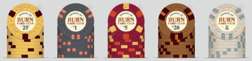
Inlays are not 100% final, but close. Probably will just fiddle with the denom colors and denom outline colors from here on.
Top row is a wonky set just for fun. I wanted to try something a little new/bold/original. Thought I could push the edge spot boundaries while retaining symmetry. May use it as a guideline for a secondary or tourney set one day.
But more likely will start with the bottom cash set.
The Goals
Of course this should be a firey set. But not necessarily too bright or bold. Rather, the vibe should be something like a cigar lounge. Old-fashioned. Antiquey. Vintage.
The top row is intended to be more "realistic". More on that below...
Green: The Ash Tray
This is a 3-finger ash tray from the top down.
I could choose all kinds of base colors, but light green is pleasant and works well for a 25 (cent) chip. Canary was a close second, but I thought I already had too much red/yellow/orange elsewhere.
The top one is considered more realistic because of course, not everyone smokes the same cigar.
White: Smoke/Ash
Off-white because it's more smokey. Bright white would not be as vintage.
Top one has some actual round puffs of smoke. Bottom one really just uses the smokey/ashy colors.
Red: Fire
Technically orange but I think it will get called red at the felt. Top one is a striking match head. Bottom again, just uses similar colors.
Black: Coals/Embers
Can't have a fire set without charcoal. Not much else to say here. Looks a bit like embers. Has changed little throughout this process. Been one of my favorites.
Concerns
- Too many orangey colors between the red chip and the black chip? I could tone the black down to a 318. But I do want it to pop.
- Anything else?
Previous Discussions
Or...
Been working on these for several months. I'd like to say they're almost ready, but I wonder if you all may open the floodgates of change again.
Inlays are not 100% final, but close. Probably will just fiddle with the denom colors and denom outline colors from here on.
Top row is a wonky set just for fun. I wanted to try something a little new/bold/original. Thought I could push the edge spot boundaries while retaining symmetry. May use it as a guideline for a secondary or tourney set one day.
But more likely will start with the bottom cash set.
The Goals
Of course this should be a firey set. But not necessarily too bright or bold. Rather, the vibe should be something like a cigar lounge. Old-fashioned. Antiquey. Vintage.
The top row is intended to be more "realistic". More on that below...
Green: The Ash Tray
This is a 3-finger ash tray from the top down.
I could choose all kinds of base colors, but light green is pleasant and works well for a 25 (cent) chip. Canary was a close second, but I thought I already had too much red/yellow/orange elsewhere.
The top one is considered more realistic because of course, not everyone smokes the same cigar.
White: Smoke/Ash
Off-white because it's more smokey. Bright white would not be as vintage.
Top one has some actual round puffs of smoke. Bottom one really just uses the smokey/ashy colors.
Red: Fire
Technically orange but I think it will get called red at the felt. Top one is a striking match head. Bottom again, just uses similar colors.
Black: Coals/Embers
Can't have a fire set without charcoal. Not much else to say here. Looks a bit like embers. Has changed little throughout this process. Been one of my favorites.
Concerns
- Too many orangey colors between the red chip and the black chip? I could tone the black down to a 318. But I do want it to pop.
- Anything else?
Attachments
Last edited: