You are using an out of date browser. It may not display this or other websites correctly.
You should upgrade or use an alternative browser.
You should upgrade or use an alternative browser.
Building a Relabeled RHC tournament Set (1 Viewer)
- Thread starter crussader
- Start date
That was my first thought too.... Do that and get a banger of a 5k....how many of those Rio $5s can you get? IMO that would be a great 500 and then maybe use jack or isle $1s as your 5000s.
OP
OP
crussader
Flush
My last time in Vegas I got two racks of flamingo $5s by going to the poker room cage and asking for them. Thought I'd do the same next time I'm at the Rio. Would be a little pricey to use as a T500, but for a 5k I would only need a couple of barrels.how many of those Rio $5s can you get?
Makes sense.My last time in Vegas I got two racks of flamingo $5s by going to the poker room cage and asking for them. Thought I'd do the same next time I'm at the Rio. Would be a little pricey to use as a T500, but for a 5k I would only need a couple of barrels.
My last time in Vegas I got two racks of flamingo $5s by going to the poker room cage and asking for them. Thought I'd do the same next time I'm at the Rio. Would be a little pricey to use as a T500, but for a 5k I would only need a couple of barrels.
oh I didn't realize those are live, lol. in that case, I agree that both the isle or jack $1s would make a fine 500 in this set. preference goes to isle for me personally.
OP
OP
crussader
Flush
I like the isles more, but now that 5k isn't quite working for me. I think every chip having two or three colors and that being so monotone is throwing me off, personally. Love the direction tho.
OP
OP
crussader
Flush
Too brown for my tastes and it repeats a spot pattern.
OP
OP
crussader
Flush
Well, a good deal fell into my lap and I jumped on it. So this is what it's going to be for now:

All chips are now accounted for except the 5Ks. Those will have to wait until my next Vegas trip.
All chips are now accounted for except the 5Ks. Those will have to wait until my next Vegas trip.
Well, a good deal fell into my lap and I jumped on it. So this is what it's going to be for now:
Really nice lineup.
OP
OP
crussader
Flush
Next up...
Deciding on a theme.
Deciding on a theme.
OP
OP
crussader
Flush
Thinking about this:

Last edited:
That looks familiar. Did you not do a previous set with this?
OP
OP
crussader
Flush
Good memory. Last year I was planning a CPC set on this theme. I just prefer to have it on a Paulson set.
OP
OP
crussader
Flush
I still might change the theme if I come up with an idea that fits the chips better.
From a design practicality standpoint I'm not sure the TOURNAMENT on the bottom is going to look too good when it gets printed out... it looks too small and at poker chip size may end up looking like a white smudge... Also the red denoms look a little out of place to me.... maybe either silver to match the eagle or possibly colored to match the chip denoms?
OP
OP
crussader
Flush
The labels are just a rough mock up. I'm not really sure if this is still the direction I want to go. Ultimately, I'll hire a designer to finish it up.
OP
OP
crussader
Flush
Agreed. They looked fine with the CPC set I was designing, but they really don't fit these chips. Good call!...Also the red denoms look a little out of place to me....
OP
OP
crussader
Flush
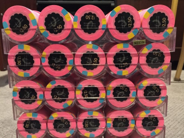
Chips have arrived.

OP
OP
crussader
Flush
Maybe this would be a better 5k option???

What about the Cincinnati $500? That way you won't repeat any spots.
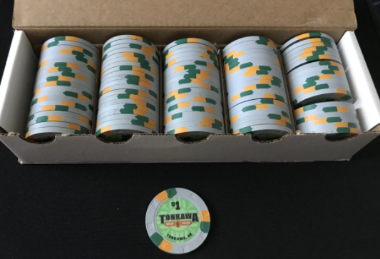
Either the primary or secondary would work.What about the Cincinnati $500? That way you won't repeat any spots.
These are available at The Chip Exchange (crop of his pics).
OP
OP
crussader
Flush
????

OP
OP
crussader
Flush
I think I'm going to go somewhere in this direction...

Are you committed to a black background label? I'm thinking that a white (or not necessarily white, but something lighter or maybe a gradient) would help pop out some of the darker colours of the chip itself.
OP
OP
crussader
Flush
Are you committed to a black background label?
I am not committed to anything at this point. I thought I might try the black background as the 25s and 100s were designed that way already, and to distinguish from my cash set which has white backgrounds.
OP
OP
crussader
Flush
I have even thought about white on one side and black on the other.
Similar threads
- Replies
- 11
- Views
- 387
- Locked
- Replies
- 9
- Views
- 1K