You are using an out of date browser. It may not display this or other websites correctly.
You should upgrade or use an alternative browser.
You should upgrade or use an alternative browser.
Berzerkr Island - Chip Thoughts (1 Viewer)
- Thread starter Gunnar
- Start date
WedgeRock
Royal Flush
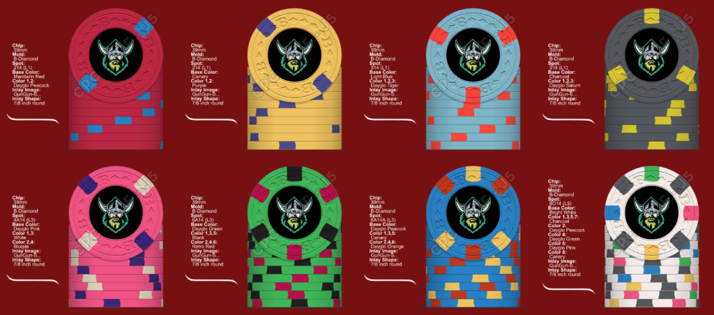
Issues with the 1/8 spots?
I like those edgespots when there are 8 and at least 2 colours, but I just can’t get behind the cost of them on a cpc chip, especially the ones with 1-4 spots and only one colours.
Cpc has so many better options at much lower spot levels.
Although I will say, a Viking theme would be very cool.
Cpc has so many better options at much lower spot levels.
Although I will say, a Viking theme would be very cool.
chipjoker
Flush
These are good so far. I do think you might want to try the 14 spots, get a little more color in these.. Vikings are a cool theme..
The base colors are pretty good, not sure about the yellow, that would be cool as DG Tiger.
The base colors are pretty good, not sure about the yellow, that would be cool as DG Tiger.
Forty4
Full House
I like where this is going but I too would suggest using a 1/4 spot when doing so few spots and just one color.
I like the Viking inlay too
I like the Viking inlay too
Rhodeman77
Straight Flush
I also prefer 1/4” spots over 1/8” spots. And if using 1/8” spots use the double 2 color versions.
Also if you haven’t seen actual chips with 1/8” spots scoure the pron for pics. You will see that the spots get broken, don’t go all the way from to top, rolling edge, to bottom.
Also if you haven’t seen actual chips with 1/8” spots scoure the pron for pics. You will see that the spots get broken, don’t go all the way from to top, rolling edge, to bottom.
Regarding the 5: I might be the outlying voice here, but I've never been a fan of chips with asymmetrical edge spots.
Other than that, the color combo on your first mockup for the yellow looks good.
Other than that, the color combo on your first mockup for the yellow looks good.
Psypher1000
Straight Flush
The chips where you have one of the spots filled with the same color as the base color - the T5 and one of the versions of the T10k - will not look good. They will still punch the extra spot & the clay will be filled with the base color - you will be able to tell that something was punched/refilled, and the result isn't a very good look. It looks more like a punching error on every chip rather than a cool effect, IMO.What do you guys think ?
Also, the single spot on the T5 is a huge waste of money. It will only be visible on 50% of the chips at any given time, so why have it at all? Either go with 2-3 spots, or none at all here.
I don't understand jumping from 1k-10k. *shrug*
The first mock is the superior of the two. The second mock has the 100 and 500 looking fairly similar, and the 10k as listed won't look good with those single offset 1/8" spots (see above).
Pablito
High Hand
Regarding the 5: I might be the outlying voice here, but I've never been a fan of chips with asymmetrical edge spots.
Other than that, the color combo on your first mockup for the yellow looks good.
I agree with this comment... It's like the chip comes up short... Unless you are specifically going for that whimsical look... Like this one

So few thoughts if we go a different route.
5 used for my work game 5/10kr
20 used for my friendly game 20/40kr
50 used for my 50/100kr game
100 used for my 100/200kr game
500
1.000
5.000
10.000
And if we use Berzerk Poker with a viking theme the B was only fitting.
PS my main table is red

5 used for my work game 5/10kr
20 used for my friendly game 20/40kr
50 used for my 50/100kr game
100 used for my 100/200kr game
500
1.000
5.000
10.000
And if we use Berzerk Poker with a viking theme the B was only fitting.
PS my main table is red
I'm with you 100% I can't tell if the people who flip over those famous vegas blue $1's are the majority or a vocal minority.Regarding the 5: I might be the outlying voice here, but I've never been a fan of chips with asymmetrical edge spots.
Other than that, the color combo on your first mockup for the yellow looks good.
crussader
Flush
Just thought I'd point out something that wasn't immediately obvious to me when I started playing with the tool designer. Your first two chips in the mockup (post #12) look like two different variations on the 214 spot. However they're exactly the same. You just have to flip one over and look at it from the opposite side.
Wow thanks did not think of that!Just thought I'd point out something that wasn't immediately obvious to me when I started playing with the tool designer. Your first two chips in the mockup (post #12) look like two different variations on the 214 spot. However they're exactly the same. You just have to flip one over and look at it from the opposite side.
Similar threads
- Replies
- 12
- Views
- 383
- Replies
- 28
- Views
- 962
- Replies
- 19
- Views
- 500
