

Hello good people of PCF!
I've had some ideas for another custom set for a while (my current ceramic tournament set). I wanted the set to still feel coherent with my current set, while doing a more traditional cash set design with progressing spots and more colors. The goal is to create something that feels distinctly Aurora Borealis & Norwegian, with strong colors, while still retaining a clean & elegant aesthetic. And of course, without becoming too busy or gimmicky, and not sacrificing good color combinations to necessarily "force" the theme across all areas.
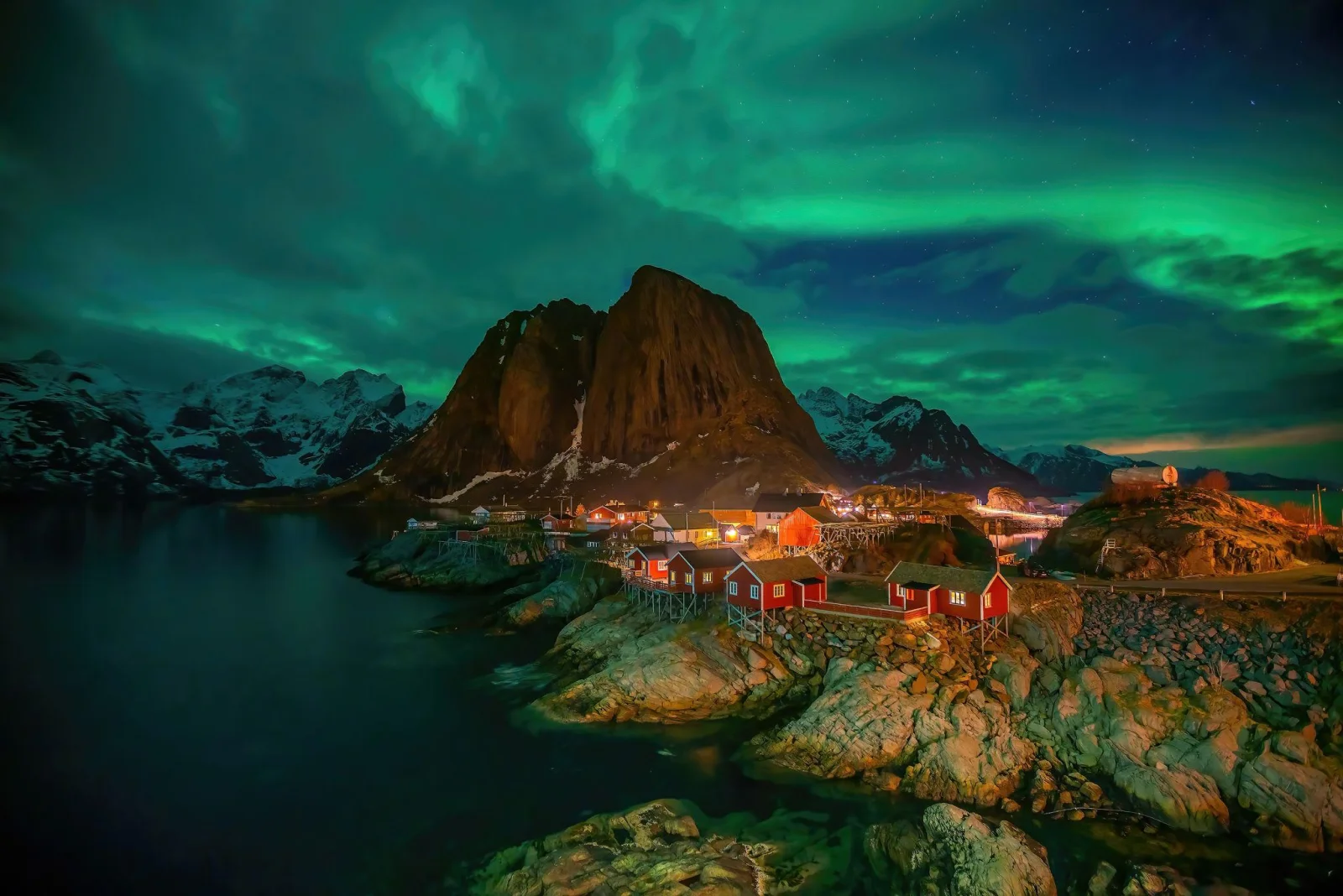
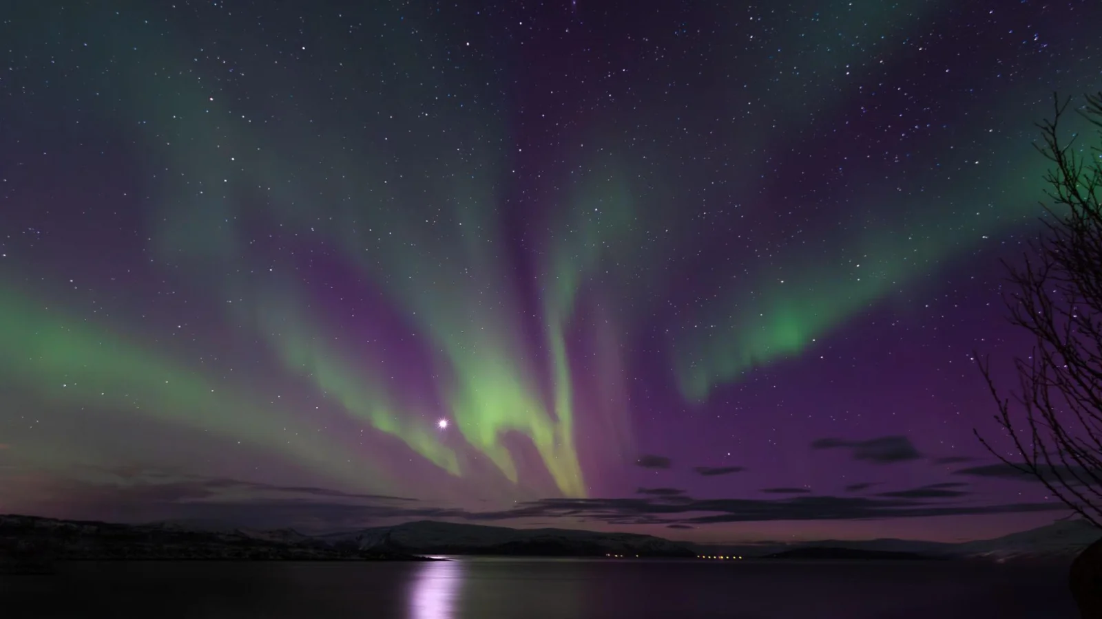
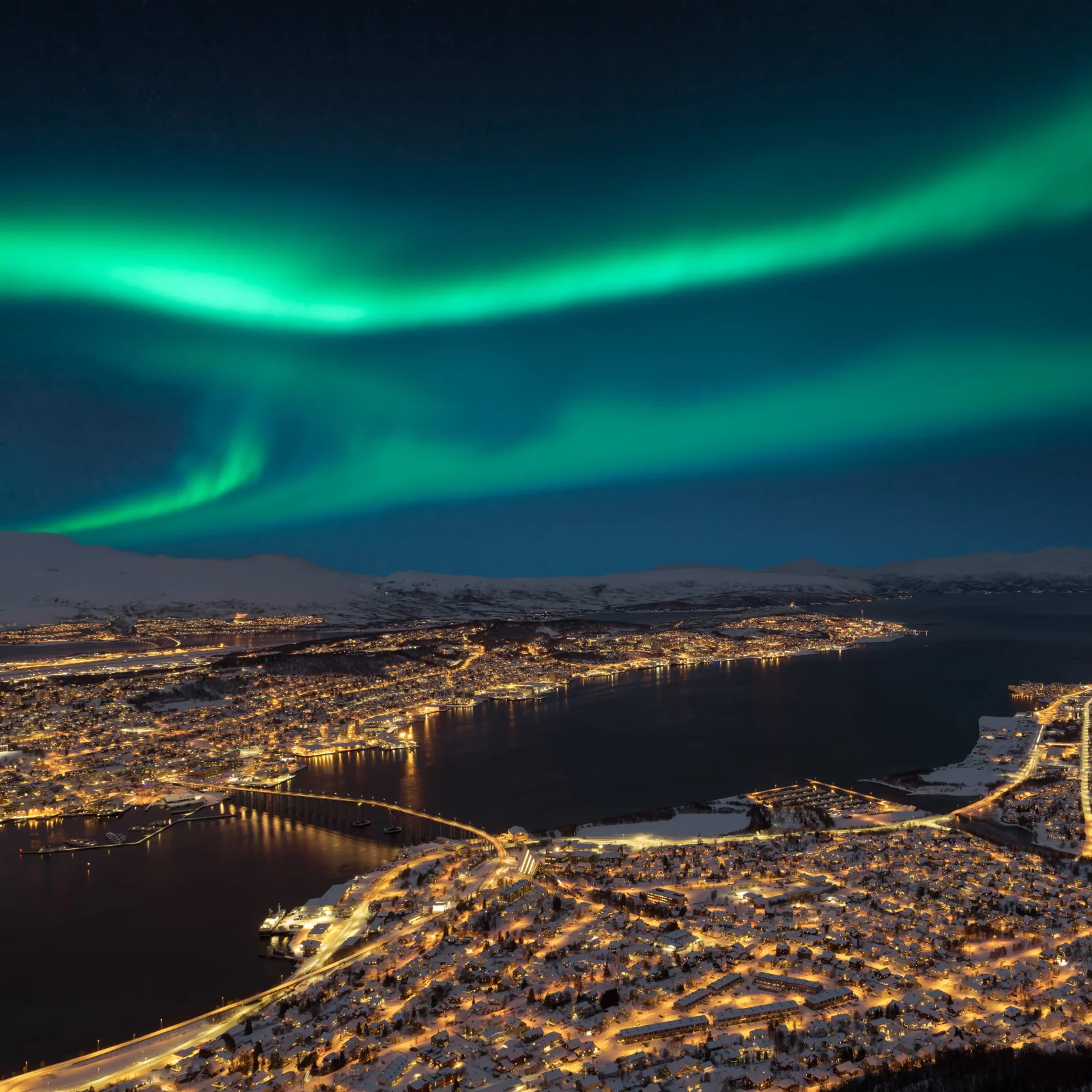
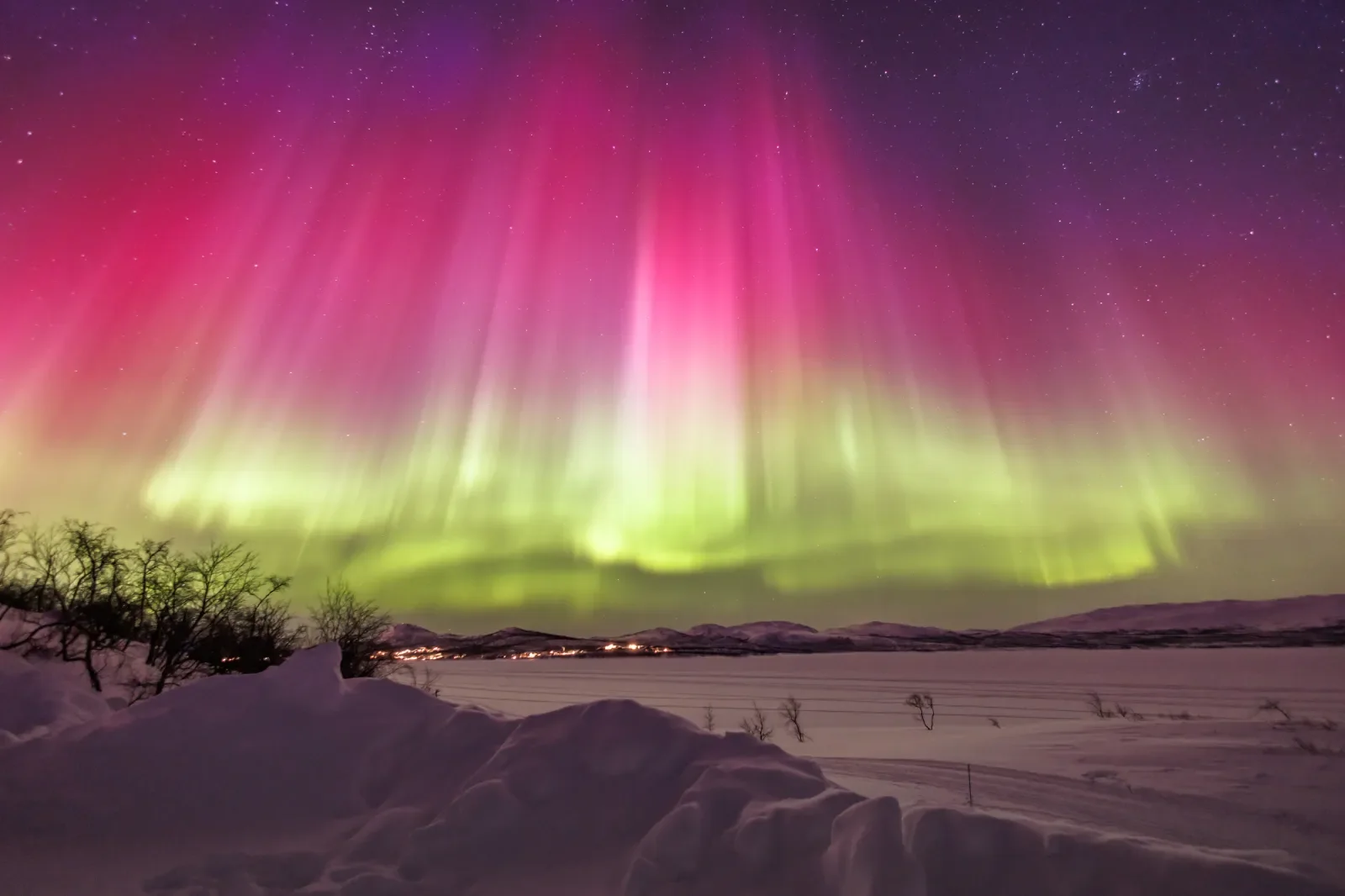
Setting: Northern Norway during winter with mixed color variations of Aurora Borealis dancing across the sky.
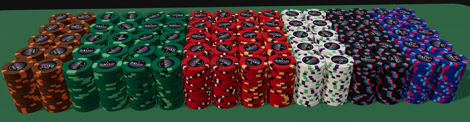
Progression with simpler spots and more monochromatic colors, gradually progressing into more advanced spots and more contrasting colors. The spots start out at larger, while gradually getting to the smaller spots.
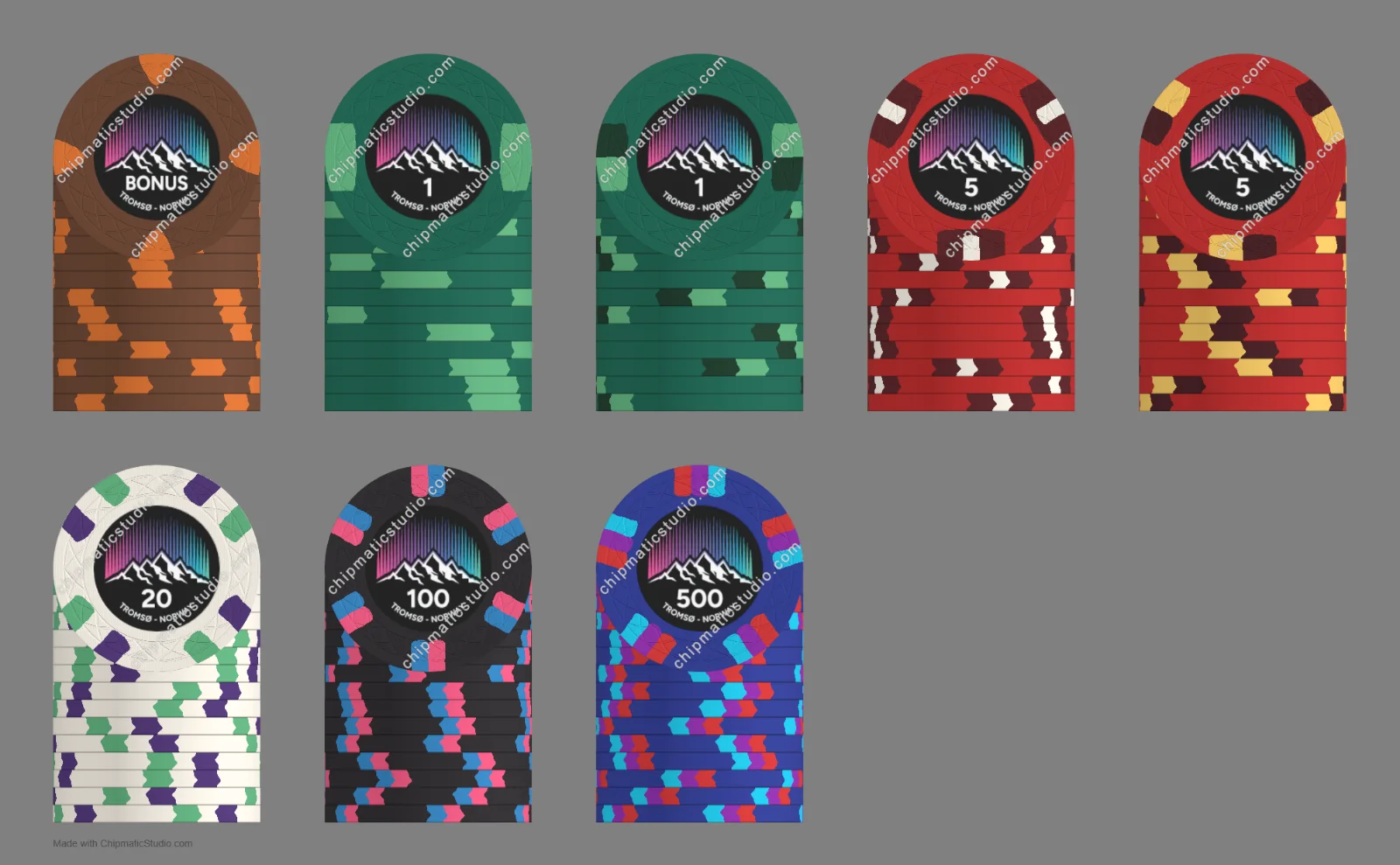
I have included two examples of the 1s and 5s.
Which do you prefer? Of course I very much would like feedback on the others as well =).
Spots - progression - colors - inlay - thoughts? Thanks!
Design images:
Some inspirational images:
Mold: Web.
I found the web visuals to be the most fitting tina mold with its interconnected pattern. It adds a nice visual detail without taking away from the central aspects of the design. It can resemble the pattern in the snow crystals or cracked ice.
Bonus chip - Mountains
The non-cash chip in the set, used for misc. like bounty, show ‘em etc. The brown base represents the mountains (we have plenty..), rock and earth, with the copper triangle spots highlighting the warm glow of the house lightning shining around.
1 chip – Green aurora
Green base with mint green spots. The green color is the main/most common color of the aurora borealis, so it felt natural that the lowest denomination chip would feature it, and the lighter green complements it perfectly, as the lights are often a range of colors.
5 chip – Red aurora & Coastal fisherman huts
The red base is inspired by the less common red aurora displays, as well as the hallmark classic red fisherman huts found across the coastal line. Dark burgundy & white spots reflect into the red-dark red aurora color progression, with the white as the contrasting snow & the hut window frame.
20 chip - Snow covered landscape
The bright white base represents the snow, ice and bright winter landscape in Northern Norway. The colorful mint green and purple spots represent the aurora dancing above the snow-covered landscape. It combines the winter and aurora elements and creates a bright visual break between the base and the high denomination chips in the set.
100 chip – Polar night
Black base points to the polar night, which in northern Norway last for about 2 months. The more vibrant colored pink and light blue spots showcasing a brighter and stronger display of aurora cutting through the dark night. I think the contrasting pink-blue colors fit very well along the black base, for the premium higher denomination chip. The spots also progress into a more advanced pattern.
500 chip – The arctic sky & rare blue aurora
The blue base represents the deep blue Arctic sky and an intense rare blue aurora display. The wider spectrum of colors in the spots represents a more powerful aurora storm where many colors appear at the sky at the same time, a fitting culmination for the highest denomination in the set as it acts as a climax of the visual progression: The entire arctic sky illuminated by the aurora.
I've had some ideas for another custom set for a while (my current ceramic tournament set). I wanted the set to still feel coherent with my current set, while doing a more traditional cash set design with progressing spots and more colors. The goal is to create something that feels distinctly Aurora Borealis & Norwegian, with strong colors, while still retaining a clean & elegant aesthetic. And of course, without becoming too busy or gimmicky, and not sacrificing good color combinations to necessarily "force" the theme across all areas.
Setting: Northern Norway during winter with mixed color variations of Aurora Borealis dancing across the sky.
Progression with simpler spots and more monochromatic colors, gradually progressing into more advanced spots and more contrasting colors. The spots start out at larger, while gradually getting to the smaller spots.
I have included two examples of the 1s and 5s.
Which do you prefer? Of course I very much would like feedback on the others as well =).
Spots - progression - colors - inlay - thoughts? Thanks!
Design images:
Some inspirational images:
Mold: Web.
I found the web visuals to be the most fitting tina mold with its interconnected pattern. It adds a nice visual detail without taking away from the central aspects of the design. It can resemble the pattern in the snow crystals or cracked ice.
Bonus chip - Mountains
The non-cash chip in the set, used for misc. like bounty, show ‘em etc. The brown base represents the mountains (we have plenty..), rock and earth, with the copper triangle spots highlighting the warm glow of the house lightning shining around.
1 chip – Green aurora
Green base with mint green spots. The green color is the main/most common color of the aurora borealis, so it felt natural that the lowest denomination chip would feature it, and the lighter green complements it perfectly, as the lights are often a range of colors.
5 chip – Red aurora & Coastal fisherman huts
The red base is inspired by the less common red aurora displays, as well as the hallmark classic red fisherman huts found across the coastal line. Dark burgundy & white spots reflect into the red-dark red aurora color progression, with the white as the contrasting snow & the hut window frame.
20 chip - Snow covered landscape
The bright white base represents the snow, ice and bright winter landscape in Northern Norway. The colorful mint green and purple spots represent the aurora dancing above the snow-covered landscape. It combines the winter and aurora elements and creates a bright visual break between the base and the high denomination chips in the set.
100 chip – Polar night
Black base points to the polar night, which in northern Norway last for about 2 months. The more vibrant colored pink and light blue spots showcasing a brighter and stronger display of aurora cutting through the dark night. I think the contrasting pink-blue colors fit very well along the black base, for the premium higher denomination chip. The spots also progress into a more advanced pattern.
500 chip – The arctic sky & rare blue aurora
The blue base represents the deep blue Arctic sky and an intense rare blue aurora display. The wider spectrum of colors in the spots represents a more powerful aurora storm where many colors appear at the sky at the same time, a fitting culmination for the highest denomination in the set as it acts as a climax of the visual progression: The entire arctic sky illuminated by the aurora.
Last edited:


