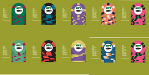
The larger spots on the T100 chip really look out of place to me..... everything else is 1/4" spots (even the complex T5000 spots 'look' like 1/4"). Also don't like the 3x 3x (non-) progression from T25 to T100. I think it would look a lot cleaner using 214 for the T25 and 314 for the hundo, followed up with your current 414 and 614 on the T500 and T1000. I do, however, really like the color combinations you have chosen (possible exception of the pink/green combo chip, which I think has been overdone in way too many sets already). I'd want something a lot more unique as my top-denom flagship chip.
For the inlay, I like the simpler look provided by the fish-less river..... but not sold yet on any of the offered B side artwork with denominations. If you like the mold look/feel, the H-mold would be a great choice. Circle-square would also work well as representing caviar...
")