Asgard Club (3 Viewers)

Joined
Aug 9, 2020
Messages
1,114
Reaction score
1,185
Rewards
55
Location
Pennsylvania
Hi everybody.
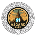
What are your thoughts on this design. For CPC or BR Pro poker? Input is always appreciated
 

Attachments

  • Untitled design_20250619_150723_0000.png
    Untitled design_20250619_150723_0000.png
    1,020.5 KB · Views: 120
  • $1_20250619_021352_0000.png
    $1_20250619_021352_0000.png
    325.9 KB · Views: 126
  • $1_20250619_021220_0000.png
    $1_20250619_021220_0000.png
    324 KB · Views: 108
  • $1_20250619_021016_0000.png
    $1_20250619_021016_0000.png
    319.1 KB · Views: 104
  • $1_20250619_021135_0000.png
    $1_20250619_021135_0000.png
    314.9 KB · Views: 116
IMO the art looks fine and could be neat, but don't think it works well with the denomination - just very much feels like a denomination placed over art vs the two being designed together cohesively.

You could always do the artwork on one side of the chip and the denom on the other, but ultimately everything is a matter of preference!
 
AI... AI is really good with colors - the design is also pretty cool. What if you moved the chip values to the side of the structure and instead of using that light blue to outline the numbers, use one of the darker colors in the design? You could add an "Est. 2025" or something to the other side if the asymmetry bothers you. I think it would be fine without it. I'd probably change the font of the denominations to match the font of the Asgard Club font or something that matches the feel of the design. And finally, (since I'm a matchy-matchy guy) you could also match the outer ring that is inside the black to the chip color.

P.S. I like Cratty's idea of the design on one side and the other side with the denomination. You could still use the design, just with a much larger number.
I put this set on the back burner but I may go a totally different direction with it with different characters from Asgard on each chip. Also, I am currently working on a Bioshock themed set
 
A different direction
 

Attachments

  • image_1751048991273~2.jpeg
    image_1751048991273~2.jpeg
    271.4 KB · Views: 62
  • copilot_image_1751047365378~2.jpeg
    copilot_image_1751047365378~2.jpeg
    179.2 KB · Views: 59
  • image_1751048490760~2.jpeg
    image_1751048490760~2.jpeg
    258.8 KB · Views: 68
  • copilot_image_1751048001191~2.jpeg
    copilot_image_1751048001191~2.jpeg
    227.6 KB · Views: 69
This direction looks better to my eyes. You should try to find a way to get the design to be more consistent from chip to chip though. The $25 chip has animals but the others have a wire flourish design, which is odd. I know you used AI so getting it to be the same across different chips will be near impossible. You’ll need to move this into photoshop or illustrator. Or maybe have BRPro just do it for you.
 
This direction looks better to my eyes. You should try to find a way to get the design to be more consistent from chip to chip though. The $25 chip has animals but the others have a wire flourish design, which is odd. I know you used AI so getting it to be the same across different chips will be near impossible. You’ll need to move this into photoshop or illustrator. Or maybe have BRPro just do it for you.
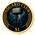
Yep still working on it. The one chip has Ravens because that's what Odin is associated with
 
Yes, love the Huginn and Muninn! But I really dislike the AI art. I believe this type of AI cartoon art will age badly. If it makes you happy, great! But my advice would be to use AI to come up with pleasing ideas, but then create/design them elsewhere.
 
Instead of opening another thread, I'll put this here. What does anyone think about these. Still in development. But once they're finished maybe a group by would be in order if we have enough people interested
 

Attachments

  • copilot_image_1751727340362.jpeg
    copilot_image_1751727340362.jpeg
    75.7 KB · Views: 54
  • copilot_image_1751755343562.jpeg
    copilot_image_1751755343562.jpeg
    146.3 KB · Views: 53
  • copilot_image_1751755606979.jpeg
    copilot_image_1751755606979.jpeg
    120.8 KB · Views: 50
  • copilot_image_1751755681363.jpeg
    copilot_image_1751755681363.jpeg
    114.7 KB · Views: 48
  • copilot_image_1751726341960.jpeg
    copilot_image_1751726341960.jpeg
    85 KB · Views: 55
  • copilot_image_1751726715282.jpeg
    copilot_image_1751726715282.jpeg
    82.4 KB · Views: 49
  • copilot_image_1751755268356.jpeg
    copilot_image_1751755268356.jpeg
    128.3 KB · Views: 52
  • copilot_image_1751755447022.jpeg
    copilot_image_1751755447022.jpeg
    141 KB · Views: 49
  • copilot_image_1751755511260.jpeg
    copilot_image_1751755511260.jpeg
    141.9 KB · Views: 48
  • copilot_image_1751756142852.jpeg
    copilot_image_1751756142852.jpeg
    147.9 KB · Views: 54
  • copilot_image_1751755010775.jpeg
    copilot_image_1751755010775.jpeg
    173.5 KB · Views: 54
  • copilot_image_1751755076816.jpeg
    copilot_image_1751755076816.jpeg
    161 KB · Views: 53

Create an account or login to comment

You must be a member in order to leave a comment

Create account

Create an account and join our community. It's easy!

Log in

Already have an account? Log in here.

Back
Top Bottom