A Few Examples of Inlay Designs (1 Viewer)

MoscowRadio

Flush
Joined
Jan 2, 2014
Messages
2,464
Reaction score
1,688
Location
Phoenix, AZ
Hey guys!

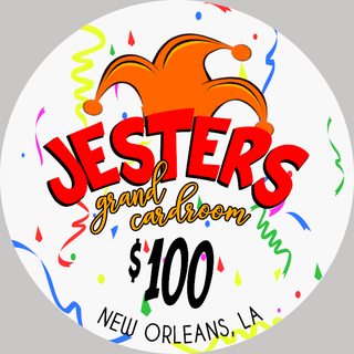
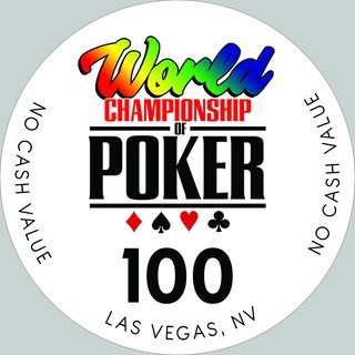
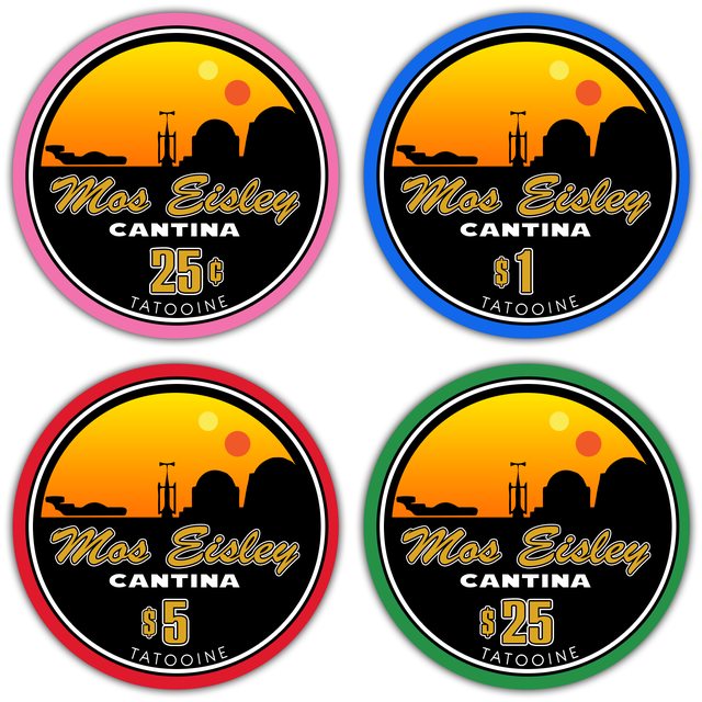
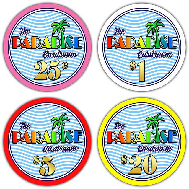
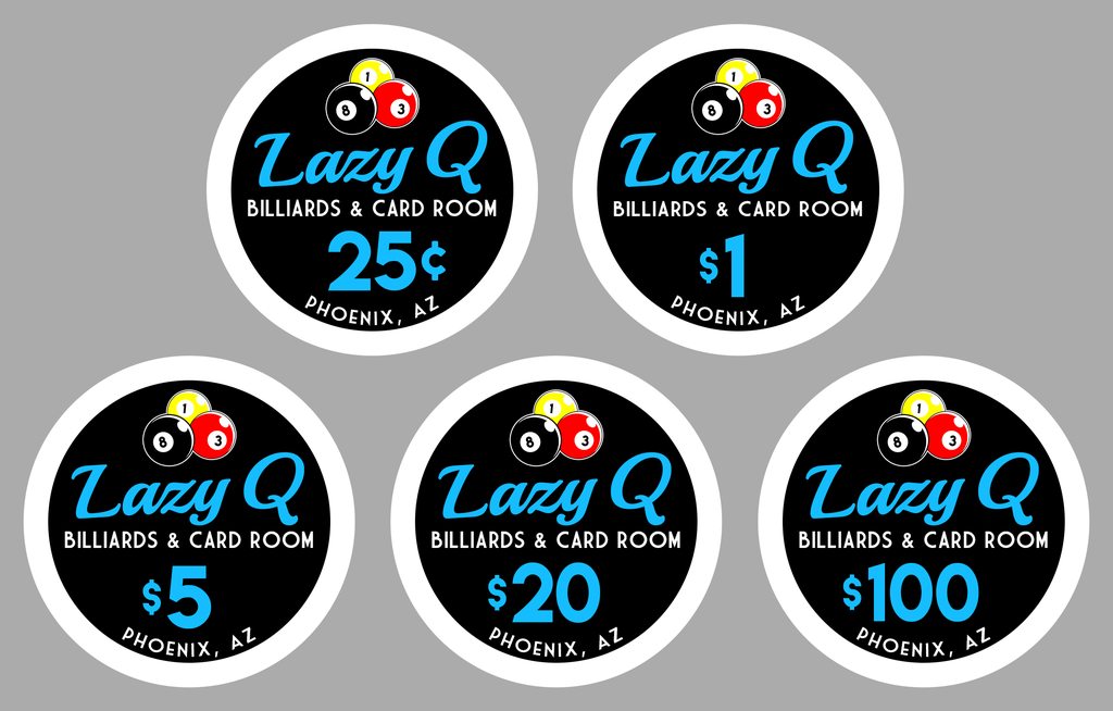
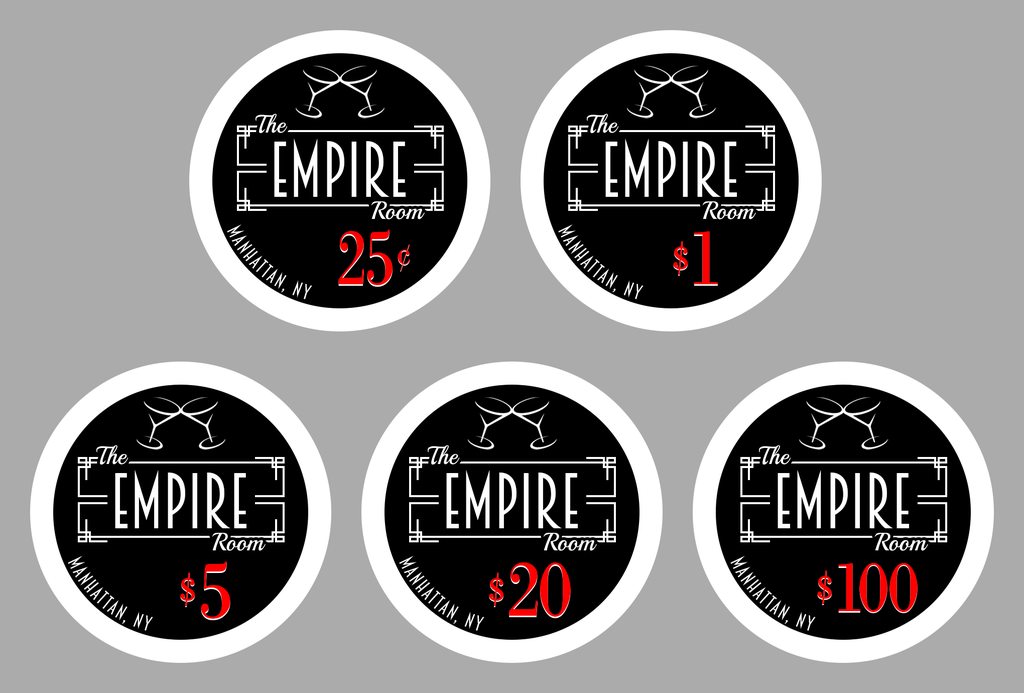
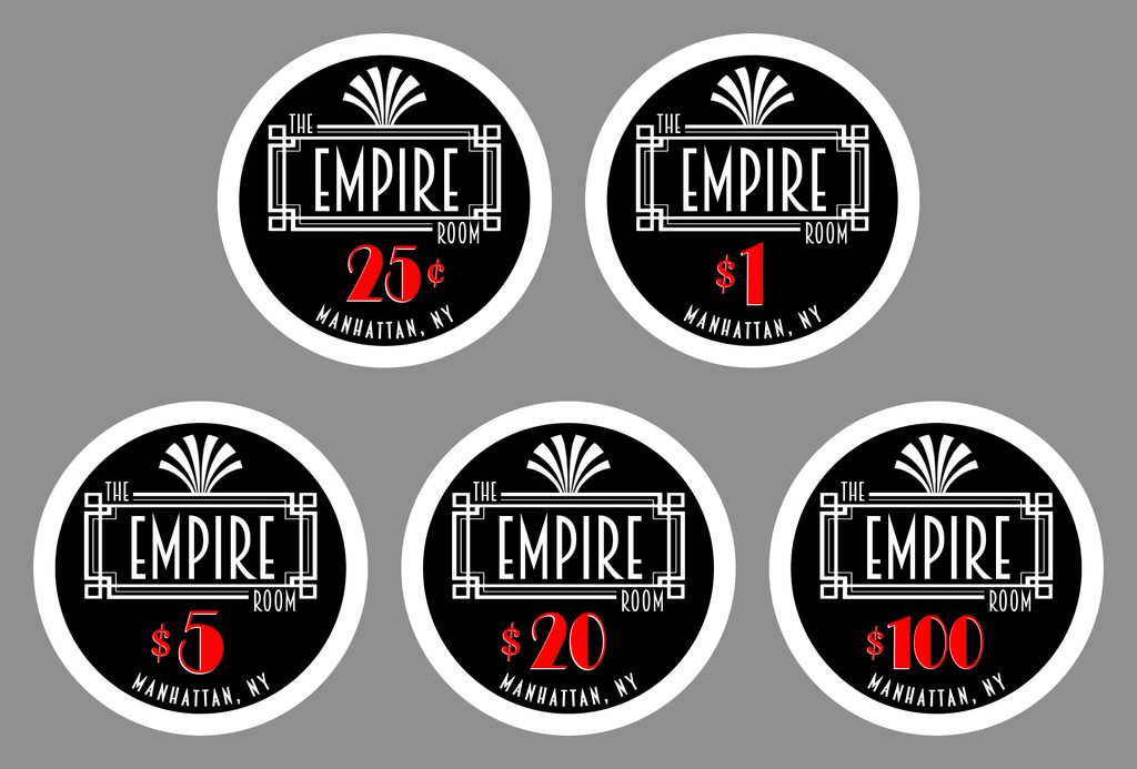
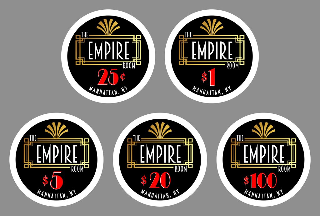
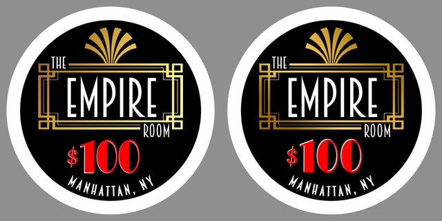
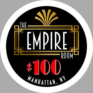
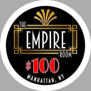
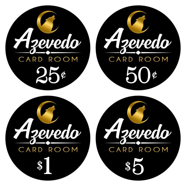
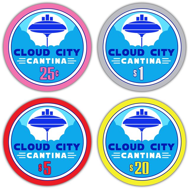
I wanted to post a few examples of some design work that I had done. I am trying to provide services for those looking to have custom chips made.

I will regularly update this thread with more renders as they come along, but here are a few of my favorites. Not all of them made the cut, but they're the ones that I really seemed to love. If you happen to have any questions about design work, please don't hesitate to shoot me a PM!

Thanks everyone!
-James
 
BXwewGkm.png
YXiZkpom.png

AnH9RmAm.png
7EaETz6m.jpg
 
Last edited:
The "Jesters" design was something that I started early on. I thought that it would be a good idea to try and emulate different types of inlays in order to practice. I certainly wouldn't try to pass it off as my own idea, and many of you, like me, love the 'Funsters' chips. I think that, up until this point, it has been my favorite design to work on. I've found out that I'm a really big fan of Mardi Gras-themes!
 
Here's one that I showed somewhere else, and it's not anything too complex by any means, but I really loved designing it. It gave me a chance to create my own sort of brushed gold pattern, which is hardly visible, but can sort of be seen in the design. :ROFL: :ROFLMAO:

I wanted to recreate the Aria Super High Roller Bowl design, but apply it to a heads-up tournament that was taking place here in Phoenix in a suburb called Arcadia. The guy who is running it wanted a design to put on a plaque on a trophy, so I pitched him this idea. Hopefully I can get him to send me a photo of the trophy once it's finished.

iC3O5Kjl.png
 
I haven't updated this thread lately, and I have been working on some inlay designs, so I just wanted to post a set that was just finished. A member contacted me with a couple of ideas and wanted to follow a 'Majestics' theme. I believe these will be going on the 39mm Majestic blanks. It's a simple and straightforward design and the person I worked with was an absolute pleasure!

3gpRmSCl.png
 
After doing the Cloud City mock-ups, I couldn't help but make a Mos Eisley set.

PM0R6tKl.png

This is my favorite. Probably because it reminds me of my sunsets lol. Not a fan of the cloud 9 mock ups. I don't want to say that it looks "cheap". For some reason that is the first thing that comes to my mind. Paradise looks like it could be fun!
 
This is my favorite. Probably because it reminds me of my sunsets lol. Not a fan of the cloud 9 mock ups. I don't want to say that it looks "cheap". For some reason that is the first thing that comes to my mind. Paradise looks like it could be fun!

Truthfully, I just want to get out of the habit of making very “normal” designs. Drawing digitally is pretty new to me, but I’ve loved graphic design for a while now. I’m just trying to expand my horizons a bit.
 
Back to normal inlays! I've been trying to put this one together for a while now. Lazy-Q was the name of a pool hall where I was first exposed to hustling, pool sharks, drunken brawls, and underground poker. At 19 and 20, I never had the gumption to sit at one of the card tables, but I would go play pool there before my shift as my work was right across the street. There were a lot of shenanigans to be seen for sure. I've also always thought that it was interesting that so many underground games take place in pool halls, and have for quite some time.

I'm pretty happy with the way this design came out, and I hope you all like it! As always, I'm very open to any thoughts you have!

3ezgGHoh.png
 
First of all, I am a big fan of your esthetic across the board.

For some reason, those Paradise designs really, really did it for me. I love the idea of a super busy ceramic with brilliant colors and contrast.

Additionally, the Lazy Q inlays are tight. One critique I'd offer: if you do iterate a little and put them into, say, pokerchipdesigntool.com you would potentially find an opportunity to tweak the denomination text to match the base color of the chip. Other than that, there's something about the bold border on the inlay that really makes them sing.

Great work overall. Keep posting.

Thank you very much for the kind words! I really appreciate it!

With the Lazy-Q design, I didn’t really want to do any color-matching because I wanted the design to be more on the retro side, but color-matching denoms is always a good idea. I just wanted them to stay as minimal as possible, but I think a lot of that has to do with what I knew about the place. They weren’t big into spending money there. In fact, I’m almost certain that they were using dice chips for their games. Also, I absolutely love that shade of blue against a black background.

Again, I really appreciate your input! I’m hopeful that people will be able to look at these designs and trust that I can make a design that they will really enjoy.
 
Oh! Speaking of color-matching, I was thinking that I could use different pool balls on the Lazy Q inlays to do that! So, for a blue chip with yellow edge spots I could use the 2 ball (blue) and the 1 ball (yellow). That might be a nice, subtle way to do some color-matching!
 
Oh! Speaking of color-matching, I was thinking that I could use different pool balls on the Lazy Q inlays to do that! So, for a blue chip with yellow edge spots I could use the 2 ball (blue) and the 1 ball (yellow). That might be a nice, subtle way to do some color-matching!
And what about in some cases that there are multi-colour edgespots? And for the 4 & 7 balls, do you use pink and light choco, or purple/blurple and maroon, or it depends on chip colour?
 
And what about in some cases that there are multi-colour edgespots? And for the 4 & 7 balls, do you use pink and light choco, or purple/blurple and maroon, or it depends on chip colour?

Firstly, the 8 ball wouldn’t need to be present on all of the inlays. There were multiple colors used then and I could add another ball or just match one to the base of the chip and two spots. Honestly, it would be completely up to the client and whatever they liked best.
 
Here's another design that I've had in mind for a few days. I wanted to do something that felt like it belonged in a 1920's New York Speakeasy, and this is where I landed. I really love hearing from you guys about these designs and what you like and don't like about them. Everything up to this point, except for the Azevedo labels, have been essentially generic designs to see what I'm able to come up with. I hope you enjoy.

VukHdVfh.png
 
I was hoping that the newest “Empire” designs would be more well-received, but I’m second-guessing the offset denomination and location. I’m not sure how to make it better other than centering those two things.

Also, I think these inlays would look really cool on the DIASQ mold!
 
I like them, I'd space manhattan off the edge of the black a little more and something about the martini glasses looks strange because they are touching
 
I was hoping that the newest “Empire” designs would be more well-received, but I’m second-guessing the offset denomination and location. I’m not sure how to make it better other than centering those two things.

Also, I think these inlays would look really cool on the DIASQ mold!

Hi James,

For my taste it doesn't feel like there's a reason for an off center denom. The fonts could also hint more at art deco, which the word "Empire" already establishes well.

The martini glasses might get a bit lost among the equally thick logo lines. I do like the idea, but not sure if black-and-white as it is achieves the oeuvre of a smoky speakeasy. Keep at it!
 
I like them, I'd space manhattan off the edge of the black a little more and something about the martini glasses looks strange because they are touching
Hi James,

For my taste it doesn't feel like there's a reason for an off center denom. The fonts could also hint more at art deco, which the word "Empire" already establishes well.

The martini glasses might get a bit lost among the equally thick logo lines. I do like the idea, but not sure if black-and-white as it is achieves the oeuvre of a smoky speakeasy. Keep at it!

Thank you so much for the feedback, guys! I was really excited about the two martini glasses “clinking” together, but maybe they could be spaced apart a bit. For some reason just having one didn’t look so hot to me. I’ll play around with the design a bit. I think I was really happiest with the border I made around the word, “Empire”, and I was hoping more people would like that.
 
I think the border should be based of squares in the corner rather than rectangles. I don't think I've ever seen that style of corner be lopsided like that.

off center denom is fine for me, I don't dislike it but if you want it in the middle you could just shift the location text.
 
Okay! So I took the advice that I was given by @Amish Rabbi and @mrplacey and switched things up a bit. Firstly, I remade the border with squares in the corners. I also replaced the martini glasses with a more Art Deco design. I also tried to keep all of the fonts in the Deco style as well. I also centered the denominations and location. Finally, I shaved down the white border just a hair. I decided to make two different mock-ups: one with a white border and one with a gold border. I also think that this might be a good area to do some color-matching to the chip bases!

Please let me know what you guys think! All of this is still a work-in-progress, but I'd like to be able to make designs for the folks around here!

CtTBKRbh.png

lyoh3Mch.png
 
can you do the gold as a center gradient? looks slightly off with one side of the chip darker than the other

Denom change to art deco style is excellent but I would do the drop shadow "south east" as it looks a bit more natural to me. I might also do a full white border to the numbers.

100 denom numbers seem slightly squished together

Gear has said the white borders may be off center so a thinner white border with colour match around that would be the most consistent design print wise.

How's this look to you? I didn't change the white border at all, but I spaced out the denomination a bit and tweaked the gradient in the border.

oxalZUIl.png
 
how does a thin ("hairline") white outline look on the numbers? with the type of colour blindness I have red on straight black is very hard to read and it's ok on these renders but when it's on a chip it and not perfect light then I would have issues.

It might screw the look though so it could also be a bad idea lol.

I actually did start a mock-up with a thin, white outline around the denom after you had mentioned it. I don't think it looks bad, but I'm also not sure about it yet.

7MOSKJhm.png
 

Create an account or login to comment

You must be a member in order to leave a comment

Create account

Create an account and join our community. It's easy!

Log in

Already have an account? Log in here.

Back
Top Bottom