Another CPC Cash Set Design Critique Request (2 Viewers)

lovetowel

Sitting Out
Joined
Apr 6, 2024
Messages
14
Reaction score
17
Rewards
113
Location
Denver
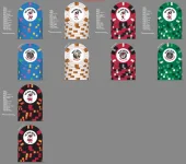
Prior thread here: https://www.pokerchipforum.com/thre...c-is-taking-orders-again.144817/#post-2929285 Got advice to go with white labels (or at least not fully grey labels), and to work a bit more on the design. Here is the result after tinkering. Feeling pretty good about it, but I said that about the last one and you all pointed out some good areas for improvement.

Constructive critique or roasting appreciated.
 

Attachments

  • White Label.webp
    White Label.webp
    146.3 KB · Views: 71
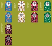
So first things first I would set the background to light gray or the table color if it exists.

I love the 5 and 25 combo, they speak to each other and have a great harmony.

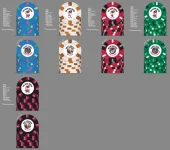
I feel like the 1 and 100 talk together but the .25 looks out of place. Just to give you some thoughts if we don’t mind having all the chips with high spot levels. Here is food for thought
1784510700806.webp


But in the end all that matters is that you like them and there is no possibility for dirty stacks. I would highly recommend to get color samples and if needed people here can also photo graph some combos for you using their color sets.
 
I see the vision of having them play off each other, especially the 25c/$5 and $1/$25.

I think for me personally they are a bit too busy, but take that with a grain of salt as I'm partial to simple designs. I like your new inlays a lot more though!
 
agree that the complexity of the quarter is jarring next to the simplicity of the 1
 
So first things first I would set the background to light gray or the table color if it exists.

I love the 5 and 25 combo, they speak to each other and have a great harmony.

I feel like the 1 and 100 talk together but the .25 looks out of place. Just to give you some thoughts if we don’t mind having all the chips with high spot levels. Here is food for thought View attachment 1704589


But in the end all that matters is that you like them and there is no possibility for dirty stacks. I would highly recommend to get color samples and if needed people here can also photo graph some combos for you using their color sets.
Thanks for the thoughts. I had never thought to change the background. My table is grey speedcloth so its good to see the chips with that background.

I do have a full sample color set in hand. I had originally had regular red for the $5 chip until I compared a rounders chip (that says is regular red) with the red color sample and got too worried about color variability. That design you put up is similar to another version I had floating around:
 

Attachments

  • white v2.webp
    white v2.webp
    141.9 KB · Views: 24
Thanks for the thoughts. I had never thought to change the background. My table is grey speedcloth so its good to see the chips with that background.

I do have a full sample color set in hand. I had originally had regular red for the $5 chip until I compared a rounders chip (that says is regular red) with the red color sample and got too worried about color variability. That design you put up is similar to another version I had floating around:
I like this version! The 0.25 reminds me of a ferris wheel like the fun ride starts here. The only thing I would worry is using black and red in both the 5 and 100.
 

Create an account or login to comment

You must be a member in order to leave a comment

Create account

Create an account and join our community. It's easy!

Log in

Already have an account? Log in here.

Back
Top Bottom