
Cash Set CPC/MSK - First Stab (1 Viewer)

DJ Mack

Flush
Joined
May 20, 2016
Messages
1,539
Reaction score
1,479
Rewards
0
Location
United States
As I've alluded to on a few other threads I'm about to embark on building a cash set. Originally I was commissioned by my sister in law to come up with some ideas and handle the ordering process, but that's now on indefinite hold due to some, ah, disagreements among the gals in her group. Not game related mind you but it sounds like they may not be playing together for some time.

Anyway, rather than scrap the bit of time I'd already put in I decided to commandeer the design for my own cash set. Since I very rarely play cash games in the home environment I have to admit being a bit of a rookie on the logistics, so many thanks to @jbutler who helped me think through quantities and denominations. On his advice I am going to be ordering $0.25 and $5.00. There is a very slim possibility of going to $1/$2 down the road but to avoid color matching issues and allow me to buy a proper quantity as a single batch I am going to forgo ordering any $1s right now. I'll probably place a large order for them early next year.

Thinking ahead I will also want some $20s and since I've been itching to buy MSK plaques this seems like a good opportunity to do so.

In terms of chips, here's where I am right now. Feedback definitely welcome on everything. As far as the chips go there's two issues I'd like input on:

1. Color for the fracs. Orange would probably be my first choice but given the closeness to the mandarin red I'm leery about having similar colors on the table at the same time. Yes, the $5 has edge spots but at the end of a long night they might look similar in stacks depending on how they are turned. Likewise I really like the light chocolate but is that too close to red - anyone colorblind and care to comment? I mocked up light blue and blurple as well.

2. Shadow or no shadow for the denomination text?
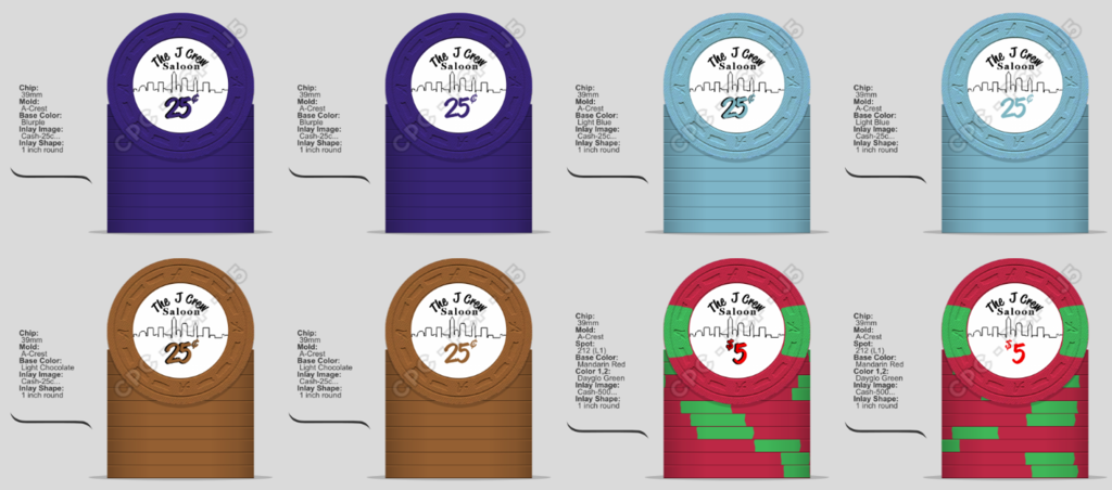
Cash-Montage.png


Now on to the plaques. Burgundy red speed cloth is what I've got for playing surfaces, hence its incorporation into the bottom part of the design. The base would be the standard MSK mother of pearl. I'm leaning heavily to the rounded corner 82x57 format. My wife likes chevrons so I'm on the fence about including some light gray ones randomly in the background on the top for some texture.

Plaque.png


Thanks for looking!
 
Last edited:
Still have to respond to your last PM! Definitely a decision to be made re: excluding $1s, but if you're certain you're never playing NL/PL and you're set on the stakes, I can certainly see the rationale. Plus if you decide to order $1s in the future, you can order them all at once and have zero risk that they won't match 100% with the denomination.
 
Yeah it's a matter of budget. I want to make sure I have enough chips to accommodate 10 players easily, more with a little squeezing. That gives me a breakdown of 800/400 ($0.25 / $5.00) and at current CPC pricing is about $1,500. To properly include $1s I should probably order 800 which would put my total at $2,700, simply unworkable right now. I don't foresee cash NL/PL in the next six months, and guys aren't buying in for much more than $20 a night, which kind of limits us to 25 centers. Occasionally someone will do a rebuy and we do special pots like bounty (n/a for cash) and best hand, but it's a rare day that anybody is in for more than $40.
 
One other thing - does anybody else do a best hand of the night pool? The new MSK jetons look slick so I'm thinking about designing a Best Hand button on one of their larger jetons. I obviously don't need a ton of them so I'd need a pretty strong GB interest to proceed with it.
 
Haven't generated much interest on this set but that's OK, time marches on :cool: The chips have been ordered so the colors and spots are set. I'd like an opinion on one thing though. I'm still working the inlays. My normal theme has been to do the denomination in the color of the chip. That works well except for the $1 which is a white chip. I'd rather not do a white denom because then I'd have to drop the shadow and there would be no color on the inlay at all. It would look very out of place.

My wife really liked the blurple chip and inlay for the frac but I went with the light chocolate, however I did mock up a blurple denom on the $1. Now I'm stuck. There's times I think it's awesome. There's times I hate it. If I get rid of it, what other colors should be in consideration? Red would be one option since that's the spot color but I'm already using red on the $5 denom so it's out.

CashSet.png
 
Well DJ, here is my 2 cents,

I like the Blurple for a chip color more then the brown, but get what you like..
I Like to have the denom match edge spots more then the chip it self, So Brown or black for the .25, red for the 1, and green for the 5... OR ALL denoms Red.

Again my 2 cents.
 
Really like your inlays. Normally not sold on brown chips, but yours looks very nice. Here's my shot. I initially tried light blue, because that's what you had as a possible frac, but the DG Katey Perry looks much better.

image.png
 
I like the Blurple for a chip color more then the brown, but get what you like..
In general I agree, but I settled on the lt. choc for strategic reasons. If I ever decide my game needs $2 chips, the blurple is rather close to the two blues I would choose from. Not that the 25 cent and $2 chips would see play at the same time but that's a lot of similarly colored chips in the racks.
I Like to have the denom match edge spots more then the chip it self, So Brown or black for the .25, red for the 1, and green for the 5... OR ALL denoms Red
Now that's something I hadn't considered. Great idea. I'll remock and post an updated image here, hopefully tonight. Thanks!
Shoot, now if only I had been around when that GB was in play I could have saved myself some grief and picked up a nice plaque. Oh well, I've got some offline interest in my jeton so I'll probably be ordering anyhow. I sent a draft to MSK yesterday but they're closed til Monday for the summer holiday. Eui didn't turn up at the Rumble in the Rockies did she? ;)
 
Thanks everyone for the feedback today. I had a back and forth with David and was able to change the edge spots on the $1. He also suggested bumping up the resolution a bit to ensure that the shadowed denominations rendered crisply so I redid them. Here's the final set. Since my sister in law inspired this project but didn't go through with it I'm having snappers made up - they'll never see play in my games, but she loves those chips in general. Consider it my gift of thanks and encouragement for her to pull the trigger on her own project...

Cash-Montage.png


As mentioned I am also doing an MSK plaque for $20 and a High Hand button. Attached are the near final mockups of those. I'll be offering an at cost group buy on these two items for anyone interested. Once I have the proofs back from MSK and preliminary shipping costs I'll start a separate thread on those for the GB. The $20 plaque is the 82x57 mm rounded and the High Hand jeton is the 51mm (~2 inch)

Plaque.png
HighHand.png
 
Thanks everyone for the feedback today. I had a back and forth with David and was able to change the edge spots on the $1. He also suggested bumping up the resolution a bit to ensure that the shadowed denominations rendered crisply so I redid them. Here's the final set. Since my sister in law inspired this project but didn't go through with it I'm having snappers made up - they'll never see play in my games, but she loves those chips in general. Consider it my gift of thanks and encouragement for her to pull the trigger on her own project...

View attachment 51353

As mentioned I am also doing an MSK plaque for $20 and a High Hand button. Attached are the near final mockups of those. I'll be offering an at cost group buy on these two items for anyone interested. Once I have the proofs back from MSK and preliminary shipping costs I'll start a separate thread on those for the GB. The $20 plaque is the 82x57 mm rounded and the High Hand jeton is the 51mm (~2 inch)

View attachment 51354 View attachment 51355

Apologies for being late to the party with this suggestion, but did you consider using 7/8" inlays? That's a lot of white space on the design and it seems like if you tighten up the space it might look a bit better. Just a thought!

Either way, really glad to see the progress here. Always love seeing someone going all in for the set and breakdown that they know is right for their game.
 
Apologies for being late to the party with this suggestion, but did you consider using 7/8" inlays? That's a lot of white space on the design and it seems like if you tighten up the space it might look a bit better. Just a thought!
Still kind of up in the air. The issue I've got is trying to capture the skyline. To do it justice I really need as much width as I can get. It's amazing what different 1/8" will make. If I go that route I have to knock all the text down by 2-4 points or come away with a really squished look. The whitespace is one reason why I'm shadowing the denoms even though I'm not usually a big fan of shadowed text. I've got another week or two to keep changing my mind, assuming I don't lose it. :)

This is a pretty awesome micro stakes chip count. Nice work!
Thanks ... Many thanks go to @jbutler. My group doesn't play a ton of cash games; it's almost always tourney and there's interesting dynamics in terms of how much money folks are willing to bring in. He helped me through several scenarios since I'm really a fish out of water trying to get the counts right. Ideally I would have bought 800 $1s to allow for the game to grow but 500 is what I can do for now. If we have to play with it we can. I can always order 300+ $1s later as it will be above the CPC minimum. There's a chance of a slight color mismatch but I'll deal with that if and when it happens.
 
Last edited:
Still kind of up in the air. The issue I've got is trying to capture the skyline. To do it justice I really need as much width as I can get. It's amazing what different 1/8" will make. If I go that route I have to knock all the text down by 2-4 points or come away with a really squished look. The whitespace is one reason why I'm shadowing the denoms even though I'm not usually a big fan of shadowed text. I've got another week or two to keep changing my mind, assuming I don't lose it. :)


Thanks ... Many thanks go to @jbutler. My group doesn't play a ton of cash games; it's almost always tourney and there's interesting dynamics in terms of how much money folks are willing to bring in. He helped me through several scenarios since I'm really a fish out of water trying to get the counts right. Ideally I would have bought 800 $1s to allow for the game to grow but 500 is what I can do for now. If we have to play with it we can. I can always order 300+ $1s later as it will be above the CPC minimum. There's a chance of a slight color mismatch but I'll deal with that if and when it happens.

You will probably be able to get by with 500 1s unless you start playing 4/8 limit. Even then, bump it to 5/10 and get more 5s! :)
 
New to this thread, but I'll toss a few pennies of thoughts out there. Use or discard these tidbits as you wish...

  • Mixing a Sans Serif font and a serif font on the same chip looks random. All serif or all sans serif.
  • If the skyline is hard to see, try adding some shading. It would also break up all the white.
  • Fine lines can get obscured on the MSK plaque mother of pearl. That speed-cloth design may be unrecognizable as the pearl image bleeds through.
 
  • Mixing a Sans Serif font and a serif font on the same chip looks random. All serif or all sans serif.
  • If the skyline is hard to see, try adding some shading. It would also break up all the white.
  • Fine lines can get obscured on the MSK plaque mother of pearl. That speed-cloth design may be unrecognizable as the pearl image bleeds through.
Thanks. I'm stuck with the lettering of The J Crew because it matches a sign we have hanging in our dining room but I don't want to use that font on everything else. I'm contemplating switching "Saloon" to Verdana though. Shading the skyline is out because it's based on a simple line drawing that a relative did and won a contest for. His was actually white lines on a black background but David cautioned me away from that because there may be uncontrollable line bleed.

As far as the MSK goes it's not critical that the speedcloth render perfectly, though I did make it bigger than it was in my earlier drafts. Your point is well taken though so I'm going to increase the skyline thickness here for sure.
 
Imagine my surprise as I finish my lunch waiting for a conference call to begin and I see the UPS man pull up and struggle with a heavy but only medium-sized box. Further imagine my surprise when he rings the doorbell and doesn't walk away - he needs a signature. He hands me the box and says your gold bars have arrived. Woof, he's not kidding - 38 pounds! Somehow in the hubbub of the last two weeks I missed the shipping notification.

I rip the box open and yep, it's my cash set! A quick pose ... more to come later. All my workspaces are filled with Horseshoe Cleveland chips and will be for some time. As my wife would say, what a first world problem to have. The colder weather couldn't get here at a better time!

As a bonus I now have 18 cardboard chip boxes to handle the HC overflow.

4Small.jpg
 
Alright, alright so it was tough to get through my afternoon meetings. 3:30 couldn't get here soon enough. Everything's unboxed. Going to be racked and caged for oiling another day but here's four with a little oil to whet the appetite:

Oiled.jpg

I think I'm ready to handle whatever walks through the door. For now:
Rows.jpg


Mmmmm...Chocolate.....
Choc.jpg


All in!
Splash.jpg
 
Well done sir. I like this set. I love the progression from the quarter to the five.
 

Create an account or login to comment

You must be a member in order to leave a comment

Create account

Create an account and join our community. It's easy!

Log in

Already have an account? Log in here.

Back
Top Bottom