-
PCF is an eBay Partner. If you make a purchase through one of our links, we may earn a commission at no extra cost to you. Thank you for your support!
You are using an out of date browser. It may not display this or other websites correctly.
You should upgrade or use an alternative browser.
You should upgrade or use an alternative browser.
Micro Stakes Cash set. (Aria/Royal inspired) Thoughts/Suggestions? (2 Viewers)
- Thread starter carza
- Start date
- Joined
- Dec 29, 2017
- Messages
- 25,940
- Reaction score
- 35,091
- Rewards
- 0
- Location
- Burnaby (Greater Vancouver), BC
carza
Sitting Out
I have a sample set of the Apache Empires, which I believe are the same thing and I believe Apache sources their Ceramics from the same company Tina supplies through. I like how those feel/handle.
As far as the inlay, one of the first youtube videos I watched about Poker tournaments/hosting/chips had the 43mm Royals from Apache, so I guess I really liked the black inlay from the get go. And I've never handled anything else.
So far my only hands on knowledge include a cheap set up the Eclipse Plastics I use for everything right now,

And then I have a sample set of the Royals, Empires (Apache) and a sample set of the King of the River ceramics from BRPro.
As far as the inlay, one of the first youtube videos I watched about Poker tournaments/hosting/chips had the 43mm Royals from Apache, so I guess I really liked the black inlay from the get go. And I've never handled anything else.
So far my only hands on knowledge include a cheap set up the Eclipse Plastics I use for everything right now,
And then I have a sample set of the Royals, Empires (Apache) and a sample set of the King of the River ceramics from BRPro.
SeanGecko
4 of a Kind
Black center art is a good look.
You can also try other options
carza
Sitting Out
@SeanGecko those are awesome! Is that a template or full custom? I love the 43mm
SeanGecko
4 of a Kind
Full custom made by @timinater@SeanGecko those are awesome! Is that a template or full custom? I love the 43mm
Sometimes less in more when it comes to center art. It is also an outstanding joke about the chips.
"How much is this worth?"
"It is on the chip"
"ohhhh"
The amount of times we had to say this after giving the chips out to new people would surprise you.
improviseallday
Flush
I like your inlay, simple and elegant, good contrast. Like that the denom draws attention. Like the vibrant base colors that you've picked. Like your 25c in particular.
A few nitpicks:
- The $1 chip doesn't match the other chips. It's not as vibrant. It's a commonly used chip for most microstakes so I'd go more colorful.
- The $20 barrel will be more spot than yellow. Not my cup of tea but maybe you'll like it, just worth considering.
- Kerning. For "CARSON", the R and S look close, while the O and N look distant.
- "Kerning". The dollar sign for the 1 looks closer than the 5 and 20. The cent sign for the 5 looks closer than the 25.
Last edited:
carza
Sitting Out
Are they ceramics or something else? Or custom designed by @timinater and ordered from Tina or similar?Full custom made by @timinater
Sometimes less in more when it comes to center art. It is also an outstanding joke about the chips.
"How much is this worth?"
"It is on the chip"
"ohhhh"
The amount of times we had to say this after giving the chips out to new people would surprise you.
SeanGecko
4 of a Kind
Cards mold.Are they ceramics or something else? Or custom designed by @timinater and ordered from Tina or similar?
Designed by Tim and my WIFE!!! Tina made them!!!
carza
Sitting Out
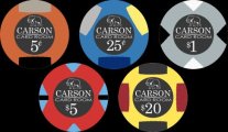
New Designs... I think these are the chip colors I'm going with. Now to decide on the inlay...
A Black

A White

B Black

B White

A Black
A White
B Black
B White
SeanGecko
4 of a Kind
A and keep working on those spots.New Designs... I think these are the chip colors I'm going with. Now to decide on the inlay...
A Black
View attachment 1183689
A White
View attachment 1183690
B Black
View attachment 1183691
B White
View attachment 1183692
Perfect example of where black “inlay” is better. D is clean. A is interesting, but it looks cramped outside that ring. I’d make Oakland Ave Card Room bigger and shrink the inner circle.New Designs... I think these are the chip colors I'm going with. Now to decide on the inlay...
A Black
View attachment 1183689
A White
View attachment 1183690
B Black
View attachment 1183691
B White
View attachment 1183692
Related: be careful with black and white… black doesn’t print clean and tends to smudge. The thin white lines are going to be over powered by the black and Tina’s crew will likely end up making them thicker so they’ll show. You’re better off designing it with that in mind from the start.
SeanGecko
4 of a Kind
Also maybe change the name. Lots of Card Rooms out there.
Maybe
Oakland Room
Oakland Lounge
Sean Gecko is Amazing
Oakland Speakeasy (if you have booze)
Oakland Gambling Hall (was going use that for mine originally)
Lord of possible options
Maybe
Oakland Room
Oakland Lounge
Sean Gecko is Amazing
Oakland Speakeasy (if you have booze)
Oakland Gambling Hall (was going use that for mine originally)
Lord of possible options
carza
Sitting Out
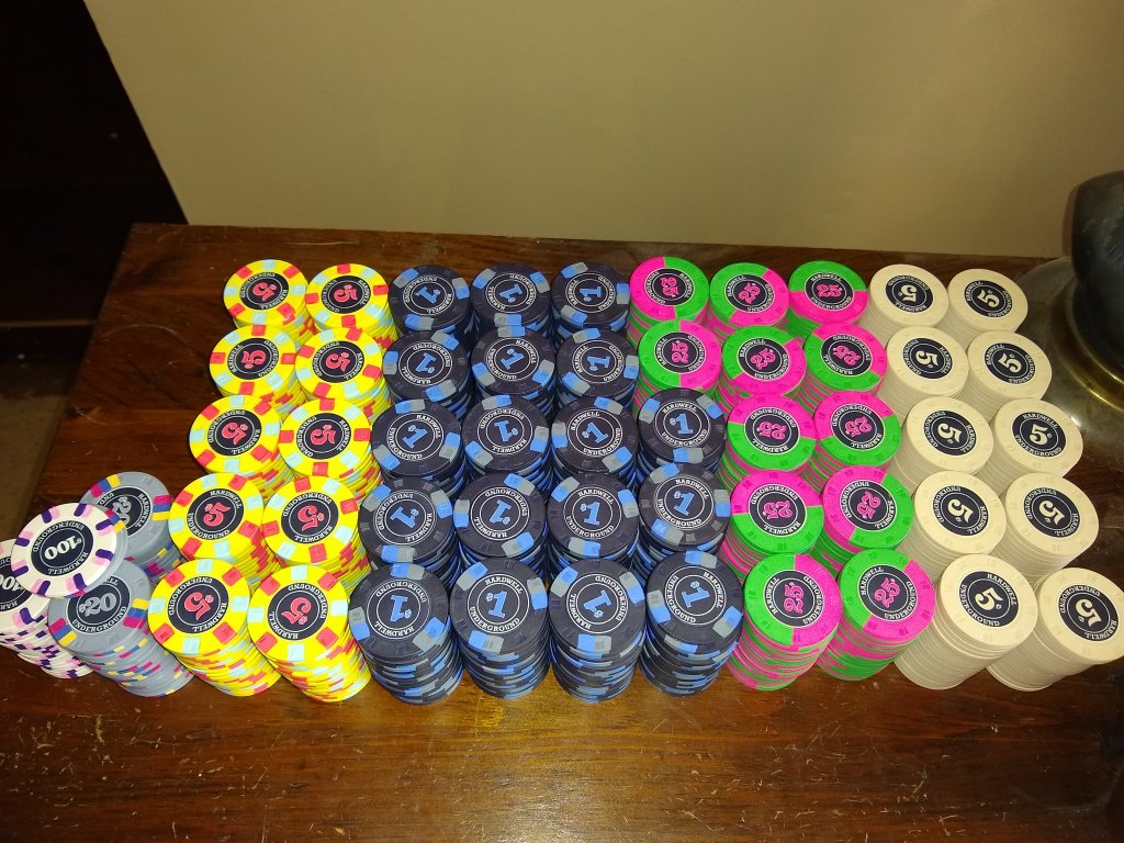
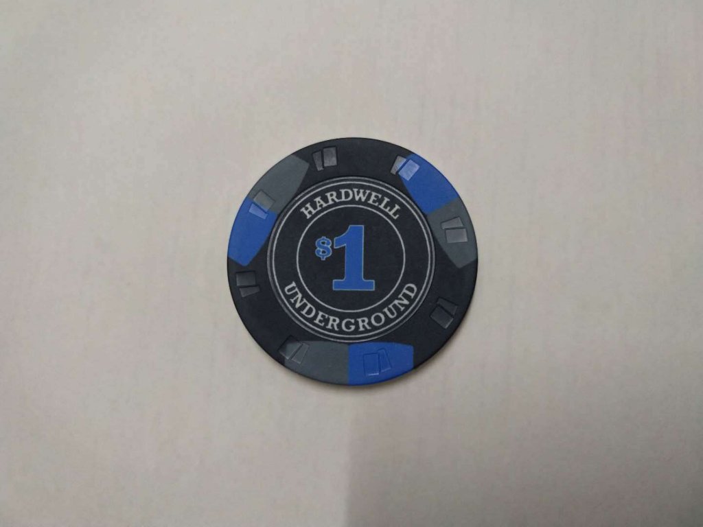
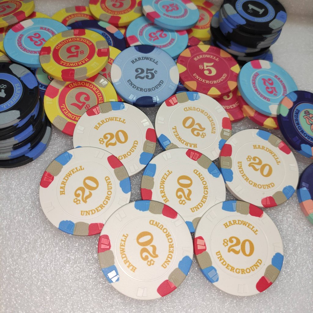
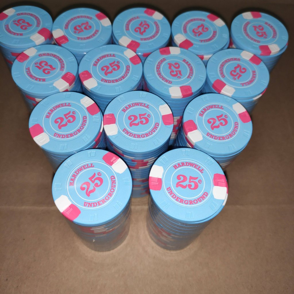
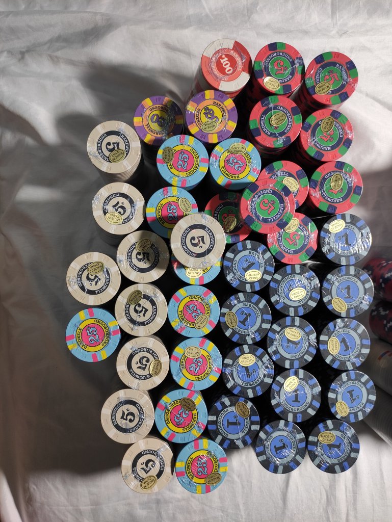
Thanks for the suggestions @warma @SeanGecko . I think I'm sticking with card room as it's symmetrical . Made some final (I think?) changes. Stole the colored numbers idea from those Hardwell Underground chips. And found my bold button in inkscape to actually make big numbers.
Comparing it to the text on the Empire Card Room chips it seems like it will come out alright.

Comparing it to the text on the Empire Card Room chips it seems like it will come out alright.
SeanGecko
4 of a Kind
It's called an homage not stealing. Take any ideas from my chips that you want!Thanks for the suggestions @warma @SeanGecko . I think I'm sticking with card room as it's symmetrical . Made some final (I think?) changes. Stole the colored numbers idea from those Hardwell Underground chips. And found my bold button in inkscape to actually make big numbers.
Comparing it to the text on the Empire Card Room chips it seems like it will come out alright.
View attachment 1183775
binoclard
Pair
I also think your text and lines are way too thin to come out proper. You should definitively choose a bolder weight for your font, and make your circle thicker. The black ink will always eat at the white paper, first physically, and then optically. What works in black on white should be bolder in white on black.
Also, more padding. You take the risk of an uneven cut that would crop your text, and even if the printer does a good job, it feels cramped.
I would not add a white stroke around the denom, or I would make it thicker too. As is, it might look like a misprint/misregister.
You elephant has something funky going on, with the thicker white part under the head. I would rework that part. And make the line thicker.
I would ditch the tiny suits, not sure it adds anything meaningful, and optically look like white smudges that distract from the elephant that deserves better.
Speaking of… "Oakland Ave Card Room" sounds as generic as it comes, more like a mass product than YOUR custom. What is the story with the elephant? Could it not be in the name? "Drunken Mammoth", "Frantic Pachyderm", "The Ivory Tusk", whatever…
Sorry if it sounds harsh, it is really written in a positive criticism spirit, as I think your idea has potential. Simple, clean, elegant.
Love the fracs btw.
SeanGecko
4 of a Kind
Hardwell is a the first 4 letters of my best friend and his brother's last name and the first 4 of my last name. 3 of the main 4.Thanks for the suggestions @warma @SeanGecko . I think I'm sticking with card room as it's symmetrical . Made some final (I think?) changes. Stole the colored numbers idea from those Hardwell Underground chips. And found my bold button in inkscape to actually make big numbers.
Comparing it to the text on the Empire Card Room chips it seems like it will come out alright.
View attachment 1183775
carza
Sitting Out
I really appreciate the feedback!I also think your text and lines are way too thin to come out proper. You should definitively choose a bolder weight for your font, and make your circle thicker. The black ink will always eat at the white paper, first physically, and then optically. What works in black on white should be bolder in white on black.
Also, more padding. You take the risk of an uneven cut that would crop your text, and even if the printer does a good job, it feels cramped.
I would not add a white stroke around the denom, or I would make it thicker too. As is, it might look like a misprint/misregister.
You elephant has something funky going on, with the thicker white part under the head. I would rework that part. And make the line thicker.
I would ditch the tiny suits, not sure it adds anything meaningful, and optically look like white smudges that distract from the elephant that deserves better.
Speaking of… "Oakland Ave Card Room" sounds as generic as it comes, more like a mass product than YOUR custom. What is the story with the elephant? Could it not be in the name? "Drunken Mammoth", "Frantic Pachyderm", "The Ivory Tusk", whatever…
Sorry if it sounds harsh, it is really written in a positive criticism spirit, as I think your idea has potential. Simple, clean, elegant.
Love the fracs btw.
I'll keep tinkering with the inlay. Thanks for the info, I'm definitely set on the colors for the chips themselves at this point. I REALLY like the fracs I ended up with.
My last name is Carson and many Carson family crests from Europe have elephants in them. And I thought that's hilarious even though I'm not really a big part of any big Carson family tree. It cracks me up having an elephant on the chips so I got kinda attached to it quickly.
As far as printer goes, these won't be on paper, going to do them on Tina Ceramics when the next card mold group buy goes in. But I think the criticism still stands.
carza
Sitting Out
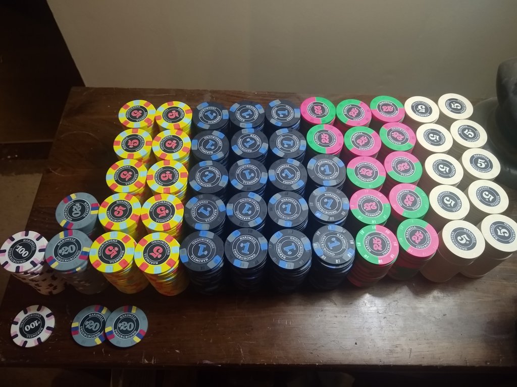
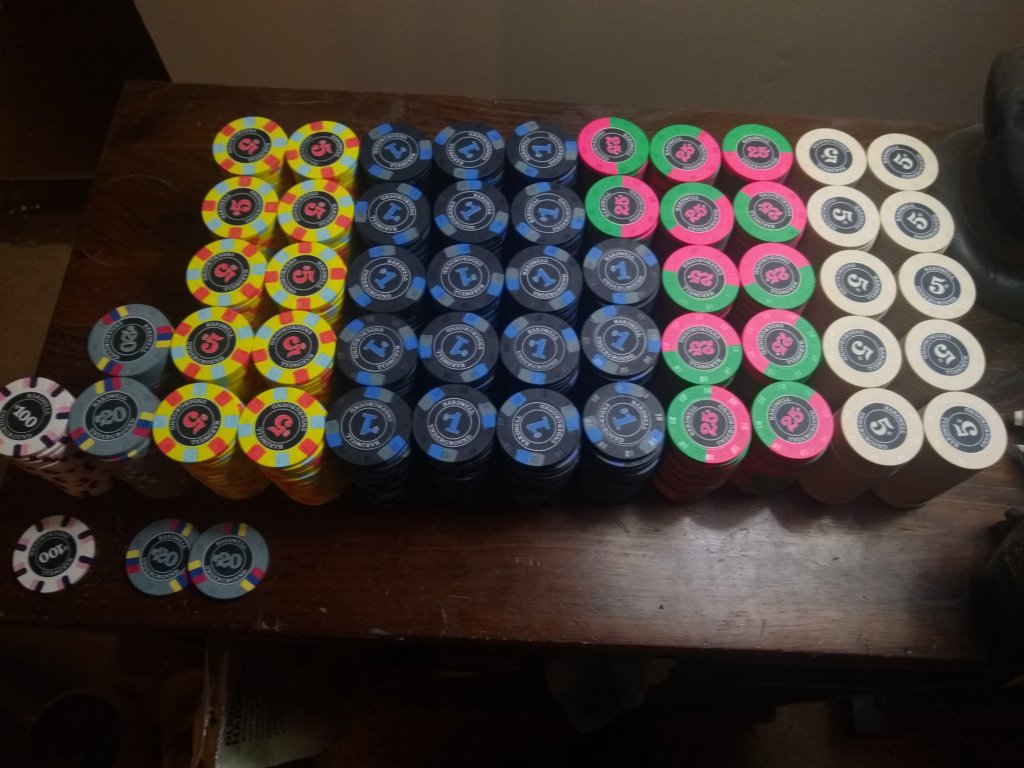
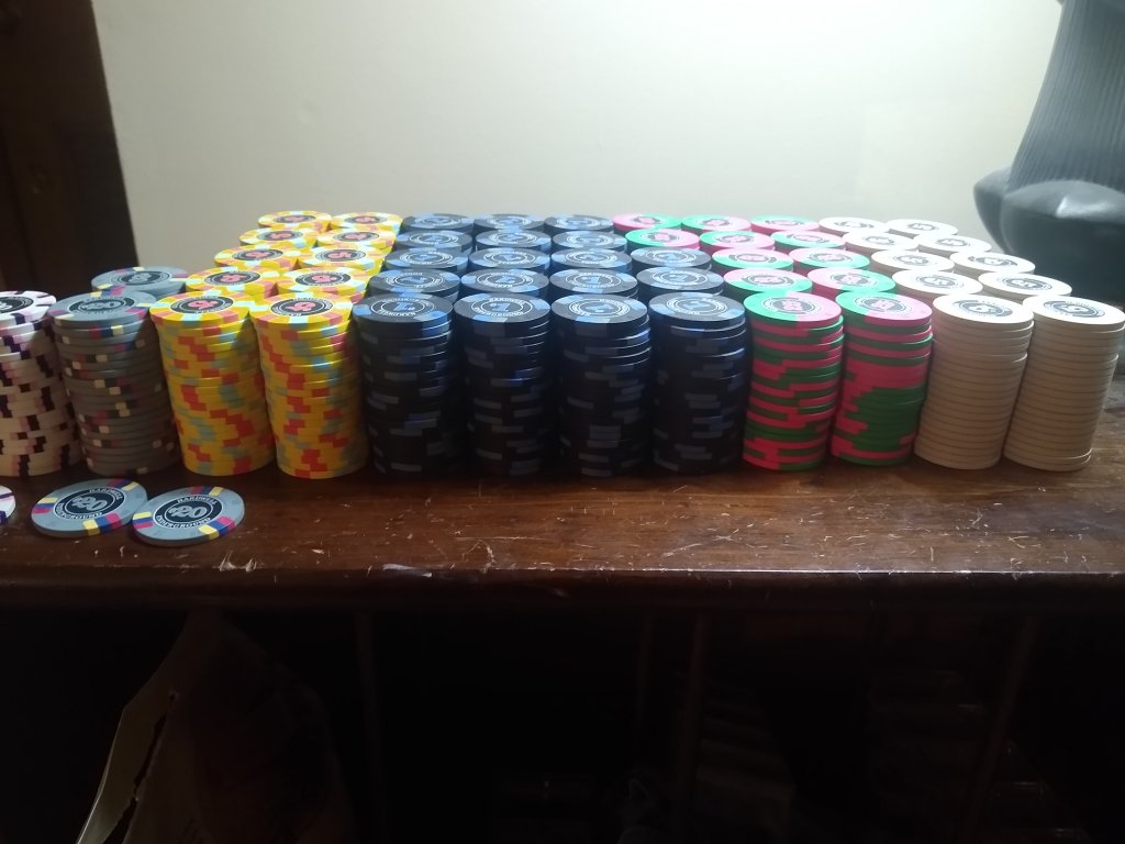
Haha took a lot of the suggestions and I think I have my sets designed out.


SeanGecko
4 of a Kind
Yissssssss!Haha took a lot of the suggestions and I think I have my sets designed out.
View attachment 1186821
View attachment 1186822
carza
Sitting Out
carza
Sitting Out
Aaaand I see I messed up the denom on the 5 lol
SeanGecko
4 of a Kind
Two 25¢ is an interesting idea@SeanGecko because I'm too picky and have a problem. And there's no group buy yet...
View attachment 1188604
Similar threads
- Replies
- 10
- Views
- 742
- Replies
- 13
- Views
- 648
- Replies
- 6
- Views
- 690