First attempt at designing a cash set - Tina web molds 39/43mm mix (35 Viewers)

oss1x

Sitting Out
Joined
Apr 12, 2024
Messages
23
Reaction score
19
Location
Tennessee, USA
Hi everyone,

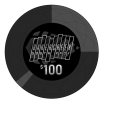
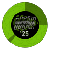
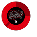
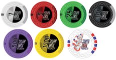
here is my first attempt at designing a cash set for Tina web molds:

I like the quarter-pip "pacman" style chips, but added an additional stripe opposite since it seemed cool. Not sure whether I like the light or dark inlay $1 better. The 5k flag is a little bonkers, but it will basically never see play, so it's more of a novelty pendant ;-).

Currently this is all done in Inkscape (so all RGB) and colors are randomly picked based on screen appearance. I'm in the process of finding a Pantone process color fan I can borrow to pick some fitting CMYK colors... I got a month of Illustrator as well, but have very little clue how to use it at the moment.

Please let me know what you think, I'm open for any kind of suggestion :).

e: oh yeah, the edges will just be simple continuations of the spots with some fake injection marks. Nothing fancy, just haven't made them yet.
 

Attachments

  • chip_1b.png
    chip_1b.png
    104.5 KB · Views: 79
  • chip_5000.png
    chip_5000.png
    122.7 KB · Views: 80
  • chip_1000.png
    chip_1000.png
    110 KB · Views: 78
  • chip_100.png
    chip_100.png
    79.9 KB · Views: 69
  • chip_25.png
    chip_25.png
    98.3 KB · Views: 68
  • chip_5.png
    chip_5.png
    85.8 KB · Views: 66
  • chip_1.png
    chip_1.png
    93.6 KB · Views: 61
I like the dark inlay, the contrast makes it easier to read the denoms.
I do feel like the logo itself is too busy/cluttered and will be difficult to read when they are on the table. I've seen other posts suggest printing the inlay out at scale and hold at arm's length to get a good idea for readability. I would remove all the rectangles around the letters to simplify the design and make the text and denom bigger. I think the arrowhead (leaf?) shape/design you have is cool and the colors are nice though maybe overall a bit basic for customs if it were me.
 
Thanks a lot!

The printout at scale is a great idea, will definitely do that.

The logo is somewhat fixed based on a pre-existing sticker, but depending on the outcome of the printout I might share your opinion and do something entirely different.

the "standard" white, red, green, black, orange/yellow color scheme is somewhat given, but I agree could be pepped up a bit. I'll iterate for a bit and post an update eventually :)
 
Thanks again for the hint with the printout. I did it, and while it kind of works the linework is clearly too finnicky and busy, especially on the 39mm chips.

Here's a completely different approach, any remarks?

Obviously this is a 5 and not a 100, but i needed to see how 3 digits would fit.
6490.png
 
In your original post, I would get rid of the boxes around each letter and see how it looks.
 
I don't like this design personally, but you definitely get a standing ovation for designing a ceramic chip that's not made to look like a clay chip. Good job!
 
Here's a completely different approach, any remarks?
I think you are definitely going in the right direction. I don't like how the bottom of the denom is cut off. Looks like $1nn to me. I think it would be better to have the entire 0 visible, even if you have to make them slightly smaller. Are you 100% on "South Knox Poker Club" on the inlay instead of variations like "South Knox Poker", "SK Poker", etc.? Maybe a slight variation would make the design pop a little more. I would also suggest playing around with the rotation of the spots, maybe would look better for the opposing stripe to be in line with the same diagonal you have made by the text on the inlay.
 
Thanks once more for the valuable suggestions.

The diagonal alignment would be nice, but it's not possible: it has to work on the opposite side of the chip as well, while keeping continuation of the edge stripes, which doesn't work.

Btw, does anyone know whether Tina allows different designs for the two sides of the inlay? That could simplify things in design.

We're not set on anything regarding name etc. "Bakercreek" is a local trail system, the logo was based on an existing bakercreek sticker. The addition of "south Knox" or "poker club" came mostly from matching number of letters, lol.

Making the second design into "south Knox poker" will actually work really well and make it a lot better. I tried not "burying" the bottom part of the denomination and it looked out of place, but there might be an improvement possible by modifying the background color scheme, see attached rough drafts.

Somewhat off topic: any pros and cons between eventually ordering these directly from Alibaba/Tina vs submitting them as part of a group buy?
 

Attachments

  • IMG_20240425_110433.png
    IMG_20240425_110433.png
    231.5 KB · Views: 14
  • IMG_20240425_110422.png
    IMG_20240425_110422.png
    65.9 KB · Views: 14
Thanks once more for the valuable suggestions.

The diagonal alignment would be nice, but it's not possible: it has to work on the opposite side of the chip as well, while keeping continuation of the edge stripes, which doesn't work.

Btw, does anyone know whether Tina allows different designs for the two sides of the inlay? That could simplify things in design.

We're not set on anything regarding name etc. "Bakercreek" is a local trail system, the logo was based on an existing bakercreek sticker. The addition of "south Knox" or "poker club" came mostly from matching number of letters, lol.

Making the second design into "south Knox poker" will actually work really well and make it a lot better. I tried not "burying" the bottom part of the denomination and it looked out of place, but there might be an improvement possible by modifying the background color scheme, see attached rough drafts.

Somewhat off topic: any pros and cons between eventually ordering these directly from Alibaba/Tina vs submitting them as part of a group buy?
I actually really like what you did with the red chip here. The white and black contrast makes the buried denom better imo. I would be interesed to see if you could still make it clearer in any way. I think the buried design might not look as good with 5s or 2s.

Something about the edge spots is still bothering me, it just doesn't flow with the inlay design anymore since you changed from the original. I think for me it is still that the diagonal design of the inlay just barely doesn't match up with any of the spots, though I guess it makes sense that you may not be able to perfectly control which way the inlay is facing to match up on both sides.

From what I've seen, the web and greek molds need to have the same design for both sides of the inlay. As far as going direct to Tina, I think it may be easier to go through Justin and Broken Arrow since he has a lot of experience with this, but I haven't personally done it either way so maybe others could share their experience.

Keep playing with the design and try out some of the different names on the inlay to see what you like best.
 
lol, might as well call it the "confederate poker club". black/white/red is not an option.

1714088397982.png
 
This is going towards "clearer" and "more simple". i kind of like it, but now the left half that holds the denomination is too empty. needs some pattern in the background i think. any ideas anyone?

1714091413070.png
 
These are looking really great! Curious if the 1 would look better if it were a different font 1 with the bottom serif(?) if that makes sense. To have something more substantial coming out of the buried part. Fantastic work on it so far!
 

Create an account or login to comment

You must be a member in order to leave a comment

Create account

Create an account and join our community. It's easy!

Log in

Already have an account? Log in here.

Back
Top Bottom