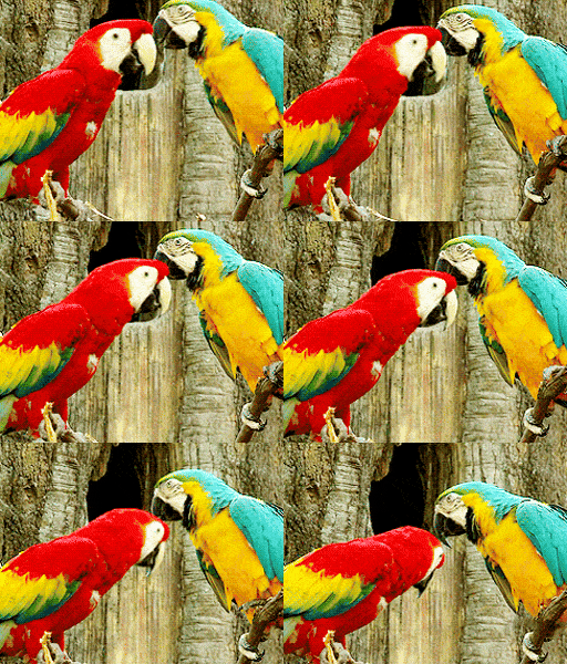
I cannot deicide and I like both ideas althuogh fonts could definitly use some work.


You are using an out of date browser. It may not display this or other websites correctly.
You should upgrade or use an alternative browser.
You should upgrade or use an alternative browser.
Which design? I cant decide? Feedback? (24 Viewers)
- Thread starter templetonjohn72
- Start date
ekricket
Royal Flush
I’d move the $1 on the toucan design. It may suffer the fate of the harlequin design.
so u suppose moving it all the way below the toucan?I’d move the $1 on the toucan design. It may suffer the fate of the harlequin design.
ekricket
Royal Flush
Got no suggestions. Just jumped out at me because of the other.so u suppose moving it all the way below the toucan?
I'm generally biased towards tiki, having used a tiki design for my own customs. That being said I really like the toucan used here.
Colquhoun
4 of a Kind
I like the Tiki design, just not fond of the "The" being so prominent.
I think it would look better as "Tiki Card Room"...or if you must call it "The Tiki Card Room", The could be much smaller:

I think it would look better as "Tiki Card Room"...or if you must call it "The Tiki Card Room", The could be much smaller:
Roslindale
Flush
I prefer the Toucan.
Though with the colors so similar. Maybe there is a way to do both. One on each side, with some sort of different card room name that brings the art together.
For example:
The Mighty Jungle Card Room
Jungle Card Room
Out of the Woods Poker
Rainforest Card Room
Though with the colors so similar. Maybe there is a way to do both. One on each side, with some sort of different card room name that brings the art together.
For example:
The Mighty Jungle Card Room
Jungle Card Room
Out of the Woods Poker
Rainforest Card Room
Bronson
Two Pair
Toucan is great! Remind me an old Guinness adverts!
Really like both designs. Look forward to seeing what the chips end up looking like.
This is my current edge spot idea. Looking for more feedback as well as idea for edge spots on a red/dark orange chip. I feel like the set is missing that red chip.
Way too many repeating colors imo
That’s kinda what I was thinking
Roslindale
Flush
Especially the green
WedgeRock
Royal Flush
I like the Tiki design, just not fond of the "The" being so prominent.
I think it would look better as "Tiki Card Room"...or if you must call it "The Tiki Card Room", The could be much smaller:
View attachment 1503171
I like the edit on the left, really dials it in IMO. I like the denom to be color coded to the chip color, and with the colors on the label it would be a better contrast to color match.
I love the Toucan one. I'm a sucker for a white background because the yellow might just make it look old. If that's the look you're going for, by all means, but I think the colors really pop with the white.
I thought the yellow background worked quite well on this, and it warms up the design.
I prefer the toucan, but it can't have the stark white background. if you went with tiki, definitely use the example without "the." Either way, bot fun designs!
dizzyChipper
Pair
I kind of like Tiki better BUT Tiki Kings BR Pro been around making toucan feel more original / custom.
I like the toucan. Very clean looking design, and cheerful.I cannot deicide and I like both ideas althuogh fonts could definitly use some work.
View attachment 1503161View attachment 1503159
dizzyChipper
Pair
Didn't he?start fresh....design yourelf some ceramics and you will be good
My thought exactlyI kind of like Tiki better BUT Tiki Kings BR Pro been around making toucan feel more original / custom.
I definitely like the idea of matching the color. The biggest part I’m struggling with is how to fit the numbers that have more than 1 character under the toucan. 1 fits nicely but 25 .25 etc do not. Any ideas?I like the edit on the left, really dials it in IMO. I like the denom to be color coded to the chip color, and with the colors on the label it would be a better contrast to color match.
I thought the yellow background worked quite well on this, and it warms up the design.
Colquhoun
4 of a Kind
Just make the numbers cut into the art with a small amount of space between, like there is on your original $1.The biggest part I’m struggling with is how to fit the numbers that have more than 1 character under the toucan. 1 fits nicely but 25 .25 etc do not. Any ideas?
And I recommend making the dollar sign smaller...it always looks awkward when it's the same size as the numbers.
dizzyChipper
Pair
I'm also generally a fan of smaller $.Just make the numbers cut into the art with a small amount of space between, like there is on your original $1.
And I recommend making the dollar sign smaller...it always looks awkward when it's the same size as the numbers.
View attachment 1504378
I am leaning toward the toucan design. As far as the color layout goes I came up with this. All of the chips are representative of different rainforest birds other than the white chip because there are not many white birds in the rainforest. I feel like it is still missing something. Feedback?I like the toucan. Very clean looking design, and cheerful.
dizzyChipper
Pair
I am leaning toward the toucan design. As far as the color layout goes I came up with this. All of the chips are representative of different rainforest birds other than the white chip because there are not many white birds in the rainforest. I feel like it is still missing something. Feedback?
View attachment 1504400

Is that the line up? .25, .5?, 1, 5, 25, 100
Most will say just go .25, 1, 5...
So bail on white chip and use blue 1. So all your chips are birds inspired which is a cool detail, story, element.
Then issue is are pink and red too similar? For 2 denoms apart? Use the yellow in the pink as the base.
Hell of a job...
That fruit loop chip is fire. The blue and the black are great too.
Last edited:
dizzyChipper
Pair
Last edited:
Yes the original lineup is .25 .5 1 5 25 100
Is that the line up? .25, .5?, 1, 5, 25, 100
Most will say just go .25, 1, 5...
So bail on white chip and use blue 1. So all your chips are birds inspired which is a cool detail, story, element.
Then issue is are pink and red too similar? For 2 denoms apart? Use the yellow in the pink as the base.
Hell of a job...
That fruit loop chip is fire. The blue and the black are great too.
Similar threads
- Replies
- 2
- Views
- 182
- Replies
- 47
- Views
- 2K
- Replies
- 24
- Views
- 995
- Replies
- 5
- Views
- 633

