The Poker Lab Mockup (1 Viewer)

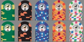
This is coming out great. What about a combination of V2 and the bone design? Maybe a small, thinner bone with or without the suits in it where the suits are on Version 2? It will act as the separating line, include a bone, and allow for a larger font size below.

That's my 2 cents but I don't think you can make a wrong choice here. Good work!
 
I really dig where the colors and edge spots are headed. They really pop next to each other. I have to say that I agree with Chipinia - that font isn't as cool as the chip. Fonts can be a real nightmare to sort through. I know it's not papyrus, but it falls into that pot...

 
Oh I saw what you were going for for sure :)

I think it looks good on all but the T1000 honestly, just think that one needs adjusting. That's also why I suggested one colour though, it removes that issue and then it also makes the big chip stand out more as special
Looked at it and I think the vertical gradient looks the best
1764627858763.webp
 
As far as the fonts go - I do like the current font. It feels fun, playful and unique. Finding another font does feel like searching for a needle in a haystack. I think as @TX_Golf_N_Poker said, it gives the set continuity.

I’ll play around with the fonts and put out a couple samples but it feels like picking a needle in a haystack
Just stumbled across this thread, very neat! will definitely be following.
 
Mock up of different fonts

Montserrat ExtraBold
1764714085090.webp


Playfair Display Bold
1764714105411.webp


Georgia
1764714121889.webp
 
I really dig where the colors and edge spots are headed. They really pop next to each other. I have to say that I agree with Chipinia - that font isn't as cool as the chip. Fonts can be a real nightmare to sort through. I know it's not papyrus, but it falls into that pot...

Had to do this just for fun :ROFL: :ROFLMAO:
1764714392650.webp
 
I still like your original best. Second for me is the Montserrat ExtraBold. I think the fonts with serifs are too serious.
 
I still like the clean, simple white label. Have you tried the bone label without the grey background? I find that dulls things and takes away from the chip. I think it’s there to showcase the bone? But again, I like simple white labels in general
 
IMO if you go simple white, perfect candidate for shaped inlays. Otherwise bone/more complicated route.
 
My person thoughts about the set is that the denomination on the bone set needs to be a little bit bigger. Not sure I love the grey outside ring. I think it might look bad on 5000 design with the bright white background. ITs hard cause I need some color to make the bone pop but not sure. The white inlay feels a little too dull but I do like the simplicity. I'll have to play around with it some more
 
Made some minor adjustments - I think we are getting close to a final product

-Outside circle is now reflective of the body color
-Denomination is bigger and bone has been resized
-Updated small circle of T5000 to match edge spotting
-Added option of red denomination color

Previous design:
1766040118353.webp


Updated design:
PL Set V3.webp


I think the outside circle color change makes the inlay a little easier on the eyes. I think I prefer the black denom color with the rainbow T5000 but wanted to post to see what others think
 

Attachments

  • PL Set V3.webp
    PL Set V3.webp
    94.9 KB · Views: 52
I've been thinking about the edge spots on these chips and I'm not sure I'm fully content with the progression. There are a few things that stand out to me. The edge spots on the 25 and 100 are both solid and have similar sizes. The 1000 and 5000 have the same story but they are different colors so I like that progression. I like the design of the 500 but its the only edge spot that feels complex. I got a few ideas for potentially improving the set that I wanted to get feedback on.

Change 1: Reduce the spot size on the 25
Change 2: Change 100 to 3D14. Change DG peach edge spot on 5000 to DG yellow to eliminate repeating DG pink/DG peach combo

Annotation 2025-12-29 145513.webp

Change 1 feels a little bit like a regression in the 25 design which I don't mind since the 25 is first off the table and I think it helps the overall set. I think I like change 2 better as it makes for a smoother progression into the 500. Only concern is that I may be getting away from the inspiration of the original chip design but I think I can live with that.

Reminder of chip inspiration: trying to stick with typical tournament base colors, 25 is colors of a duck's head, 100 is hunter orange (may add pink since its an alternative hunter safety color), 500 is waves of water, 1000 is colors of fall, 5000 is just fun colors
 
I like change 2. Although I normally like some tri moons, when I see the “blocky” version of the $100 it feels really natural whereas the tri moons now feel out of place.

Especially for tournament chips, I like them being close/similar in style to make the set cohesive. Cash sets I like having almost random chips together.
 

Create an account or login to comment

You must be a member in order to leave a comment

Create account

Create an account and join our community. It's easy!

Log in

Already have an account? Log in here.

Back
Top Bottom