You are using an out of date browser. It may not display this or other websites correctly.
You should upgrade or use an alternative browser.
You should upgrade or use an alternative browser.
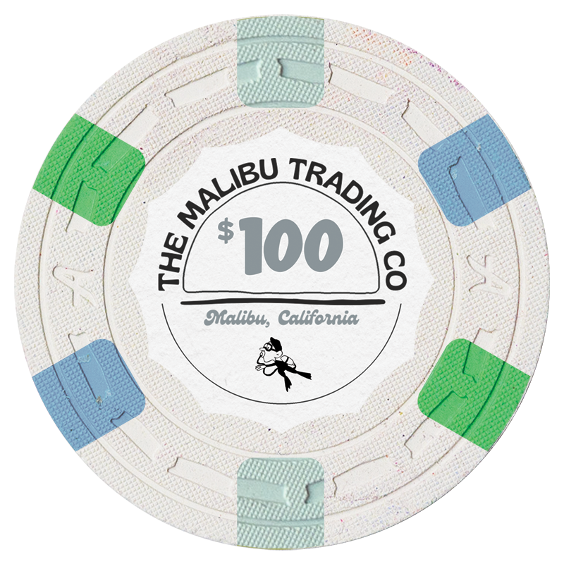
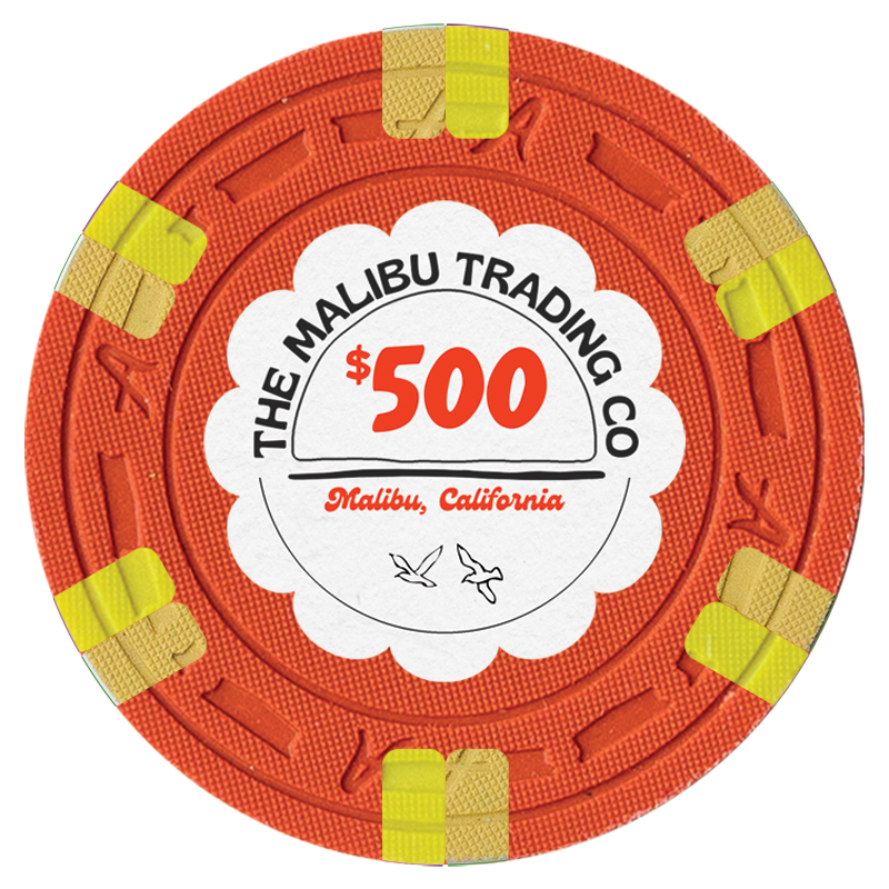
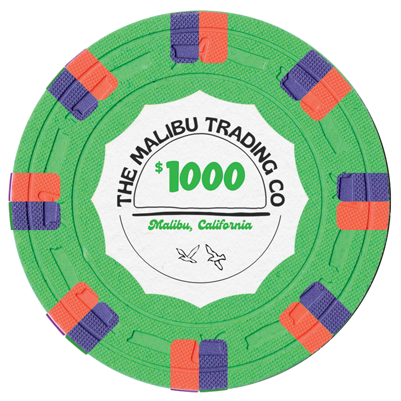
The CPC Malibu Trading Company Set (1 Viewer)
- Thread starter Windwalker
- Start date
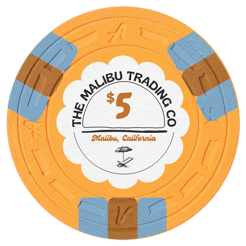
I 'd suggest Lavender or Purple or Blurple instead of Chocolate as middle little spot on the $5, and some blue as second spot color on the $500.
God no. Keep the five the way it is. The brown against the blue is perfect
Rhodeman77
Straight Flush
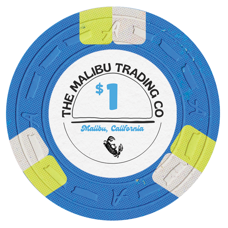
You could have dirty stack issues with the $1 and $100, both chips having blue/white/green shades.
the art work on the bottom may be too small and hard to see on an actual chip. Consider blowing them up some.
the art work on the bottom may be too small and hard to see on an actual chip. Consider blowing them up some.
Eloe2000
Straight Flush
I’m a big convert
I believe it’s butterscotch, which I am a big convert on thanks to @JeepologyOffroad ’s insistence. It’s a fantastic color that always looks much better in person than online.
I 'd suggest Lavender or Purple or Blurple instead of Chocolate as middle little spot on the $5, and some blue as second spot color on the $500.
I believe it’s butterscotch, which I am a big convert on thanks to @JeepologyOffroad ’s insistence. It’s a fantastic color that always looks much better in person than online.
Yep! Great suggestion. The inlay is being designed as we speak. This is my crap work.You could have dirty stack issues with the $1 and $100, both chips having blue/white/green shades.
the art work on the bottom may be too small and hard to see on an actual chip. Consider blowing them up some.
As has been said the artwork on the bottom may lose detail on the actual chip, esp. with the textured A-mold. I’ve read that a test run on the A-mold is available though, so depending on the final artwork you may want to use that option.
I like the chip spots and colors. I would keep the denom color consistent across all chips, maybe a darker red to bring a new color to the chips (the text could still be color matched). Kinda sucks to have to reuse the inlay shape on the $500, maybe try to find a way around that?
I like the chip spots and colors. I would keep the denom color consistent across all chips, maybe a darker red to bring a new color to the chips (the text could still be color matched). Kinda sucks to have to reuse the inlay shape on the $500, maybe try to find a way around that?
Eloe2000
Straight Flush
I love them. Great classic spot patterns and progression and fantastic color combinations. Very excited to see these fully executed and produced.
Have you decided on a mold yet?
Have you decided on a mold yet?
Rbonus012
Full House
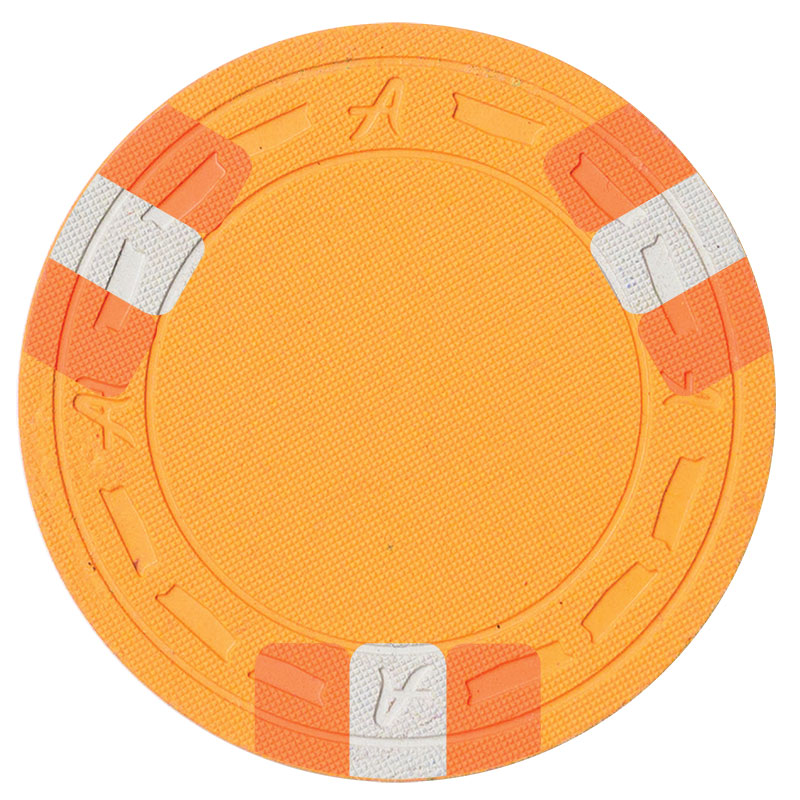
Join the Arc Yellow $5 club with me!
Eloe2000
Straight Flush
Join the Arc Yellow $5 club with me!
View attachment 756496
Hey, dont forget about me! Although mine is non-public!
It was really hard for me to find any examples of arc yellow base when I was designing my set. It’s a great color and kind of splits the difference between yellow and red. Excited to see it gain some traction!
Rbonus012
Full House
Hey, dont forget about me! Although mine is non-public!
It was really hard for me to find any examples of arc yellow base when I was designing my set. It’s a great color and kind of splits the difference between yellow and red. Excited to see it gain some traction!
View attachment 756502
So many great sets in the pipeline. Your lineup is nuts also
Eloe2000
Straight Flush
I’ll admit that I really really wanted to do Peach but I just couldn’t make it work. But Arc Yellow really really grew on me.So many great sets in the pipeline. Your lineup is nuts alsoI must say that I think Arc Yellow is my favorite CPC color.
I’ll admit that I really really wanted to do Peach but I just couldn’t make it work. But Arc Yellow really really grew on me.
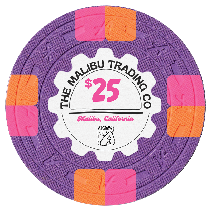
@Windwalker I'm thinking about using 4TA181418 as a prog after a 3TA316, maybe that could be good for your $25? The colors feel great but the $25 looks like a let down from the chips before and after it
Not sure this could be considered a WW set without a 4d14 …@Windwalker I'm thinking about using 4TA181418 as a prog after a 3TA316, maybe that could be good for your $25? The colors feel great but the $25 looks like a let down from the chips before and after it
Revisions, V2:

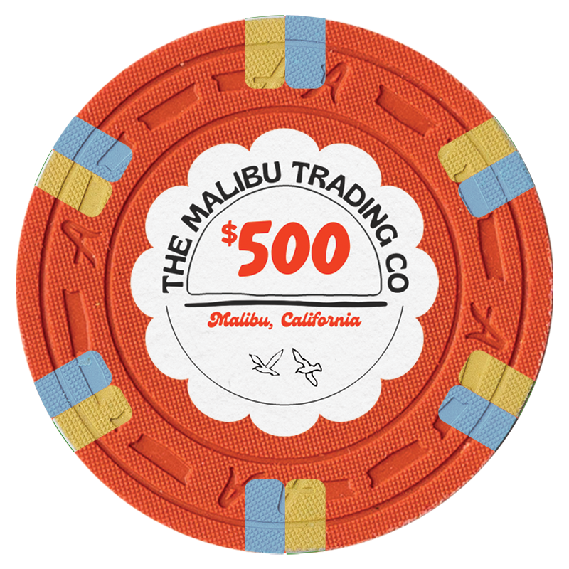
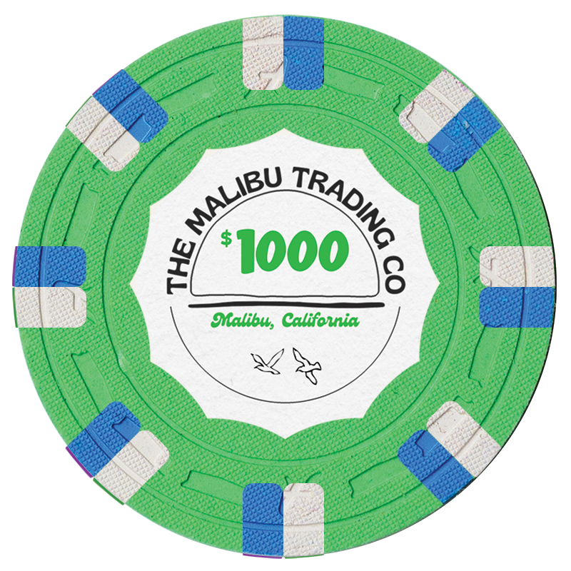


Venturalvn
Full House
@Eloe2000 is that template public? Planning a CPC set right now and this would be great!
With Krish posting his mock ups and working through the creative process publicly I'm convinced he loves cruel and unusual punishment.
No offense to the artist or the commissioner, but this is not an award winning inlay. It will be a beautiful set, but if you're looking for centerfold or goat status, get back to the drawing board.
No offense taken! See my quote above.
Yep! Great suggestion. The inlay is being designed as we speak. This is my crap work.
I’m not sure if you’re actually planning on A-mold or if it’s just because that’s the only mold you can make those mockups with, but I would change the mold if I were you. DiaSqr is my personal favorite both in feel and looks, but really any of their other options is better than the A-mold, IMO.
I’m not sure if you’re actually planning on A-mold or if it’s just because that’s the only mold you can make those mockups with, but I would change the mold if I were you. DiaSqr is my personal favorite both in feel and looks, but really any of their other options is better than the A-mold, IMO.
Evan’s photos are all on the Arnold mold. I think I’m going to do the Jockey, but am also considering the B-Mold.
Phish1321
Full House
That $25 is super hot. IMO the first $100 is much nicer.
Eloe2000
Straight Flush
@Eloe2000 is that template public? Planning a CPC set right now and this would be great!
It’s not a template or an application, it’s a PSD file with layers and masks. It’s easier and faster for me to just do it for most people unless they are pros with Photoshop. I’m happy to do it for people if they PM me and just ask nicely. All I need is the png of your set from the CPC tool and also the inlay art or I can leave it blank.
RainmanTrail
Straight Flush
Very cool set Krish!
You should look into getting 3D renderings made of the sets. Someone around here used to do those until they got overwhelmed with requests and disappeared, but seeing your set in stacks and in 3D rendered settings is a great way to visualize them during the planning phase. I always find it difficult to visualize how they might look in stacks otherwise.
You should look into getting 3D renderings made of the sets. Someone around here used to do those until they got overwhelmed with requests and disappeared, but seeing your set in stacks and in 3D rendered settings is a great way to visualize them during the planning phase. I always find it difficult to visualize how they might look in stacks otherwise.
Love the Cali colors, that 25 is super hot!That $25 is super hot.
Geremie
Full House
The denom colors are not consistent. Some chips use the base color and others use a spot color. Not sure how much OCD you have…but it would tilt me a bit.Revisions, V2:


Similar threads
- Replies
- 32
- Views
- 1K
- Replies
- 31
- Views
- 1K

