Terrible's Quarter Relabel (1 Viewer)

MoT519

Two Pair
Supporter
Joined
Jul 16, 2019
Messages
482
Reaction score
559
Location
NC
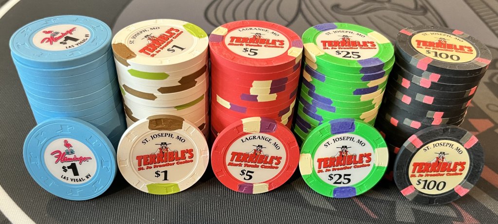
Anybody have an suggestions on what chip to use to relabel as a quarter for a Terrible's set? Was thinking about these 2 options, but open to ideas.
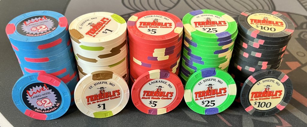
TerriblesQuarter-OptionA.jpg

TerriblesQuarter-OptionB.jpg


Also, when I create a label for the quarter, are there guidelines in terms of what city I can use? Is it frowned upon to use St. Joseph or Lagrange?

Thanks!
 
First one, no contest. I’d certainly want to add LaGrange or St Joe’s to the label. Just ask Gear or whoever is doing the labels. All they can say is sure or no!
 
First one, no contest. I’d certainly want to add LaGrange or St Joe’s to the label. Just ask Gear or whoever is doing the labels. All they can say is sure or no!
Gear's work is amazing, but I'm attempting to do my own labels for this project using the @JustDogbert method posted here.. I may just put Raleigh, NC to be safe and change the text under Terrible's to "Hotel Casino".
 
Don’t know why there’s be an issue I’d the casino is closed. Especially just doing one rack of fracas. In any event, please post again when the labels are done. Anxious to see them! Sure they’re going to look awesome with this set!
 
I’m not really a fan of either. I think a pale yellow works better and spotted yellow rhcs are a nightmare to find in good condition so I’d lean towards yellow rhc solids preferably not too vibrant.
 
I’m not really a fan of either. I think a pale yellow works better and spotted yellow rhcs are a nightmare to find in good condition so I’d lean towards yellow rhc solids preferably not too vibrant.
Solid yellow RHC does sound good. Although I'm curious why you don't prefer vibrant for the quarter when all the other Terrible chips are vibrant.
 
Maybe vibrant isn’t the right word but the live phillys look almost neon with max contrast between the colors… and then you have the 1s which are offwhite with russet brown and moss green for a rustic nature-y vibe. It’s like mark Twain on a jaunt through the rugged wilderness and then out of nowhere pops mister roboto shooting lasers.
 
Maybe vibrant isn’t the right word but the live phillys look almost neon with max contrast between the colors… and then you have the 1s which are offwhite with russet brown and moss green for a rustic nature-y vibe. It’s like mark Twain on a jaunt through the rugged wilderness and then out of nowhere pops mister roboto shooting lasers.
Haha, yeah I see what you mean now. Maybe Santa Ysabel $1 could work or a non-neon solid.
 
If you wanted a blue chip the ysabel 1s are a better fit I think with same spot pattern and the spots are different colors which is consistent with others in the set.

1633999590499.jpeg
 
something pink ?
I’m not a big fan of pink quarters when using a red $5. With 25c or 50c blinds, we would probably only use 3 denominations. That would mean pink, white, red….just feels too one sided on the color wheel.
 

Create an account or login to comment

You must be a member in order to leave a comment

Create account

Create an account and join our community. It's easy!

Log in

Already have an account? Log in here.

Back
Top Bottom