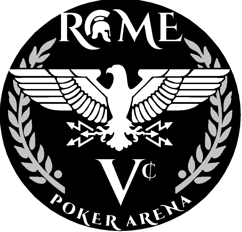
Irrespective of the chips selected, I needed to simplify my logo before the order for a set of ceramics. I started with this one which is was very busy for the size of the label area

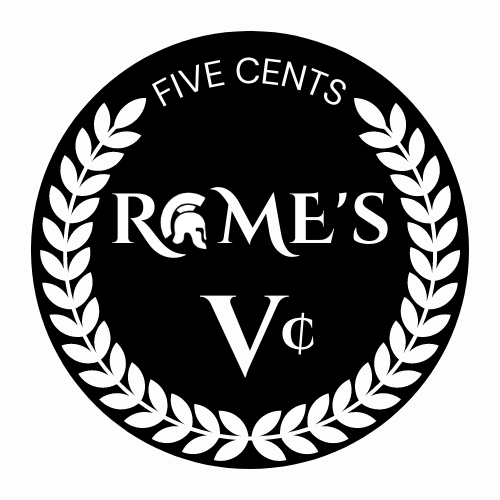
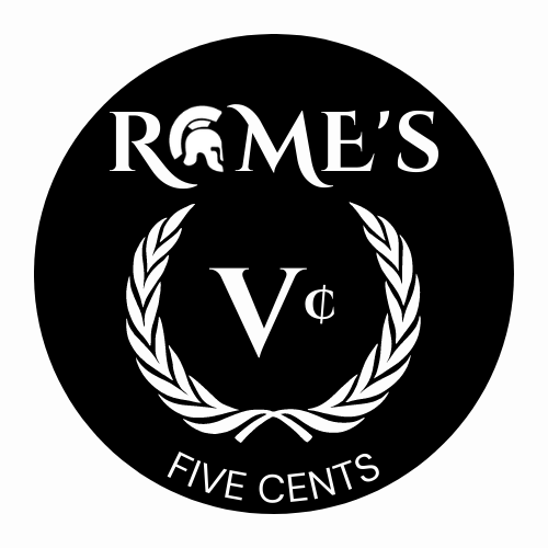
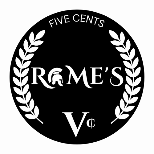
I tried a few different ways to simplify the logo while keeping some of the design elements. Which one works better between the three? I could remove the laurel wreath entirely, but I'm not sure what to add to the design to keep it interesting. Very open to suggestions! Thanks!
1.)
 2.)
2.)
 3.)
3.)

I tried a few different ways to simplify the logo while keeping some of the design elements. Which one works better between the three? I could remove the laurel wreath entirely, but I'm not sure what to add to the design to keep it interesting. Very open to suggestions! Thanks!
1.)
