Opinions on my Chip design ? Wanted to try something new. (1 Viewer)

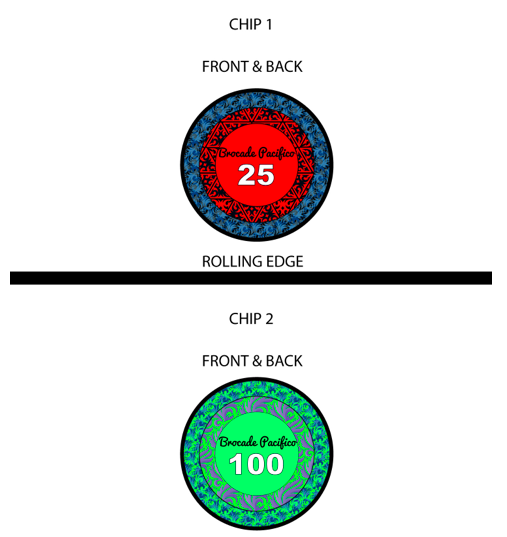
On the general design:

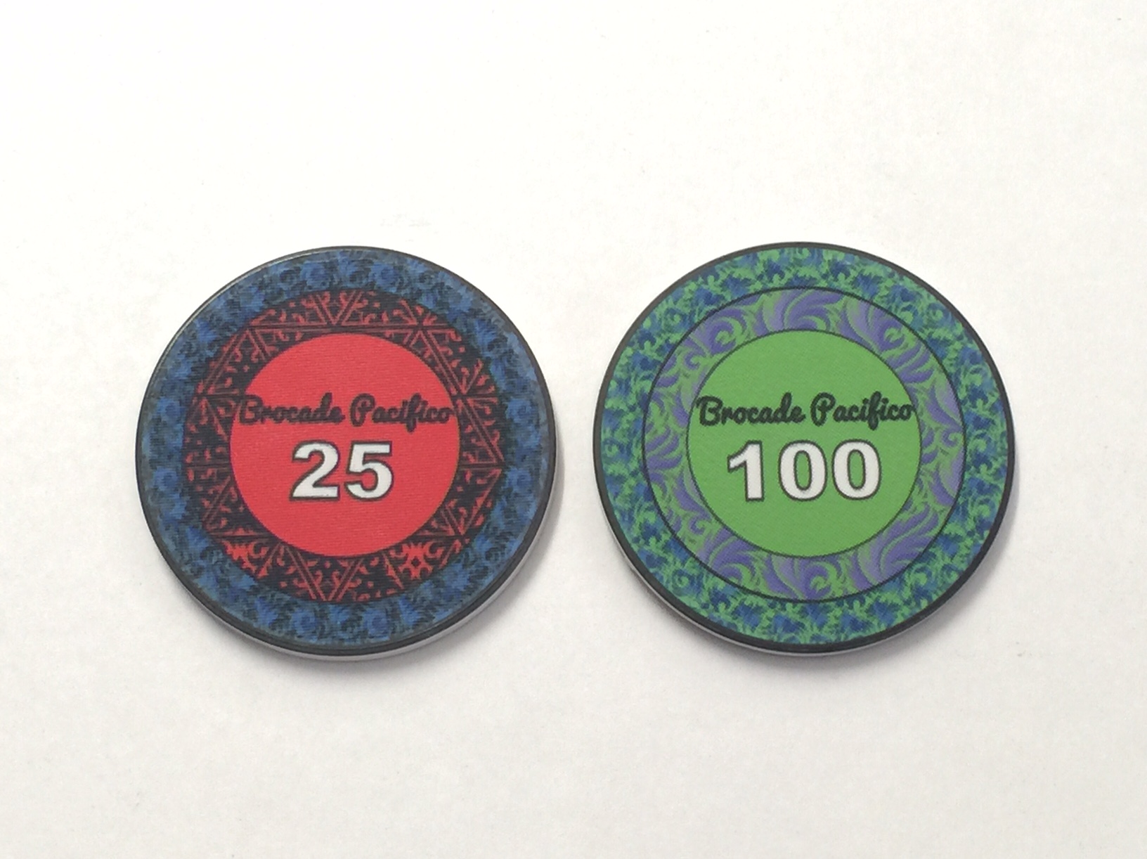
It's very different - and I like different. It's not for me, but I can see why you like this.

On the "business" - many elements make something busy. This has very few elements. The pattern is complex, but if a complex pattern is tight/small enough, it just because a texture, and doesn't always feel busy at all - the other elements on these chips are very simple; circle, denom.

On the print: you'll definitely want samples. These colored patterns will have fine over-spray. The effect may be something you hate (blurry) or something you love (looking like dyed fabrics.) Test prints will tell all.

On the rolling edges: I HAVE CONCERNS. On two counts.
1: The fact the edge is primarily black on all denoms will lead to a LOT of dirty stacks. It will drive players crazy. I played a game on Tuesday where the white $1 had red in an edge spot, and the $5 was primarily red. We had two dirty stacks show up, but both were caught (barely.) I found myself double-checking my own more often than I ought. With these all-black, it will happen a LOT and become annoying.
2: The print overspray from the rolling edge may bleed onto the face, depending on the way the print is done. If the edge is a color, it can look good on the face; it can even look intentional. If the edge is brown or black, though, it just makes the chip look dirty. I've seen this on, for example, some of my Venerati samples. Ask if you want to see a picture. Again, seeing your samples will help you understand the effect on your design.
 
I'd call this set, "Jacquard."
Or maybe, "Brocade."

I definitely like the novelty of the theme, and approve of you putting in the work to make something different.
 
changed some stuff....

eC3tf.jpg
 
Getting there, try removing the line across the middle, move up the denom and center it and make it a bit larger
 
After hearing some opinions, taking some advice and doing some tinkering... i feel like you have beautiful set in the works! those are dynamic colors and a pretty design! i cant wait to see the final product! good luck sir! and may the force be with you!
havent seen your message until now , thanks alot :)
 
I'm assuming you're using this rolling edge only for the test print. If all chips have a black rolling edge it's gonna be hard to determine how many chips a player has of each denomination.
 
I'm assuming you're using this rolling edge only for the test print. If all chips have a black rolling edge it's gonna be hard to determine how many chips a player has of each denomination.
yup only for the test print, since the factory said its hard to make edges for only 2 chips
 
Hi Niklas,
print the inlays in 1:1 scale and check if the details still work. I did that with my inlays and ended up in something completely different as details went to small or fuzzy.
Same for the borders. try if the text is still readable. On my dealer button which is much bigger the print isn't very good. Take also in consideration that the print on ceramics isn't as good as your photo printer at home. I suggest to get some samples to see what is working good or not.
Hope that helps.
Mr Hanky
 
Very cool design but I'll have to agree, it's def a lot going on and I think less is sometimes more
Love the design though... Maybe it's the color's?
A lil further tinkering and I think you've got a winner!
 
I'm just gonna be honest, and you really shouldn't pay attention to me because I'm not the target audience and ultimately what I think about the chips should not keep you from creating a chip that you like.

That being said, this seems to be an exercise in how many layers and patterns you can fit in a single design. I'm all for doing something different, but there doesn't seem to be any method to what you're designing. The patterns are random, they don't match, the colors are pick-n-mix, the type is illegible, and there's no relation or progression in the design. Also, you're using non-standard colors for your denominations which further complicate many players' abilities to calculate the potsize and stack sizes (further aggravated by the previously suggested design of the rolling edge). If it were me, I'd choose a single design for all the denominations, make sure that the colors are following the standards, and use denominations and texts that people can read when the chips are halfway across the table. Chips should be a practical tool for the players, not something designed to frustrate them.

Again though, if this is what you like, then by all means go for it. But I think all the advice you'll get here will ultimately steer the end result towards a more standard chipset in both design, color, and denominations.


Thanks for the feedback.
I just like the design very much, and if other people dont like that, oh well theres nothing I can do about that. But in the end I have to like it :). I can understand you absolutely hate them :D
 
I must say, I'm pretty impressed with how they turned out. Like a couple others, I felt the images were just too "much". However the finished versions have much more of a "texture" appearance to them rather than a bold pattern. At this point I will only reinforce that when complete, from a usability perspective, you will want to make sure the denomination is visible (and it is) and that the dominant color of all of the chips can be easily distinguished from the others.

I like the 100 more than the 25. Reason being, the 100 has an overall "green" look to it. The colors compliment the green. The 25 has very contrasting colors (blue/red). The hundred is clearly a green chip. The 25... is it blue, is it red? I don't know.

Might rework it I dont know now, but for now I am satisfied with the outcome
 
I'm not a fan of the font used for "Brocade Pacifico," but I'm very pleased with out the pattern printed. It definitely comes off as a texture, in the photos. Less harsh, more "soft fabric" feel.

Looks like it will be a great-looking set.
 

Create an account or login to comment

You must be a member in order to leave a comment

Create account

Create an account and join our community. It's easy!

Log in

Already have an account? Log in here.

Back
Top Bottom