Salmonblaster
Two Pair
We'll see soon enough - USPS says it's out for delivery!

Mine haven't updated since yesterday morning, even though they're scheduled to be delivered today.....not feeling too hopeful...
We'll see soon enough - USPS says it's out for delivery!
I am happy with it. I agree purple is really tough to nail down, at least getting the purple you EXPECT to get.Are you happy with the purple? I know purples and pinks are tricky to get right.
As you know, I shot from the hip on mine with no experience and little time. I wonder how the colors will look in real life. We'll see soon enough - USPS says it's out for delivery!
Agreed, I got a couple of the Stardust faux molds in my sample pack and they are very well done. If/when I get a chance to take a picture of the all white nickel, that one is very well done.I really like the faux mold effect on all the above. Its subtle but it makes you look twice.
My delivery date was pushed back yet another day. Not surprised. Tomorrow is C Day, hopefully. (C = CHIPS!)I have a lot of knowledge from an insider with USPS. I wonder if USPS paid employees $49/hour (like UPS now) if they'd get their act together..... probably NOT. My delivery date was just pushed back one day as well and I'll be surprised if they make it by then.
") Chips feel great, the texture really adds to the grip. Edge spot alignment is excellent, colors are as I had hoped. Negligible spinners. I'm really happy with these especially for the cost of completely custom chips! BIG THANKS to @Colquhoun for helping me with the art (I HIGHLY RECOMMEND HIM!) and of course to Justin/Broken Arrow Card Room Supply! Some quick Pron:
Chips feel great, the texture really adds to the grip. Edge spot alignment is excellent, colors are as I had hoped. Negligible spinners. I'm really happy with these especially for the cost of completely custom chips! BIG THANKS to @Colquhoun for helping me with the art (I HIGHLY RECOMMEND HIM!) and of course to Justin/Broken Arrow Card Room Supply! Some quick Pron:
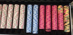
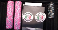
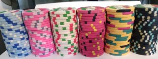
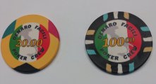
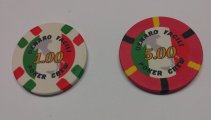
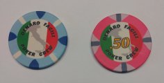
Chips arrived today! Denaro Facili Poker Crew. "Denaro Facili" in Italian translates to: "Easy Money". The decimal points are there so I can use these for cash and tourney chips as well (just ignore the decimal point - $100 chip will not be used in tourneys). I feel safe in doing so because this is a small "crew", all of whom know the penalty for any tomfoolery
I'd love to see more. Where can I find pictures of yours? If not up yet, post some please.Glad to see someone else went with a country theme. Love the $1.00
Package just came in! I will open and post in about an hourI'd love to see more. Where can I find pictures of yours? If not up yet, post some please.
These are great. The longer time passes, the more emotion this set of WSOP chips evokes from me. So many memories from the poker boom.Quick and dirty from me literally opening the box about two minutes ago....they're....GREAT!!!
View attachment 1201014View attachment 1201015
Between hitting my love of the early ESPN WSOP days when I fell in love with the game, to having my in-house Flamingo logo, to the quality of the product, I am floored! More suitable pron will be posted in the new pictures thread that was set up once I am able to get the table set up again this weekend, but I wanted to show off my new babies as soon as I could.
Edit: I can't believe I almost forgot, thank you for your time and your skills @timinater This project would have been impossible without you and when I am ready for my custom cash set (hopefully diamond mold or hybrid), you will be the first person I look to!
Thank you so so much again @justincarothers Amazing work on communicating though the process, the packaging for shipping and everything else. You now have a very loyal future customer for life!
That's where I was exactly! Those 5 or 6 years of watching the ESPN shows and having almost constant weekly games in my early 20's will always have a fond place in my heart. When I decided I wanted a custom tournament set the choice was easy for me and I am so happy with them.These are great. The longer time passes, the more emotion this set of WSOP chips evokes from me. So many memories from the poker boom.
I think I'll have to have a customized set of these done for myself soon.
How did you determine which chips were going to get a comma for the thousands and which were not?Quick and dirty from me literally opening the box about two minutes ago....they're....GREAT!!!
View attachment 1201014View attachment 1201015
Between hitting my love of the early ESPN WSOP days when I fell in love with the game, to having my in-house Flamingo logo, to the quality of the product, I am floored! More suitable pron will be posted in the new pictures thread that was set up once I am able to get the table set up again this weekend, but I wanted to show off my new babies as soon as I could.
Edit: I can't believe I almost forgot, thank you for your time and your skills @timinater This project would have been impossible without you and when I am ready for my custom cash set (hopefully diamond mold or hybrid), you will be the first person I look to!
Thank you so so much again @justincarothers Amazing work on communicating though the process, the packaging for shipping and everything else. You now have a very loyal future customer for life!
This is a great question! I have seen so many casinos that make chips with commas, without commas, and a mix. There’s plenty of examples where the 1K doesn’t have a comma, but the 5K does. Sometimes it’s 1K and 5K do, but anything above does not.How did you determine which chips were going to get a comma for the thousands and which were not?
Interesting! I am in a consistently consistent camp but cool to see that it is done unintentionally intentional.This is a great question! I have seen so many casinos that make chips with commas, without commas, and a mix. There’s plenty of examples where the 1K doesn’t have a comma, but the 5K does. Sometimes it’s 1K and 5K do, but anything above does not.
It’s consistently inconsistent.
That question would have to go to @timinater as they were his source files that I was able to personalize.How did you determine which chips were going to get a comma for the thousands and which were not?
Simple! Don’t know why I didn’t see it before.5 or more digits = comma
4 or less digits = no comma


I think these turned out great! Please post in the pron thread. Great picturesHere are some photos. Overall I am very happy! Thank you @justincarothers for the group buy, @Colquhoun for design tips, and @BGinGA who helped me with the breakdown.
I would change a couple design things if I could do it again. Some of the yellows are too light (@Colquhoun warned me). The stroke in general is too heavy around most of the text and the Casa Grande building itself (@Colquhoun also warned me about this). I did not ignore him, I just thought I had compensated enough!
But still very happy and excited to get these into play.
View attachment 1201116
View attachment 1201117
View attachment 1201118
View attachment 1201124
Great case too!Here are some photos. Overall I am very happy! Thank you @justincarothers for the group buy, @Colquhoun for design tips, and @BGinGA who helped me with the breakdown.
I would change a couple design things if I could do it again. Some of the yellows are too light (@Colquhoun warned me). The stroke in general is too heavy around most of the text and the Casa Grande building itself (@Colquhoun also warned me about this). I did not ignore him, I just thought I had compensated enough!
But still very happy and excited to get these into play.
View attachment 1201116
View attachment 1201117
View attachment 1201118
View attachment 1201124
Sure, I'll go post in theI think these turned out great! Please post in the pron thread. Great pictures
https://www.pokerchipforum.com/threads/tina-cards-mold-no-mold-greek-mold-pron.110561/
I saved so much money on the chips I decided to splurge on the case!Great case too!
I think they turned out great! I love how bright they are.Here are some photos. Overall I am very happy! Thank you @justincarothers for the group buy, @Colquhoun for design tips, and @BGinGA who helped me with the breakdown.
I would change a couple design things if I could do it again. Some of the yellows are too light (@Colquhoun warned me). The stroke in general is too heavy around most of the text and the Casa Grande building itself (@Colquhoun also warned me about this). I did not ignore him, I just thought I had compensated enough!
But still very happy and excited to get these into play.
View attachment 1201116
View attachment 1201117
View attachment 1201118
View attachment 1201124
Someone told me to amp up the saturation!I think they turned out great! I love how bright they are.
That case is fantastic.Great case too!