JUNK CASINO - INLAY MOCK UP (FEEDBACK WANTED) (1 Viewer)

JunkSalesman74

Sitting Out
Joined
Oct 16, 2025
Messages
34
Reaction score
42
Rewards
76
Location
Massachusetts
After lurking for a while and finally joining in October, I decided to get Illustrator last week and get to work on my custom design!

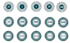
Step 1 was the inlay. At first, all the labels were going to match the top row (cash set) with the only difference being the little icon on both sides and a different colored center. However, my Fiancee walked in and suggested doing a negative which I ended up liking. I did toy with the idea of the demon. being outlined in the darker shade and filled with the tan/gold color, but I'm not sure.

Anyway, I'm curious to see what the pro's (and chip addicts, lol) we have here on the forum think about these. My biggest concern is that I'm off on something since I'm brand new to illustrator and the label will get cut off, print too small, etc. I'm open to suggestions and critique though.

Next step will be the color/design of the chips themselves, but I may end up picking pre-designed chips since I'm not sure how to go about importing, color filling, etc. We'll see, I'm having a lot of fun learning Illustrator but the Group Buy ends 12/3 and I don't know if I can wait another month, haha.

Any feedback would be greatly appreciated!

Overview and a few close ups:

Image 11-23-25 at 9.25 PM.webp
Image 11-23-25 at 9.37 PM.webp
Image 11-23-25 at 9.37 PM (1).webp
 
Cool design, I like it!
I do recommend not stretching the type, it can get a bit distorted, especially along the ends.
You can use a more expanded typeface, and the “type on a path” tool to get it to curve.

Also, the outline stroke around the text looks like it is following the inside of the path. There’s an option in Illustrator that gives you the ability to put the stroke on the “outside” of the text path (the default is the inside). When it is set to inside, it can squeeze the look of the letters. When you use outside stroke, the letterform remains untouched, with the stroke going around it.
Here is an example:
IMG_7395.webp

Good luck!
 
I like that design.

Just one thing: It took me quite a while to notice the different currency symbols on the cash labels while asking myself why the 25 is left of the 5. It is a nice touch, but it is unusual and potential cause for confusion because it is separated from the amount. Sticking to $ and ".25" might be better for the players. It will probably be less confusing once they are on different color chips, but still...

Oh, and did you try rotating the labels yet to see what they would look like on the table? Maybe different orientations of the crowns would work better on the NCV chips.
 
Cool design, I like it!
I do recommend not stretching the type, it can get a bit distorted, especially along the ends.
You can use a more expanded typeface, and the “type on a path” tool to get it to curve.

Also, the outline stroke around the text looks like it is following the inside of the path. There’s an option in Illustrator that gives you the ability to put the stroke on the “outside” of the text path (the default is the inside). When it is set to inside, it can squeeze the look of the letters. When you use outside stroke, the letterform remains untouched, with the stroke going around it.
Here is an example:
View attachment 1597129
Good luck!
Thank you! I knew there had to be a better way to curve text than the warp tool. I spent way too long tinkering with that. A quick google search for type on path has me in the right direction.

Great tip on the text too, I'll try both of these when I get home later tonight. Some of the outlines are a bit cramped and inside/outside explains it.

I appreciate the help!
 
I like that design.

Just one thing: It took me quite a while to notice the different currency symbols on the cash labels while asking myself why the 25 is left of the 5. It is a nice touch, but it is unusual and potential cause for confusion because it is separated from the amount. Sticking to $ and ".25" might be better for the players. It will probably be less confusing once they are on different color chips, but still...

Oh, and did you try rotating the labels yet to see what they would look like on the table? Maybe different orientations of the crowns would work better on the NCV chips.
Thanks, I'll tinker around with the crown. I turned my phone upside down and noticed it may look better with each one facing a different direction. I thought about it with the currency symbol but it wasn't really noticeable so I didn't even think of it for the crown. The more sets of eyes the better!

I'll experiment with the .25 too. You may be right. I wanted to use a $20 chip for cash to avoid any confusion (and lend itself to easier rebuys/limit games), however it may be cleaner to use $.25 instead.
 
I turned my phone upside down and noticed it may look better with each one facing a different direction.
I was also thinking about how it might look like with the crowns turned 90 degrees, tops facing outward.

Next step will be the color/design of the chips themselves, but I may end up picking pre-designed chips since I'm not sure how to go about importing, color filling, etc. We'll see,
Don't rush it. I don't think Tina group buys will end soon, and even at the comparatively low costs of Tina's, you will probably still spend a couple hundred bucks. If it's your custom design, you'll want it perfect.

Besides, I have the feeling that your label would work very well with Matsui-like designs, and there are not many pre-designed chips to chose from with that style. Solids will work, too, but a Matsui-inspired chip design might just be the perfect choice for your labels. (And that is coming from someone who is very indifferent towards Matsui.)
 
Here’s a great video for illustrator and round text, especially the type on a path tool, and making it “align to path>center”, not just sitting on the path. That can be very helpful.
Thanks Colq, that was a huge help!

I still can't get the stroke outside since the box is grayed out. I didn't get to spend as much time as I wanted with it last night, but I'll try again later today. The text looks so much cleaner with the path. So much so that I ended up switching the font, haha. I guess the bit of distortion it had from warping it made it look a lot different.

Back to the draft board later tonight.
 
Thanks Colq, that was a huge help!

I still can't get the stroke outside since the box is grayed out.
If it is still editable text, you won't get the outline stroke options. Once you are happy with the text select it and Convert To Outlines. This will then give you the letters as shapes and you can do the different strokes.

Note - before I convert to outlines I always take a copy of the editable text and keep that layer for later. Mainly as you WILL want to edit the text or try a new font option at a later time. Which you can't if you converted it to outlines :)
 
Last edited:
If it is still editable text, you won't get the outline stroke options. Once you are happy with the text select it and Convert To Outlines. This will then give you the letters as shapes and you can do the different strokes.

Note - before I convert to outlines I always take a copy of the editable text and keep that layer for later. Mainly as you WILL want to edit the text or try a new font option at a later time. Which you can't if you converted it to outlines :)
I knew there was a reason I felt the need to check here first before settling in to Illustrator.

I'll try that now, thank you!
 
A few tweaks with the text curve, font, outline position, and alignment of the crowns has brought me here. I also increased the size of the currency symbols to make them more noticeable since I didn't like how the .25 looked vs the cleaner 25.

Now I'm wondering if the text on the larger tournament chips (100k-1M) will appear too small and thus make the 5000 and under seem bigger (too big?).. a problem for tomorrow. I'm also toying with the stroke pt at .5 instead of .25 but again the larger denomination chips seemed off due to the smaller size font.

I appreciate everyones input on this. It has been extremely helpful!
 

Attachments

  • Image 11-25-25 at 11.35 PM.webp
    Image 11-25-25 at 11.35 PM.webp
    41 KB · Views: 79
  • Image 11-25-25 at 11.34 PM (1).webp
    Image 11-25-25 at 11.34 PM (1).webp
    39.3 KB · Views: 85
  • Image 11-25-25 at 11.34 PM.webp
    Image 11-25-25 at 11.34 PM.webp
    127.7 KB · Views: 81
Looks good! I would adjust the space between the numbers, especially the 100, 1000, etc.
The kerning space in that typeface makes the 1 look way too far away from the 00s. Maybe the 00s are just too close to each other also.
 
Tweaks to kerning seem to be in order. I would also like to see how the labels would look if the numbers did not use the comma as a thousands separator, but just a bit of kerning. The comma in that font is pretty dominant. Kerning space instead of it might result in an even cleaner look.

The spacing between "Casino" and "Junk" seems to be different on both sides, too. This is very noticeable at the right crown, which is visually much closer to the "O" than to the "J" (same with the currency symbol, but slightly less visible on these chips). You will need to eyeball the right distance; the mathematical center will not give the visually correct position. Our eyes cannot see the characters' bounding boxes, and the perceived distance to the "J" is anchored to the J's vertical bar.

Now I'm wondering if the text on the larger tournament chips (100k-1M) will appear too small and thus make the 5000 and under seem bigger (too big?).
Yes, the difference in appearance is really huge. One way to solve this could be to open the inner circle on the larger denom chips to have more room for the number. If needed, you could even drop the crowns on the 1M chip for even more room - but then you need a solution that considers the different background color in the outer ring, too. And you might need to use a smaller font for the "Junk Casino" lettering...
 
Still need to go back and adjust the stroke to the outside, but keeping the text alive in case it needs tweaking. I need to clean up and center a few things too but wanted to drop this draft in here as I'm working through a few ideas. Primarily on how to make the 1M chip work/do the Bounty, Rebuy, Add On chips to tie it in. They may need to go on 43mm chips to further set themselves apart from the rest of the 39s.

As for the adjustments... I swapped the font for a different one, fixed the loud comma (it was bothering me too), adjusted the kerning that I couldn't unsee after it was mentioned, haha, and massaged the way "JUNK CASINO" sits in relationship to the crowns/currency. In other words, keep the suggestions coming and hopefully this turns out great!

Thanks again for all the help.

Image 11-26-25 at 9.16 PM.webp
 
I like the size of the small denoms, makes them stand out. Have you tried doing “5K”, “100K”, “1M” etc? I think with the focus of the chips seemingly being the denoms that it would look good and cohesive. But you might not like that look
 
Looking great. The only ting I see with that new typeface is the J is the only letter that dips below the baseline, looks a little strange to me. Maybe there's an alternate J in that typeface, or you could possibly edit the bottom J manually?
That is, unless you want it that way...then it's fine! :ROFL: :ROFLMAO:
 
The new font seems to be a step back in readability; the ratio between outline and the characters makes the numbers appear blurred. The old font was much better in that regard - but I understand the change if you really want to have a comma as a thousands separator (otherwise the little space between the "1" and the "000" of the 1k in the old design - before you adjusted the kerning - was almost perfect as a separator). If you want to have thousands separators, I would add them on the 1k and 5k chips, too, for consistency.

For the new designs: I would not go with the 1M crown version; it looks more like a non-denominated chip to me. Likewise, I would not go with both the "1 Million" and the "R Rebuy" style chips at the same time - they are too similar.

If you do not want to open the inner ring to have more room for the numbers, then going with 43 mm for the 100k, 500k and 1M chips could be the way to go, and very fitting for the highest value chips. The inlay of the 43 mm web mold and jester mold is 4.3 mm larger in diameter. The numbers should become noticeably larger if you can allocate all of this to the inner disc. If the label still looks good enough with the rings staying at their current width, that is; this needs to be tested.

One more thing I did not notice before: I believe the right "$" on the cash chips is slightly closer to the outer ring than the left.
 
Thanksgiving set back the design work but I started messing with a few ideas to get some space and may have created a new design in the process. This may end up being two sets that blend together (25-500 or 1k and 1k or 5k-1M).

I think I'm also changing the font for "JUNK CASINO" because that J has been pissing me off too, haha. I could move it around but it's best to start with something more useable. I've spent way too much time trying to adjust around it sitting low.

Noted on the font. I think once everything is outlined correctly and centered it will look a lot cleaner, but I realized the design itself needed a bit more work before moving on to the final details.

This is why I posted, much appreciated!

Happy Thanksgiving!


To Be Continued..
 
Is this going to be black/white or you will add some color?
 
Are you familiar with the template for Tina chips?
I'm not sure which template that is.

Is there a template for the chip itself (edge spots, etc) or do you mean for inlay shape? I found a pdf of a bunch of the CPC style spots, but I'm still working through how to edit it.
 
Busy day but here is what I was tinkering with for the larger demon. chips. I think I like it enough to make it work for all the tournament chips or even the cash, although I kind of like the cash to be simple. I'm debating comma or no comma. Currently liking the comma.

Top and Bottom "JUNK CASINO" is in different fonts. I'm not sure which I like more yet. The 1M chip I'm leaning toward has the last font still.
Image 11-28-25 at 11.14 PM.webp
Image 11-28-25 at 11.17 PM.webp
Screenshot 2025-11-28 at 11.23.11 PM.webp
 
I like the top font, and think the comma is a must have. I like the look overall, but you’d be combing those with the other inlays for small denoms? I’d have to see them all side by side to decide if I’d like that or not, but my suspicion is I wouldn’t like having it mixed
 
I like the updates you made
I'm not sure which template that is.

Is there a template for the chip itself (edge spots, etc) or do you mean for inlay shape? I found a pdf of a bunch of the CPC style spots, but I'm still working through how to edit it.
Here’s the template.

Thread '39mm spot vector graphics (useful for Tina/Anita cards mold?)'
https://www.pokerchipforum.com/thre...phics-useful-for-tina-anita-cards-mold.81302/

It’s got all the colors, edge spots, etc. Seems like you might be using it already. Just wanted to make sure since you said you weren’t decided on colors yet
 
I like the updates you made

Here’s the template.

Thread '39mm spot vector graphics (useful for Tina/Anita cards mold?)'
https://www.pokerchipforum.com/thre...phics-useful-for-tina-anita-cards-mold.81302/

It’s got all the colors, edge spots, etc. Seems like you might be using it already. Just wanted to make sure since you said you weren’t decided on colors yet
Thanks! Yup, that's the one I have.

Now if I could only figure out how to edit the damn chips (color, roughen the edge spots, etc) I'd be in business, lol.
 
Thanks! Yup, that's the one I have.

Now if I could only figure out how to edit the damn chips (color, roughen the edge spots, etc) I'd be in business, lol.
The edgespots are behind a clipping mask. Think a 39mm circle where anything outside the circle is hidden, and anything within the circle is visible. The reason for this is that you don’t have to align a perfect edgespot to the edge of the chip…as long as it goes beyond the edge of the mask, it will look (and print) perfectly.
If you keep clicking the edge of the mask, it will go into “isolation mode” where you will be able to select the edgespots, their colors, or even move them around if you like.
What may also be throwing you off, is those templates are set up so that the base color chip is another circle, behind the edgespot clipping mask. It is also 39mm and is placed directly behind the mask and isn’t always easy to select just that base color circle.
There is a better solution than having two circles stacked on each other. I prefer to color the mask itself, but I fear I’ve made all this explanation a bit confusing already!
 
Thanks! Yup, that's the one I have.

Now if I could only figure out how to edit the damn chips (color, roughen the edge spots, etc) I'd be in business, lol.
It should be a double click to enter isolation mode, then single click to select the edge spot. Then just change the fill color as needed.

If you select the whole chip, you can scale everything from 39mm to 43mm. Just make sure you have the link selected so that it maintains the height and width proportions.
1764434386781.webp
 
The edgespots are behind a clipping mask. Think a 39mm circle where anything outside the circle is hidden, and anything within the circle is visible. The reason for this is that you don’t have to align a perfect edgespot to the edge of the chip…as long as it goes beyond the edge of the mask, it will look (and print) perfectly.
If you keep clicking the edge of the mask, it will go into “isolation mode” where you will be able to select the edgespots, their colors, or even move them around if you like.
What may also be throwing you off, is those templates are set up so that the base color chip is another circle, behind the edgespot clipping mask. It is also 39mm and is placed directly behind the mask and isn’t always easy to select just that base color circle.
There is a better solution than having two circles stacked on each other. I prefer to color the mask itself, but I fear I’ve made all this explanation a bit confusing already!
This makes sense in my mind, but may be above my pay grade to execute, lol. I think I was looking at it from the perspective of how I would have created the shape (albeit with my extremely novice skill level, haha). What you described sounds like it makes the most logical sense, but I'm clearly limited in my technical understanding.

I'll mess around with it when I get home and hopefully figure it out. At this point I'm unlikely to make the 12/2 order deadline if I'm getting into total chip design, so I can can take my time. I still may look through the predesigned sets and pick something there.. we'll see how ambitious I wanted to get.

As always, I appreciate the help!
 
It should be a double click to enter isolation mode, then single click to select the edge spot. Then just change the fill color as needed.

If you select the whole chip, you can scale everything from 39mm to 43mm. Just make sure you have the link selected so that it maintains the height and width proportions.
View attachment 1599318
Good tip! I'll be home later tonight to mess around with it.

Thanks for the help! Much appreciated!
 

Create an account or login to comment

You must be a member in order to leave a comment

Create account

Create an account and join our community. It's easy!

Log in

Already have an account? Log in here.

Back
Top Bottom