Initial mockup for my upcoming CPC customs (1 Viewer)

AKA_Tattoo

Sitting Out
Joined
Nov 7, 2014
Messages
41
Reaction score
22
Location
Tennessee
This the "1st draft". I'm not 100% sold on these colors, though I will stick with the edgespots, I think :)

The inlays are a mix of the 3 styles my artist buddy has sent me, we're working up some other options with a lil more " pizazz"

 
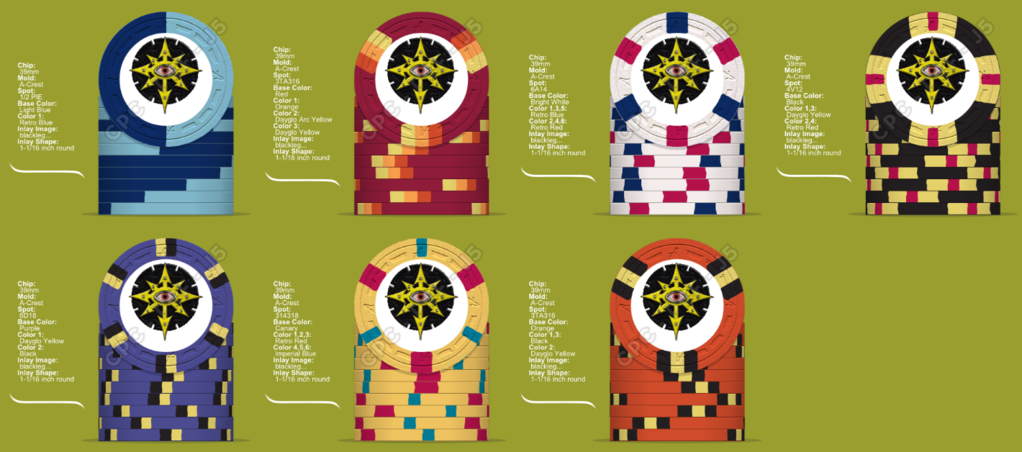
Interesting set. It looks like you're not interested in maintaining a particular/consistent spot progression; if I'm wrong and that is of interest, then methinks your spot pattern selection needs some tweaks.

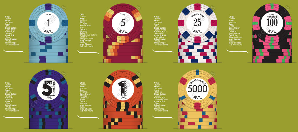
As for what's in front of me, I like 1-100 and the 5k. While I like how the 500 looks on my monitor, I'm afraid that the blurple and blue offer little contrast when put next to each other(I have the color samples in hand - they're much closer together than they appear on screen, to my eyes), and the black isn't a whole lot better. I'm also not a big fan of the 1k, but that's just personal preference...I don't care for the spot color selections there.

The labels...I don't care for the numbers on the 25/100. I like how the 5000 looks, but I don't like that numeral style on the 1/5 (they look too plain), and the text above the number on the 5k starts to crowd the number itself. The most visually interesting are the 500/1k, but this is a case where form has taken over function. Someone could *easily* mistake the 500 for a 5 if they weren't careful. I'd have significant reservations about mixing numerals with text to make up the whole denomination, save for something like 1k or 5k with the two characters right next to each other...and even then, I'm not a huge fan.

Looking forward to how this set develops!
 
Hi mate,

Is there a theme in mind for the set? What sort of stakes/games are you using them for? I only ask so we can assess the colours and spot patterns against what you envisage.

If this is the inlay, it seems to make the chip look off-centre or oblong.

FWIW, I like the white chip, and for some reason (probably the WSOP 5K), but I like the orange.

Good luck with designing the set :).
 
Revision 1 with my lame-o attempt to get the image I want in the inlay. I've played with some stuff, and I'm much happier with this now.


I'm liking where this is heading. IMO go back to your original 1 and 25. Also the 100 and 5000 need some work. Really liking the rest.

Also not sure how the orange/red combo on the 5 will go. Consider swapping the orange for tiger.
 
If this is the inlay, it seems to make the chip look off-centre or oblong.
This. Looks wrong. Don't do it.

I like the colors, spots and progression of 1-5-25-100.

500-1000-5000: I wouldn't reuse the color-combo black/yellow on a second and a third chip. Also, instead of a second blueish and a second reddish/orange chip, I'd mix in some other colors (many great options, like green, brown, lavender/purple, grey). Red/orange and yellow are present on five of your seven chips, while green is virtually non-existent. I'd rebalance the color-choices a bit. Spot progression from 1 to 500 is nice, but I don't like how it is continued with the final two denoms.

Good luck! :)
 
Last edited:
OK, I'll try and cover some of the points mentioned :)

Stakes: 1/2 or 2/5 cash or 20k to 30k tourney.

The 1 and 5 most likely will add on later down the road, sticking with tourney for the initial order.

Theme: trying to stick with a black gold/yellow, and red, whilst avoiding green like the plauge.

More to come later
 
For the logo, I'd suggest making it much smaller, moving the logo towards the top or bottom, and leaving room for a denom. If you're set on having it take the whole label at least move it down a little bit; otherwise it throws off the aesthetic of the chip and makes it look more like an egg with all the negative space on one side of the label.

I actually preferred your original 1 better. I like the new 25, particularly if its primary purposes is to start a tournament set - it's a little less busy than the original 25.

I echo Stocky's sentiments that I think the hundo and 5k could use some tweaks. You say that you're trying to avoid green - I'm sure you have your reasons, and I'll not judge. I would suggest, then, at least employing purple and/or pink in your spot patterns somewhere. As it stands, the set as a whole comes off as entirely too red/yellow to me. You state this is by design, and ultimately you're the one that has to enjoy it, so take everything I say for what its worth - I'm not paying for the chip set, after all!
 
index with inlay2.png

Revision 2

Wife-monster didn't like the 1 either, so this version we can agree on. The 5 I'm still not 100% on. I agree with you on the 25 Psypher, this version is less busy and I like it much more. The hundo is the "theme" chip of the set, the only thing likely to change on it is the shade of the yellow, depending on what I see when my color samples get here. the 500 I agree had to many repeated colors, this seems more fitting to me. The 1k I'm happy with, but may come up with something better. The 5k is probably my favorite chip, the only way I can see to improve it would be if a 4t16 or 4t18 edgespot was available.
The inlay is still totaly fluid, really just waiting on the artist to send me some mockups, I'd like it smaller and centered with denoms curved around it, but I'll wait and see what he throws my way.

Breakdown will be:
200 1's
200 5's
150 25's
150 100's
100 500's
100 1000's
100 5000's

That is enough to handle anything our group plays right now, if we grow I'll have a good reason to add on :)
 
No 4t18 or 4t16 spot available. Closest is 414ds18.

If this a tournament set and cash set will the $25 play in both? If so I'd recommend against doing this and get a $20 for the cash set.
 
Ok, this is the final draft of the colors and edgespots for the Tournament part of the set. I've made some minor changes to some colors after getting my samle set. Tell me what you think.


Cash set is still up in the air.
 
Nice work. Have you considered the 3V12 for the 5? Just remembering what other people have said about the 4v12: that's a lot of edge spot and you loose a lot of the base color. If that's important to you. Also, just noticed, there's an awful lot of yellow (3/5 of the chips) in that set. But, get what you want! Really enjoying the halloween chip, and it's giving me ideas for my set! Thanks!
 
That's an awful lot of yellow. Definitely way too much for my tastes. Beyond that, the set looks pretty disjointed..... not much aesthetic flow. And those denominations are tiny.... and will basically be unreadable at the table. That might work with a set built of traditional colors, but not here....
 

Create an account or login to comment

You must be a member in order to leave a comment

Create account

Create an account and join our community. It's easy!

Log in

Already have an account? Log in here.

Back
Top Bottom