Hotel El Portal- CPC Customs (1 Viewer)

One of the biggest hurdles in designing a great set of meaningful customs is finding an image that perfectly encapsulates the theme and feeling you're trying to emulate, and at the same time actually looks good on a printed circle that's less than an inch in diameter. The stars completely aligned here with that old truck at the resort, not only is it a cool personal connection to the hotel that will trigger those awesome memories every time you play with them, but it just 100% fits in with the southwest / Arizona theme. Love the almost-non standard base colors too, most are just a shade or too different from your "standard" chip colors, which gives them a really unique feel without getting crazy off the wall different and potentially confusing players. The fiver (both of them!) is awesome, I had a very similar color combo in mind for a future meetup chip. If you get the chance, could you post the full breakdown of the CPC spots and colors?

It's been 20+ years since I've visited but IMHO Sedona is one of the most beautiful towns in the country, and you really nailed the vibe hear - all without going over the top with their famed red rocks. Bravo sir!

These are my favorites types of custom sets - those with a cool backstory that are incredibly personal to the owner and very well thought out, top to bottom.
Really awesome set, thank you for sharing your story with us and best of luck in dragging many pots your way with these beauties. :tup:
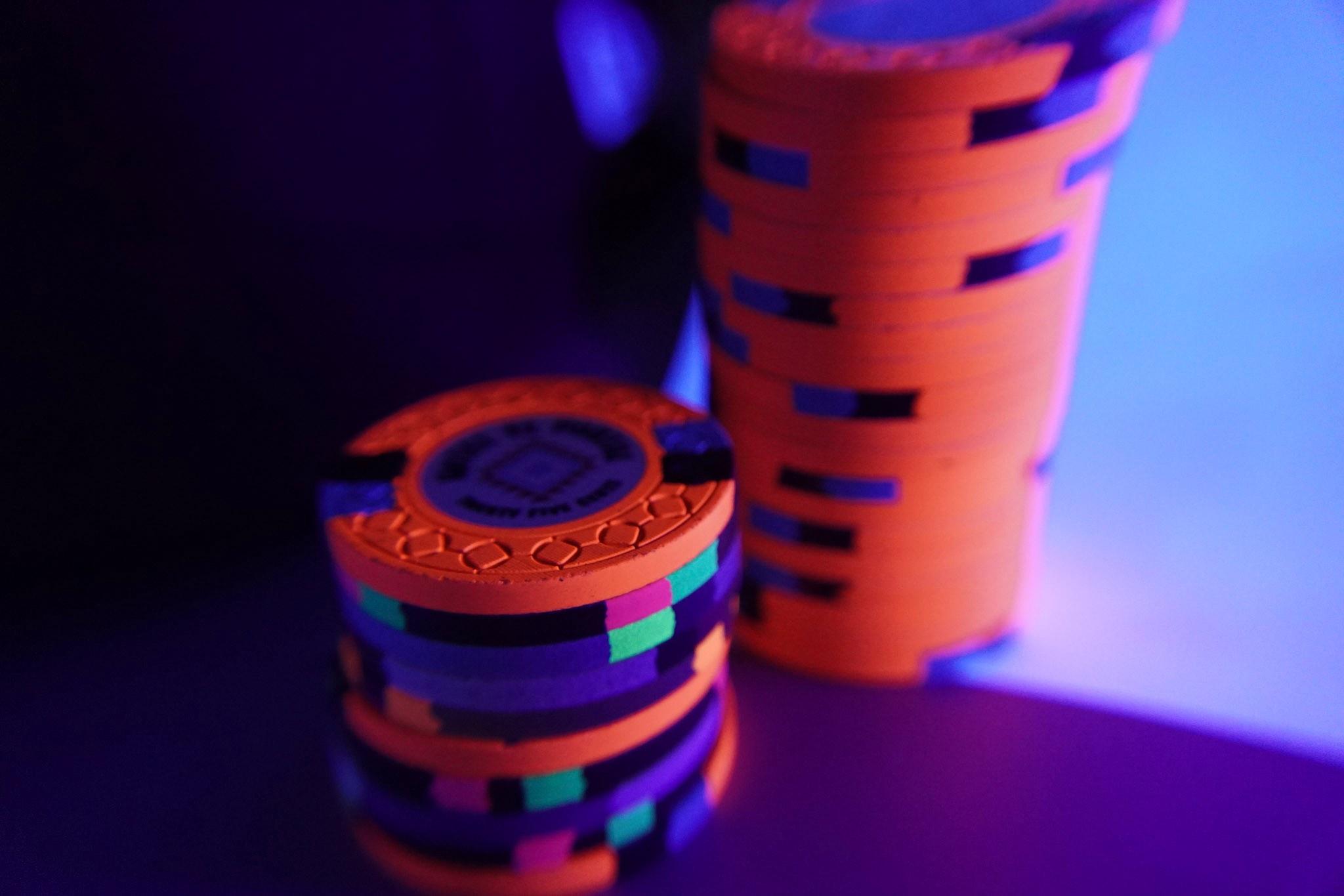
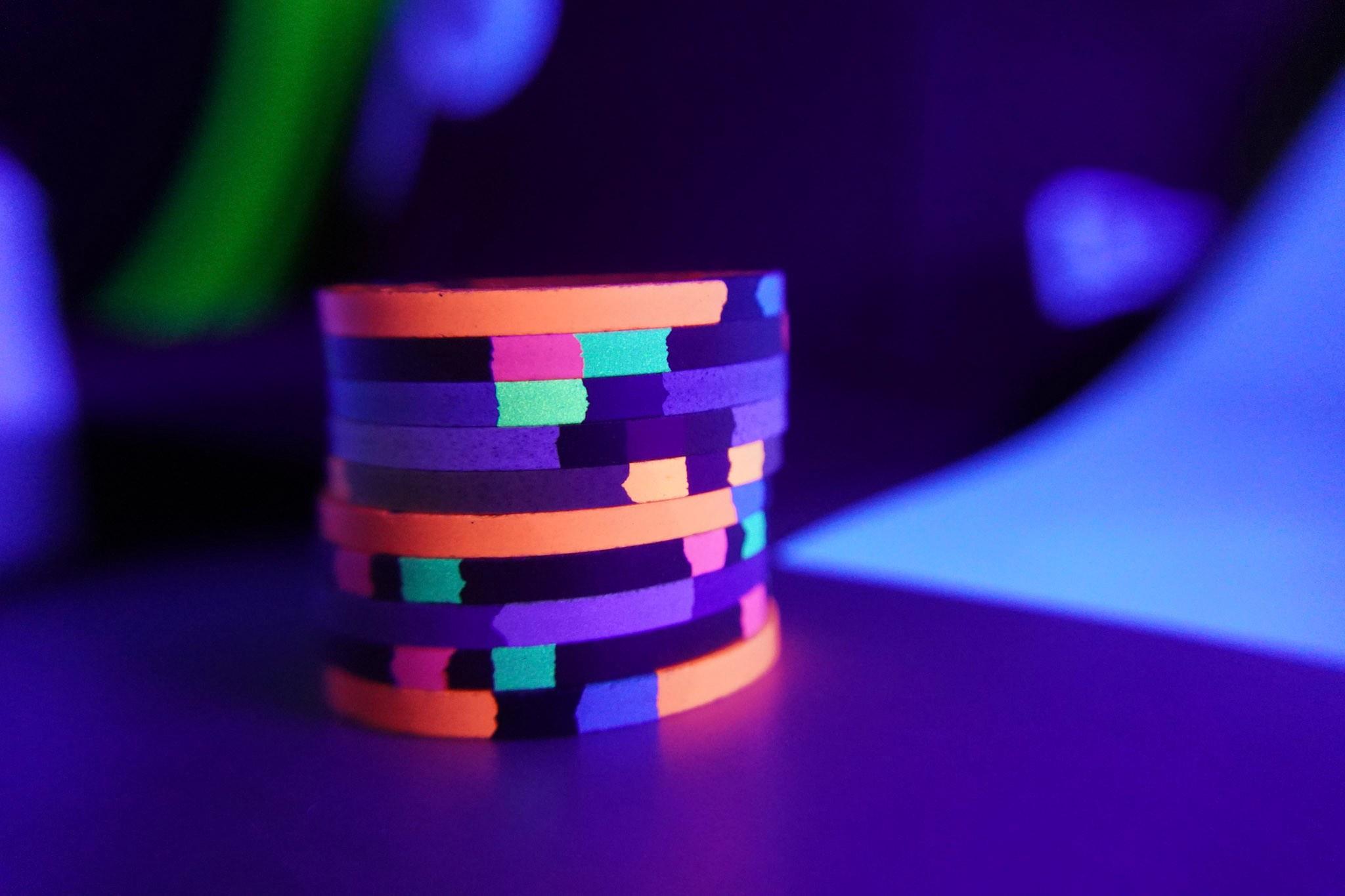
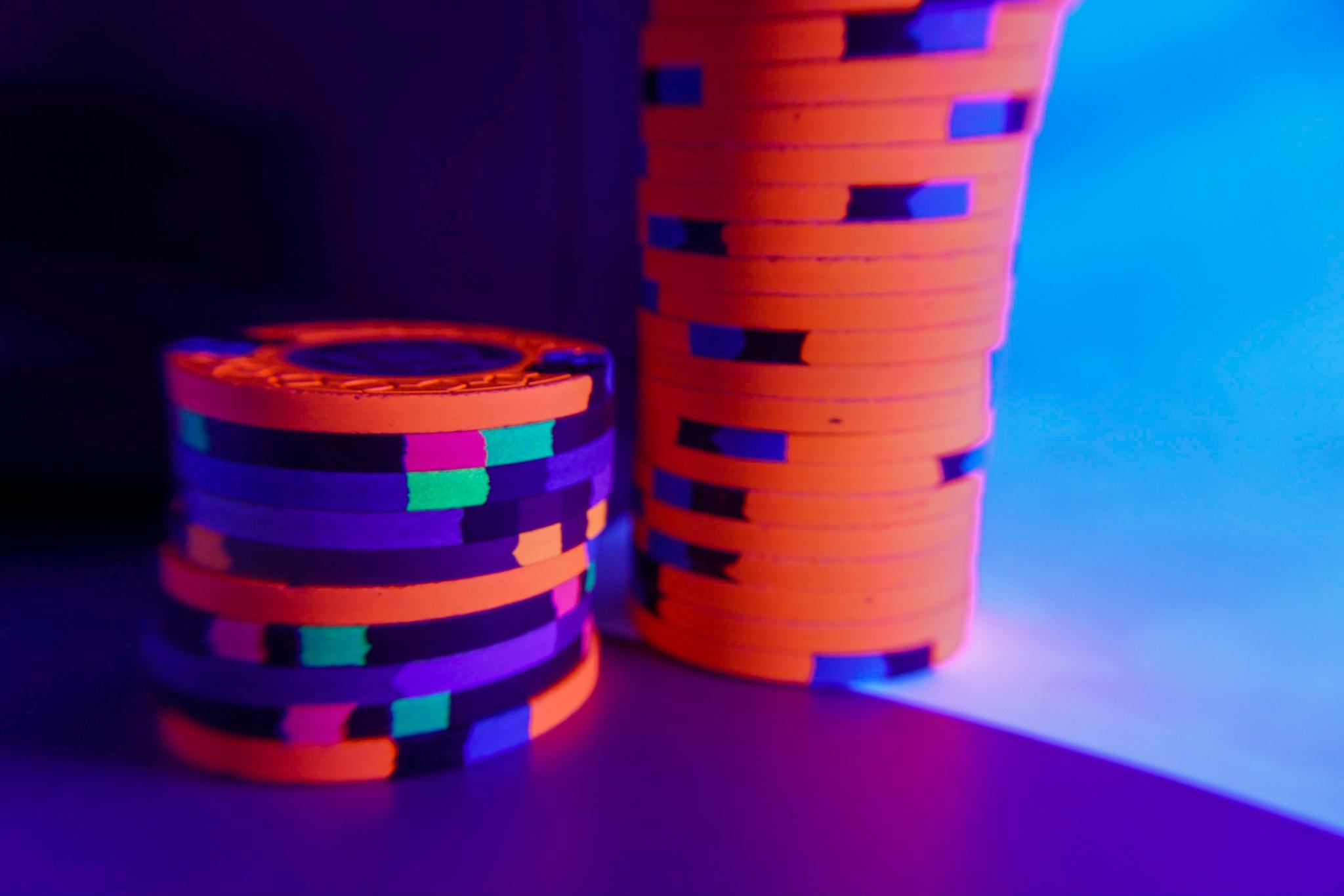
Wow- thank you! Appreciate all the kind words and detailed response. You said exactly the elements I wanted to pull off with the set so it makes me very happy to hear it translated to some degree, especially from someone like you.

I was actually hesitant to post the set at all due to some fear that some feedback may make me think of something I would kick myself for not doing better- which there always will be- and sour me on it.
Realized that the forum at large is why I got into the hobby as much as I have and how much I love seeing everyone else's reveals. The more I looked at them in person I more I loved them anyway so was worth biting the bullet on the post.

I will certainly post the build sheet here as well in the second post, hopefully this afternoon, with the inlay artwork and a few more random shots.
 
awesome set! i love both $5s, and i can see why you couldn't decide.

curious when you got these though, CSQ run has been over for a while right?
Thank you!
I've had them sitting on ice for a month+. Had a brutal work schedule, some family illnesses, and traveling on top of letting the initial honeymoon feelings pass before the full post. I've dribbled out a few teaser photos here and there in the mockup and upcoming molds thread, but hadn't had time for the full hog.
 
Really well done!

I'll echo @Irish here. The best CPC sets are the ones that have the great backstories and callbacks to the original theme reflected in each chip. When I first saw photos of these, I wasn't sure where you were going with it, but now in reading the OP and learning the significance of the inlay artwork and that there is a reference to the theme in each chip, makes the set even more meaningful and awesome.

I am totally in for a sample if any are ever made available, though I would understand if none ever are. Selling samples for my Canoe Clubs is likely the first and only time I'll sell samples, as each project and CPC set that I'll come out with is so personal and has so much thought and consideration put into it.
I appreciate it! I love your Canoe Club set as well so mean a lot. I did order a few extra for samples, likely full set with cut cards and buttons when ever they get here, but haven't decided yet how I will roll those out yet.
 
Awesome chips sir! I think I would pick the purple nickle. I love purple chips and love when people pay the money and add a micro denom! They are all great but a fresh clean purple nickle on my favorite mold! Bad Ass!!
Thanks Ben! I have a huge soft spot for the simple old school sets, so I totally get that and certainly one of my favorites as well. Love the cpc purples with the slightly pastel feel. My only regret is not being able to make something with the retro Lavender work- something to look forward to on the tourney set someday- but love the way these play together. I was hoping to pull off a simple/ classic base feel with the whole set and inlay with a few modern dg pops for contrast.
 
I would love to have some forum member at one of my games some time! Alternatively, hope to make it to a meetup some day, and maybe I can bring some of these along.

Side note- your collection of the Ace's helped seal my early love of the orange chip, and I'm sure you can see those color influences on the .25
 
Original buildsheet
54808.png


Inlay Artwork:
Hotel El Portal-v3_20 Front.jpg

Hotel El Portal-v3_20 Back.jpg


Additional Random Shots
20220604_150520.jpg


20220604_150559.jpg
20220604_145933.jpg
20220604_150257.jpg
20220604_150317.jpg


fRNx0q9.jpeg

8uTsHYj.jpeg

RdTY0Uz.jpeg
 
That is a great looking set. Classic style inlay which I love. The colors look great and all work well together and there’s great separation between denominations. Well done
 
Awesome set. I live in the Valley so head up to Flagg and Sedona couple times a year. know the Portal well. You really nailed the spirit and flavor of the region. Love the backstory and inspiration for the chips.
 
Wow….. and…. Wow….. not to forget… wow….

The background storys to all the chip colors are amazing and have such a personal touch. This set has easily to be among the best thought out sets on PCF …. I love a lot of sets, I love a lot of chips, but non has ever brought these smiles on my face like your chips… thanks a lot for sharing!!!

oh boy, that canary dg peach red combination is so lovely
 

Create an account or login to comment

You must be a member in order to leave a comment

Create account

Create an account and join our community. It's easy!

Log in

Already have an account? Log in here.

Back
Top Bottom