Feedback on my Oilers themed set (3 Viewers)

wtlau

Sitting Out
Joined
May 20, 2025
Messages
11
Reaction score
9
Location
UK
I’ve been thinking of a set I want to put together when CPC is up and running again.

Would be great to get feedback and expertise of the group here.

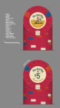
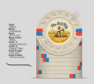
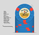
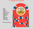
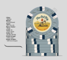
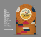
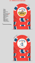
As a good Canadian boy, I grew up hockey mad. Particularly for my beloved Edmonton Oilers. Given they’re now in the finals, they’re really on my mind (particularly tough with the time difference in the UK). I’ve put together an Oilers themed set for my regular cash game.

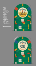
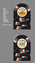
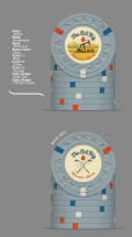
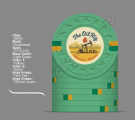
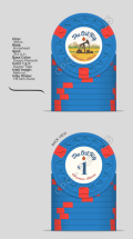
My group generally plays .50/1 or 1/2, so I’ve set up around that. I wanted some flexibility, so put in one non-denom for the frac.

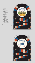
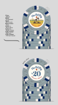
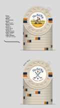
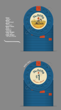
I tried to keep the set simple, and repeated edge spots around the team colours. I particularly like my $1, as it reminds me of the team logo. Will still play around with the colours of the inset. I like them feeling a bit vintage, but I want to get them a little closer to the colours of Alberta’s crest. Not really in love with the non-denom symbol (Crossed hockey sticks), was debating just an “X” but felt like a missed opportunity.

Would appreciate any feedback or ideas on what I could tweak or if I have any blind spots around playability.

Thanks!

IMG_0466.pngIMG_0465.pngIMG_0464.pngIMG_0463.pngIMG_0469.png
 
Love the inlay! And that’s usually the hard part to get right.

Don’t really like repeating colors but I don’t see any real issues, dirty stack wise. So it’s just an opinion that obv matters way less than your own.

I think a $25 plays better than a 20 for your stakes, and it also makes more sense since it’s green. I do not like that chip at all frankly. I don’t think those spot colors work well with the green.

Hundo is my favorite of the bunch.
 
Go Oilers!

Love the inlay, and I think most of the chips are really well done. Agree with @Eriks that the $20 doesn't work as well as the others though, and seems like the odd one out.

Like the idea of the crossed hockey sticks, but not those particular ones for whatever reason. Having them flipped the other way I think looks better, something like:

IMG_5692.jpeg
 
Green 25s

I think given that you don't intend to have an orange frac or orange big chip consider an orange $5 with 3 x dual 18 blue and white spots. It should be an easy adjustment for people from red default to orange.

Also, the logo is great but if you can find the Oilers font maybe consider using so your intentions of a tribute are clear.

But awesome!
 
Following!

Love the idea. Executing it with the available colour palette is going to be the challenge, but I think it's doable.

Some thoughts:

Love the inlay design so far.

Blue $1 is the money chip. Would consider using DG Peacock perhaps as the base colour.
1748641839422.png
Screenshot 2025-05-30 at 23.52.03.png


That $5 needs to be orange (or better said, dayglo tiger!)
1748641750385.png
Screenshot 2025-05-30 at 23.48.13.png


The grey chip is an opportunity to pay tribute to the greatest 3rd jersey ever! Personally, I'd use this as a $20
1748641571073.png
Screenshot 2025-05-30 at 23.43.10.png


Black $100 looks really nice - easily my favourite from your initial mock-up!
 
Amazing - thanks for the feedback!

Going through other forum advice, I was going to get some sample colours to see what’s what. My first iterations had tiger and peacock, but wasn’t sure exactly what shades would look best. Appreciate the steers here.

Totally agree with the green feedback. $20 makes sense for our game so I want to stick with it, but it was colour combo I liked the least. Grey is much better and love the @cpac54 suggestion of the Mcfarlane. (What a great inspo shot. All solid players there!)

I never considered an orange $5 but I think it’s great. Is it a common variation to the standard Red? Considering DG, do you feel a difference while handling the chips between the weighted and unweighted colours? Also, I’m less precious about split spots - do you guys know how prevalent they are?

Had another play and made a white non denom to go with the set and spot progression. Does the white work as a frac? Thoughts on bright white vs white would be appreciated as well. Is the price premium worth it?

Still not 100% on the non denom graphic. @BNads86 Agree on the sticks not being quite right. They feel too thin too. Will have a play flipping them around and making them chunkier later. Maybe I’m overthinking an image vs just a standard X…

Thanks again all for the great comments.

IMG_5057.pngIMG_5060.pngIMG_5058.pngIMG_5059.png
 
A bit stream of consciousness now - I had 2 other thoughts that probably go to the non denom options

One based on the late 90s copper and blue:
IMG_0471.pngIMG_0470.jpeg

Other based on Edmonton’s Uni team, the Golden Bears

IMG_0474.pngIMG_0473.jpeg

Welcome any thoughts! Thanks!
 
A yellow $20 is a standard color.

You can do a gold $20 with green for the bears (or green $20 bc yolo)

and use the Grey non denom - black being a standard $100 color Grey is almost there.

Also - use the sticks. Ask AI to generate a few versions.
 
Last edited:
Thanks - Sticking with the grey $20 for now. Had a play with the artwork and colours.

Lightened the colour up, and changed the font for the values.

IMG_0491.pngIMG_0490.pngIMG_0489.pngIMG_0488.pngIMG_0487.png
 
Off the back of that glorious Oilers game 1 win, I’ve played around with the main inlay.

Main Inlay D.jpg


Took the steer for off white from the @Cratty’s excellent Jester’s Court design.

Printed it out to see what it looks like at scale and it’s not terrible, but maybe a bit busy still? Particularly on the tower side. Welcome any feedback and suggestions.

IMG_5143.jpeg
 

Create an account or login to comment

You must be a member in order to leave a comment

Create account

Create an account and join our community. It's easy!

Log in

Already have an account? Log in here.

Back
Top Bottom
Cart