-
PCF is an eBay Partner. If you make a purchase through one of our links, we may earn a commission at no extra cost to you. Thank you for your support!
You are using an out of date browser. It may not display this or other websites correctly.
You should upgrade or use an alternative browser.
You should upgrade or use an alternative browser.
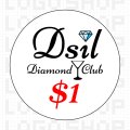
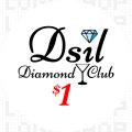
Dsil Diamond Club Inlay Draft (1 Viewer)
- Thread starter davesilver88
- Start date
mipevi
Full House
The center seems a bit busy, but I'm just looking at it on the screen so not sure... Have you tried with a black outline for the denom? Alternatively, or with it, could try a lighter gray watermark. Best to print it out in true size and see of course.
And how about some drink in the glass, the liquid surface could be level to the inlay/denom orientation, perhaps even playfully spilling over a little since the glass is tipped..?
And how about some drink in the glass, the liquid surface could be level to the inlay/denom orientation, perhaps even playfully spilling over a little since the glass is tipped..?
OP
OP
davesilver88
Straight
Great feedback, I’m looking for stuff like this.The center seems a bit busy, but I'm just looking at it on the screen so not sure... Have you tried with a black outline for the denom? Alternatively, or with it, could try a lighter gray watermark. Best to print it out in true size and see of course.
And how about some drink in the glass, the liquid surface could be level to the inlay/denom orientation, perhaps even playfully spilling over a little since the glass is tipped..?
I agree on everything, especially the middle being too busy.
I’m gonna give it a day to think about and then redraft.
OP
OP
davesilver88
Straight
Good point. I should find a better font. Thank you!You have a lovely font/logo in the middle. The outer ring is just a plain font- real bummer and distracts from the nice work in the center- seems like it was just thrown on there with no effort.
OP
OP
davesilver88
Straight
links_slayer
4 of a Kind
design in the op is definitely too busy, imo. i don't mind the "plain" font around the edges. i also like to center the denoms without taking the symbol into consideration but realize i may be in the minority.
chipinla
Straight Flush
- Joined
- Apr 12, 2018
- Messages
- 9,612
- Reaction score
- 26,082
- Rewards
- 370
$ symbol is ginormous.Okay quick update to V2
upNdown
Royal Flush
I think the exact opposite. I think the plain font around the outside is great and whatever is happening in the middle needs to be less and clearer.You have a lovely font/logo in the middle. The outer ring is just a plain font- real bummer and distracts from the nice work in the center- seems like it was just thrown on there with no effort.
To me, if inlays aren’t easily legible then they’re bad design. So simple fonts work.
And I’m sure it’s way too on the nose, but I like more retro designs, so I’d suggest a big diamond as the background in the center, instead of whatever scrolling initials are there now.
chipinla
Straight Flush
- Joined
- Apr 12, 2018
- Messages
- 9,612
- Reaction score
- 26,082
- Rewards
- 370
Here’s an idea to clean it up a little. I’m assuming DSil is for Dave Silver
As a minimalist I like your revision way better. Still the dollar sign is too big and I like the denominations centered without the symbol (smaller symbols help with this).
I like the Dsil font and I like a style like that with a plain style font (see my avatar/set).
Is there a personal/meaningful story that goes with diamonds and martinis, or are you going to tell a story (like by serving cocktails at your game/building a poker room with an old school classy 'diamond club' or speakeasy feel)?
upNdown
Royal Flush
I’m a dummy because I didn’t see that.DSil is for Dave Silver
If Dsil is like a nickname, then it’s probably pronounced Dee-sill? Like Alex Rodriguez was A-Rod? But with A-Rod, that’s how they spelled it and it was clear what it meant. Dsil doesn’t read Dee-sil to me. I see it and say Deh-sill.
chipinla
Straight Flush
- Joined
- Apr 12, 2018
- Messages
- 9,612
- Reaction score
- 26,082
- Rewards
- 370
I’m a dummy because I didn’t see that.
If Dsil is like a nickname, then it’s probably pronounced Dee-sill? Like Alex Rodriguez was A-Rod? But with A-Rod, that’s how they spelled it and it was clear what it meant. Dsil doesn’t read Dee-sil to me. I see it and say Deh-sill.
Just take away the grey text in the background, replace the dot on the i in Dsil with the diamond, reduce the size of the cent — and I think we've got ourselves a winner.
I’m a dummy because I didn’t see that.
If Dsil is like a nickname, then it’s probably pronounced Dee-sill? Like Alex Rodriguez was A-Rod? But with A-Rod, that’s how they spelled it and it was clear what it meant. Dsil doesn’t read Dee-sil to me. I see it and say Deh-sill.

OP
OP
davesilver88
Straight
V3 I will reduce the $ sign, I agree it’s too large$ symbol is ginormous.
OP
OP
davesilver88
Straight
Haha yes “Dsil” is my nickname that’s stuck with me for over 20 years across all social circles.I’m a dummy because I didn’t see that.
If Dsil is like a nickname, then it’s probably pronounced Dee-sill? Like Alex Rodriguez was A-Rod? But with A-Rod, that’s how they spelled it and it was clear what it meant. Dsil doesn’t read Dee-sil to me. I see it and say Deh-sill.
It’s pronounced “Dee-Sil”
When people don’t know me they either think I’m “deh-sil” or “diesel”
OP
OP
davesilver88
Straight
How did you do this so quickly? Looks greatView attachment 1120176
Here’s an idea to clean it up a little. I’m assuming DSil is for Dave Silver
OP
OP
davesilver88
Straight
No big story behind the Diamond. I like jewelry, it’s an alliteration to my nickname, and it’s a suit in poker.As a minimalist I like your revision way better. Still the dollar sign is too big and I like the denominations centered without the symbol (smaller symbols help with this).
I like the Dsil font and I like a style like that with a plain style font (see my avatar/set).
Is there a personal/meaningful story that goes with diamonds and martinis, or are you going to tell a story (like by serving cocktails at your game/building a poker room with an old school classy 'diamond club' or speakeasy feel)?
As far as the martini glass goes, I like James Bond; I own every movie. I too enjoy a vodka martini, and hahaha yes, it seems to fit into the old school fancy cocktail theme with diamonds - just thought it worked
chipinla
Straight Flush
- Joined
- Apr 12, 2018
- Messages
- 9,612
- Reaction score
- 26,082
- Rewards
- 370
How did you do this so quickly? Looks great
JMC9389
Royal Flush
This works! Dual inlay chips FTW!Maybe go with two different inlays, one side with the initials and one with the rest on the first version.

OP
OP
davesilver88
Straight
chipinla
Straight Flush
- Joined
- Apr 12, 2018
- Messages
- 9,612
- Reaction score
- 26,082
- Rewards
- 370
Have to be honest, it just looks cluttered to me
chipinla
Straight Flush
- Joined
- Apr 12, 2018
- Messages
- 9,612
- Reaction score
- 26,082
- Rewards
- 370
You should put it in the design tool to get an idea how it would look on a chip
OP
OP
davesilver88
Straight
No worries I appreciate the feedback. All opinions are welcome; I’m from Jersey - my feelings won’t get hurtHave to be honest, it just looks cluttered to me
I think it’s a bit unbalanced. The diamond and martini glass are close to each other and make the right side of the label too “heavy” in my opinion.
chipinla
Straight Flush
- Joined
- Apr 12, 2018
- Messages
- 9,612
- Reaction score
- 26,082
- Rewards
- 370
OP
OP
davesilver88
Straight
Dude you’re a machine! Thanks for helping with this. How do you get the 3 chips to the same image? I always have to do it 3 different times
Similar threads
- Replies
- 3
- Views
- 442
- Replies
- 2
- Views
- 601