Designing my chips, give me the good and bad of my rough design (1 Viewer)

mstang1988

Pair
Joined
Apr 21, 2021
Messages
174
Reaction score
71
Location
Texas
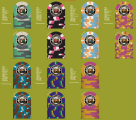
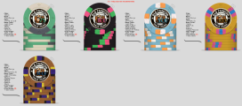
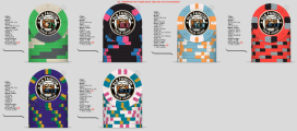
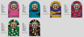
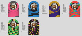
Title says it, designing a CPC set. Looking for feedback on the rough design. I need to fix up the numbering etc to match color better and be positioned the same. Inlay also needs centering.

IMG_1897.jpeg

IMG_1896.jpeg
IMG_1895.jpeg
IMG_1894.jpeg
IMG_1893.jpeg
 
It will be easier to review the set if you post them all in one image. Like this:


CPC TFPC v20 2024 10 16.png
 
Yup, caught that one earlier. I generated the base image with AI. I need to fix that. I have a few alternate chips I had looked at 6 and 7). The exported view had those.
 

Attachments

  • IMG_1898.png
    IMG_1898.png
    708.2 KB · Views: 76
The good: honestly I love the T25 chip. Beautiful colors, maybe switch the charcoal for a gray or retro green? T100 also looks really nice, I would personally keep it as is.

The bad: I feel there’s a lot of white spots in a lot of your chips, maybe we can experiment changing those out with different colors. I’d try more variations of the T1000, I personally think the options you have fall short or don’t make sense with the edge spot progression.

The ugly: please change the background color from that ugly green. Also you can just export 1 side of the chip to reduce clutter.
 
Yup, caught that one earlier. I generated the base image with AI. I need to fix that. I have a few alternate chips I had looked at 6 and 7). The exported view had those.
Step 2) Change the background to something more neutral so we can see the chip and not the baby shit green. A nice grey ;)
 
I like the first 3 (25-100-500), even with the white, if you were to make changes, I would look to the 100
 
Another renovation to remove some white and improve edge progression. Still not sold on the 5000 chip update. For the inlay style do folks think that’s too saturated and hard to see the denomination?
 

Attachments

  • IMG_1900.png
    IMG_1900.png
    575 KB · Views: 55
YES! Most of the denom colors are too close to the background color of the cocktail. Maybe try white inside of the black outline.

Edit: Color matching of the denom to the chip colors looks great when you have a very simple, mostly one color inlay background. Choose one thing to focus on, either the image of the old fashioned, or color matched denoms. I'd keep the image, and make the denom a simple black and white in this case.
 
No cherry or orange peel? I suspect that’s just whiskey on the rocks. ;)
 
YES! Most of the denom colors are too close to the background color of the cocktail. Maybe try white inside of the black outline.

Edit: Color matching of the denom to the chip colors looks great when you have a very simple, mostly one color inlay background. Choose one thing to focus on, either the image of the old fashioned, or color matched denoms. I'd keep the image, and make the denom a simple black and white in this case.
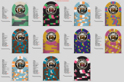
I started with black and it was even more unreadable. I’ll put some work in on the laptop where I have real photoshop instead of the gimped version I was messing around with last night in my IPad.
 
A lot of very expensive spot patterns. I’d simplify some of the workhorse chips to save cost.
 
I still need to do some inlay updates but changed the chip color.
 

Attachments

  • IMG_1157.png
    IMG_1157.png
    277.4 KB · Views: 42
Do you have a color sample? I think canary is a prettier color than yellow but your opinion might differ.
 
I made a few updates to the set. Ignore the inlay still.

I also started designing a cash set. I can’t decide between the weighted chips and dayglows. Give your thoughts on all of them please!

On the cash pink and blue are fracs. They won’t both be on the table, some will be 25c but I want 50c as the value of money changes in the future.
 

Attachments

  • IMG_1908.png
    IMG_1908.png
    327.5 KB · Views: 32
  • IMG_1907.png
    IMG_1907.png
    297.4 KB · Views: 33
  • IMG_1906.png
    IMG_1906.png
    303.2 KB · Views: 31

Create an account or login to comment

You must be a member in order to leave a comment

Create account

Create an account and join our community. It's easy!

Log in

Already have an account? Log in here.

Back
Top Bottom
Cart