CPC Color Palette Rated by Usefulness (2 Viewers)

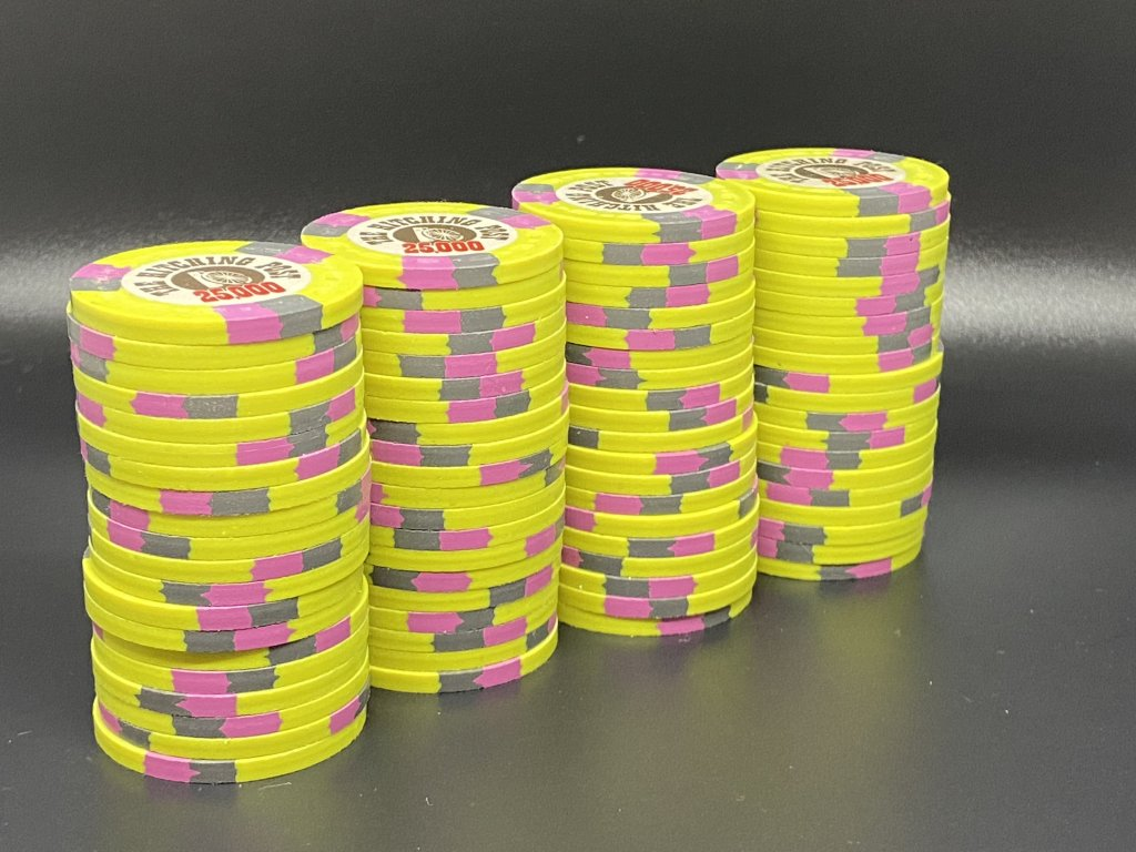
DG Saturn should never be used in any set, ever. It is the only color CPC makes that is complete garbage. Anyone who disagrees is hereby formally challenged to duel.

Agreed... DG Saturn should be at the bottom with about 20 clear spacers between it and the next color... that next color should not be dk blue.
 
For brass-flake haters, it would be interesting to offer a set exclusively using "unweighed" colors, ie chosing among all Retros, all DGs and Bright White.
Nice exercise:D
I have done many mock-ups of this. It is really difficult for me because blurple and maroon are two of my favorite CPC colors. I don't think that I could actually order a set full of unweighted chips. Maybe a tourney set where each chip uses only two colors.
 
I have done many mock-ups of this. It is really difficult for me because blurple and maroon are two of my favorite CPC colors. I don't think that I could actually order a set full of unweighted chips. Maybe a tourney set where each chip uses only two colors.
This is my exact struggle trying to put together my set with all 1/4 pies. Would a 1/4 with half weighted and half non-weighted be/look/feel weird?

What about a mix of some chips with only DG and some with DG and weighted? It’s hard to get a feel for it with only the sample chips.
 
This is my exact struggle trying to put together my set with all 1/4 pies. Would a 1/4 with half weighted and half non-weighted be/look/feel weird?
It's surprising how you can feel a difference in them. It's not major, but it's something.
 
This is my exact struggle trying to put together my set with all 1/4 pies. Would a 1/4 with half weighted and half non-weighted be/look/feel weird?

What about a mix of some chips with only DG and some with DG and weighted? It’s hard to get a feel for it with only the sample chips.
When I mocked mine up I'm trying to use all weighted chip bases and weighted edge spots, and vice versa for non weighted .
 
DG Saturn should never be used in any set, ever. It is the only color CPC makes that is complete garbage. Anyone who disagrees is hereby formally challenged to duel.

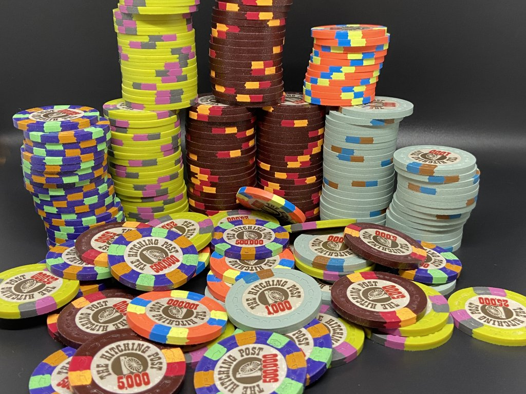
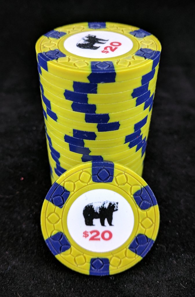
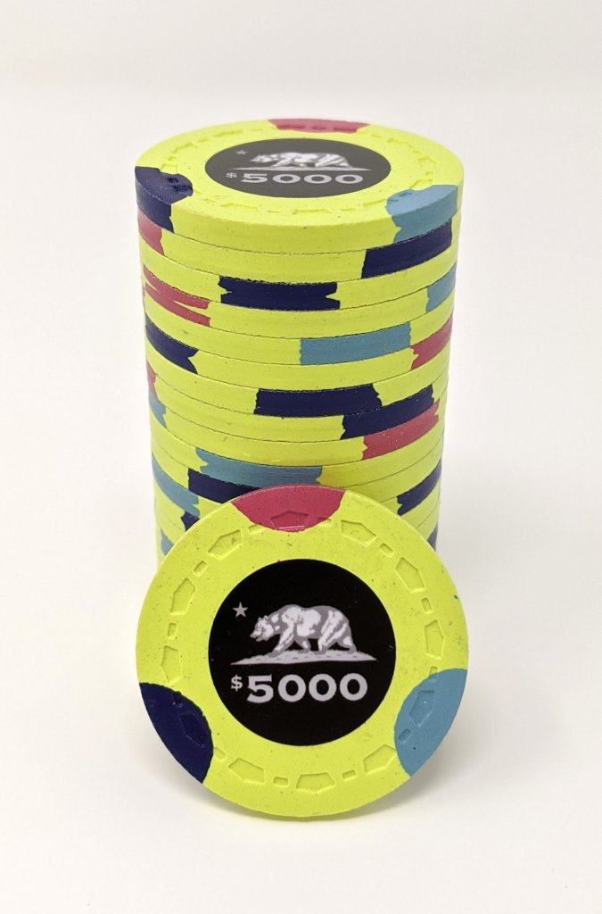
I dunno these look pretty nice to me.

KmsY9jM.png


w9A0ugj.png
 
DG Saturn by far one of the worst base colors around. Don’t recall chips I’ve liked that had a DG Saturn base
 
Last edited:
OK, I read the whole thread and still don't see how colors could be considered useful or not useful.
I can see some being better or worse for a particular use.

sumbudy splain it to me like im 3
 
DG Saturn should never be used in any set, ever. It is the only color CPC makes that is complete garbage. Anyone who disagrees is hereby formally challenged to duel.

The closest I ever got to DG Saturn in a set was in the cpc design tool. I used the color for a spot to make some very nice combos with the main chip color.

....THEN, I looked at the same colors among my sample chips and trashed the entire idea because saturn in reality looks awful.

Thus the axiom: Always get samples...
 
Last edited:
The DG Saturn chips look, feel, and sound like cheap plastic. They're probably not even made from the same composite material as all the other chips. They have a bit of translucence to them. They also change color drastically in different lights. They're more like puke green in person. An almost see-through puke green.

I've ordered DG Saturn chips myself. I tried to convince myself that I liked them. That only lasted so long though. The new DG Yellow is awesome though! You definitely want DG Yellow if you're looking for a brighter yellow. It's much better than it used to be (which was more of a butter yellow in the past).
 
Useful can be slightly different than just which color is the best. If there is a color which is very close, the usefulness goes down. Imperial blue is fantastic...but DG Peacock is right there. Usefulness requires the context of the entire palette
 
All the colours can be useful. Complements and contrasts between two or three or more colours in a chip can lead to all sorts of chip design happiness.

I'll be using standard weighted colours for my base chips but will try to use dayglo colours liberally in the edge spots when my Casino Royale design comes through. Still fairly far in the future, though.
 
Dg Saturn and dg orange. Both colors are meh but it’s the fact they are translucent that irks me the most. When used as spots they have this weird effect and make the chip look like plastic.
 
The DG Saturn chips look, feel, and sound like cheap plastic. They're probably not even made from the same composite material

I tried and tried and cannot honestly identify any texture difference. Since you have some, run a quick test. Blind shuffle 50/50, half DG Saturn, half some other unweighted color. needs to be same mold obviously.

See if you can sort them, blind, with any sort of accuracy.
 
I tried and tried and cannot honestly identify any texture difference. Since you have some, run a quick test. Blind shuffle 50/50, half DG Saturn, half some other unweighted color. needs to be same mold obviously.

See if you can sort them, blind, with any sort of accuracy.
Now this is prime Content. BLIND COLOR SHUFFLING.

The sad part is.... I'm interested on the results!
 

Create an account or login to comment

You must be a member in order to leave a comment

Create account

Create an account and join our community. It's easy!

Log in

Already have an account? Log in here.

Back
Top Bottom