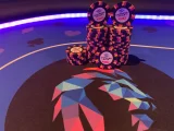
Definitely an improvement, imo. But, as
@allforcharity mentioned, get a color sampler. You’ll be surprised by how vastly different the colors are in real life than on your screen. Colors that look amazing together on screen drown each other out and drab appearing colors really pop, etc.
Since you have time before
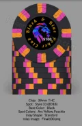
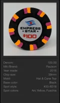
CPC is taking any orders anyway, you have plenty of time to play around and tweak it. I look at the first few iterations I came up with compared to what I’d order today and it’s as radical as the difference between the screen colors and real life. One of the easiest and cheapest way to make your chip set really stand out is by including the colors of your chips edge spots in your inlay, usually the text. This is just an example and in no way am I claiming to be the premier authority. I’ve got a lot of help from the PCF community.
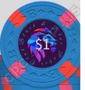
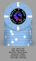
Take the below inlay... Yes, the chip changed, but note how much a couple minor tweaks like changing the font, the color and the placement compliments the chip compared to my first attempt. The
CPC chip design was something I thought was pretty solid at the time. After a lot of help from
@GreatWhiteDope, I worked and reworked the inlay a few dozen times for the Paris $1s it’s being used on and you’d probably agree it’s night and day better. My lion theme stayed a constant and these tweaks cost nothing, but some of my time.


