-
PCF is an Amazon Associate and an eBay Partner. If you make a purchase through one of our links, we may earn a commission at no extra cost to you. Thank you for your support!
You are using an out of date browser. It may not display this or other websites correctly.
You should upgrade or use an alternative browser.
You should upgrade or use an alternative browser.
Can i get some feedback - cosmic cardroom (2 Viewers)
- Thread starter daddylongleg6666
- Start date
It would really help to see the label with the chips
OP
OP
daddylongleg6666
Two Pair
I haven't decided on the rest of the chips. feedback on that would be appreciated as well. maybe a purple or black chip?It would really help to see the label with the chips
Attachments
Have you printed them at 7/8” yet and looked at them at arms length?
OP
OP
daddylongleg6666
Two Pair
I'll order samples once I finalize my chip choice.Have you printed them at 7/8” yet and looked at them at arms length?
OP
OP
daddylongleg6666
Two Pair
Bump
Stylistically, you've got two different inlay designs here:
For example, I think this would look awesome:

This one, not so much:

FWIW, the second design style has some killer potential for a 43mm ceramic design with that nice big canvas...
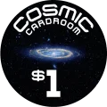
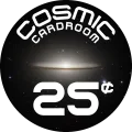
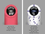
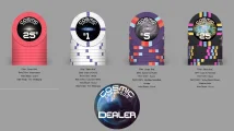
- The 25¢ and $1 are blackout style inlays with a central graphic. I think having the circumferential text for Cosmic Cardroom works well here, it draws the focus to the central graphic. It's simple and clear to read.
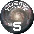
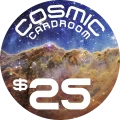
- The $5 & $25 have a broader, non-focused background graphics, and they have a very light/colorful look. 180^ different feel than the other inlays. And without the central graphic, the circumferential text for Cosmic Cardroom feels a little off to me. For this style of design, I'd consider flattening that out, see how it looks.
For example, I think this would look awesome:
This one, not so much:
FWIW, the second design style has some killer potential for a 43mm ceramic design with that nice big canvas...
OP
OP
daddylongleg6666
Two Pair
Thank you this is excellent feedback. My intentions were to have grander and grander celestial objects as denomination increases but you are absolutely right in that the label is completely different for the second two. I think I will continue the designs of the first and second label and for the second two I will keep with the theme in having black space on the outside and a centralized object in the middle. Thank youStylistically, you've got two different inlay designs here:
Overall, I'd recommend picking one style or another to make the design cohesive. Given this looks to be a relabel or CPC style clay set, my very personal opinion is that the blackout style will provide a cleaner, sharper looking design - and one where you can make the design work with pretty much any chip you pick to relabel. If you're going as a RHC relabel with a decent sized inlay area, the second style could work, but as @Rhodeman77 notes above, the clay will have a MUCH bigger impact on how the set looks. Not saying you couldn't make it work, but you'll either be limited to chips with certain spot colors to match the inlay, or you'll need to tailor the cosmic background graphic to match the chip you want.
- The 25¢ and $1 are blackout style inlays with a central graphic. I think having the circumferential text for Cosmic Cardroom works well here, it draws the focus to the central graphic. It's simple and clear to read.
- The $5 & $25 have a broader, non-focused background graphics, and they have a very light/colorful look. 180^ different feel than the other inlays. And without the central graphic, the circumferential text for Cosmic Cardroom feels a little off to me. For this style of design, I'd consider flattening that out, see how it looks.
For example, I think this would look awesome:
View attachment 1554156
This one, not so much:
View attachment 1554164
FWIW, the second design style has some killer potential for a 43mm ceramic design with that nice big canvas...
The dominant color of the space object could match the color of the chip maybe worth a try.
I like the space theme.
Needs a Galaxy mold!
I like the space theme.
Needs a Galaxy mold!
To your point and original design intent, something else to consider is your game stakes & workhorse chips. Most folks find sets with a cohesive theme/style more appealing, but some like to have the highest denomination as something different. That way when it finally hits the felt after some rebuys, it's flashier / noticeable / special and stands out a bit more from the workhorse chips, gives it that WOW factor. So maybe you keep the $25 with the bigger celestial style inlay, and the 25¢ / $1 / $5 have the darker deep space theme.Thank you this is excellent feedback. My intentions were to have grander and grander celestial objects as denomination increases but you are absolutely right in that the label is completely different for the second two. I think I will continue the designs of the first and second label and for the second two I will keep with the theme in having black space on the outside and a centralized object in the middle. Thank you
All just my 2¢ worth, remember there are no right answers
")
OP
OP
daddylongleg6666
Two Pair
OP
OP
daddylongleg6666
Two Pair
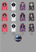
Current progress
OP
OP
daddylongleg6666
Two Pair
Any recommendations for the color of my 4th denomination? It will be my $20/$25 chip
Have you played with some other fonts & layouts?
The SciFi font with it's text wrapped along the curve clashes.
The tone of your chosen font feels better straight rather than curved, the font has such defined straight lines.
You can maybe play with Cosmic as the larger font size with card room underneath it as a much small size.
here are a few other fonts that might be cool to try at least:
OP
OP
daddylongleg6666
Two Pair
These are nice, I will play around with those later. I want to stick to the curve as it makes that central object the focus but you are right in saying that the font is definitely not meant to be curved so I will see if any of the ones you linked look better.Have you played with some other fonts & layouts?
The SciFi font with it's text wrapped along the curve clashes.
The tone of your chosen font feels better straight rather than curved, the font has such defined straight lines.
You can maybe play with Cosmic as the larger font size with card room underneath it as a much small size.
here are a few other fonts that might be cool to try at least:
No worries,These are nice, I will play around with those later. I want to stick to the curve as it makes that central object the focus but you are right in saying that the font is definitely not meant to be curved so I will see if any of the ones you linked look better.
You can also play with drop shadows to mimic the nebulas.
It's purpose is two fold: can be used to place numbers over your spaces images for contrast & also run with the theme.
You dont have to fight the images with the numeration this way and have more space for your "cosmic card" text/logo
just an idea
5 min example:
OP
OP
daddylongleg6666
Two Pair
Made some slight tweaks, I don't know how I feel about it. I really want to keep the main focus the object in the center, I don't want to cover it.

OP
OP
daddylongleg6666
Two Pair
BigGrizz
Pair
Love your 25. Its nearly identical to the one I designed for my set. Great minds think alike.
OP
OP
daddylongleg6666
Two Pair
Yshs
Oh awesome, do you have any photos?Love your 25. Its nearly identical to the one I designed for my set. Great minds think alike.
BigGrizz
Pair
Still in mockup myself. Got a second kid comin so I had to back burner my custom set. Might get to pull the trigger within the next 6 months though.
My 20 and 100k are from Tiger Palace (asked the designer for permission) and the 5 is loosly based on Kodiak, another bear claw set.
Im also working on a second set with variable patterns that is an omage to other sets.
My 20 and 100k are from Tiger Palace (asked the designer for permission) and the 5 is loosly based on Kodiak, another bear claw set.
Im also working on a second set with variable patterns that is an omage to other sets.
Attachments
Similar threads
- Replies
- 8
- Views
- 647
- Replies
- 9
- Views
- 647
- Replies
- 1
- Views
- 374