Building a CPC microstakes CG set... would love to hear your thoughts (1 Viewer)

OfficerLovejoy

Full House
Joined
Sep 27, 2020
Messages
4,034
Reaction score
14,437
Location
Cologne, Germany
I found PCF last month and have been browsing all of your awesome paulson collections and CPC custom sets.
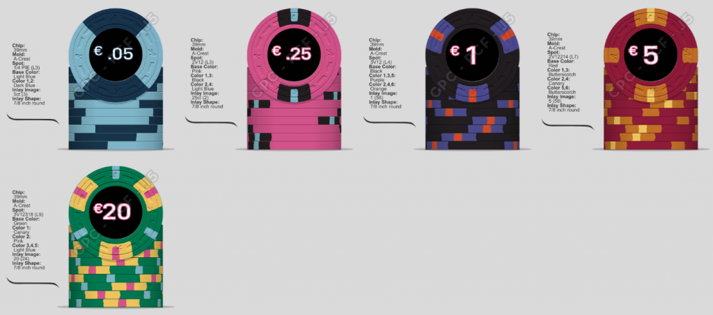
My goal here is to get a microstakes set for my monthly .05/.10 single table homegame with the option to grow my game to a .10/.25. Through the breakdown guide i found on here, i settled on a set of 600 chips with the following breakdown:

100x .05
200x .25
150x 1
100x 5
50x 20

I have not yet contacted someone about the lables, so all i have are placeholders with the denoms right now.
For the name / theme of this set: My homegame consists exclusively of cops, so maybe a cop design / name would make sense, ideas would be appreciated.

This is the mockup of the design i am quite happy with. I tried to include an egdespotprogression as well.

Any ideas or obvious misstakes you guys already spotted?
2020-10-17 Microstakes.png
 
Looks great! The only issue I might see, is possible dirty stacks with the nickel and 1. If the nickel is turned right, that dark blue could look black. Maybe light blue/imperial blue or light blue/white?
 
Looks awesome! I would consider using some of the dg colors for the spots: dg tiger on the $1, dg yellow on the $5 and dg pink on the $20.

Do you have a color sample set?
 
Looks great! The only issue I might see, is possible dirty stacks with the nickel and 1. If the nickel is turned right, that dark blue could look black. Maybe light blue/imperial blue or light blue/white?
That ist a valid point and one, i already gave some thought. I approached it, by turning the black €1 into a white one, but missed that solid black in my set and changed it back. I will try your suggestions on the .05, thank you. :D

Looks awesome! I would consider using some of the dg colors for the spots: dg tiger on the $1, dg yellow on the $5 and dg pink on the $20.

Do you have a color sample set?
My color samples are still on their way from the UK and i will definately use those to check If i like the actual colors i am using right now.
The thought of using the DG colors for the spots did not cross my mind yet, but seems like a good Idea. I am concerned about 2 shades of pink in the set because of the solid .25 thought.
 
That ist a valid point and one, i already gave some thought. I approached it, by turning the black €1 into a white one, but missed that solid black in my set and changed it back. I will try your suggestions on the .05, thank you. :D


My color samples are still on their way from the UK and i will definately use those to check If i like the actual colors i am using right now.
The thought of using the DG colors for the spots did not cross my mind yet, but seems like a good Idea. I am concerned about 2 shades of pink in the set because of the solid .25 thought.
To me the weighted colors are a bit too dull for edge spots (at least weighted colors only) but it’s great that you have color samples coming so you can decide for yourself
 
This is potentially a LOT of money to spend for a microstakes game, if you're starting with custom CPC.
Yes I am aware of that. ;)
Poker is and has been a big passion of mine for the last 20 years. I'm in a position now where i can afford a nice set of CPC chips. Although i am sure, noone in my homegame will come close to appreciate the amount of work and money i am putting into those chips, I'm determined to fulfill this dream of mine. :D
But that is why I'd love the input of some seasoned pros in the chipping world.
 
A few tips:
  • Definitely get a CPC color sample
  • Get mold samples, at least 8 or 10 of the molds you think you may want, so you get a feel for how they feel, sound and handle
  • Do lots of mockups, and save them all. Then go back after a month and look at your first mockup, and see if you still like it.
  • Look at other's sets to get an idea of what spots and color combos you really like.
 
Last edited:
Looks great! The only issue I might see, is possible dirty stacks with the nickel and 1. If the nickel is turned right, that dark blue could look black. Maybe light blue/imperial blue or light blue/white?
I agree with this assessment, I’d play with some different colour options for either the $1 or the frac to help differentiate the two a bit. The $5 is my favourite from the lineup.
 
A few tips:
  • Definitely get a CPC color sample
  • Get mold samples, at least 8 or 10 of the molds you think you may want, so you get a feel for how they feel, sound and handle
  • Do lots of mockups, and save them all. Then go back after a month and look at your first mockup, and see if you still like it.
  • Look at others sets to get an idea of what spots and color combos you really like.
All helpful tips, thank you. I am currently in week 3 of doing mockups and samples are on their way.

I agree with this assessment, I’d play with some different colour options for either the $1 or the frac to help differentiate the two a bit. The $5 is my favourite from the lineup.
I agree, I don't want a dirty chipstack problem on my hands.
Some chips, like the .25 and the €20 did not change much, some are in constant refinement like the $1. I'm playing around with stuff like:
2020-10-17 alternative €1.png

#1 is fine but maybe not as punchy as the black one, #2 looks cool, but the set would be very pink-heavy #3 also looks cool, but i am not sure i like the canary color i've seen on pictures of actual CPC-Sets as a base color. Will have to wait for the samples.

Alternatively: Changes to the .05:
2020-10-17 alternative 05.png

I like #2. It should be light enough to fix the issue but still has the aesthetics of #1. I am not a big fan of #3. Very different look to what i originally had in mind.
 
All helpful tips, thank you. I am currently in week 3 of doing mockups and samples are on their way.


I agree, I don't want a dirty chipstack problem on my hands.
Some chips, like the .25 and the €20 did not change much, some are in constant refinement like the $1. I'm playing around with stuff like:
View attachment 554833
#1 is fine but maybe not as punchy as the black one, #2 looks cool, but the set would be very pink-heavy #3 also looks cool, but i am not sure i like the canary color i've seen on pictures of actual CPC-Sets as a base color. Will have to wait for the samples.

Alternatively: Changes to the .05:
View attachment 554844
I like #2. It should be light enough to fix the issue but still has the aesthetics of #1. I am not a big fan of #3. Very different look to what i originally had in mind.
I think either frac #1 or #2 are fine options. As others have mentioned, don't rush the process. Make a bunch of versions of your lineups, save them, and re-visit them after some time. I mocked up over 40 different lineups over a couple of months for my own CPC set before finally settling on the final version, which I finally submitted just recently.
 
Yes, very reasonable approach.
How did you go about starting the design for your lable? Did you have a pretty clear vision where to start or did you get a designer to show you some ideas.
I'd also love to see your final design. Not gonna steal anything, I promise, just curious. :)
 
Yes, very reasonable approach.
How did you go about starting the design for your lable? Did you have a pretty clear vision where to start or did you get a designer to show you some ideas.
I'd also love to see your final design. Not gonna steal anything, I promise, just curious. :)
I had a pretty clear idea of what I was going for with my CPC set (Canadian-themed), and reached out to @Johnny5 for his help and expertise in bringing that idea to life. The inlay is still a work in progress, but should be finalized pretty soon. You can see that journey though here if you're interested: https://www.pokerchipforum.com/threads/new-theme-canadiana-or-something-eh.59893/
 
I had a pretty clear idea of what I was going for with my CPC set (Canadian-themed), and reached out to @Johnny5 for his help and expertise in bringing that idea to life. The inlay is still a work in progress, but should be finalized pretty soon. You can see that journey though here if you're interested: https://www.pokerchipforum.com/threads/new-theme-canadiana-or-something-eh.59893/
That is an awesome set and it was fun to see how you developed the ideas over time. :)

I threw together a very simple temp lable, worked on the dirty stack problem and updated the edgespot colors as @Eriks suggested. This is where I am atm:
2020-10-17 Microstakes.png
 
2020-10-18 black label 25ct.png

I think a black lable might be a better fit with the colors since that is what i used as a temp lable during the mockup.
 
Black inlays go well with bright chip colors :)
Great looks also have been accomplished by color-matching an element of the inlay to the dominant color of the chip itself.

When your color samples arrive you'll notice that many of CPC's colors are significantly darker than displayed in the design tool. The regular pink and light blue for example are pretty muddy. Blue/Dark Blue IRL come closer to Dark Blue/Black. Purple doesn't have enough contrast to black imo, similar thing with red and butterscotch. You'll probably make some bigger changes after checking the colors in person.
By the way: The colors named Dayglo are UV reactive. You can get pretty cool effects with that.

Something to think about denominations: If you want to get the maximum out of your budget, replace the 20€s with 25€s. You get 25% more value stored in the same amount of chips, meaning just a little more leeway if the game gets bigger.
That UV effect is really cool, but aren't the dg colors without the brass flakes as the base affecting the weight of the chip a lot? I would want them to be as close to 10g as possible. Maybe a noob question, but that is how i understood the description on CPC.

About that €20/€25 suggestion: the €20 is more covenient for a rebuy, since as you know as a fellow german, in europe most guys carry around several €10, €20 and €50 notes and usually only one or two €5 notes if at all. I would want to be able to just hand out a €20 chip for a €20 rebuy and make change from the big stack.
I will be losing value in my bank though, that is very true. Something to think about.
 
Last edited:
You can see the difference on a scale, but it really is negligible for the "feel" of the chips. Perhaps if you took a whole barrel of each, but just holding a single chip you can't really notice anything.
club-hel-weighted-unweighted.jpg

(left is 100% weighted colors, right 100% unweighted)

Regarding the €20/€25 -- not trying hard to convince you, but you could just as well take a 25 from the bank, make change for 5s with the biggest stack, and then perform the rebuy with the gained 5s. Change has to be made anyway, doesn't really matter who does it in terms of time wasted, you or the rebuyer. Americans have no $25 bill either, yet most casinos opt for $25 chips over $20 (or they only use the $20s for special occasions).

Edit: Perhaps also think about spot progression. I wouldn't cling too hard to it. If you want the maximum distinguishability between denominations in stacks even under bad lighting conditions, then you'll want a different type of spot on every chip. Repetition of a pattern at max on two chips that rarely or never are in play at the same time.
Consider this example with a 4A14 vs 6A14 --
4a14-6a14-daylight-uv.jpg

On the rolling edge, and in a stack, there's not so much difference between in this example four and six repetitions of the same kind of spot. (Especially at the usual distance you will be looking at the stacks of the other players at the table.) This means your only way to distinguish the chips is by color. Color however has worse performance under bad lighting conditions than shape (spot type). Combining both color and shape gives best results in this regard.
 
Last edited:
Ok, the difference in weight is negligible indeed. I hope, the color samples come this week so i can push forward with the project.
I changed some edgespots and the base color of the pink .25 to the dg variants and added some chip specific color to the lables (i will still get a designer to do it, I want something way better).
The progressive edgespots are quite close to my heart. You definately have a point though, and I will take it into consideration.

Thank you guys so much for your helpful advice. I appreciate the thoughts and work you put into educating me and protect me from an expensive misstake.
2020-10-18 Microstakes.png
 
For your design name how about

The Station
The Joint
Lockup Card Room
The Firing Range
Patrol Room
 
I hope, the color samples come this week so i can push forward with the project.

+1 to @Beakertwang's tip:
Do lots of mockups, and save them all. Then go back after a month and look at your first mockup, and see if you still like it.
Same what good artists, photographers and the likes do. Your perception tends to get skewed when you keep working on a piece without a sufficiently long break during which you keep mental distance from it. You feel like it's good, but only a good while later realize it actually isn't. Not good if you already pulled the trigger by then.

Do take your time and don't rush. The A mold is mounted all year round afaik so there's no rush to get into a mold run window. The EUR-USD exchange rate would be an argument, but what good are chips you end up not enjoying or even biting your ass over because you overlooked a flaw. Of course this can still happen, but at least you then know you did what you could to try and avoid it. Less frustration.
 
For your design name how about

The Station
The Joint
Lockup Card Room
The Firing Range
Patrol Room
Oh yeah, I was hoping for some suggestions for the name or theme of the set! Great stuff, I like the station a lot. Maybe artwork of a station with color matching details for the various chips?
 
+1 to @Beakertwang's tip:

Same what good artists, photographers and the likes do. Your perception tends to get skewed when you keep working on a piece without a sufficiently long break during which you keep mental distance from it. You feel like it's good, but only a good while later realize it actually isn't. Not good if you already pulled the trigger by then.

Do take your time and don't rush. The A mold is mounted all year round afaik so there's no rush to get into a mold run window. The EUR-USD exchange rate would be an argument, but what good are chips you end up not enjoying or even biting your ass over because you overlooked a flaw. Of course this can still happen, but at least you then know you did what you could to try and avoid it. Less frustration.
100% agree. I don't want to rush it, but i still want to keep moving forward. Next step ist colorproofing with the samples, then finalizing a name / theme and after that getting a designer involved.
If all that is done, i can check if I still like my mockup and after final changes I'll be ready to order.
 
@OfficerLovejoy
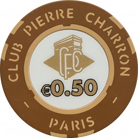
If I may, I would put the currency unit "€" on the left side not on the right.

Like dat :

50995.jpg
250374.jpg
I was gonna point out, that this ist only true for the dollar sign and that the € has to be after the number.
A quick google check taught me that that is not the case. It actually can be wherever you choose, as long as the number stands alone and is not part of a text.
Will change it, thank you.
 

Create an account or login to comment

You must be a member in order to leave a comment

Create account

Create an account and join our community. It's easy!

Log in

Already have an account? Log in here.

Back
Top Bottom