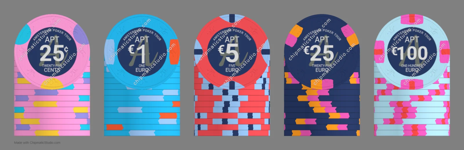
Very cool! If I were to try and nit pick I’d say there’s maybe a lot of blue, which could risk dirty stacks. Love the Aria 25K cranberry design for the $5
Very cool! If I were to try and nit pick I’d say there’s maybe a lot of blue, which could risk dirty stacks. Love the Aria 25K cranberry design for the $5
I like them! Good change on the €100. I was going to say that in your original €100 design, the pink and red in the edge spots are very close together and might visually bleed together.
I like the quarter and the $100 (both versions). But I understand the slight change in the $100 as well. Blue is one of my favorite colors too! Nice job over all.