Artwork discussion for new Paulson chips (3 Viewers)

These are the two I like

#1: This one is my favorite if it only had the denomination font used in chip #2. If all the chips are color matched it has enough color including the outer ring to make splashed pot recognition good.
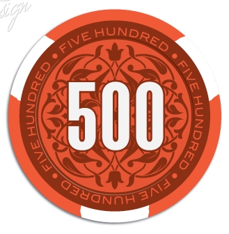
Image101.jpg


#2: This one probably has too much white, hard to judge without looking at more of the set side by side (different colors) but standing alone it looks really good. I'm afraid all the white would make splashed pots harder to separate the different denominations.
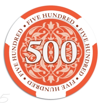
Image102.jpg
 
Here are a few more looks at the Apache chip. This one is important to me so it might take a long time to get final art.
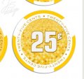
I think there is a strong need for a simple $.25 chip. I would like to put out just one chip and not a whole set.

View attachment 155567 View attachment 155568

Top left by a pretty good margin for the Apache design. I like the shaped inlay and the smaller picture.

Screenshot_20180220-083556_01.jpg

I also like bottom left.

I agree the need for a quarter, but I'm too picky I think to put a non matched quarter into a set unless it's a mixed set, and in that case I'd probably want to have similar molds.

For quarter design I really like the bottom right option.

Screenshot_20180220-083603_01.jpg
 
For the Apache designs, my runaway favorite is top left. Distant second is bottom right.

For the fracs...wow. If I had to choose one it would be the bottom right, but these designs don’t really appea to me at all. Not a fan of the background nor most of the denom fonts (only one I like is bottom left, but I can at least tolerate the bottom right). Definitely don’t like the darker yellow font against the yellow background. Not sure if I like the text ring here, but if I was choosing between the two it would be the white ring. So, as a whole, yes, bottom right, but I’m not jumping for joy over it.

Keep in mind, just one man’s opinion and preferences. Nothing personal intended here.
 
Regardless of what design is ultimately chosen, I strongly encourage the decision-maker(s) to 1) not include ~any~ white on the inlay design itself (except perhaps the denomination), and 2) to avoid making all inlays identical across all denominations.

Doing either one will make the chips extremely difficult to distinguish during play, especially in pots.

There is already a minor issue with this, inherent with the required use of relatively large white edge spots. Adding even more white to the chip inlay will merely accentuate the large amount of white that the chips are already straddled with, due to design constraints established by the manufacturer.
 
Like the blue chips best - For me best of the best are bottom right blue or upper left blue
 
We could artificially change the spot colors with the inlay itself, similar to those gorgeous Crystal Park $5s..... or at least add a faux 1/8" colored spot in the middle of each white spot.....

......ducks......


This 100%. I really think the inlay should be used as much as possible to add an additional color to the chips, otherwise it’ll be dirty stacks and pots galore.
 
Maybe make the back ground the light orange then the leaf and outer ring the base orange
8E35C83A-A6AD-42B6-961B-AA33E1E5BDAF.jpeg
 
Here is where we are heading. One of these designs will be what we are going with. Minor adjustments can be made.
Just wondering if we should remove letters around outer ring?


25.jpg

apc_gh_ws1a.png
apc_gh_ws1a2.png
apc_gh_ws1b.png
apc_gh_ws1c.png
apc_gh_ws1d.png
apc_gh_ws1e.png
 
Last edited:
Any from C through E are fantastic, A and B are okay but the white seems to overwhelm the chips.
 
My favorite is the WS1B but with a Dark Blue or Bluple T25K. :sneaky: Designs look awesome btw!

Screen Shot 2018-02-20 at 1.57.19 PM.png
 
I'm with @Psypher1000 on this one. The bottom lineup is my pick.

Will there be a .25 available? Hot pink? (y) :thumbsup:;)
 
Color options are limited; pink is already on the 500. It might be better to move brown to the frac/non-denom spot and, per @ChaosRock, use blurple for the 25k.

Yeah, I much prefer a pink frac but tan would be okay. I can't think of any game where a quarter and a 500 would both be in play though.
 

Create an account or login to comment

You must be a member in order to leave a comment

Create account

Create an account and join our community. It's easy!

Log in

Already have an account? Log in here.

Back
Top Bottom