Interest Rancho Agave bounty plaques interest thread (2 Viewers)

calfdemon

Flush
Supporter
Joined
Jul 21, 2022
Messages
2,443
Reaction score
3,728
Rewards
260
Location
Santa Clarita, CA
CCA#
R-9505
I spoke with Jim @TheChipVault about having some bounty plaques made for those that bought a tournament set. He spoke with @justincarothers about having them made in his group buy and it will go forward if there is enough interest. Jim will provide the art to have them done if the interest is there and he asked me to start this interest thread to see.

So post if you are interested and how many you may want if it goes forward. This is not the order thread and your numbers aren't binding at this time, we just need to see if the demand is there to go forward. Justin has the ordering deadline on his current order thread for April 7th and a minimum order of 100 is needed.

I would be in for 20 of them.

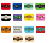
These would be the style of plaques with Rancho Agave bounty art provided by Jim:

Thread 'Acrylic Plaques Group Buy- APRIL 2026' https://www.pokerchipforum.com/threads/acrylic-plaques-group-buy-april-2026.141431/
 
20 for me.
3/27 Edit: changed to 10

Classy, comic, Cali/Tex-Mex, or politically incorrect?
 
Last edited:
Well we have numbers, who's doing the designing?
High School GIF
 
The main logo is done obviously. Im guessing Jim needs the Bounty aspect of it added. I dunno, maybe @Cratty could take a swing at it? He always makes great designs!!
 
The main logo is done obviously. Im guessing Jim needs the Bounty aspect of it added. I dunno, maybe @Cratty could take a swing at it? He always makes great designs!!
I made two versions of bounty chip labels:
1774471668673.webp

(Edit: To clarify, I have not had the actual labels made--I don't have a RAT set--but I designed the labels.)

But they don't really translate to plaques.

I’ve got some ideas. I’ll give it a crack on the weekend if no one beats me to it.

Taking a crack at it too, but haven't really designed this style of plaques before, only solid ceramics ones since they're more chip-like.

Anyone have ideas how to design for the pearlescent background or the multiple layers that some of these plaque designs seem to have?
 
Last edited:
I got the art and templates, going to take a crack at the bounty plaque design.

Anyone have ideas how to design for the pearlescent background or the multiple layers that some of these plaque designs seem to have?
It seems to me that you can only print 1 opaque layer for Tina plaques (as opposed to several layers for MSK - background transparent, foreground opaque, and metallic gold/silver), can anyone confirm?
 
rancho-agave-bounty.webp


Here's my proposal.

- I think the "teal" color of the Agave plant (that is also represented on the 43mm cash set) provides a nice contrast vs. the vibrant tourney chips.
- For Tina plaques, we're limited by the background marble color. This would be a representation of their standard white marble.
- I'm not sure how Tina's CMYK color values translate, so what I see on screen may not be how they print.
 
Last edited:
I really like both of the black versions. If I had to pick between those 2, I think the blue version takes the cake. Great job!
 
Note that the background colors are pre-specified by Tina's available palette. I'm not sure how close my representation is to the actual color in person.
Do you have a copy of the palette or other templates? I tried download the template that Justin linked to but it didn't give me much info.
 
It seems to me that you can only print 1 opaque layer for Tina plaques (as opposed to several layers for MSK - background transparent, foreground opaque, and metallic gold/silver), can anyone confirm?

So in this example in the GB thread:

1774513565707.webp


Is the "marbling" the text/denom likely just printed in the artwork itself? Also the top plaque seems to have some potential subtle marbling in the light teal background (with the heavier mabling in the leaf graphic) but maybe that's just an optical llusion.
 
So in this example in the GB thread:

View attachment 1657817

Is the "marbling" the text/denom likely just printed in the artwork itself? Also the top plaque seems to have some potential subtle marbling in the light teal background (with the heavier mabling in the leaf graphic) but maybe that's just an optical llusion.
Other way around. Marbling below, and opaque layer covering it above.
 
Do you have a copy of the palette or other templates? I tried download the template that Justin linked to but it didn't give me much info.
I didn't get any color palette for the background marble in template form, I had to just eyeball the available colors from pictures of plaques previously made.

@justincarothers, is there a set list of color palettes (for background marble) available to choose from?

Is the "marbling" the text/denom likely just printed in the artwork itself? Also the top plaque seems to have some potential subtle marbling in the light teal background (with the heavier mabling in the leaf graphic) but maybe that's just an optical llusion.
The marbling is not printed, it's an actual physical layer of the plaque that Tina provides with that pattern. Your design is an opaque layer of print (of patterns and text) that covers up parts of the marble. What the print doesn't cover will then reveal the marble underneath.

The "subtle marbling" that you see is either 1) the opaque print layer wasn't strong enough to completely cover the marble underneath, or 2) a pattern in the print that somehow looks similar to the marble (meaning for example, the yellow text isn't completely solid yellow).
 
I didn't get any color palette for the background marble in template form, I had to just eyeball the available colors from pictures of plaques previously made.

@justincarothers, is there a set list of color palettes (for background marble) available to choose from?


The marbling is not printed, it's an actual physical layer of the plaque that Tina provides with that pattern. Your design is an opaque layer of print (of patterns and text) that covers up parts of the marble. What the print doesn't cover will then reveal the marble underneath.

The "subtle marbling" that you see is either 1) the opaque print layer wasn't strong enough to completely cover the marble underneath, or 2) a pattern in the print that somehow looks similar to the marble (meaning for example, the yellow text isn't completely solid yellow).
These are the colors she says are available for marbling when asked "light blue,gold,green ,white ,purple,red,dark blue ,orange,black"

Screenshot 2024-10-11 075840.webp
 

Attachments

  • Screenshot 2024-10-11 075840.webp
    Screenshot 2024-10-11 075840.webp
    73.2 KB · Views: 40
I'm going to jump in here and make an executive decision. We are going to do this plaque. Although teal would be perfect for the marbling it is not available. I chose the light blue because it is more inline with the original southwest color palette. Also, if we are not making the text larger, I prefer we leave off Mexico. Done and done as far as I'm concerned. Make it so. THANK YOU @sleepypiggly

1774527115577.webp
 
The marbling is not printed, it's an actual physical layer of the plaque that Tina provides with that pattern.
I understand that. I was asking, in the Harrah’s plaque, the one with the white flleur de lis marble layer, the yellow/orange text and denom doesn’t appear to be a solid color but also has some marbling effect. I’m assuming that is simulated since there isn't multiple marble layers available on the Tina plaques.
 
I understand that. I was asking, in the Harrah’s plaque, the one with the white flleur de lis marble layer, the yellow/orange text and denom doesn’t appear to be a solid color but also has some marbling effect. I’m assuming that is simulated since there isn't multiple marble layers available on the Tina plaques.
I think the "subtle marbling" that you see is either 1) the opaque print layer wasn't strong enough to completely cover the marble underneath (making the print semi-transparent, and/or 2) a pattern in the print that somehow looks similar to the marble (meaning for example, the yellow text isn't completely solid yellow, such as a gradient).
 

Create an account or login to comment

You must be a member in order to leave a comment

Create account

Create an account and join our community. It's easy!

Log in

Already have an account? Log in here.

Back
Top Bottom