Preview of first new Clay mold (2 Viewers)

This the other design. mockup
View attachment 1582522
One comment: maybe it's just me, but none of the denominations have a currency listed as text except for the fracs (e.g., “Fifty cents”). Wouldn't it be more consistent to reword the fracs? For example, is “zero point fifty” common usage? I don't know.

Btw, I have seen that I only live 2 minutes away from your shop 🙂
come over and visit me
 
short update on final chips before mass production


Noir final.webp
 
yes we saw this too. final labels will be without this mistake
 
yes we saw this too. final labels will be without this mistake
I think the chips are great in general. My probably too late to be considered thoughts are:

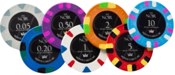
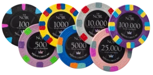
Monte Carlo is soooo overdone. I understand there’s mass appeal and a proven theme but please consider *anything* else? Noir also done but done less. There’s already Royal Card Room China Clays. Why compete more than you have to? You can be all original or even borrow from less often used stuff.

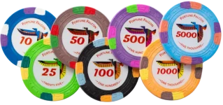
In the space you’re playing in these themes aren’t overdone:
mob themes (tangiers), tribal casino themes, 20s speakeasy themes, country club themes (dunes), nautical (like faro dunes, RPC, etc), fishing (like roros card room, jacks fishing and musky jacks), Egypt (pharaohs, pyramid casino, Luxor), cigars/cuba/havana, liquor/agriculture (rancho agave).

I understand the appeal of universal appeal but weigh that with standing out vs the other Monte Carlo, Noir, Royal chips. I’ll further add that when people see your chips and want to go buy them for themselves you want them to find you and only you and not a bunch of similar but slightly different competitors.

I think the $1k doesn’t have enough yellow showing through.
Consider 6 groups like your logo inspo:
1764778610370.webp


My 2c because you asked…

Best of luck.

—Diz
 
Love the inlays and color coordination on the Fortune Falcon - very sharp.

Also, chip colors are just generally better than a lot of the competition, IMO. One of the reasons I ended up at PCF originally is I couldn't pull the trigger on a lot of the drab colors available in commercial stuff.
 
Yes, would like to know how these are! Might be willing to donate a design.
 

Create an account or login to comment

You must be a member in order to leave a comment

Create account

Create an account and join our community. It's easy!

Log in

Already have an account? Log in here.

Back
Top Bottom