Messing with inlay/label designs (2 Viewers)

Snow day here in the Hudson Valley... Finished shoveling / sweeping / sanding / chopping wood, so I get to indulge in some inlay design.

Below is a latest stab at it. Notes to follow.

harvest-010721.jpg
 
Anyway, notes:

1) Some of these choices are determined by my struggles in getting enough of the chips I want in quantity. For example, if I could get more of the canary yellows, I would probably make those my $5s and go with brown $20s or $25s.

2) Likewise, I have had no success in getting more of the mustard chips which originally were going to be the $25s, so I have left those aside for the moment. I might make a rack of these NCVs just for the heck of it.

3) I’m kind of concerned about the brown $5 and dark gray $100 having some dirty stack / dirty pot issues. I hate to lose the dark gray chip, as it’s one of my favorites. But I do have a rack of minty 43mm HSI 1K secondaries which could make a great $100 chip and would work color-wise with the harvest theme -- pumpkin-y base color, subtle green/aqua spots. A rack of $100s is a bit more than I need, but it would give me a deep bank and obviate the need for more a barrel of $500s as backup.

4) While the butterscotch chips make a nice color complement to the set, I don’t really need fracs, and realistically I don’t really need $2s either. So I have held off on redesigning inlays for those as well.

5) Added some light gradient shadows to the design... Feels like it may be overkill, especially on the canary yellow $25, which has gotten pretty busy.
 
Much as I love the dark gray 100 above, here is an alternative using the 43mm HSI 1K secondary. It’s less successful, but I think using my rack of these will eliminate the dirty stack issue with the brown chips:

1642011972174.png
 
Aaaand unfortunately all the resolution got lost in the upload. Oh well, you get the idea. Rest assured these are very crisp in Photoshop...
 
NOTES:

-- Got rid of a lot of gradients (not all) which I felt made things hard to read. There are a few faint ones still, mainly as shadows under the oak leaves.

-- I sacrificed my favorite design (the dark gray $100) because I wanted a 43mm hundo, and had a mint rack of the HSI 1K secondary which fit the color scheme perfectly.

-- I may add a barrel of $500s just for kicks/in case the cash game runs over 24 hours sometime. And to have a chance to design one more inlay/label.

-- The $2 chip may seem extraneous, but sometimes we play 1/2 and sometimes 2/5. Self-dealt, no tipping, so in the 2/5 games the 1s become extraneous. Plus, I wanted to use that chip.

-- The frac will probably never get used, but I have two very nice racks of these that I got cheap. Maybe should be an NCV for flexibility.

-- Though I am still having trouble finding more of the base chip for the $25, I’m going with it on the assumption that someday another matching rack or two will emerge. (I have two racks, Appletons and CDMs, which are a verrrry close match if not perfect.)

-- The pink 2 and 5 on the $25 denom is getting a little lost, and so may need a shadow behind it. But then, I am only begrudgingly using denoms here at all ;^)

-- In addition to the spot variation (and 43mm size for the $100/possible $500), I’ve kept the idea of using the ring as a subtle indicator of value -- a broken single line for the frat, one line for the $1, two lines for the $2, pentagon for the $5, twenty-five points on the $25, 100 on the $100.

-- Likewise, the changing positions/ orientations/ size/ overlap styles of the oak leaf helps differentiate each chip.

-- On all except the $2, the background is the base color. On several there is a subtle gradient where the middle of the chip is darker, on some it’s just flat. I made the $2 stand out because I was actually worried that the $1 spots might look identical to one of my colorblind players, so this differentiates them.

So much to consider! But I think I’m getting close. Once the designs are set, I then have to hope Kifer and Gear aren't too backed up...
 
I know you’ve been thinking and re-thinking the chips/progression for some time, and I’m flattered that you asked me for my opinion (which really just reconfirmed your already masterful choices). I love this set and can’t wait to drag pots of these chips!
 
Hey Tag, really glad this thread got some new life as I've not been here long and I could get see the great progression through the designs.

I joined this forum more for inlay appreciation and the way they sit with the chips than what the chips are actually made of or feel like or spot design, because I too love tinkering with design much like you have done here.

I liked a couple of your first designs (green middle/purple bottom) and liked the plain numbered designs a lot too.

I really liked the 'Hoyle Road' design, the font and the way it sat and filled the space and how it was more cohesive as a set but still allowed you to play with the colours. But this didn't leave a lot of room for your accents (leaves/denoms/club), so shifting to 'Hoyle' book club gives that room, aligns the name to what you actually refer to your game as, but keeps the feel.

As for the accents,
- love the toppling leaf theme but my preference would be to stick to one leaf per chip.
- love the subtle denomination nods on the border designs, not something people would notice but if they were like me and they did you just catch a little grin and head nod only one I would adjust is the Pentagon, maybe round the straight edges so to allow just a touch more room inside.
- I also like the way the 5 & 100 denoms merge with the boarder (the 100 more so as it has the mint ring) not sure if you could do that with the rest but also allows the denoms to be slightly bigger.

Anyway enough from me. Thanks for some really great reading on the thought process. Great work!

Cheers
 
Subtle changes to this iteration... Mostly improved, but at some point it can get too busy...

1659538141323.png
 
harvest-2023.jpg


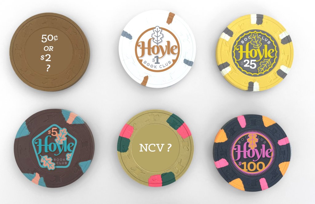
Back on the Harvest set lineup... Awaiting arrival of the snappers. The label will need more work once I see the colors in person.

Much as I liked the bright yellow $2s, I think they conflicted with the mustard $25s. And while the dark gray hundo was probably the best design of the bunch, it also conflicted too much with the brown $5s.

Lastly this iteration also brings in the monster fat hat $500 into the image with the rest.
 
(I may make the 50¢ piece an NCV, which would allow more flexibility to be used as a quarter, 50¢, or even a $20 chip in a limit game.)
 
So I’ve shipped about 1,250 chips to @Nanook (for inlay removal) and to @Josh Kifer (for milling) for this set I’ve been futzing with for ages. Have also contacted Gear to see about his availability for labels to replace these.

Next step is to try to finalize the artwork. I have been mocking everything up in Quark and Pixelmator (a free-ish Photoshop substitute), but now have to make some decisions and essentially recreate everything in a more perfect, high res form.

Below is the current state of the inlay designs. Since these will be actual replacements, I probably will go with a thicker option and maybe textured.

The rightmost chip will be an NCV, more for fun than anything, and the varmint design is just something I whipped up in MidJourney then modified. May go with something else. And I only have 5 of those chips right now.

My main focus is on the workhorse $1, $5, $25 and $100 designs.

Final feedback most appreciated as I am getting closer to trigger-pulling on the art. Posting this as a link so it can come through higher-res.

https://www.sampratt.com/hoyle/harvest-full.jpg
what happened to the $2?
 
Oh, shoot. Just a layer that must have gotten accidentally duplicated and slid over. Try to upload a corrected version later.
 
Some notes on design and the general set idea:
  • I’m very grateful to all the chippers who helped me get these together. It’s been an almost two-year saga, now entering the home stretch.
  • In addition to trying to have an overall color scheme that worked together, and good variation in the edgespots, I put some subtle tweaks into the design, such as varying the number and position of the oak leaves. I may adjust those.
  • Some of the chips have subtle shadowing behind the leaves and the type, but I may eliminate most or all of those. I think they look sharper with less fiddly graphics.
  • I varied the ring around the inlay to reflect the chips' value. The frac (shown here as a 50¢ pice but which I’ll bump down to quarters) is a thin line broken up into... quarters. The $1 has a single line, $2 double line, $5 a pentagon, $25 a 25-point emblem, the $100 has 100 points...
  • This “harvest” color theme for my main workhorse chips in this set came about simply because I was having trouble finding 400+ spotted THCs to use as my $5s. I wound up landing enough of the AS $2s in mint condition. Though brown isn't a standard $5 color, it works fine for me and my regs will get used to it.
  • Found 200 of the $1 Jack Cincys, mint or near-mint, which mesh well with the other brown/tan/gray/mustard chips.
  • Stumbled into a rack of the pink Jack snappers, which I don’t really need for the set... but again that makes for more design indulgence, and I always liked this chip.
  • I also was a longtime admirer of the CDM5 and similar chips with the same spots/mustard base color, which I’m using here for the $25. Again, not totally standard, but I like it. Finding enough of these was a major struggle as well. These are not 100% mint, but pretty close.
  • I already had 300 of the tan solids, dead mint, which I was going to sell but I figured I’d use them as 25c or 50c francs. Haven’t decided which. Only going to use 200 of these, which is probably overkill, but they don’t have a lot of market value despite being really sharp and beautiful IMHO.
  • For the $100, I originally was going to go with the dark gray ES T100, and I think that was maybe my best design of the bunch. Also a gorgeous chip. But ultimately I had to sacrifice it, because the dark gray 100 could create issues with the brown 5s. I also like to have larger denoms go bigger, and I had a rack of mint pumpkin-y 43mm HSI 1Ks that I’d never found another use for. The color works well with the others.
  • Another unfortunate casualty of the design process was my original yellow $2 chip, using the AS T1K hotstamps, which almost became the $5 chip instead. I felt it was too much of a color conflict with the CDMs, which I’d gone to such lengths to assemble and couldn’t give up. So I’ll be selling those.
  • The 48mm $500 and NCV chips are more of a folly, and will seldom get actual use. I only have 15 of the former and 5 of the latter. The colors are also not totally consistent, but again these are more aspirational/fun chips to have around in case our 1/2 or 2/5 games run late and people throw around more money than usual... Plus I love graphic design and this lets me expand the country theme a bit with the acorn and woodchuck, building on the oak leaf motif. (Lots of oaks at my place.)
 
Here’s a corrected JPG without the smudging that marred the earlier one...

https://www.sampratt.com/hoyle/harvest-full-lineup040623.jpg
I LOVE this design in general, especially the subtle nods to the denominations built in. A few thoughts:
  • on the 500 I read the text as "club book" instead of "book club". i would personally rotate the book to the left and club to the right.
  • having the leaf cover part of the "book club" on the $25 and $100 bothered me a bit (just because it's not consistent with what you did on the .50 for example). Don't have a perfect solution for those, but they instantly bothered me
 
So my next step (after conferring with Andrea and Chris at Gear) is to recreate the labels in my design program, Quark. My worksheet is below, posted as a JPEG so probably the image quality will be poor.

[I may be the last human on earth using Quark... Everyone else has migrated to InDesign. But I started working with QXP way back in college, c. 1987 or 1988. The keystroke commands are like second nature to me, and I just can’t give it up.]

Eventually these will be output to EPS files, and probably also PSD files, which the color-correct against actual sample chips. My goal as much as possible is to have the inlay colors match the base and edge spot colors of the chips as much as possible. The hardest to match, I gather, are the hot pinks, which can’t be as saturated in print as the clay. But as a result I’ve bumped up some of the colors beyond the actual expected output in anticipation of some of the colors dulling down in print.

This process of recreating the designs is helpful to me, as it forces me to reconsider a ton of choices, refine a lot of small things, and tune everything up. It’ll probably be a week or two before I’m ready to ship files to Gear.

harvest-worksheet.jpg
 
I LOVE this design in general, especially the subtle nods to the denominations built in. A few thoughts:
  • on the 500 I read the text as "club book" instead of "book club". i would personally rotate the book to the left and club to the right.

I second this. It reads Club Book to me too :- )
 

Create an account or login to comment

You must be a member in order to leave a comment

Create account

Create an account and join our community. It's easy!

Log in

Already have an account? Log in here.

Back
Top Bottom