Fantastic Gradients and Where to Find Them (1 Viewer)

Bozz

Waiting List
Joined
Mar 28, 2024
Messages
5
Reaction score
13
Location
Pennsylvania
Hello everyone! After searching through the forum for insights, there did not appear to be a 'direct' discussion about gradients in chip design. I figured this might be a good spot to post designs where gradients were used successfully, or in ways that produced a more unique design. Or perhaps discussing good color combinations? Any of it!

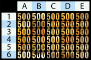
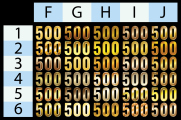
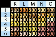
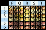
The overarching reason for this is to assist my design process for a tournament set that is a bit more dramatic and showy, and my headspace is leaning towards mimicking metals / metallics (ex. Gold, Silver, or Bronze). I've seen some examples of this during my search, but if you have a particular design you've liked (labels/ceramics/etc) - post them here and lets talk about what makes them work well.

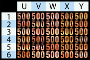
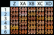
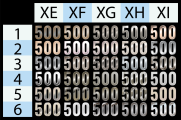
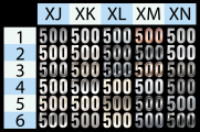
To kick things off, here's 240 metallic gradient denoms.
 

Attachments

  • Grid-01.png
    Grid-01.png
    342.3 KB · Views: 50
  • Grid-02.png
    Grid-02.png
    348.4 KB · Views: 44
  • Grid-03.png
    Grid-03.png
    355.9 KB · Views: 41
  • Grid-04.png
    Grid-04.png
    358.1 KB · Views: 32
  • Grid-05.png
    Grid-05.png
    351.3 KB · Views: 37
  • Grid-06.png
    Grid-06.png
    363.3 KB · Views: 36
  • Grid-07.png
    Grid-07.png
    341.9 KB · Views: 38
  • Grid-08.png
    Grid-08.png
    340.2 KB · Views: 49
TBH almost every time I’ve started adding gradients to an inlay design, I’ve either made them verrry subtle or ended up removing them entirely at the end of the process.

I think this is due to the tiny space available for multiple elements. Gradients further clutter up an already crowded space.

A lot of classic chip inlays are quite spare — simple line art, limited and solid colors, blocky text. That was probably due to printing technology of the time. But I also think it was a choice made by experienced printers of a bygone era, who recognized the limits of designing within a 7/8"-1" circular label.

Not saying everything has to look like it came from the 1950s... Just that there is a lot to learn from the classics. What looks awe-inspiring on my giant monitor doesn’t always work at actual size.

One chipset which used subtle gradients well, I think, were the custom Pointe Afters. They use a gradient fill at the edges to blend the edge color into a white background for the main label area. I’ve always liked those.

https://www.pokerchipforum.com/threads/pointe-after-casino-set.113595/

All that said, if you pull off a great blingy gradient design I’ll be the first to applaud ’ya.
 
Last edited:
I think this is due to the tiny space available for multiple elements. Gradients further clutter up an already crowded space.

A lot of classic chip inlays are quite spare — simple line art, limited and solid colors, blocky text. That was probably due to printing technology of the time. But I also think it was a choice made by experienced printers of a bygone era, who recognized the limits of designing within a 7/8"-1" circular label.

Not saying everything has to look like it came from the 1950s... Just that there is a lot to learn from the classics. What looks awe-inspiring on my giant monitor doesn’t always work at actual size.
Yeah agreed, part of the reason I'm leaning towards a 43mm ceramic. Not be constrained to a label, and plenty of room to let the design breathe.
 

Create an account or login to comment

You must be a member in order to leave a comment

Create account

Create an account and join our community. It's easy!

Log in

Already have an account? Log in here.

Back
Top Bottom