bentax1978
4 of a Kind
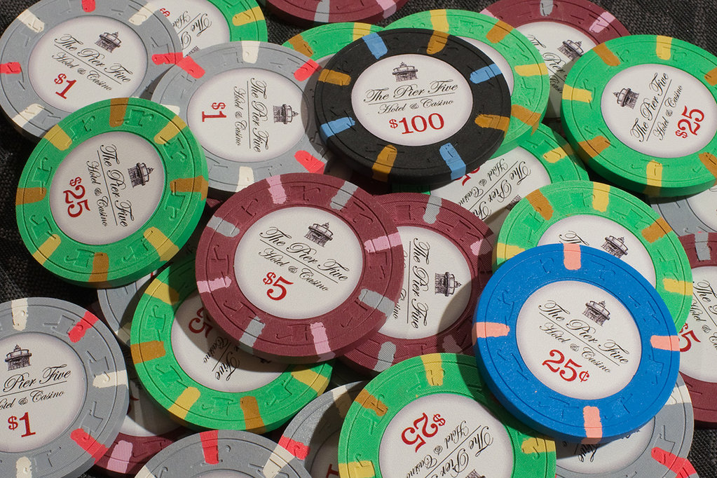
I'm looking to get input on a Condado Beach Tribute set I've been working on. However, instead of going with "The Condado Beach - Hotel & Casino", I am going to label them "The Pier Five - Hotel & Casino" chips. The Pier 5 hotel (in Baltimore) is where my wife and I were married back in 2002. The graphic on the top of the chip is a sketch of the Seven Foot Knoll Lighthouse, located on Pier 5 where we had the ceremony.
All of the chips are going to be relabeled Paulson THC 818 spotted chips. I've already acquired three different chips in sufficient quantities to proceed, and I'm working on trying to get a fourth denomination to add to the set. The three chips that are set to go are the gray Casablanca $100 chips (to be relabeled into $1 chips), the red-brick Casablanca $100 chips (to be relabeled into $5 chips) and the Aztar $25 chips (to be relabeled into either $25 chips, or possible $0.25 chips, depending on what the fourth chip ends up being).
I had done a rough mockup of my design and @Gear printed out some sample labels (along other labels I had already ordered for a different project) so I could get an idea of how the graphic and text would look printed out on an actual label. I was very happy with the results in terms of the quality of the printing, despite some initial concerns about how legible the text and graphic would be. I applied the samples to the chips, and I think it's a good first iteration.
Based on what I liked and didn't like about the first draft samples, and incorporating the input and advice from several helpful PCF members, I've tweaked the layout a bit. The main changes were the font, which now more closely matches the font on the Condado Beach chips. The denomination is a slightly deeper red, and centered without respect to the dollar sign. There is a little more space near the edge of the inlay, and the separation line is thinner and doesn't extend as far beyond the text. I also replaced the "and" with an ampersand on the lower line of text.
I'm still undecided on whether to go black or blue, the latter obviously being more true to the original. I welcome any opinions on that. Obviously I welcome opinions on any aspect of the project, which is why I am posting it here")
Condado Beach $5 chip

Original inlay concept

revised inlay - black

revised inlay - blue

original sample labels on chips

original sample labels in mini splashed pot

wedding shot for context

edit: most recent mockup


All of the chips are going to be relabeled Paulson THC 818 spotted chips. I've already acquired three different chips in sufficient quantities to proceed, and I'm working on trying to get a fourth denomination to add to the set. The three chips that are set to go are the gray Casablanca $100 chips (to be relabeled into $1 chips), the red-brick Casablanca $100 chips (to be relabeled into $5 chips) and the Aztar $25 chips (to be relabeled into either $25 chips, or possible $0.25 chips, depending on what the fourth chip ends up being).
I had done a rough mockup of my design and @Gear printed out some sample labels (along other labels I had already ordered for a different project) so I could get an idea of how the graphic and text would look printed out on an actual label. I was very happy with the results in terms of the quality of the printing, despite some initial concerns about how legible the text and graphic would be. I applied the samples to the chips, and I think it's a good first iteration.
Based on what I liked and didn't like about the first draft samples, and incorporating the input and advice from several helpful PCF members, I've tweaked the layout a bit. The main changes were the font, which now more closely matches the font on the Condado Beach chips. The denomination is a slightly deeper red, and centered without respect to the dollar sign. There is a little more space near the edge of the inlay, and the separation line is thinner and doesn't extend as far beyond the text. I also replaced the "and" with an ampersand on the lower line of text.
I'm still undecided on whether to go black or blue, the latter obviously being more true to the original. I welcome any opinions on that. Obviously I welcome opinions on any aspect of the project, which is why I am posting it here
Condado Beach $5 chip
Original inlay concept
revised inlay - black
revised inlay - blue
original sample labels on chips
original sample labels in mini splashed pot
wedding shot for context
edit: most recent mockup
Last edited:


