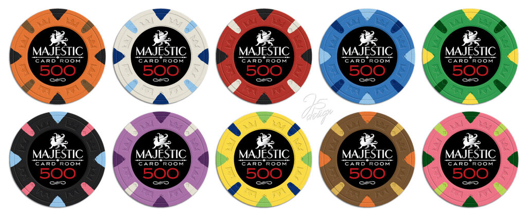
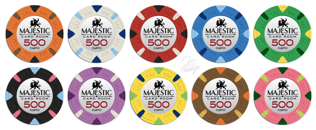
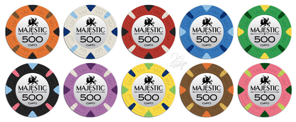
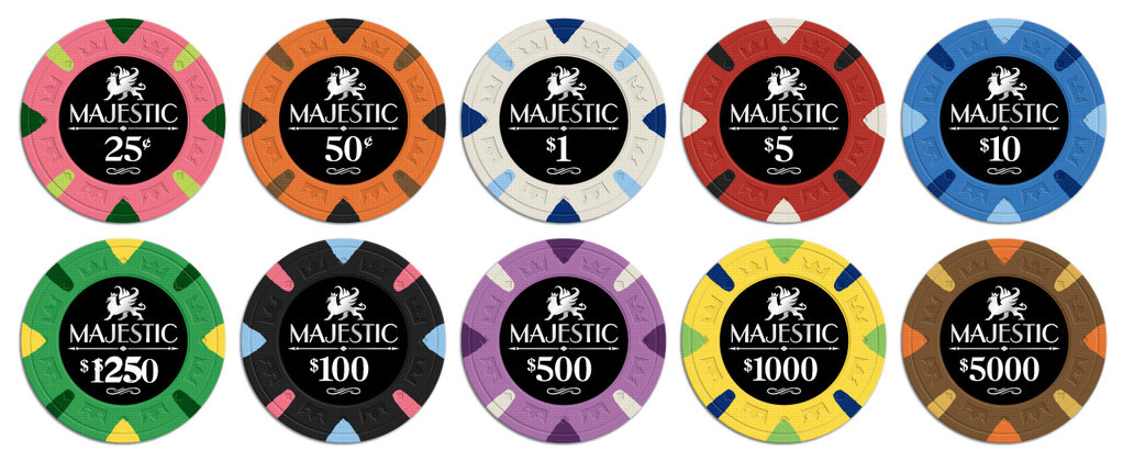
Here is what they look like in sets. Let me know what you think. I like #2 the best. Not sure If I like the red denomination with the black labels. Matching silver or white might be the best with a black background.
You are using an out of date browser. It may not display this or other websites correctly.
You should upgrade or use an alternative browser.
You should upgrade or use an alternative browser.
Coming Soon!!! (6 Viewers)
- Thread starter Apache
- Start date
RichMahogany
Straight Flush
The top two rows are looking hella fine!!
Psypher1000
Straight Flush
I lean towards middle, but the top is still good. Can't wait for dat pink chip!
I'm the dissenting voice  I like the white inlays with red denoms better... That's not to say the back with red isn't great, it's 'almost' as awesome as the white with red!
How about the option of black inlay on one side and white on the other.
Ben
Full House
black inlay, red denoms. easiest decision i've made all day.
This for sure. I think the red and orange chips look better with black denom, but the red crushes all the rest.
CdnBeerLover
Full House
Either #1 or #2, but #1 is slightly better. I agree that a silver denom might work better with the black inlay, but perhaps a slightly brighter red (or bolder font, as per shaboo's suggestion) would make it "pop" more.
Forty4
Full House
I like the red denoms on the black. I agree with the comment, that the denom font needs to be larger or bold. Not sure if this is true or just my eyes but the third set where CARD ROOM has been removed the denoms appear larger. Maybe it's just more negative space so the appearance is more pronounced. In any case I think the CARD ROOM should be left off.
I also see the white sticks are back on the red T500 chip. I wasn't a fan of that but with the black label I think it looks good.
Have you determined what chips are going to be which values?
I also see the white sticks are back on the red T500 chip. I wasn't a fan of that but with the black label I think it looks good.
Have you determined what chips are going to be which values?
Strike1st
Straight
I like the middle....right there with Chaos!
Bloody Marvelous
3 of a Kind
I'm torn between the white and black inlays. The red denoms are definitely betters than the blacks.
I'd lose the "card room" on the chips. Just "Majestic" looks better imho.
For colors I'd go with:
(Tan: 5¢)
Blue: 25¢
White: $1
Red: $5
Green: $25
Black: $100
Purple: $500
Yellow: $1,000
Orange: $5,000
Pink: $25,000
(Tan: $100,000)
I'd lose the "card room" on the chips. Just "Majestic" looks better imho.
For colors I'd go with:
(Tan: 5¢)
Blue: 25¢
White: $1
Red: $5
Green: $25
Black: $100
Purple: $500
Yellow: $1,000
Orange: $5,000
Pink: $25,000
(Tan: $100,000)
Mental Nomad
Full House
Josh - I don't have much to say, because I don't feel a strong preference among these choices. But I do want to say that I very much like the direction.
I also like that it meshes well with the Heraldic seating buttons.
I do currently intend to acquire a sizable set of each when they come around (1000+ on the chips.)
I also like that it meshes well with the Heraldic seating buttons.
I do currently intend to acquire a sizable set of each when they come around (1000+ on the chips.)
Last edited:
I also like that it meshes well with your Heraldic seating buttons.
the seating buttons are from a different vendor....
atomiktoaster
Full House
They do mesh well, but the seating buttons are Sal's at OWPS.Josh - I don't have much to say, because I don't feel a strong preference among these choices. But I do want to say that I very much like the direction.
I also like that it meshes well with your Heraldic seating buttons.
I do currently intend to acquire a sizable set of each when they come around (1000+ on the chips.)
Mental Nomad
Full House
the seating buttons are from a different vendor....
Ah, but I'm an idiot.
Rush4Rod
High Hand
Was hoping for something more like the "Protege" and focus on denomination. I like the griffon and we'd probably just call them that if there was no name on them. First glance I like #3, think I prefer the black labels. But I completely trust J5!!!
Maybe something like this without a title.
I like silver or white denoms on the black background, red denoms on the white background. I second the suggestion for 2 sided chips, black on one side, white on the other. I think the labels would look "cleaner" without the flourish design under the denom. It looks like an afterthought.
The words "card room" don't bother me, with or without seems to work.
The words "card room" don't bother me, with or without seems to work.
MoscowRadio
Flush
I really like the black labels with the red denominations, but I think red denoms always look good. As far as the "card room", I think it looks good with or without it. You can always be sure that J5 will deliver.
Maybe something like this without a title.

I actually like this quite a lot. Griffins ftw, although this technically isn't one.
The griffin, griffon, or gryphon (Greek: γρύφων, grýphōn, or γρύπων, grýpōn, early form γρύψ, grýps; Latin: gryphus) is a legendary creature with the body, tail, and back legs of a lion; the head and wings of an eagle; and an eagle's talons as its front feet.
Last edited:
loul13
Straight
I like a lot the white label , red denom and i would remove the card room !!!
Don't beat yourself up too badAh, but I'm an idiot.
black inlays rock, top set for sure
Forty4
Full House
Rush - I like the idea but my thought was denom in the center of the chip to allow for the greatest area possible. I've actually started to warm up to the Majestic name and like the spears below it. Maybe if the denom was in the center and the spears under that with the Majestic curved along the bottom. Probably too long of a name to make that work. But just a thought. Still in favor of red denom on a black label, I am just looking for a way to increase the size of the denom.
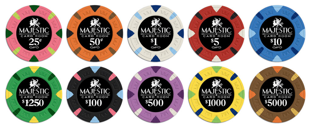
I am narrowing it down. I removed the little pattern under the denomination on the one set. I changed the black v's on the red chip to white. Let me know if we should include "Card Room". Which set do you like better?
Psypher1000
Straight Flush
Looks like the changes didn't get made to all the denoms, and there seems to be something wrong w/the #25 as listed. Would also be nice to have a $20 label available for the yellows for those that want it.
Love the red w/black and white edge spots!
Love the red w/black and white edge spots!
i prefer the previous $5. less white (i.e., keeping the 1/8" spot white) on the rolling edge makes more sense imo since the adjacent denom is a white chip.
i don't have a huge preference between including "card room" or not, but lean toward including it.
also, red denoms >>>>>>>>>>>>>>>>>>>>>> white denoms imo.
i don't have a huge preference between including "card room" or not, but lean toward including it.
also, red denoms >>>>>>>>>>>>>>>>>>>>>> white denoms imo.
Similar threads
- Replies
- 12
- Views
- 831
- Replies
- 10
- Views
- 447
- Replies
- 5
- Views
- 235
- Locked
- Replies
- 19
- Views
- 1K
