My New Design, Tequila Sunset... (3 Viewers)

Colquhoun

4 of a Kind
Joined
Apr 4, 2020
Messages
6,890
Reaction score
17,877
Location
Long Island, NY
I've created this basic design idea a while back and finally made something with it.
I wanted a tropical theme with bright colors, so here it is.
I mocked these up on the Jester mold, but it will look great on the palm tree mold, if that ever gets made!
logo.webp

Cash set:
cash-detail.webp

cash-set.webp


And Tournament set:
tourney-detail.webp

tournament-set.webp
 
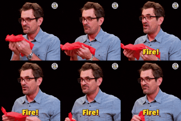
Fire indeed - great work, Colquhoun! The bright tropical/beach vibe is great - awesome design! :love:
 
Most excellent design!

Bur I'm not sure there's much hope in reading the thin white font on black background.
On a no-mold with dye sub printing, you’re right.
This set will be hybrids only, where the label is printed in much higher resolution. I’m confident it won’t be an issue.
I used a similar size/weight on the Pioneer set:
IMG_7089.webp
 
On a no-mold with dye sub printing, you’re right.
This set will be hybrids only, where the label is printed in much higher resolution. I’m confident it won’t be an issue.
I used a similar size/weight on the Pioneer set:
View attachment 1548120

I own a large 39mm hyrbid Pioneer Club tourney set, and I can confirm that the label prints out really nicely. The thin white font is refined and easy to read on the 24mm high resolution label! On the larger 28.3mm label of the 43mm hybrids - I assume it would look even better.
 
Wow I love it! great job, the chip colors and edge spots working really well together & inlay is spot on!
 
This looks super crisp! I am a fan of the different gradient on the cash and the tourney set. You don't really notice it at first.
 
Beautiful. I love the font choice for the denoms. Out of question, why is the $1 only in gray rather than full white to match the chip? I'm sure you have a great reason, and I'm wondering what it is. Or are my eyes playing tricks on me?
 
Beautiful. I love the font choice for the denoms. Out of question, why is the $1 only in gray rather than full white to match the chip? I'm sure you have a great reason, and I'm wondering what it is. Or are my eyes playing tricks on me?
If the 1 is in white, it will appear too bright to me, especially when you compare it to the other denoms. I wanted to keep in the same theme but not be so distracting.
 
Beautiful. I love the font choice for the denoms. Out of question, why is the $1 only in gray rather than full white to match the chip? I'm sure you have a great reason, and I'm wondering what it is. Or are my eyes playing tricks on me?
I don't think I explained my previous post very well. I think the larger some text is, the less it should be either white or black (depending on the background.)
If I make all the text white in this example, certain text demands more attention simply because of it's size:
quick1.webp


But if I alter the color or shade for the different sized lines, one size type doesn't dominate over smaller ones as much.
Here only the bottom line is 100% white:
quick2.webp


Sorry you asked? :ROFL: :ROFLMAO:
 
I don't think I explained my previous post very well. I think the larger some text is, the less it should be either white or black (depending on the background.)
If I make all the text white in this example, certain text carries more weight simply because of it's size:
View attachment 1549715

But if I alter the color or shade for the different sized lines, one size type doesn't dominate over smaller ones as much.
Here only the bottom line is 100% white:
View attachment 1549719

Sorry you asked? :ROFL: :ROFLMAO:
Teach Me Benedict Cumberbatch GIF
 
Your logo is great!
The color pallet doesn't convey anything with "toquilla sunset" though other than maybe your blue frac.
I can see the "blue agave" in the .25 frac. The others dont convey a Mexican dessert or sunset feeling.

Example: when the tequila is harvest, its cut an exposes the steam with the green, so the green "agave" chip can have off whites/light greens matching cut steams. The current green and purple remind me of TMNT chips.

This would be a great set to break away from traditional colors and center piece a bright workhorse chip against a darker tone desert pallet.

tequilla.webp
 
These are amazing! I can't decide if my favorite is the quarter, $1, or $5. I'll put in an order once I figure out which mold I want!
 
Very, very nice though I do like the 'dark' cash game label the best. It's really striking.
 
Really dig that cash set. Not too vintage, not too modern. Classy, like "Where'd these beauties come from?"
Those sunset colors are very easy to look at. My only critique would be on the green $25 chip - yellow/purple edgespots on the green look like MardiGras instead of sunset to me. The pink, red, and blue chips are especially stunning. Bravo.
 
@Colquhoun The inclusion of a micro chip is thoughtful and not many designers include them in a set. I now use the denom "AV" instead of a micro denom. AV means "Assigned Value". It allows that chip to be used as the owner sees fit. .05, .10, .50, $2 or they can be used as a high value chip in the case a game goes big. Some like the idea, some don't. I just get more flexibility out of my set using it. In this case, I can use it as .25 (or less) or even $2 or $500:
1758558035488.webp
 
@Colquhoun The inclusion of a micro chip is thoughtful and not many designers include them in a set. I now use the denom "AV" instead of a micro denom. AV means "Assigned Value". It allows that chip to be used as the owner sees fit. .05, .10, .50, $2 or they can be used as a high value chip in the case a game goes big. Some like the idea, some don't. I just get more flexibility out of my set using it. In this case, I can use it as .25 (or less) or even $2 or $500:
View attachment 1568857
That’s cool.
I did something similar a while back as a request. I used an icon instead of a denom, and keeping with the theme, a steer and a boot:
IMG_7222.webp
 
That’s cool.
I did something similar a while back as a request. I used an icon instead of a denom, and keeping with the theme, a steer and a boot:
View attachment 1568904
Very attractive set you have made here. I am sure it will be a hit. I like the icon option as well vs NCV. Pharaohs inspired that idea for me on my original set 15 years ago.
20250202_112543.webp
 

Create an account or login to comment

You must be a member in order to leave a comment

Create account

Create an account and join our community. It's easy!

Log in

Already have an account? Log in here.

Back
Top Bottom
Cart