Hawaii Set (1 Viewer)

scbill88

Pair
Joined
Apr 14, 2023
Messages
143
Reaction score
97
Location
Anderson, SC
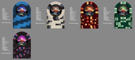
I literally started on this set last night so there are a lot of tweaks planned. Also, I did these in photoshop so I hope there is a way to make them vectors when I am done.
If not I am sure a good vector graphics designer can come close.
chips.jpg
 
Graphic is nice, but I would rethink the type…it looks upside-down to me. Maybe because there’s only 2 instances of “Island Poker Club” , it doesn’t have the wrap-around repeating pattern like the Aurora chips shown in the later post.
Maybe the type is readable on the top above the volcano, or maybe do “island poker club” readable on the top, and “Maui, HI” readable on the bottom.
That is one of my tweaks along with the font (which I think is to small). I think it would be better if the top was upside right and the bottom was upside down. Photoshop fought me every time I tried to change it so I will fix it in Mockup #2. Thanks for the Input!
 
This design is hot , well done. As long as the base colors aren’t so dark where it’s hard to distinguish them, you’re in great shape, and the edge spots assist with this.
 
Nice typeface. I still prefer “Maui - Hawaii” not be upside-down when viewing in this position.
And have you considered making the dollar sign smaller? It’s distracting when it is full sized compared to the other numbers, imo.
Yea the dollar sign can use some work. I think I am going to leave the Maui though. It can lay any direction on the table and both text lines up means there is only 1 correct way to look at it....That would kill my OCD. Before the next mock up I will flip it and see if I can live with it. Thanks
 
Yea the dollar sign can use some work. I think I am going to leave the Maui though. It can lay any direction on the table and both text lines up means there is only 1 correct way to look at it....That would kill my OCD. Before the next mock up I will flip it and see if I can live with it. Thanks
OCD? Mine is going crazy with it upside-down! I definitely agree with @Colquhoun on this one but hey, you gotta play/live with them...
 
I hear ya.....this will be lots of trial and error to get it just right....here is the final "upside down set". Ill flip the text next week sometime and see how they look.
ALLCHIPS.jpg
 
I missed out too. I have never been to Alaska but have been to Maui 3 times. So, I feel a little connected to this set I am building. While it is not a 100% original idea, I feel it breaks away just enough to call it my own.
 
Getting closer to final product....different currency sizes and "$" symbols are bugging me, but I flattened the images so that means starting from scratch. Yikes
 

Attachments

  • IPCset.jpg
    IPCset.jpg
    60.7 KB · Views: 78

Create an account or login to comment

You must be a member in order to leave a comment

Create account

Create an account and join our community. It's easy!

Log in

Already have an account? Log in here.

Back
Top Bottom
Cart