Brochure feedback (1 Viewer)

T_Chan

Full House
Site Vendor
Joined
Apr 25, 2013
Messages
4,584
Reaction score
13,830
Location
Vancouver
Hi All,

I got so much great feedback with my new logo design that I'd like to try it again with my new brochure. My last one was done with a MS Word template so not so great. I'm making a new one and would like to see where I can improve. All feedback is welcome.

These images are exported from Illustrator as jpg and look a bit fuzzy but they are very high resolution as PDF and AI files. I just can't post those on the forum and still be readable.

Outside:
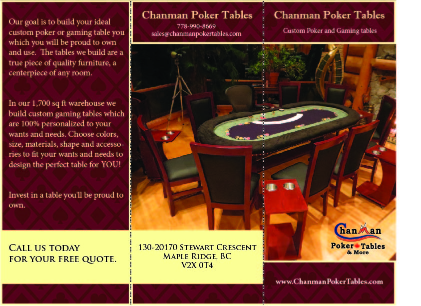
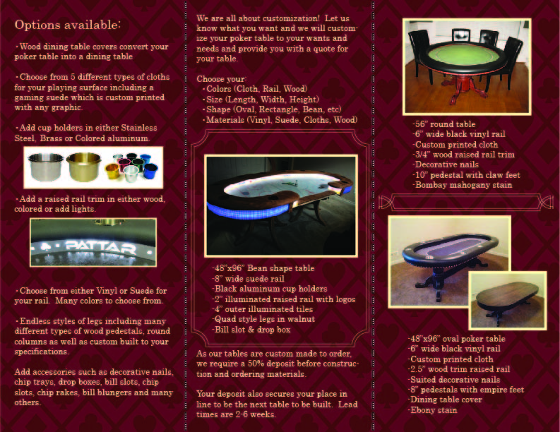
Sales brochure.jpg


Inside:
Sales brochure page 2.jpg
 
Looking good but a few things I'd change.

Front page has chanman 3x (including the website) I would remove the top one and replace it with your logo. Or make it logo larger.

Text/background. Not liking the red on red effect. Need to remove the red outline on the text IMO. As for the background, your pictures have a lot of reddish hues. (Woods etc.) I would personally change it to something else. Maybe a light blue.
 
1st paragraph "you which you"


On the 1st page you repeat the same line about wants and needs and again on the second page as well so I would drop those repeats.


2nd page: types is the plural word. It should read:

5 different types of cloth


Colours and coloured are spelled wrong. ;)

Also it is a bill plunger

Finally: you don't need "to be" twice and lead time should be singular.

Your deposit also secures your place in line to be the next table built. Lead time is 2-6 weeks.
 
Last edited:
I figured all the typos would get hammered. That's what I get for not proof-reading it first, doh..

Thanks for the pointers so far guys.
 
I just noticed that your new logo says Vancouver but your brochure says Maple Ridge which is confusing.
 
Looking good but a few things I'd change.

Front page has chanman 3x (including the website) I would remove the top one and replace it with your logo. Or make it logo larger.

I realize that it appears several times, but once it's folded it will appear less. Originally I didn't have my logo on there at all but decided that it should appear somewhere. I can't make the logo much bigger and that corner is the only really good place it can be without getting lost in the image. I figure I either keep both, or get rid of the title and leave my logo or vice versa. I don't think I can replace the one at the top with the logo as it really gets lost against the background (black on burgundy). I could change the background color, I will play with it a bit, but I quite like the color combination right now as I think it looks very regal/royal which is the high end look I'm after.

Text/background. Not liking the red on red effect. Need to remove the red outline on the text IMO. As for the background, your pictures have a lot of reddish hues. (Woods etc.) I would personally change it to something else. Maybe a light blue.

The outline around the text is just a double tan line. Do you think it would look better as a single line?
 
For any advertising I do locally, I show Maple Ridge. Anything outside of BC I show Vancouver, which is close to Maple Ridge as anyone outside of BC normally hasn't heard of Maple Ridge.

Same with where I live, which is Coquitlam. Anytime I go abroad and someone asks me where I live, I say Vancouver.

Revisions:
Sales brochure.jpg


Sales brochure page 2.jpg
 
Your main photo is really nice except for that tripod in the shot, I'd yank that out of there, really detracts from the beauty of the room imho
 
Something about the font on the top of the front and back (when folded) bothers me a lot. Is it Times New Roman? It doesn't stand out enough from the rest of the text. It's got a very "powerpoint" feel, which comes off as unprofessional for me. The lower case "t" in "Custom Poker and Gaming tables" doesn't help that, but I think there's more work to do (either color or font changes or something.
 
That font is Imprint MT Shadow. The rest of the brochure is done in Minion Pro font.

The title has a bit of detail on it which isn't visible from my image. Here's a closeup.

Screenshot 2015-09-08 08.32.32.png
 
My illustrator program isn't exporting very good quality images. Here are some better photos:

Screenshot 2015-09-08 08.34.17.png


Screenshot 2015-09-08 08.38.23.png
 
I think the descriptive text should bei justified. All in all, nice work.
 
First page, left column, first paragraph

Grammar correction: "The tables we build are true pieces of quality furniture" "In our 1,700 square foot warehouse, we" insert comma

In the same paragraph, you hyphenate "accessories"; you might be able to switch words around and eliminate "size" to get rid of the hyphen. Maybe a bit anal on my part, but you'll notice that top notch ads never include any hyphenated words

Also, on the same page and column, you use 'wants and needs' twice. I'd substitute 'desires' for the first set - less repetition.

"Call us today for your free quote." You can move 'for' to the top line and center the two lines of text to improve the look

Second page, left column

Grammar correction: "Choose from 5 different types of cloth for your playing surface, including" insert comma

If you're going to capitalize, then make it "Colored Aluminum"

Not sure what you mean by "Add a raised rail trim in either wood, colored or add lights." Can you word this better?

middle column, last section

if you switch words in the phrase "construction and ordering materials" to "ordering materials and construction", you can get around the hyphen

"Lead time is 2-6 weeks"
 
Last edited:
Outside comments:
Recommend changing "1,700 square foot warehouse" to "1,700 square foot manufacturing facility." Warehouse implies that you procure your tables elsewhere and simply store them for resale.

Recommend changing "Our goal is to build your ideal custom poker or gaming table which you will be proud to own and use" to "Our goal is to build you a custom poker or gaming table that you will be proud to own and use for a lifetime."

No need to repeat the "proud to own" statement again on outside.
 
Thanks very much guys. I will make the changes. It sounds like most of the changes are grammatical and wording. Does anyone have any feedback on overall design? Or did I nail it?
 
Thanks very much guys. I will make the changes. It sounds like most of the changes are grammatical and wording. Does anyone have any feedback on overall design? Or did I nail it?

Not sure if you saw my comment before or if you're able to get another shot, but the primary photo is a beautiful shot that I feel is marred by the tripod visible behind the table. Maybe if you can't get the shot again you could edit that tripod out of the scene? Just doesn't seem to fit with the rest of it.
 
I had some concern initally over the dark background and light yellow text, but in your latest version, the text appears much brighter and sharper; a lot easier to read.
You have put a lot of time, thought and effort into this. Good job, Chan!
 
Colors and fonts are great. I love how the Chanman logo just leaps out, but is still unobtrusive. Pretty brilliant, and an excellent start.

If the image of the colored cup holders, and the image of the lighted rail diffuser (or whatever it's called) were the same size, that section of the pamphlet would look cleaner. You want to give the impression that your aesthetic tolerances are spot-on, not "close enough".

The Light diffuser says "Pattar". I had to Google Pattar to see if that was a custom name, or a brand name for light diffusers. This could have been avoided if it said "add a raised rail, trimmed in wood, colored (name the material that is colored here i.e. wood, plastic, etc) or customized lights.

I personally think descriptive text should go immediately below the photograph. If someone picks up a brochure at a trade show or something, they may not read the whole thing start to finish. At least Americans don't, we're lazy that way. People will open it, glance at the pic, and if the pic interests them, they will read down from there. This is where you set your hook. Big selling point words like "custom", and "walnut" (it screams quality) should be directly below the image, not something boring like dimensions and "bean shaped". This is advertising. You have under 5 seconds to get into their brain. Make it count.

Also, have someone proofread the whole thing. Someone not familiar with what it might or should say. There are still a lot of typos and grammatical errors, and I'm too lazy to keep scrolling up and down on this thread to point them out (because I cannot just copy/paste text in an image).
 
Ok, lets give this another go. I'm still going to get someone to do a full proofread to make sure it can be understood by someone who doesn't know poker terminology.

Thanks again to everyone for the great feedback. I'm trying to nail down this design for an upcoming trade show. I've gotta have a great brochure.

Screenshot 2015-09-09 20.03.06.png


Screenshot 2015-09-09 20.03.29.png
 
Small typo: Under options available, last bullet point...think you're missing the word "more" at the end.

Looks great overall. I like the cover photo a lot, it shows a beautiful poker environment not only the table. Makes me dream of having something like that!
 
1st bullet point, you forgot the period at the end of the sentence (in addition to bmichaelhorn's catch).
 
Mrs. Zombie (knows little to nothing of table building) gave it a proofread. She mistakenly thought 10" pedestal literally meant 10" tall. We had a good laugh (reminiscent of This is Spinal Tap and the 18" stonehenge), but the word "diameter" might not be a bad thing...
 
Mrs. Zombie (knows little to nothing of table building) gave it a proofread. She mistakenly thought 10" pedestal literally meant 10" tall. We had a good laugh (reminiscent of This is Spinal Tap and the 18" stonehenge), but the word "diameter" might not be a bad thing...

That would make for a great poker table if sitting at it Japanese style on the floor. I'll throw in the word "wide" there. Diameter is too long and will make that line of text run onto the next line.

Thanks for getting her to proofread it for me. I was wondering who I could get to do that because pretty much everyone I know is into poker in one form or another.
 

Create an account or login to comment

You must be a member in order to leave a comment

Create account

Create an account and join our community. It's easy!

Log in

Already have an account? Log in here.

Back
Top Bottom